65 Maps
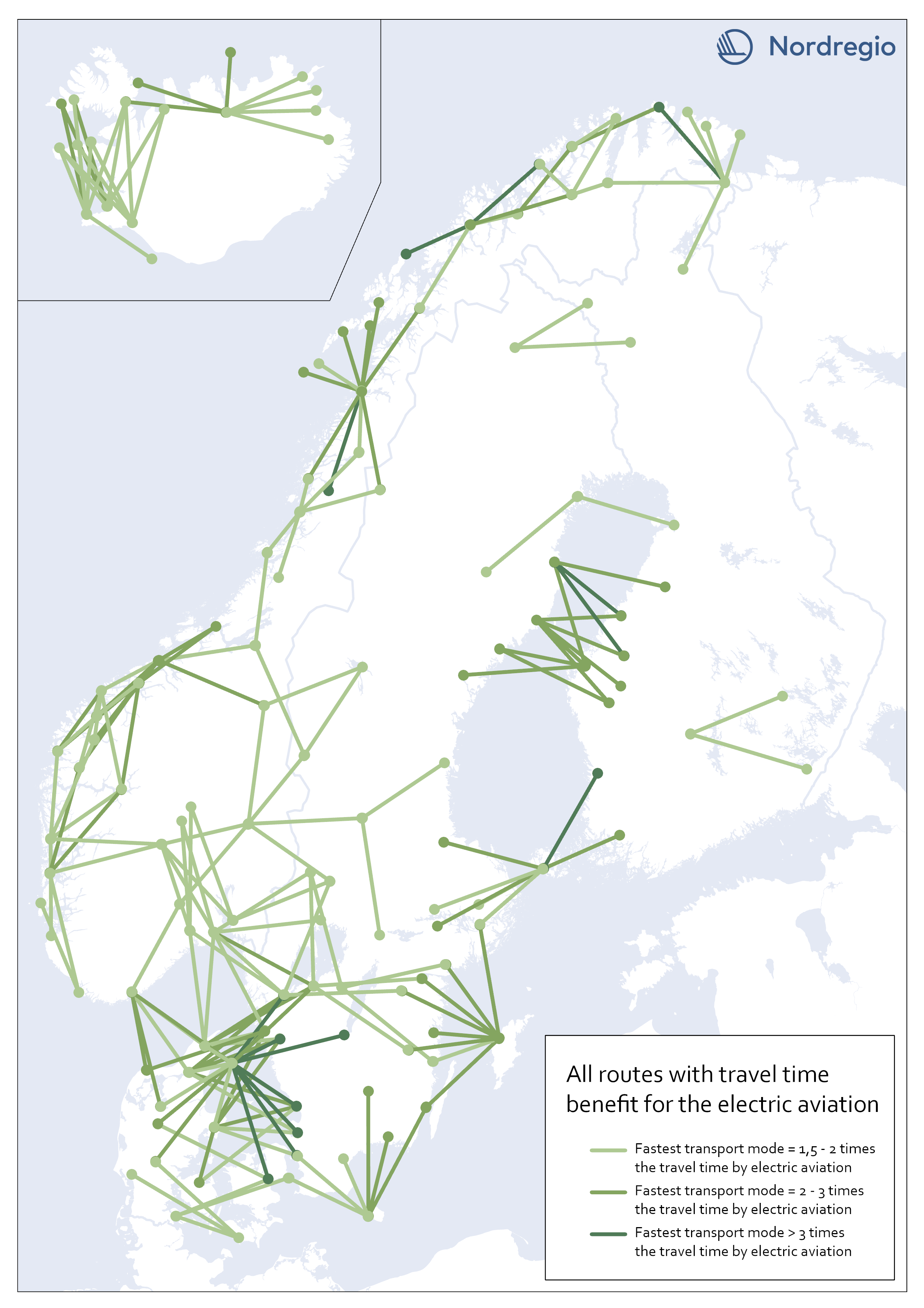
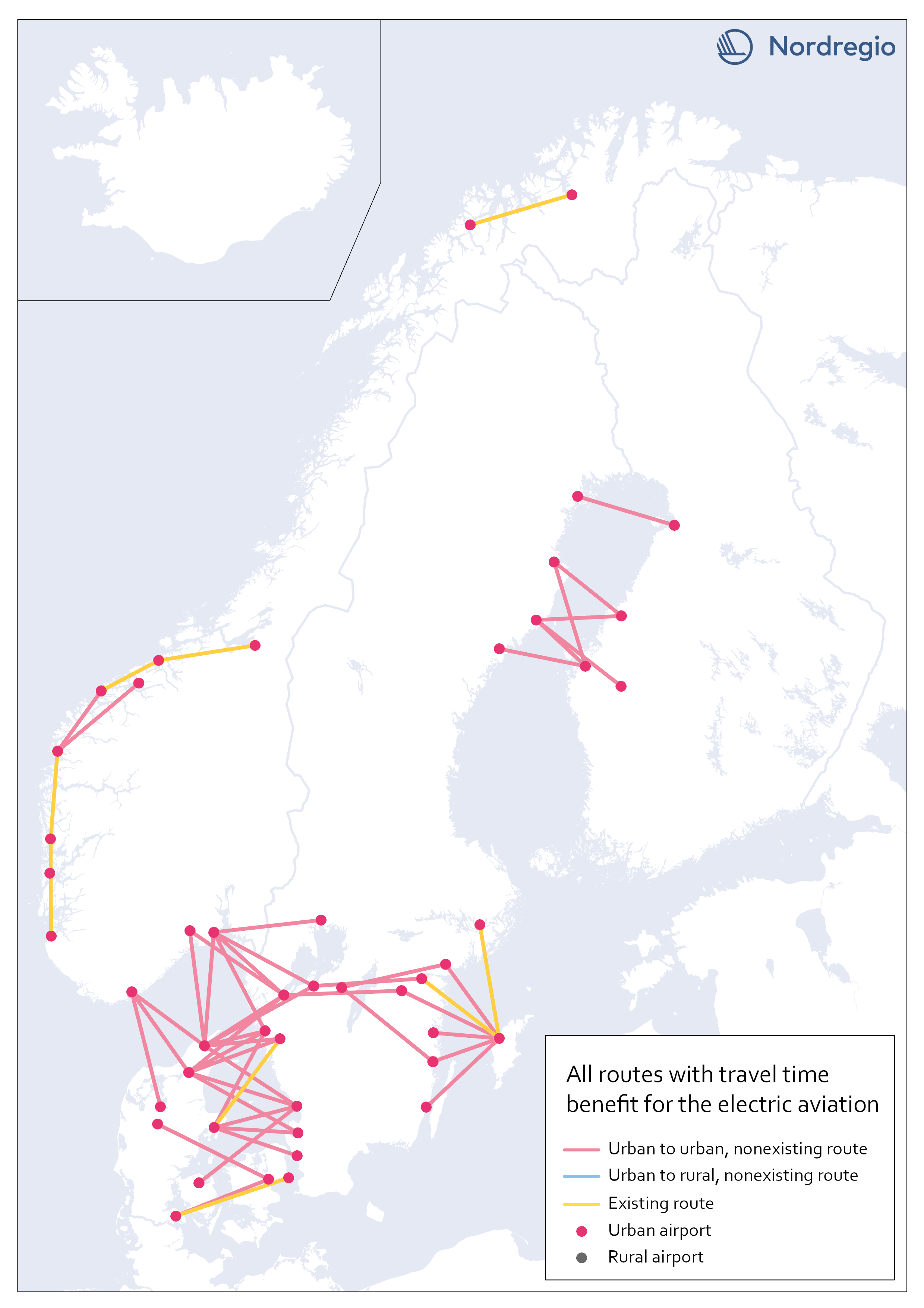
All routes with time benefit for electric aviation
The map shows all routes in our sample with significant travel time benefit for electric aviation. They are 203 in total. A route has a significant travel time benefit if the travel time for both car and public transportation exceeded 1,5 times the travel time for electric aviation. I.e., if one of the existing transport modes is faster or up to 1,5 times the travel time for electric aviation, electric aviation does not have the potential to improve accessibility between the two destinations, according to our analysis.
 2023 February
 - Nordic Region
- Transport
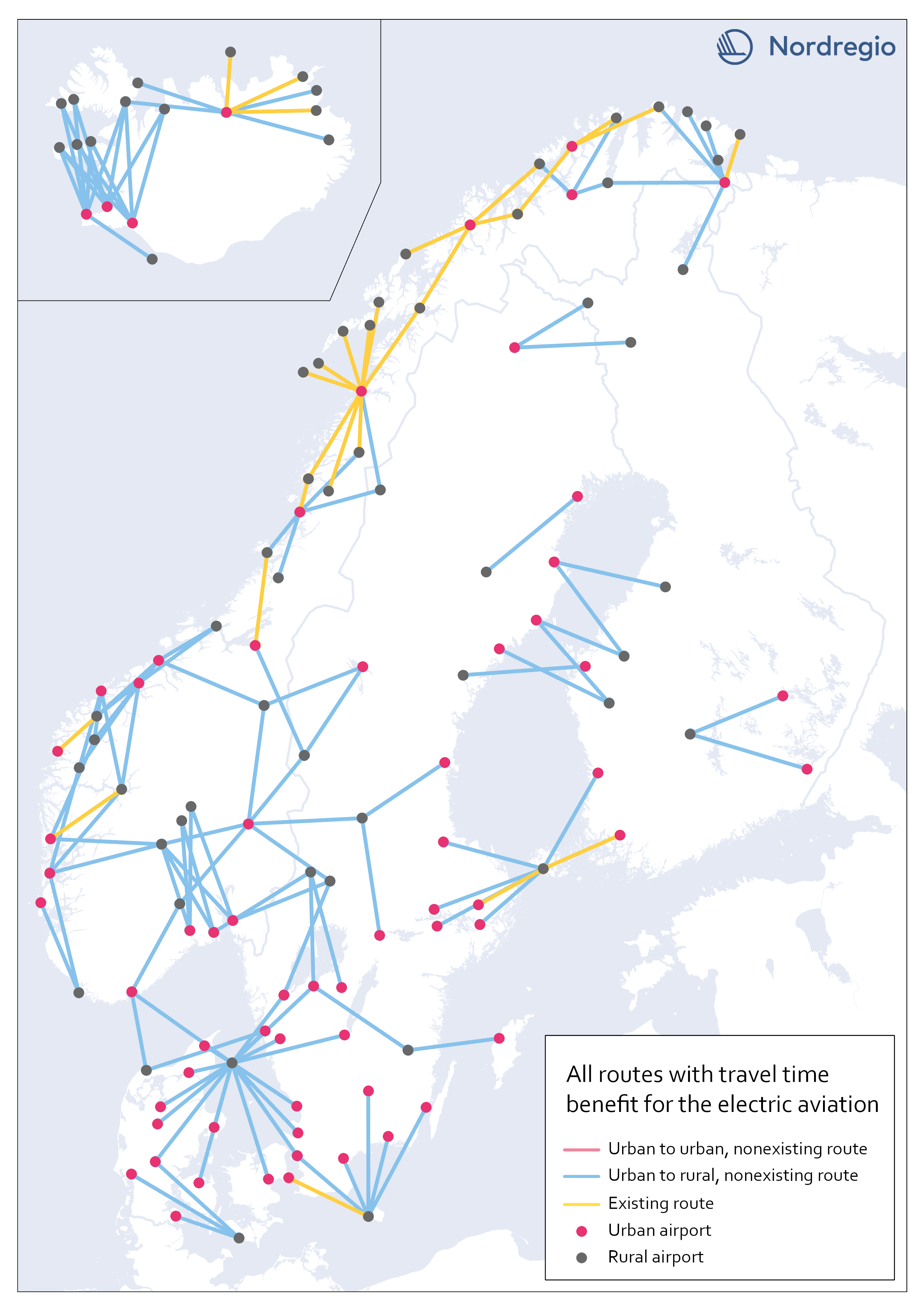
Electric aviation time benefits between urban and rural areas
The map shows all routes between urban and rural areas where electric aviation has significant time benefits compared to other traffic modes. Yellow lines are already served by aviation, while blue color indicates non-existent routes where electric flight would reduce the travel time between destinations. Our motivation for focusing on urban-rural routes was based on the assumption that electric aviation can increase the access for rural areas to public facilities and job opportunities, as well as the possibility of connecting remote areas with national and international transport systems. The result, though, can only be understood in terms of travel time benefits between the areas, and thus reveals little about accessibility to mentioned opportunities. The following are examples of themes to be investigated further within the main project. Identify regional hubs Among others, the project FAIR (2022) has addressed the need to update the flight system to a more flexible aviation network, that meet travelers’ needs with smart mobility. This can be done by identifying demands and establishing regional hubs for electric aviation, which can serve remote and regional areas. The potential of Hamar and Bodö in Norway as regional hubs should be studied more closely.
- 2023 January
- Nordic Region
- Transport
Electric aviation time benefits between urban areas separated by water
The map shows all routes between urban areas separated by water, and where electric aviation has significant time benefits compared to the fastest traffic mode. Yellow lines are already served by aviation, while red color indicates non-existent routes where electric flight would reduce the travel time between destinations. The result is in line with our assumptions, that there is a lack of fast connections between potential labor markets in urban areas, which are geographically close but separated by open water.
- 2023 January
- Nordic Region
- Transport
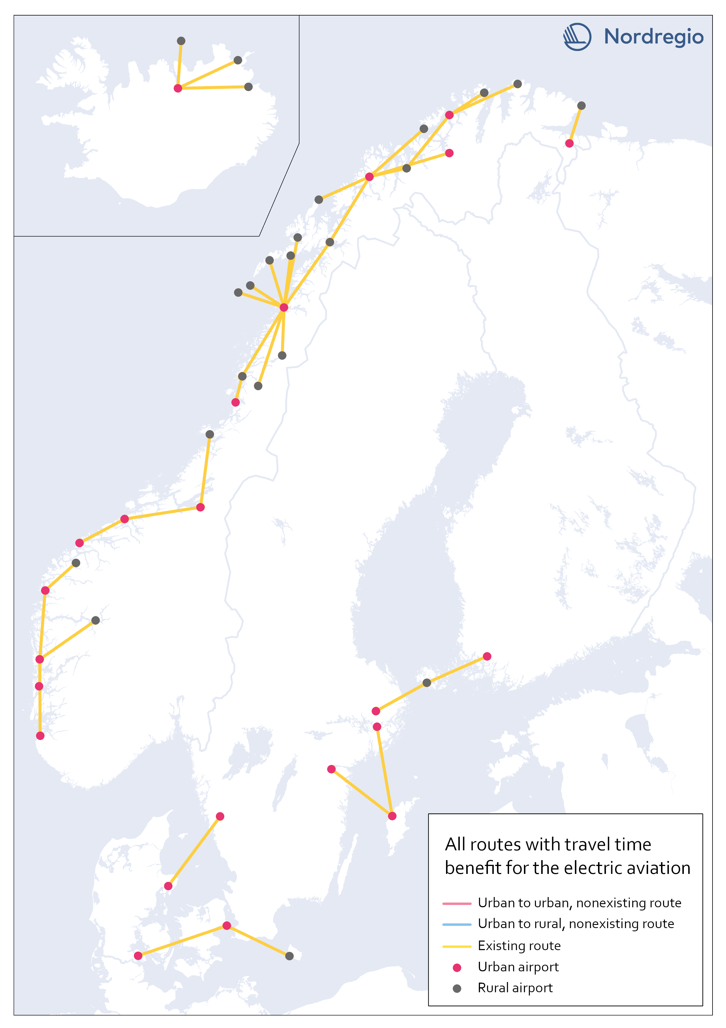
Existing routes with time benefit for electric aviation
The map visualizes all routes with significant travel time benefit, which are already served with commercial flights. Information on existing routes has been obtained from the report Nordic Sustainable Aviation (Ydersbond et al, 2020) and applies to the year 2019. Since then, routes may have been added or removed, which is important to bear in mind in future investigations. However, choosing a later year risk giving equally misleading results, as flights decreased drastically during the pandemic. Statistics for 2019 provide a picture of the demand that existed before the pandemic, which is the latest stable levels that can be obtained. Whether air traffic will ever return to the same levels as before the pandemic is too early to say. The majority of routes are found in Norway, along the coastline, which confirms earlier knowledge that Norway has a more extensive and coherent aviation network than the rest of the Nordic region.
- 2023 January
- Nordic Region
- Transport
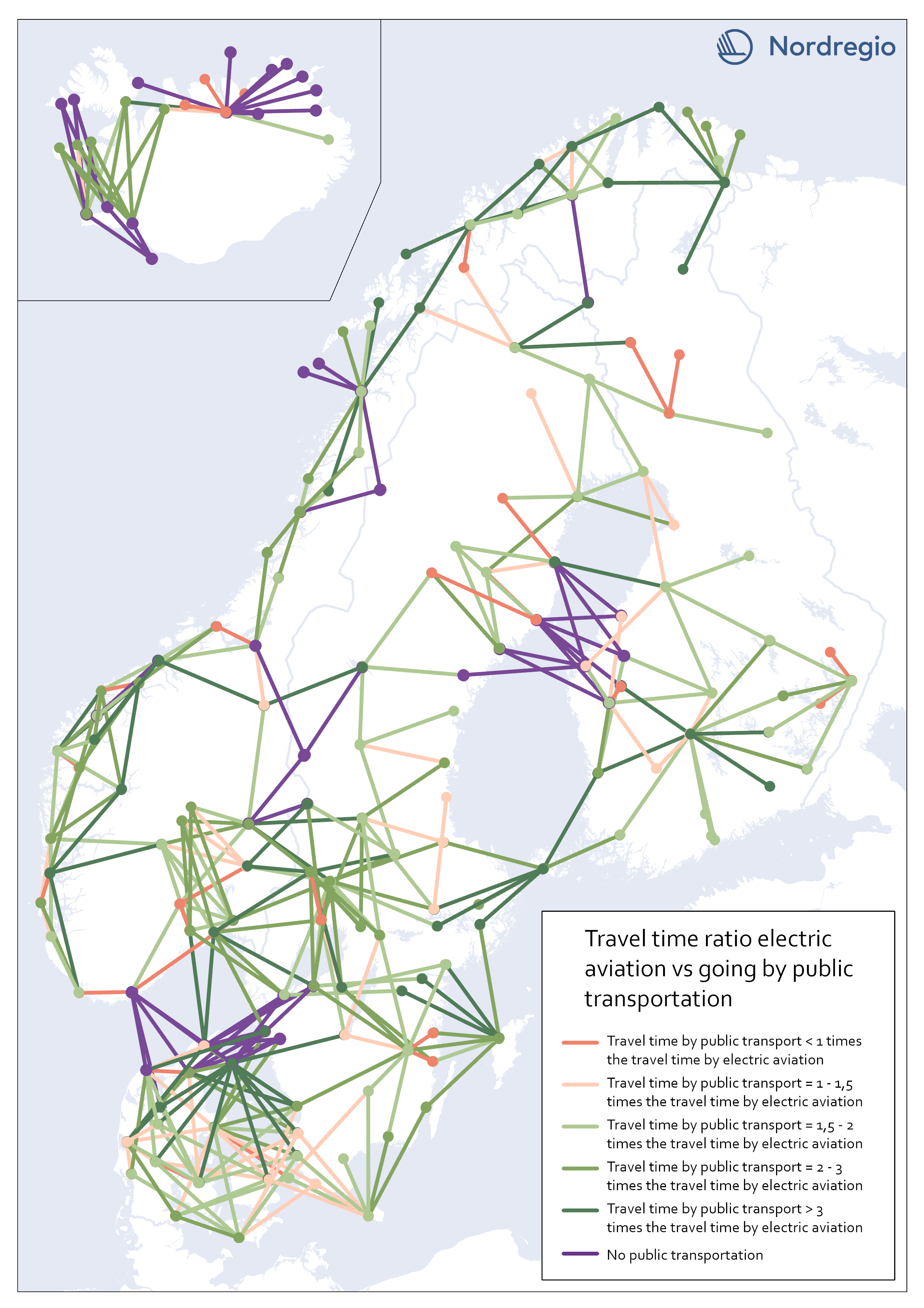
Travel time ratio – electric aviation vs public transportation
This map shows the travel time calculations for electric aviation versus travelling by public transportation. Routes represented by any nuance of green, are routes with significant travel time benefits for electric aviation in comparison with public transportation. The darker the nuance of green, the larger time benefit for electric aviation. The beige color represents routes where the travel time for public transportation is the same or up to 1,5 times the travel time for electric aviation. The red color represents routes where public transportation is faster than electric aviation. Purple lines represent routes where no public transportation is available. These were also routes where we could see significant time benefits for electric aviation. The number of changes when commuting with public transport may have a negative impact on perceived accessibility. In this accessibility analysis, however, we stay with the same criteria for public transport as for travel by car. For future research, the number of changes when commuting by public transport could be considered in the comparison.
- 2023 January
- Nordic Region
- Transport
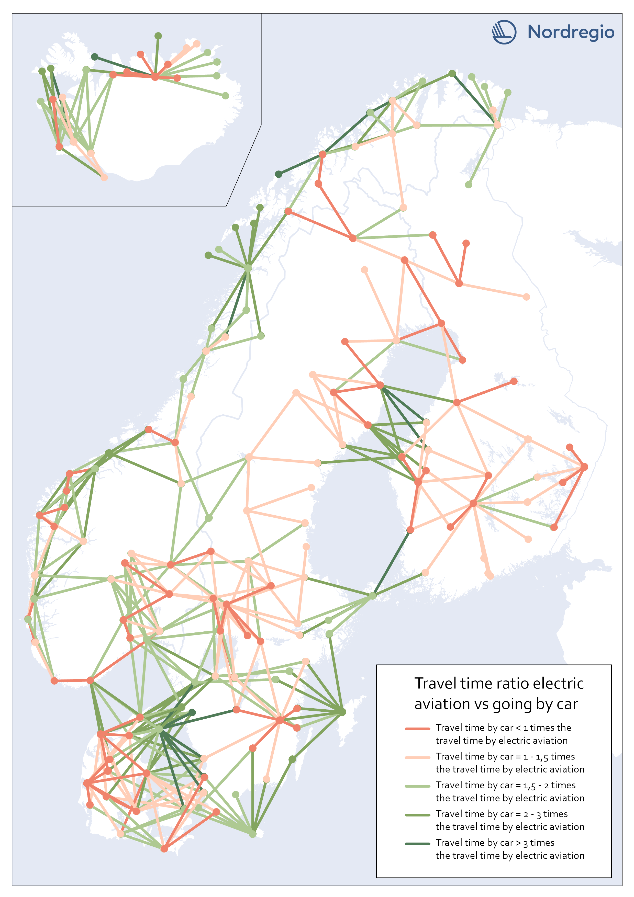
Travel time ratio – electric aviation vs car
This map shows the travel time calculations for electric aviation versus traveling by car. Routes represented by any nuance of green, are routes with significant travel time benefits for electric aviation in comparison with car. The darker the nuance of green, the larger time benefit for electric aviation. The beige color represents routes where the travel time for car is the same or up to 1,5 times the travel time for electric aviation. The red color represents routes where car is faster than electric aviation.
- 2023 January
- Nordic Region
- Transport
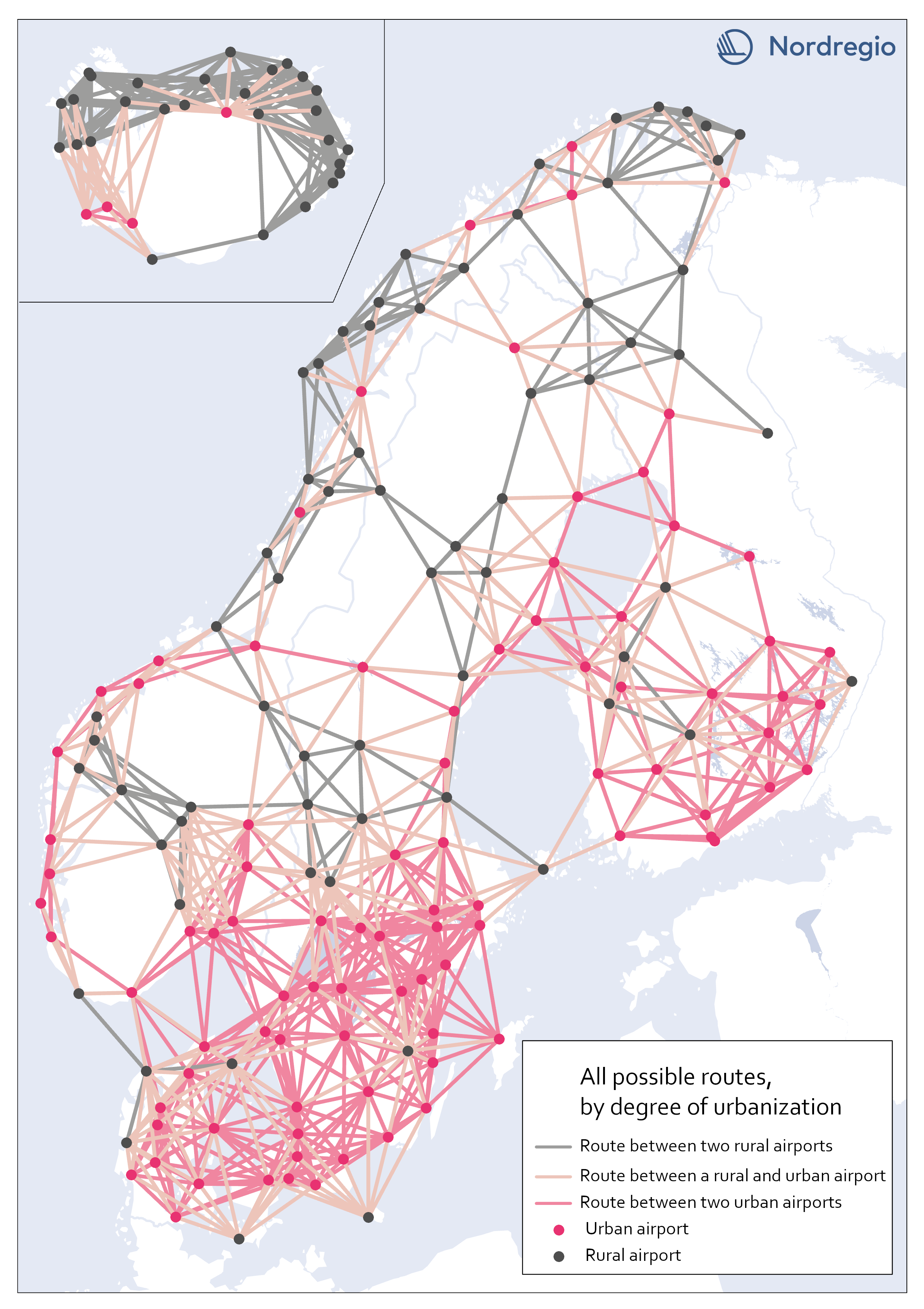
All possible electric aviation routes by a degree of urbanisation
The map shows all routes with a maximum distance of 200 km divided into three categories, based on the airports’ degree of urbanization: Routes between two rural airports, routes between one rural and one urban airport and routes between two urban airports. The classification is based on the new urban-rural typology. We restricted the analysis to routes between rural and urban areas as well as routes between urban areas that are separated by water. Those are 426 in total. We based our criteria on the assumption that accessibility gains to public services and job clusters can be made for rural areas, if better connected to areas with a high degree of urbanization. Because of possible potential to link labor markets between urban areas on opposite sides of water urban to urban areas that cross water are also included. This is based on previous research which has shown the potential for electric aviation to connect important labor markets which are separated by water, particularly in the Kvarken area (Fair, 2022). Our choice of selection criteria means that we intentionally ignore routes where electric aviation may have a potential to reduce travel times significantly. There might also be other important reasons for the implementation of electric aviation between the excluded routes. Between rural areas, for example, tourism or establishing a comprehensive transport system in the Nordic region, constitute reasons for implementing electric aviation. Regarding routes between urban areas over mainland, the inclusion of more routes with the same rationale as above – that significant time travel benefits could be gained between labor markets with electric aviation (for example between two urban areas in mountainous regions where travel times can be long) – can be motivated. Some of those routes can be important to investigate at a later stage but are outside the…
- 2023 January
- Nordic Region
- Transport
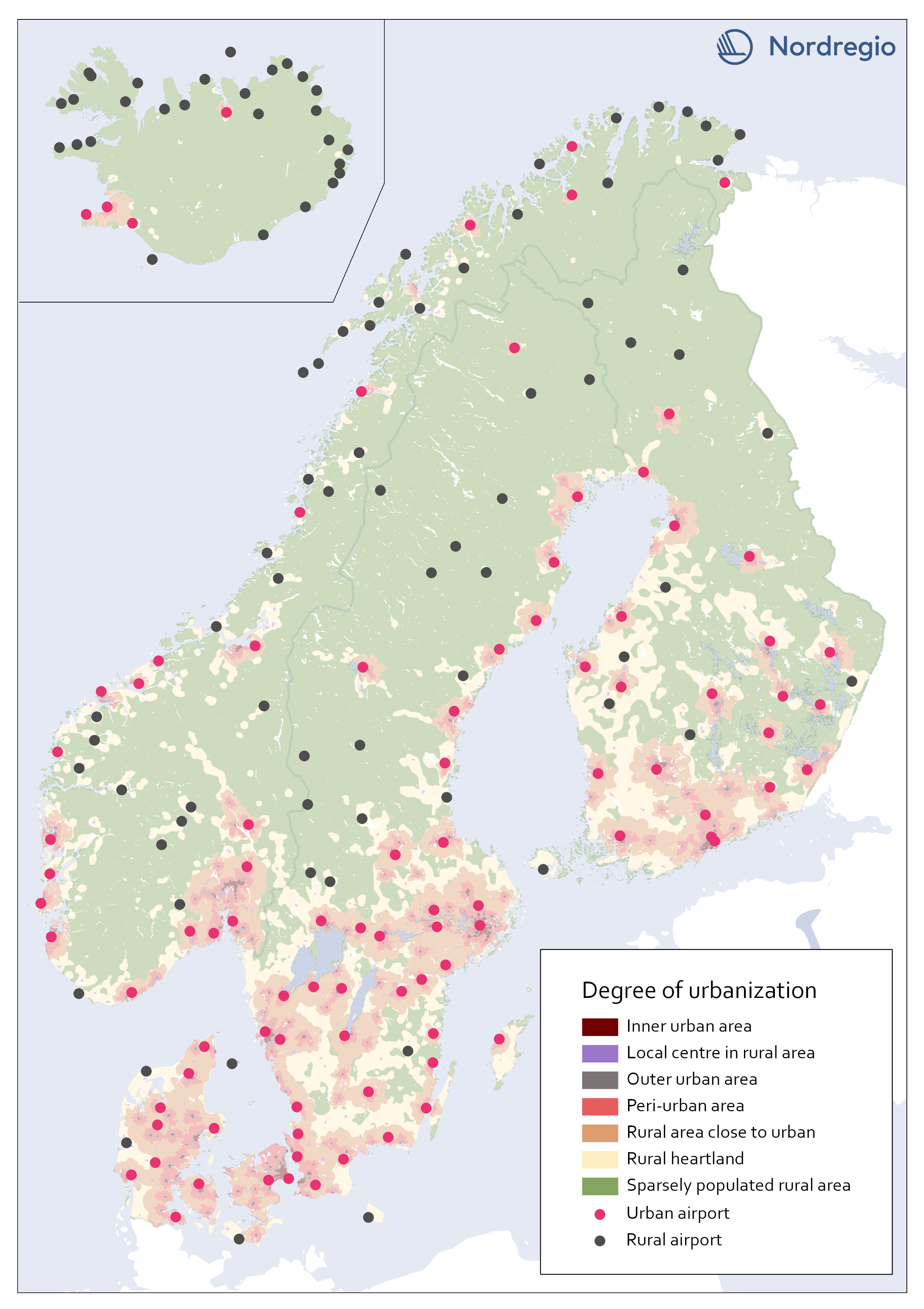
All airports in the Nordic region by a degree of urbanisation
This map classifies all airports by a degree of urbanisation. The classification is based on the new urban-rural typology. We classified all airports localized within any of the top five urbanization classes (Inner urban area, Local center in rural area, Outer urban area, peri-urban area, or Rural area close to close to urban) as Urban. All other airports, localized within the bottom two classes (Rural heartland or Sparsely populated rural area) were classified as Rural. No adjustments were made based on the proximity of the airports to urban areas. During the process we considered adjustments in the categorization based on the airports’ potential catchment area from a close urban area. For example, one can assume that Gällivare Lappland airport in the north of Sweden, has its main catchment area from Gällivare which is classified as a local center in rural area (i.e. Urban). The airport, though, is localized within the category Rural heartland. Yet, we decided to let the typology determine to which category each airport belong.
- 2023 January
- Nordic Region
- Transport
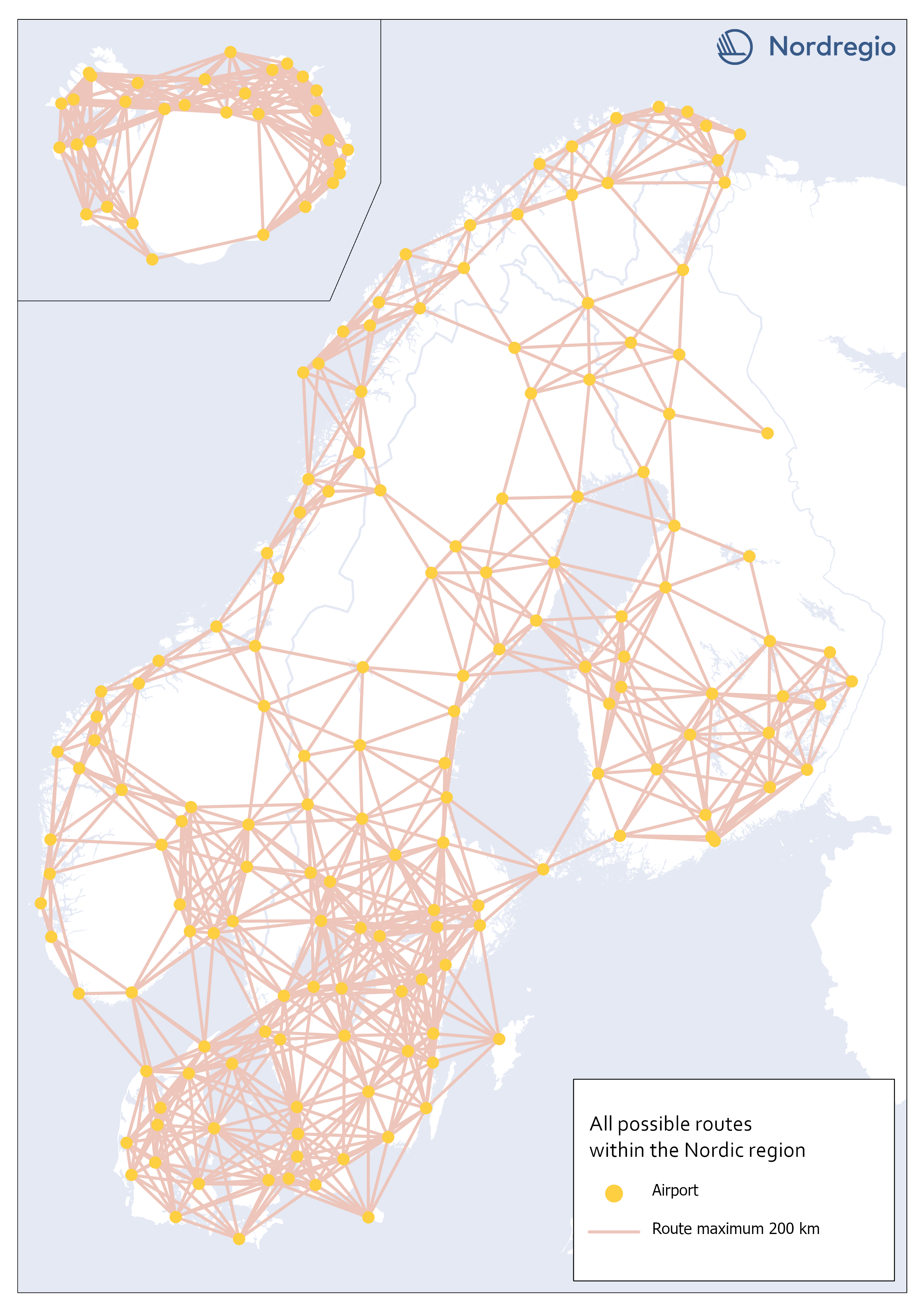
All possible electric aviation routes, max 200km, within the Nordic region
This map shows all possible electric aviation routes of a maximum distance of 200 kilometres within the Nordic region. First generation electric aviation will have a limited range due to battery capacity. According to the report Nordic Sustainable Aviation, routes up to 400 kilometers constitute an initial market for electric airplanes in the Nordic region. However, also shorter distance routes under 200 km, where cruise speed is less important and in sparsely populated regions where passenger volumes are very small, will be the focus (Ydersbond et al, 2020). The first generation of aircrafts that rely solely on electric power have a defined maximum range of 200 km (Heart Areospace, 2022). For this accessibility study, we only included routes of a maximum distance of 200 kilometers. This selection gave us 1001 possible routes in total.
- 2023 January
- Nordic Region
- Transport
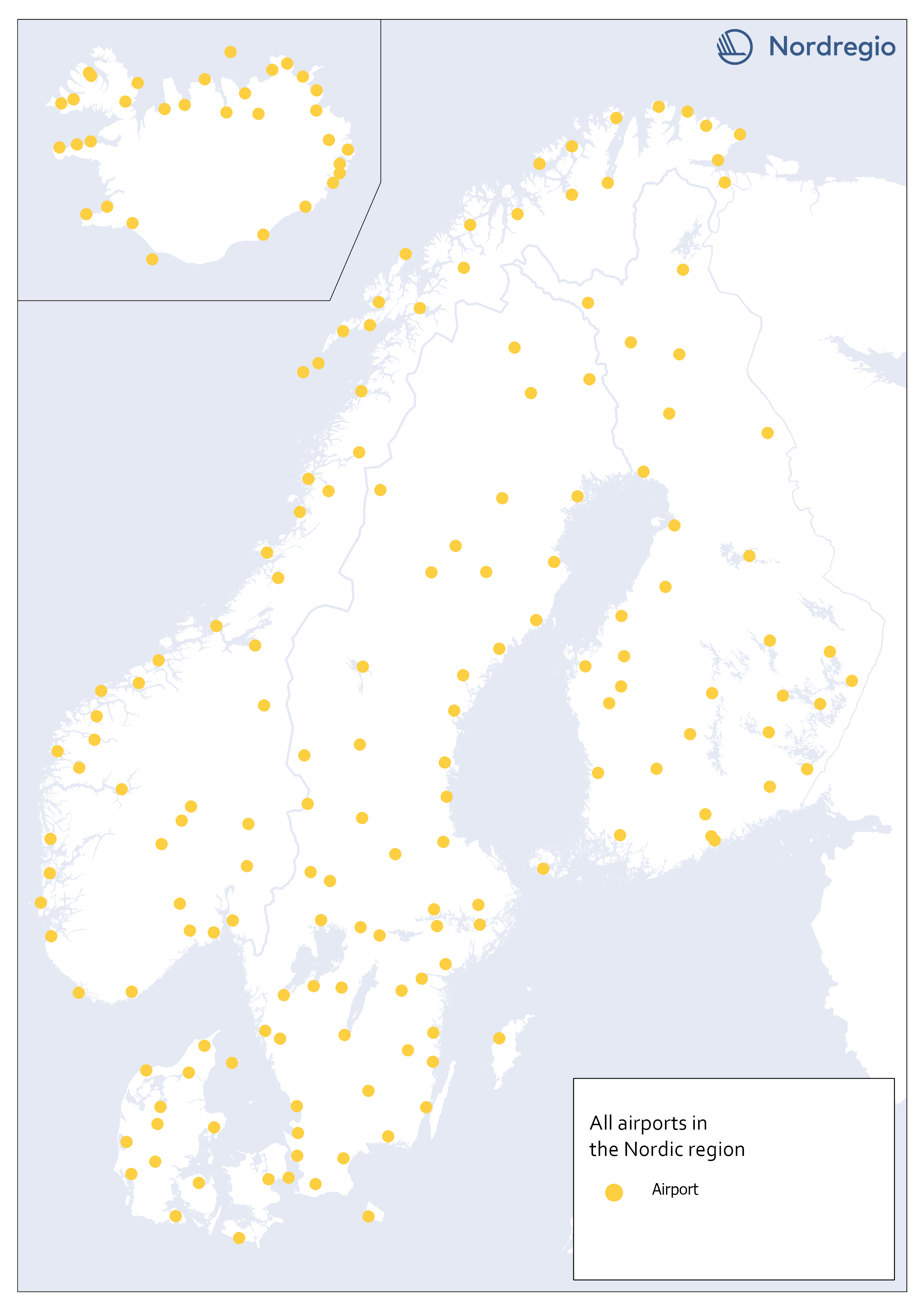
All airports in the Nordic region
This map shows all airports within the geographical scope which may be operated with commercial flight. To limit our selection of airports, we used a combination of two official airport code systems: IATA (International Air Transport Association) and ICAO (International Civil Aviation Organization). IATA-codes specify the airport as a part of a commercial flight route. However, the IATA system, is not solely limited to airports. Other locations, such as bus or ferry stations can also apply for an IATA location code, as long it is included in an airline travel chain. The ICAO-code, on the other hand, indicates that the location is an airport, but not necessarily for commercial flights In order to obtain a selection of airports that met our criteria, an airport was included only if it had both an IATA-code and an ICAO-code. Three different sources are used: 1) Swedavia (lists all airports in the Nordics that Swedavia traffics today). This is our main source, but it does not include all existing airports in the Nordic countries. Therefore, we also use two other sources: 2) Avcodes: Airport code database, from which other airports, that are not served by Swedavia, are obtained. 3) Wikipedia. Finally, the listed airports are checked against Wikipedia, to verify if any airports have been missed through the other sources. This selection gave us 186 airports in total.
- 2023 January
- Nordic Region
- Transport
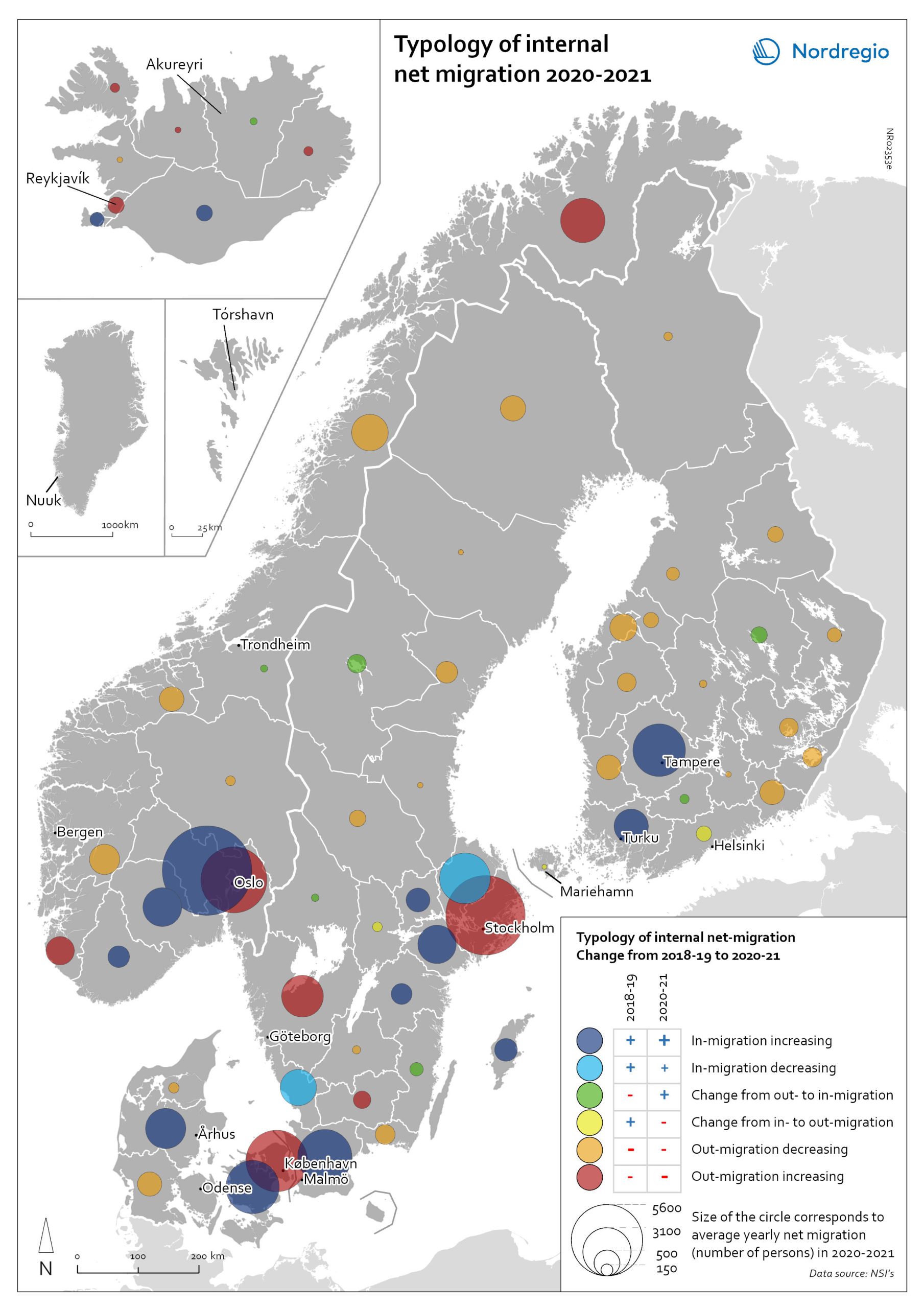
Typology of regional internal net migration 2020-2021
The map presents a typology of internal net migration in regions by considering average annual internal net migration in 2020-2021 alongside the same figure for 2018-2019. The colours on the map correspond to six possible migration trajectories: Dark blue: Internal net in migration as an acceleration of an existing trend (net in-migration in 2020-2021 + increase compared to 2018-2019) Light blue: Internal net in migration but at a slower rate than previously (net in-migration in 2020-2021 + decrease compared to 2018-2019) Green: Internal net in migration as a new trend (net in-migration in 2020-2021 + change from net out-migration compared to 2018-2019) Yellow: Internal net out migration as a new trend (net out-migration in 2020-2021 + change from net in-migration compared to 2018-2019) Orange: Internal net out migration but at a slower rate than previously (net out-migration in 2020-2021 + decrease compared to 2018-2019) Red: Internal net out migration as a continuation of an existing trend (net out-migration in 2020-2021 + increase compared to 2018-2019)
- 2022 May
- Demography
- Migration
- Nordic Region
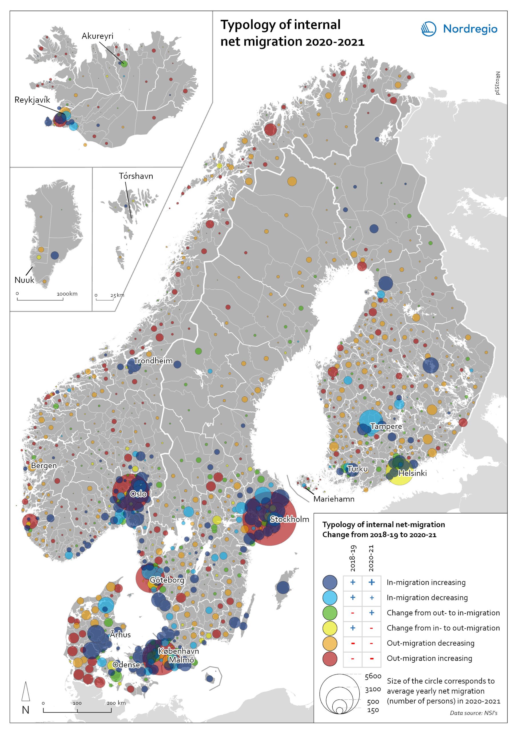
Typology of internal net migration 2020-2021
The map presents a typology of internal net migration by considering average annual internal net migration in 2020-2021 alongside the same figure for 2018-2019. The colours on the map correspond to six possible migration trajectories: Dark blue: Internal net in migration as an acceleration of an existing trend (net in-migration in 2020-2021 + increase compared to 2018-2019) Light blue: Internal net in migration but at a slower rate than previously (net in-migration in 2020-2021 + decrease compared to 2018-2019) Green: Internal net in migration as a new trend (net in-migration in 2020-2021 + change from net out-migration compared to 2018-2019) Yellow: Internal net out migration as a new trend (net out-migration in 2020-2021 + change from net in-migration compared to 2018-2019) Orange: Internal net out migration but at a slower rate than previously (net out-migration in 2020-2021 + decrease compared to 2018-2019) Red: Internal net out migration as a continuation of an existing trend (net out-migration in 2020-2021 + increase compared to 2018-2019) The patterns shown around the larger cities reinforces the message of increased suburbanisation as well as growth in smaller cities in proximity to large ones. In addition, the map shows that this is in many cases an accelerated (dark blue circles), or even new development (green circles). Interestingly, although accelerated by the pandemic, internal out migration from the capitals and other large cities was an existing trend. Helsinki stands out as an exception in this regard, having gone from positive to negative internal net migration (yellow circles). Similarly, slower rates of in migration are evident in the two next largest Finnish cities, Tampere and Turku (light blue circles). Akureyri (Iceland) provides an interesting example of an intermediate city which began to attract residents during the pandemic despite experiencing internal outmigration prior. From a rural perspective there are…
- 2022 May
- Demography
- Migration
- Nordic Region
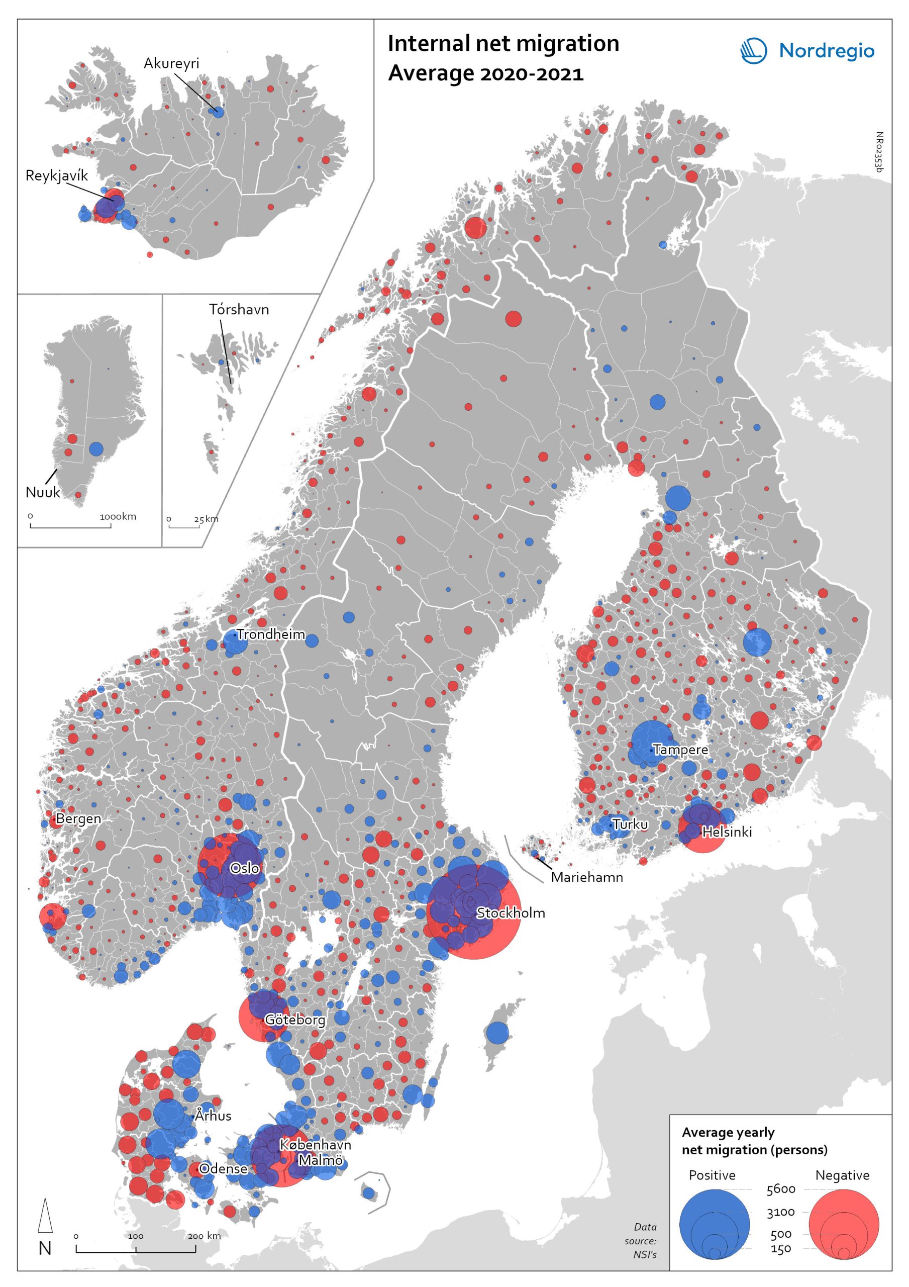
Internal net migration 2020-2021
The map shows the average internal net migration in 2020 and 2021 for Nordic municipalities. Blue dots indicate positive internal net migration (more people moving in than out) and red dots indicate negative internal net migration (more people moving out than in), while the size of the dots represents the extent of the positive or negative trend. Internal migration refers to a change of address within the same country. The map shows substantial outmigration from the Nordic capitals, as well as from Gothenburg and Malmö in Sweden. Alongside increased suburbanisation, the map also provides some evidence of growth in medium-sized cities and smaller cities within commuting distance of larger cities.
- 2022 May
- Demography
- Migration
- Nordic Region
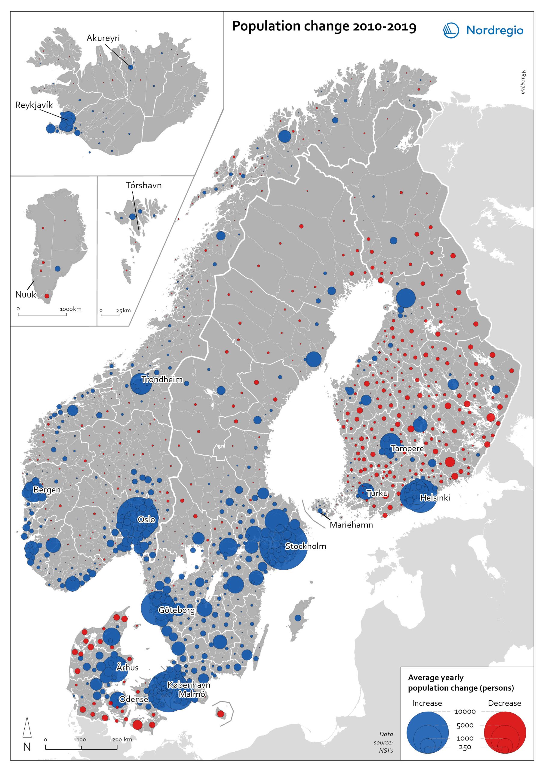
Population change 2010-2019
The map shows the type (positive or negative) and size of population change from 2010 to 2019 in all nordic municipalities. In Finland, Denmark, and Greenland there is a clear pattern of population growth in and around the larger cities and population decline in rural areas. Geographical and administrative differences mean that a much larger number of rural municipalities in Finland are dealing with population decline. Sweden experienced substantial population growth between 2010 and 2019, primarily due to high levels of international immigration. As a result, many rural areas also experienced population growth, particularly in the south of Sweden. However, in the more sparsely populated municipalities in the north of Sweden, the pattern is somewhat similar to that observed in Denmark and Finland, albeit with population decline in lower absolute numbers. Both Iceland and the Faroe Islands experienced substantial growth of their tourism industries within the period. This enabled some rural areas to maintain or even grow their populations. Norway exhibits more balanced population development in general, with a mix of population growth and decline in rural areas throughout the country.
- 2022 May
- Demography
- Migration
- Nordic Region

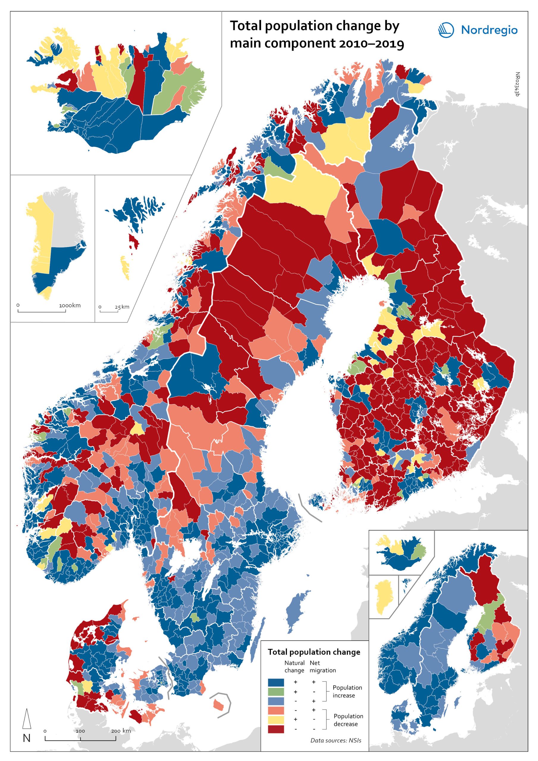
Population change by component 2020
The map shows the population change by component 2020. The map is related to the same map showing regional and municipal patterns in population change by component in 2010-2019. Regions are divided into six classes of population change. Those in shades of blue or green are where the population has increased, and those in shades of red or yellow are where the population has declined. At the regional level (see small inset map), all in Denmark, all in the Faroes, most in southern Norway, southern Sweden, all but one in Iceland, all of Greenland, and a few around the capital in Helsinki had population increases in 2010-2019. Most regions in the north of Norway, Sweden, and Finland had population declines in 2010-2019. Many other regions in southern and eastern Finland also had population declines in 2010-2019, mainly because the country had more deaths than births, a trend that pre-dated the pandemic. In 2020, there were many more regions in red where populations were declining due to both natural decrease and net out-migration. At the municipal level, a more varied pattern emerges, with municipalities having quite different trends than the regions of which they form part. Many regions in western Denmark are declining because of negative natural change and outmigration. Many smaller municipalities in Norway and Sweden saw population decline from both negative natural increase and out-migration despite their regions increasing their populations. Many smaller municipalities in Finland outside the three big cities of Helsinki, Turku, and Tampere also saw population decline from both components. A similar pattern took place at the municipal level in 2020 of there being many more regions in red than in the previous decade.
- 2022 March
- Demography
- Migration
- Nordic Region
Population change by component 2010-2019
The map shows the population change by component 2010-2019. The map is related to the same map showing regional and municipal patterns in population change by component in 2020. Regions are divided into six classes of population change. Those in shades of blue or green are where the population has increased, and those in shades of red or yellow are where the population has declined. At the regional level (see small inset map), all in Denmark, all in the Faroes, most in southern Norway, southern Sweden, all but one in Iceland, all of Greenland, and a few around the capital in Helsinki had population increases in 2010-2019. Most regions in the north of Norway, Sweden, and Finland had population declines in 2010-2019. Many other regions in southern and eastern Finland also had population declines in 2010-2019, mainly because the country had more deaths than births, a trend that pre-dated the pandemic. In 2020, there were many more regions in red where populations were declining due to both natural decrease and net out-migration. At the municipal level, a more varied pattern emerges, with municipalities having quite different trends than the regions of which they form part. Many regions in western Denmark are declining because of negative natural change and outmigration. Many smaller municipalities in Norway and Sweden saw population decline from both negative natural increase and out-migration despite their regions increasing their populations. Many smaller municipalities in Finland outside the three big cities of Helsinki, Turku, and Tampere also saw population decline from both components. A similar pattern took place at the municipal level in 2020 of there being many more regions in red than in the previous decade.
- 2022 March
- Demography
- Migration
- Nordic Region
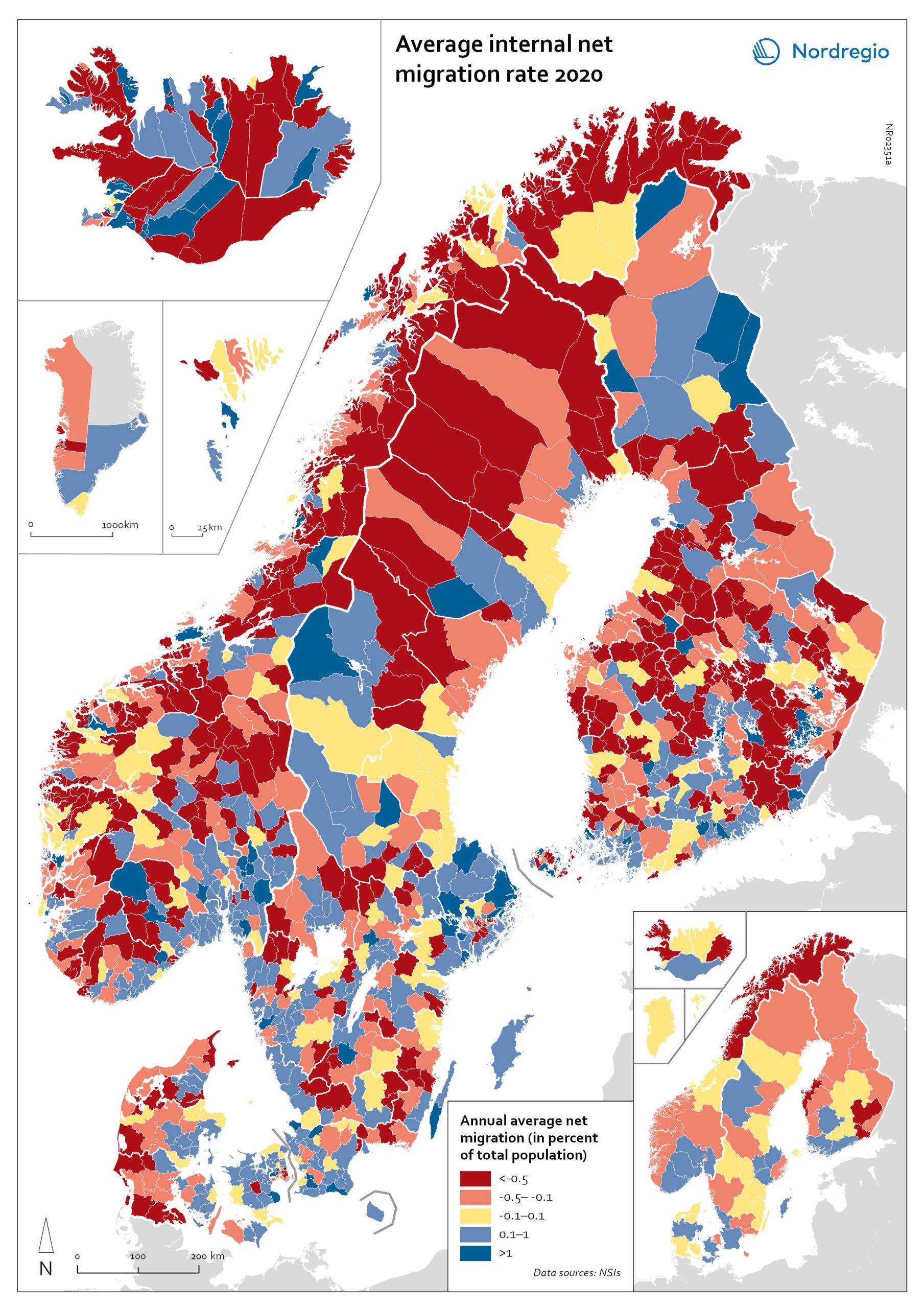
Net internal migration rate 2020
The map shows the internal net migration in 2020. The map is related to the same map showing net internal migration in 2010-2019. The maps show several interesting patterns, suggesting that there may be an increasing trend towards urban-to-rural countermigration in all the five Nordic countries because of the pandemic. In other words, there are several rural municipalities – both in sparsely populated areas and areas close to major cities – that have experienced considerable increases in internal net migration. In Finland, for instance, there are several municipalities in Lapland that attracted return migrants to a considerable degree in 2020 (e.g., Kolari, Salla, and Savukoski). Swedish municipalities with increasing internal net migration include municipalities in both remote rural regions (e.g., Åre) and municipalities in the vicinity of major cities (e.g., Trosa, Upplands-Bro, Lekeberg, and Österåker). In Iceland, there are several remote municipalities that have experienced a rapid transformation from a strong outflow to an inflow of internal migration (e.g., Ásahreppur, Tálknafjarðarhreppurand, and Fljótsdalshreppur). In Denmark and Norway, there are also several rural municipalities with increasing internal net migration (e.g., Christiansø in Denmark), even if the patterns are somewhat more restrained compared to the other Nordic countries. Interestingly, several municipalities in capital regions are experiencing a steep decrease in internal migration (e.g., Helsinki, Espoo, Copenhagen and Stockholm). At regional level, such decreases are noted in the capital regions of Copenhagen, Reykjavík and Stockholm. At the same time, the rural regions of Jämtland, Kalmar, Sjælland, Nordjylland, Norðurland vestra, Norðurland eystra and Kainuu recorded increases in internal net migration. While some of the evolving patterns of counterurbanisation were noted before 2020 for the 30–40 age group, these trends seem to have been strengthened by the pandemic. In addition to return migration, there may be a larger share of young adults who decide to…
- 2022 March
- Demography
- Migration
- Nordic Region
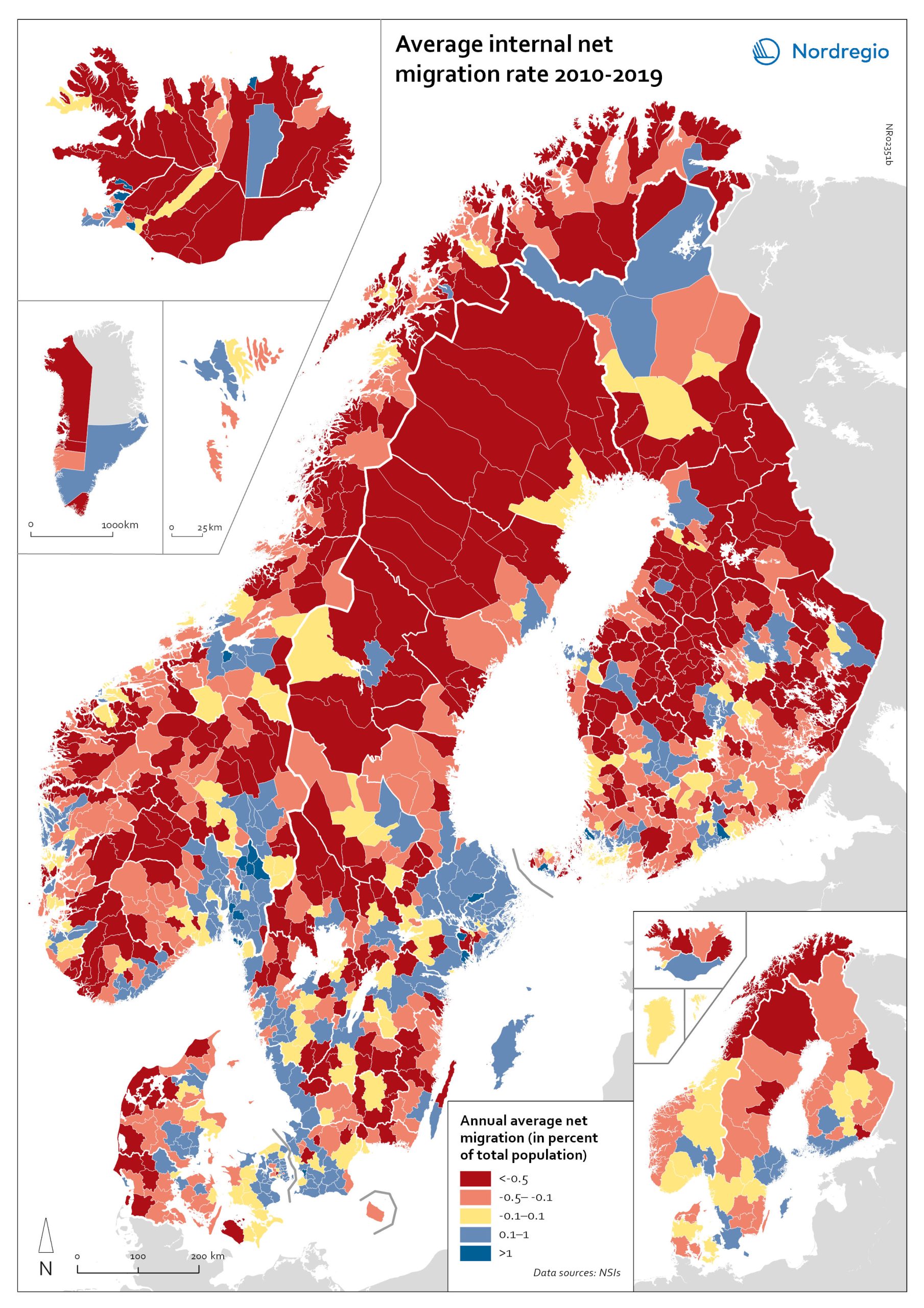
Net internal migration rate, 2010-2019
The map shows the annual average internal net migration in 2010-2019. The map is related to the same map showing net internal migration in 2020. The maps show several interesting patterns, suggesting that there may be an increasing trend towards urban-to-rural countermigration in all the five Nordic countries because of the pandemic. In other words, there are several rural municipalities – both in sparsely populated areas and areas close to major cities – that have experienced considerable increases in internal net migration. In Finland, for instance, there are several municipalities in Lapland that attracted return migrants to a considerable degree in 2020 (e.g., Kolari, Salla, and Savukoski). Swedish municipalities with increasing internal net migration include municipalities in both remote rural regions (e.g., Åre) and municipalities in the vicinity of major cities (e.g., Trosa, Upplands-Bro, Lekeberg, and Österåker). In Iceland, there are several remote municipalities that have experienced a rapid transformation from a strong outflow to an inflow of internal migration (e.g., Ásahreppur, Tálknafjarðarhreppurand, and Fljótsdalshreppur). In Denmark and Norway, there are also several rural municipalities with increasing internal net migration (e.g., Christiansø in Denmark), even if the patterns are somewhat more restrained compared to the other Nordic countries. Interestingly, several municipalities in capital regions are experiencing a steep decrease in internal migration (e.g., Helsinki, Espoo, Copenhagen and Stockholm). At regional level, such decreases are noted in the capital regions of Copenhagen, Reykjavík and Stockholm. At the same time, the rural regions of Jämtland, Kalmar, Sjælland, Nordjylland, Norðurland vestra, Norðurland eystra and Kainuu recorded increases in internal net migration. While some of the evolving patterns of counterurbanisation were noted before 2020 for the 30–40 age group, these trends seem to have been strengthened by the pandemic. In addition to return migration, there may be a larger share of young adults who…
- 2022 March
- Demography
- Migration
- Nordic Region
