48 Maps
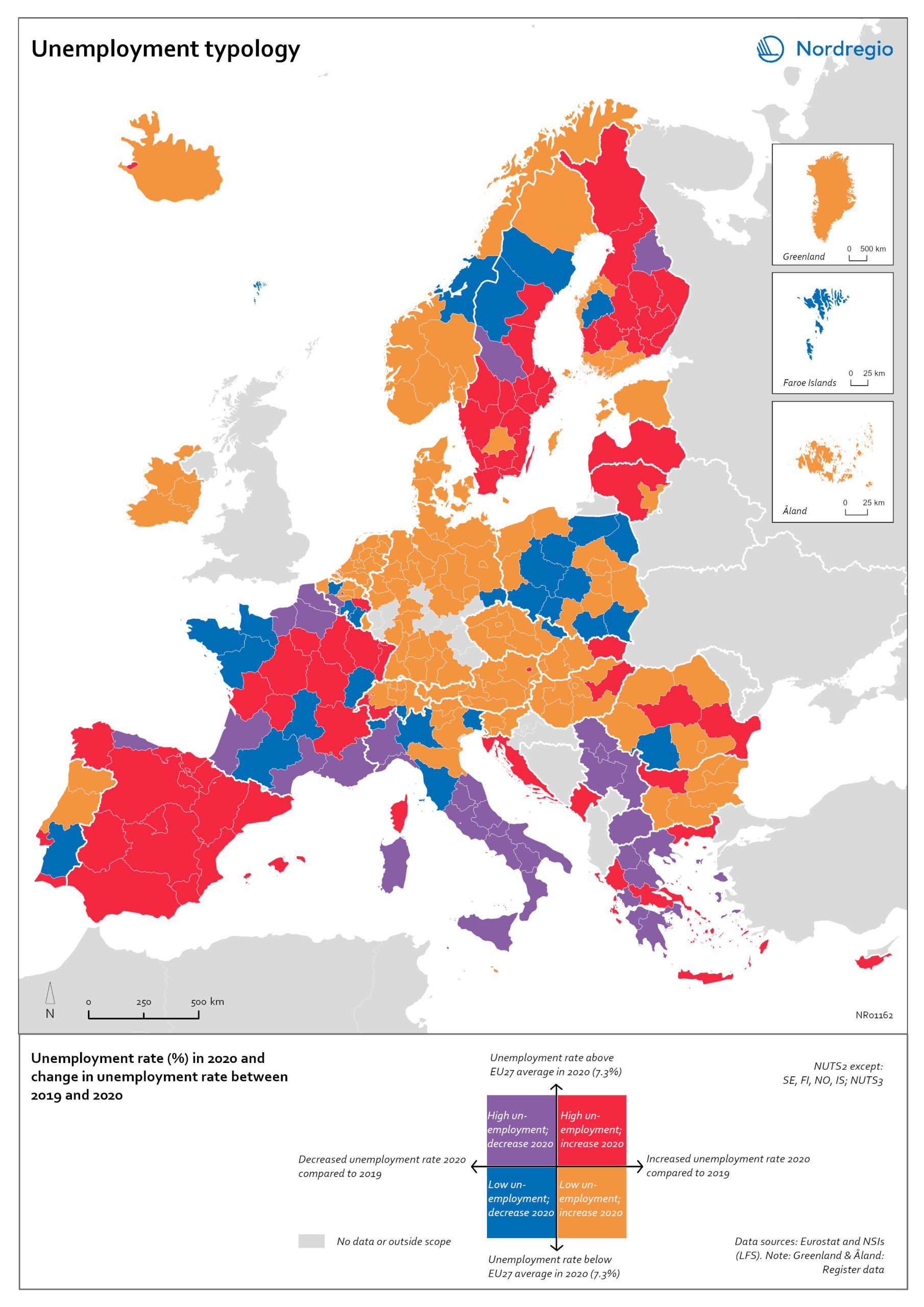
Unemployment typology
The map shows a typology of European regions by combining information on pre-pandemic unemployment rates with unemployment rates in 2020, based on the annual Labour Force Survey (LFS) that is measured in November. On one axis, the typology considers the extent of the change in the unemployment rate between 2019 and 2020. On the other axis, it considers whether the unemployment rate in 2020 was above or below the EU average of 7.3%. Regions are divided into four types based on whether the unemployment rate decreased or increased and how it relates to the EU average. Regions falling into the first type, shown in red on the map, had an increase in the unemployment rate in 2020 as well as an above-average unemployment rate in general in 2020. These regions were most affected by the pandemic. They are mainly found in northern and central parts of Finland, southern and eastern Sweden, the capital area of Iceland, Latvia, Lithuania, Spain and central parts of France. Regions falling into the second type, shown in orange on the map, had an increase in the unemployment rate in 2020 but a below-average unemployment rate in general in 2020. These regions had low pre-pandemic unemployment rates and so were not as badly affected as the red regions, despite the rising unemployment rates. They are located in Denmark, Iceland, Norway, Åland, southern and western Finland, Sweden (Gotland, Jönköping, and Norrbotten), Estonia, Ireland, northern Portugal and central and eastern parts of Europe.
 2022 March
 - Europe
- Labour force
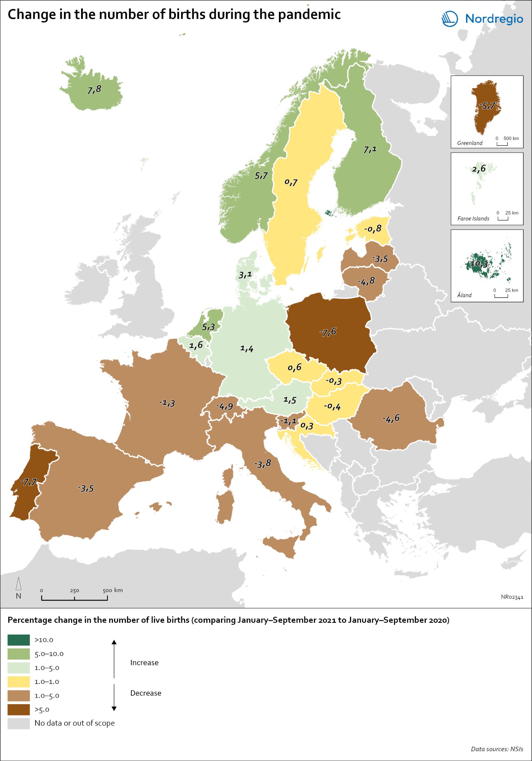
Change in the number of births in Europe
The map shows the number of births during the first nine months of 2021 (January to September) compared to the number of births during the same months in 2020. The babies born during the first nine months of 2021 were conceived between the spring and winter of 2020 when the first waves of the pandemic affected Europe. Babies born during the first nine months of 2020 were conceived in 2019 (i.e., before the pandemic). The map therefore compares the number of births conceived before and during the pandemic. At the time of writing, it seems as if both baby boom and baby bust predictions have been correct, with developments playing out differently across countries. In many Southern and Eastern European countries, such as Spain, Italy or Romania, the number of births declined by more than 1% during the first nine months of 2021. In Portugal and Poland, but also Greenland, drops in the number of births were particularly sharp with more than 5% fewer babies born in 2021. In several of these “baby bust” countries, these decreases in fertility came on top of already low fertility rates. Spain, Italy, Portugal and Poland, for instance, all already had a total fertility rate (TFR) of less than 1.5 children per woman before the crisis. These values are substantially below the so-called ‘replacement ratio’ of 2.1 children per woman, which is necessary to maintain population size. In these countries, existing demographic challenges have thus been aggravated during the pandemic.
- 2022 March
- Demography
- Europe
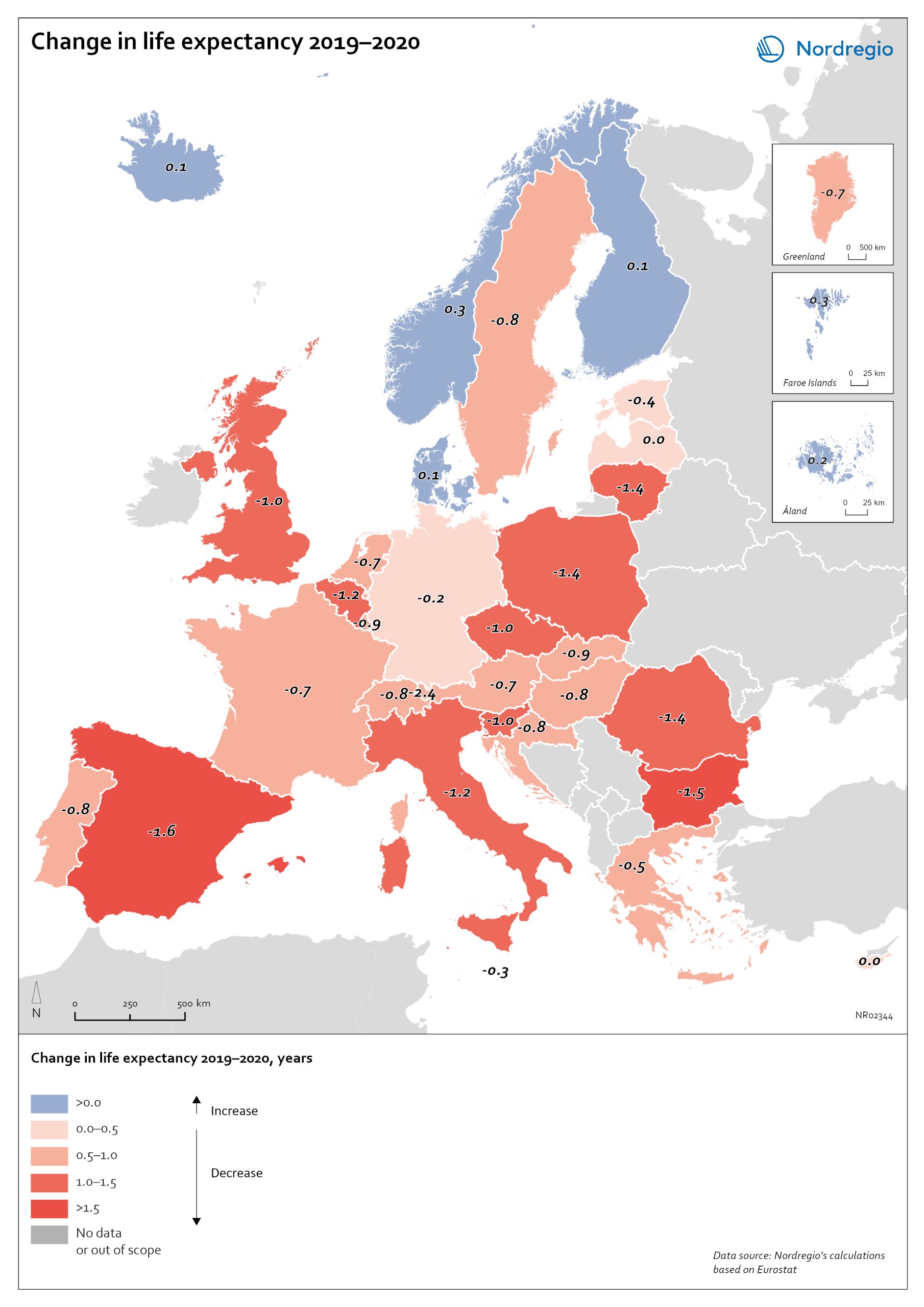
Change in life expectancy 2019–2020 by country in Europe
The excess mortality has affected overall life expectancy at birth across Europe. In 2019, prior to the start of the pandemic, Spain, Switzerland, and Italy had the highest life expectancy in Europe, followed closely by Sweden, Iceland, France, and Norway. Finland and Denmark had slightly lower levels but were still at or above the EU average (Eurostat, 2021). Life expectancy across the EU as a whole and in nearly all other countries has been steadily increasing for decades. Declines in life expectancy are rare, but that is indeed what happened in many countries in Europe during the pandemic in 2020. One study of upper-middle and high-income countries showed that life expectancy declined in 31 of 37 countries in 2020. The only countries where life expectancy did not decline were New Zealand, Taiwan, Iceland, South Korea, Denmark and Norway. The largest falls were in Russia and the United States. The high excess mortality in Sweden in 2020 has had an impact on life expectancy. In Iceland, Norway, Finland, Denmark and the Faroe Islands, life expectancy went up for both sexes in 2020 (data not yet available for Greenland and Åland). In Sweden, life expectancy fell by 0.7 years for males from 81.3 years to 80.6 and for females by 0.4 years from 84.7 to 84.3 years. The steeper decline in life expectancy for males is consistent with the larger number of excess deaths among males. Thus, compared to other Nordic countries, the adverse mortality impact of the pandemic has been greater in Sweden. However, when comparing Sweden to the rest of Europe, it is the Nordic countries, other than Sweden, which are exceptional. The trend among countries in Europe is for a fall in life expectancy in 2020. The largest declines were in countries in southern and eastern Europe. Italy and…
- 2022 March
- Demography
- Europe
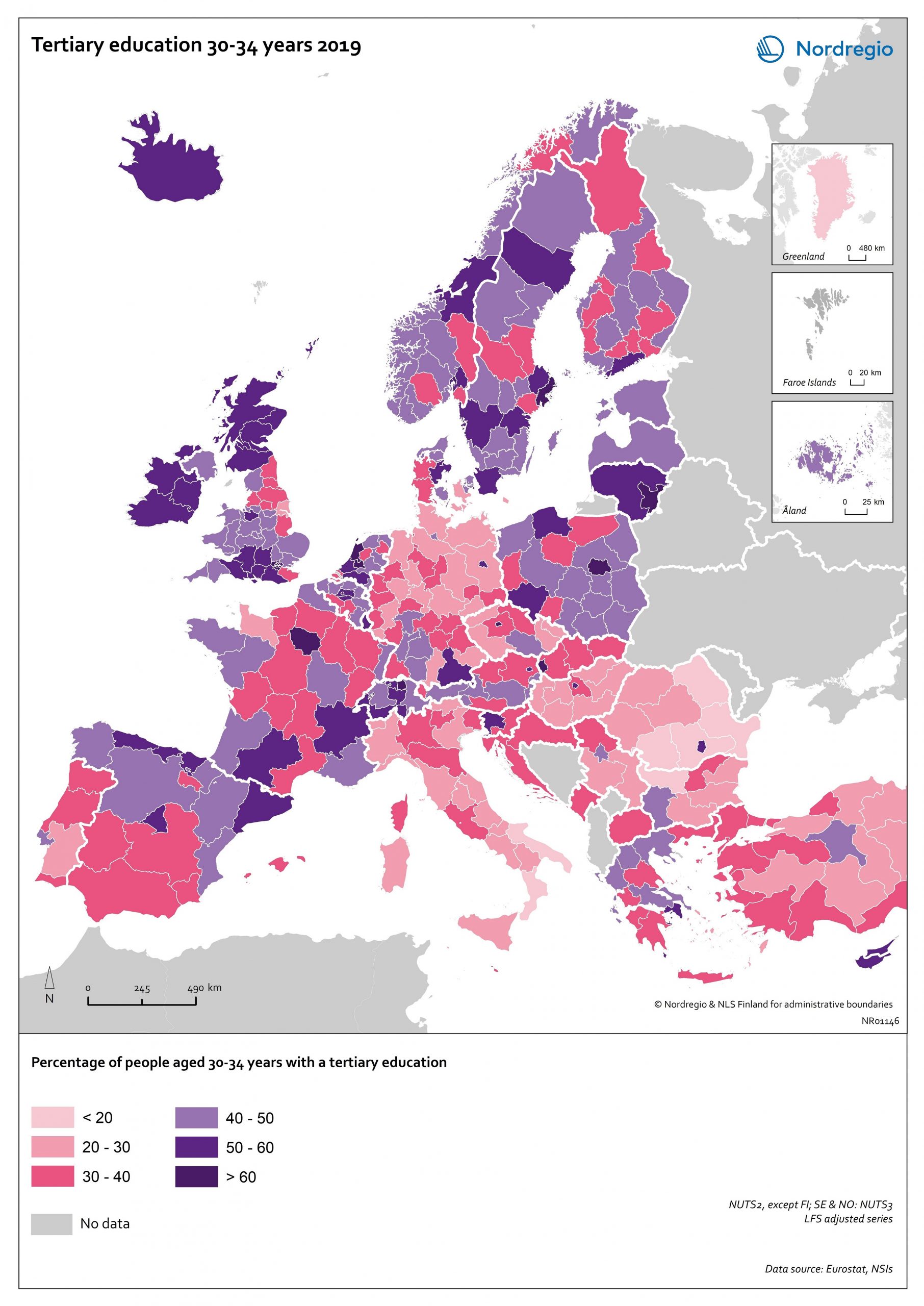
Tertiary education attainment level of 30- to 34-year-olds 2019
The map shows the proportion of the population aged 30-34 years old, who had a tertiary education at the European level in 2019. Purple shades indicate higher proportions, and pinkish shades reflect lower proportions. It is common to show the education attainment for the age group 30-34 since it is an age group where most people have finalised their studies. The focus on this age group makes it easier to see recent trends and outcomes of policies. Overall, over 40% of Europeans aged 30-34 years old had a tertiary education in 2019. Young people in the Nordic countries are among the most educated, with approximately half of 30 to 34-year-olds achieving a tertiary education across all Nordic countries. The highest proportions can be found in the capital regions. Stockholm is particularly noteworthy, with over 60% of 30 to 34-year-olds having had a tertiary education. Regions with prominent universities also stand out – for example, Skåne, Uppsala, Västerbotten and Västra Götaland (Sweden), Trøndelag (Norway) and Østjylland (Denmark).
- 2020 October
- Baltic Sea Region
- Demography
- Europe
- Nordic Region
- Others
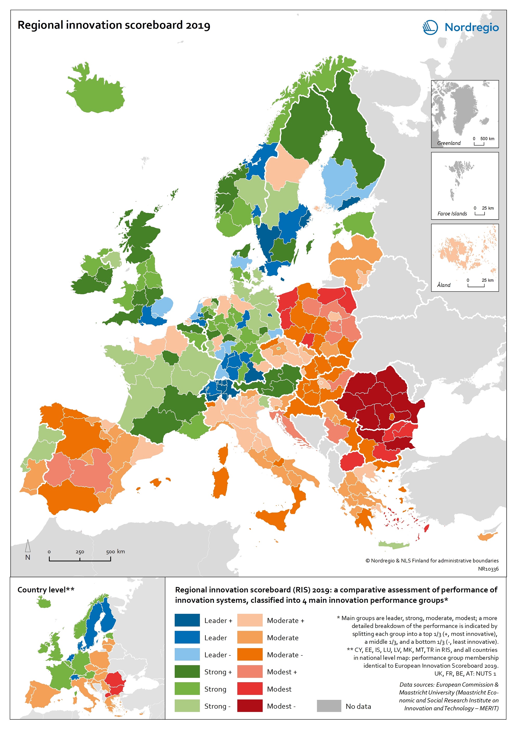
Regional innovation scoreboard 2019
This map shows the regional innovation scoreboard (RIS) in the European regions in 2019. The small map shows the innovation scoreboard at national level. The index shows the performance of innovation systems, classified into four main performance groups (leader, strong, moderate and modest). The European innovation scoreboard provides a comparative assessment of the research and innovation performance in European countries. It assesses the relative strengths and weaknesses of national innovation systems and helps countries identify areas they need to address. The Regional innovation scoreboard (RIS), a regional extension of the European innovation scoreboard, assesses the innovation performance of European regions on a limited number of indicators. The RIS 2019 covers 238 regions across 23 EU countries, as well as Norway, Serbia and Switzerland. Cyprus, Estonia, Latvia, Luxembourg and Malta are also included at country level. The RIS 2019 is a comparative assessment of regional innovation based on the European innovation scoreboard methodology, using 18 of the latter’s 27 indicators. It provides a more detailed breakdown of the performance groups with contextual data that can be used to analyse and compare structural economic, business and socio-demographic differences between regions. The Nordic regions are doing well in an overall RIS comparison regarding innovation performance. There are, however, considerable differences in innovation performance between the Nordic regions. For example, the capital regions have higher levels of innovation performance than more rural and peripheral regions, according to RIS 2019. This is often due to the critical mass of companies and the spatial significance of the proximity of firms and entrepreneurs, enabling knowledge-sharing and spill-over effects. Read the digital publication here.
- 2020 February
- Economy
- Europe
- Research and innovation
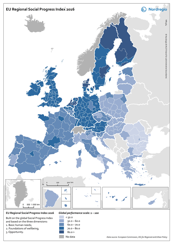
EU Regional Social Progress Index 2016
This map shows the regional social progress index in the regions of the European Union (EU) in 2016. Social progress is defined in this index as the capacity of a society to meet the basic human needs of its citizens, establish the building blocks that allow citizens and communities to enhance and sustain the quality of their lives and create the conditions for all individuals to reach their full potential. The EU Regional Social Progress Index is an aggregate index of 50 social and environmental indicators capturing three dimensions of social progress and its underlying components: basic human needs, foundation of well-being, and opportunity. This index is a complement to other indexes which are being developed currently to reflect similar dimensions of social situations or development. The blue tones indicate different levels of social progress index in the EU regions in 2016. The darker the tone the higher the social progress index. The grey colour indicates no data. All the Nordic regions perform well in terms of social progress. High scores are observed in all categories of the index. For some dimensions the Nordic regions are the top regions throughout Europe. At the regional scale the Nordic regions are among the top performers and only really challenged by some Dutch, UK, Austrian and German regions. The very top regions are found in Finland, northern and central Sweden, and in northern Denmark. Övre Norrland in Sweden is the top region in Europe, closely followed by the Danish capital region Hovedstaden, Helsinki-Uusimaa in Finland, Midtjylland in Denmark and Åland.
- 2018 February
- Demography
- Economy
- Europe
- Others

Employment rate 2016 related to the EU2020 goal and 2009-2016 change
This map shows the employment recovery from the financial crisis, with the employment rate (20-64 years) in European regions in 2016 related to the EU2020 goal of 75%, as well as the change in the employment rate between 2009 and 2016. The green colour indicates regions with employment rates above 75% and an increase in the employment rate between 2009 and 2016. The red colour indicates regions with employment rates below 75% and a decrease in the employment rate between 2009 and 2016. The yellow colour indicates regions with employment rates above 75% and a decrease in the employment rate between 2009 and 2016. The blue colour indicates regions with employment rates below 75% and a decrease in the employment rate between 2009 and 2016. The grey colour indicates regions with no data available. On a European scale, the effect of the financial crisis on employment became noticeable from 2009 onwards when average employment rates started to decline. This continued until 2013 when the average European employment rate reached its lowest level of 68.3% for the age group 20–64 years. After 2013 the employment rate started to rise again but it took until 2016 for the average European employment rate to reach and then surpass pre-crisis levels. In 2016 the average employment rate in the European union was 71%, edging closer to the EU2020 goal of 75%. In some regions, primarily in southern Europe, employment rates have still to recover to pre-crisis levels. This is particularly so for Greece, Spain, Italy and Portugal which were particularly hard hit by the debt crisis and thus had to undertake massive cuts across the public sector. On the other hand, some countries such as Germany, Austria and Switzerland saw rising employment rates even during the financial crisis. The differential nature of outcomes in…
- 2018 February
- Europe
- Labour force
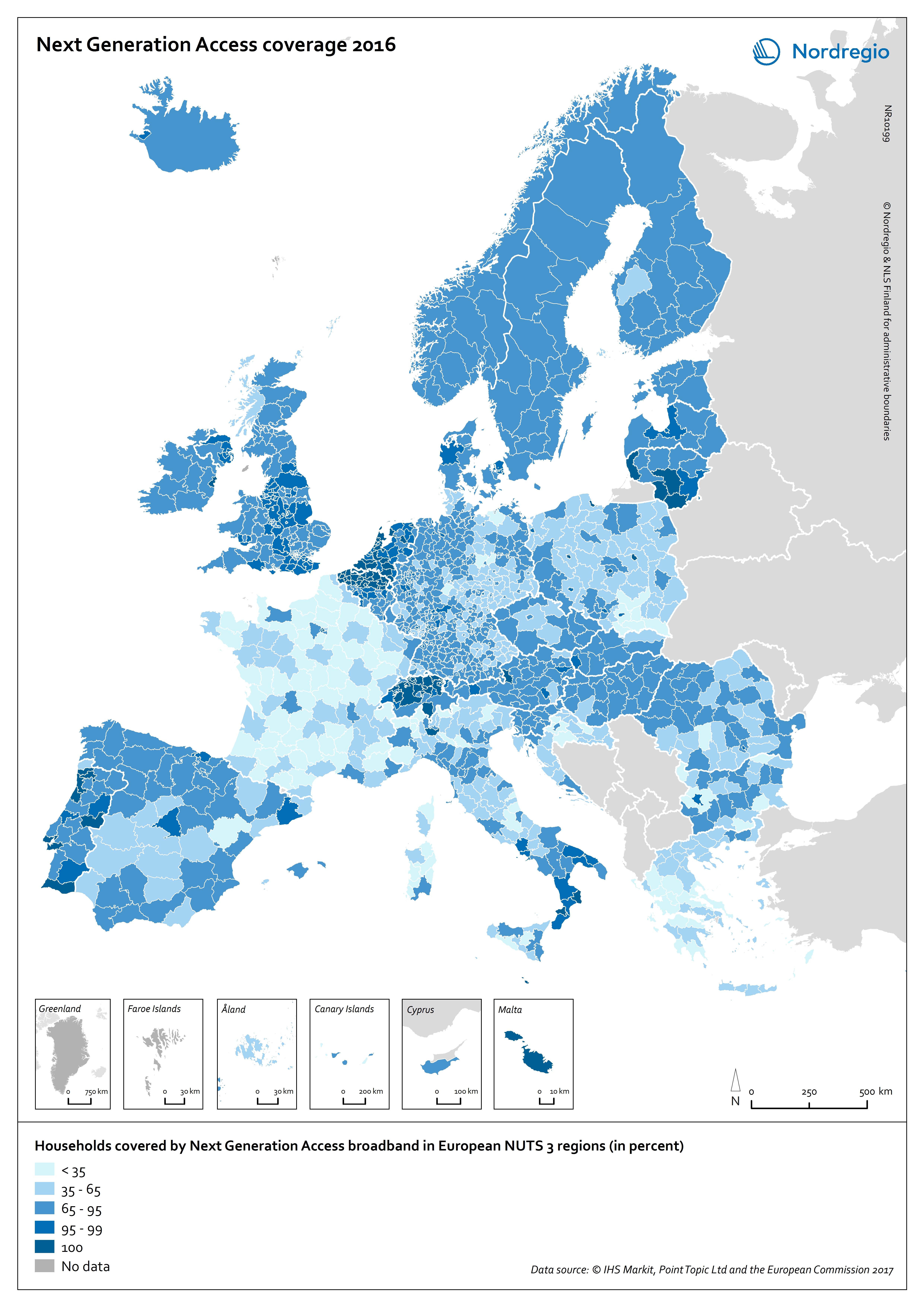
Next Generation Access coverage 2016
This map shows the Next Generation Access (NGA) network coverage in European regions in 2016. The blue shading indicates the percentage of household covered by NGA broadband in European NUTS 3 regions. The darker the blue the larger the percentage of household covered by NGA broadband in the region, while the brightest colours represent regions with a low share. Regions with relatively small territories and important population densities stand out in terms of high NGA network coverage, e.g. urban regions in the Netherlands and Switzerland. Capital city regions also have high NGA network coverage scores, while the more rural regions continue to lag, e.g. in parts of France and Poland. The Nordic countries are characterised by having almost no differences within their territories, i.e. no large variation in terms of NGA network coverage, unlike the clear regional differences in countries such as France or Italy. All regions in the Nordic countries score in the range of 65% to 95% of households having NGA network coverage, except for Etelä-Pohjanmaa in Finland which has a coverage range of 35% to 65% and the Danish statistical region of Østjylland and the capital regions of Denmark and Iceland with scores between 95% and 100% respectively. The relatively high figures for the Nordic Region can in part be explained by the existence of national and regional digitalisation strategies over the last decade or so. In Denmark, as well as in the other Nordic countries, digitalisation has long been on the national agenda. One of the main goals of these strategies has been to increase the growth and productivity of the business community – and to make it easier and cheaper to establish digital infrastructure. The regional level has an important role to play in the development of digital infrastructure, hence the relevance of the elaboration…
- 2018 February
- Europe
- Others
- Research and innovation
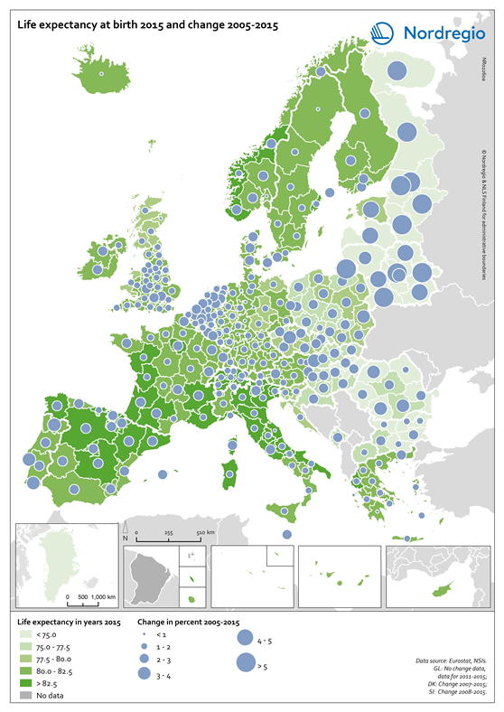
Life expectancy at birth 2015 and change 2005-2015
This map shows the life expectancy at birth in the regions of Europe in 2015 and the change between 2005 and 2015. The green shading indicates the life expectancy at birth in years in the regions of Europe in 2015. The darker the green the longer the life expectancy at birth. The grey colour indicates regions with no data. The blue circles represent the changes in the life expectancy at birth between 2005 and 2015. The larger the circle, the greater the increase in the life expectancy at birth between 2005 and 2015. As one of the UN Sustainable Development indicators for good health and well-being, life expectancy at birth measures the general health status of a population. Life expectancy at the national level is highly correlated to national income indicators such as GDP per capita. Most of Europe has however reached a level where further increases in wealth no longer increase average life expectancy. The longest life expectancies are found in parts of Spain, France, Italy, Switzerland and Norway. In 2015 there is still a visible East-West divide, where countries in Eastern Europe, in the south-east of the Baltic Sea Region and Northwest Russia have a significantly lower life expectancy. The size of the blue bubbles indicate however that these regions have witnessed the largest increases over the last ten years. If their economies continue to grow it is likely that their life expectancy will continue to increase for some years to come. Regional differences are partly due to individual characteristics, but also to the local environment as well as the politics and institutions that influence the local economy, access to local services and care, general educational levels and the local norms that influence lifestyles.
- 2018 February
- Demography
- Europe
