This map shows the life expectancy at birth in the regions of Europe in 2015 and the change between 2005 and 2015.
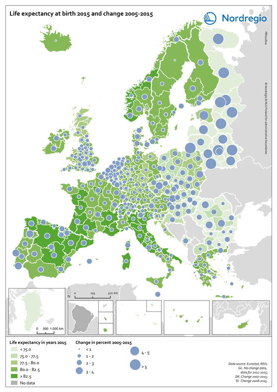
The green shading indicates the life expectancy at birth in years in the regions of Europe in 2015. The darker the green the longer the life expectancy at birth. The grey colour indicates regions with no data. The blue circles represent the changes in the life expectancy at birth between 2005 and 2015. The larger the circle, the greater the increase in the life expectancy at birth between 2005 and 2015.
As one of the UN Sustainable Development indicators for good health and well-being, life expectancy at birth measures the general health status of a population. Life expectancy at the national level is highly correlated to national income indicators such as GDP per capita. Most of Europe has however reached a level where further increases in wealth no longer increase average life expectancy.
The longest life expectancies are found in parts of Spain, France, Italy, Switzerland and Norway. In 2015 there is still a visible East-West divide, where countries in Eastern Europe, in the south-east of the Baltic Sea Region and Northwest Russia have a significantly lower life expectancy. The size of the blue bubbles indicate however that these regions have witnessed the largest increases over the last ten years. If their economies continue to grow it is likely that their life expectancy will continue to increase for some years to come. Regional differences are partly due to individual characteristics, but also to the local environment as well as the politics and institutions that influence the local economy, access to local services and care, general educational levels and the local norms that influence lifestyles.