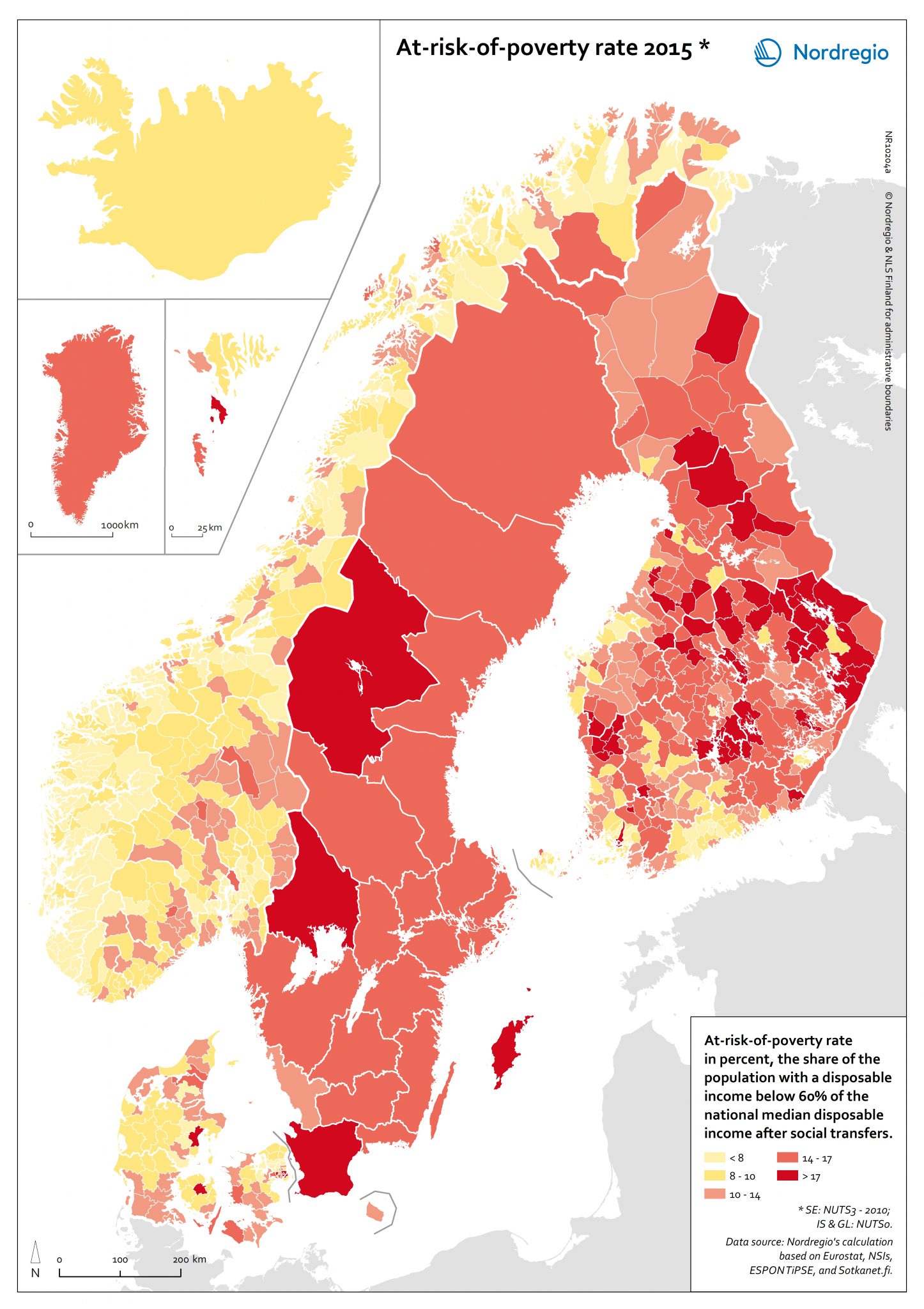
This map shows the share of the total population with a disposable income below 60% of the national median disposable income after social transfers in the Nordic Region in 2015.

The experience of a person being at risk of poverty is relative to the society that directly surrounds them, as is manifest by having less monetary resources that one’s peers to maintain well-being.
The red shading indicates regions with an at-risk-poverty rate of 10% or more in 2015. The darker the red, the higher the at-risk-poverty rate. The yellow shading indicates municipalities with an at-risk-poverty rate lower than 10% in 2015. The brighter the yellow, the lower the at-risk-poverty rate.
Sweden has the highest share of people living in a household at-risk-of-poverty (15.1%) followed by Finland (12.8%), Denmark (12.1%), Norway (10.9%) and Iceland (7.9%). Regional variations are somewhat more difficult to discern compared to the other health and well-being indicators. This is in part caused by the higher administrative scale that is shown for Sweden compared to Denmark, Finland and Norway, as well as the lack the cross-border dimension in this indicator. It is notable however that municipalities within the metropolitan areas of larger centres like Oslo and Copenhagen show higher percentages of the population being at risk of poverty. This reflects the reality of higher income variance in metropolitan areas, which can be an important factor causing segregation and social exclusion, and further reinforcing negative effects on well-being.
Metropolitan areas also face higher variance in housing structure, with more single person households than rural areas and small and medium sized towns. Coupled with high rents, this leads to a burdensome cost of housing and risk of poverty. The capital region of Finland shows a much different picture and is in fact an outlier with lower percentages of people at risk of poverty compared to the rest of the country.


