This map shows the travel time calculations for electric aviation versus travelling by public transportation.
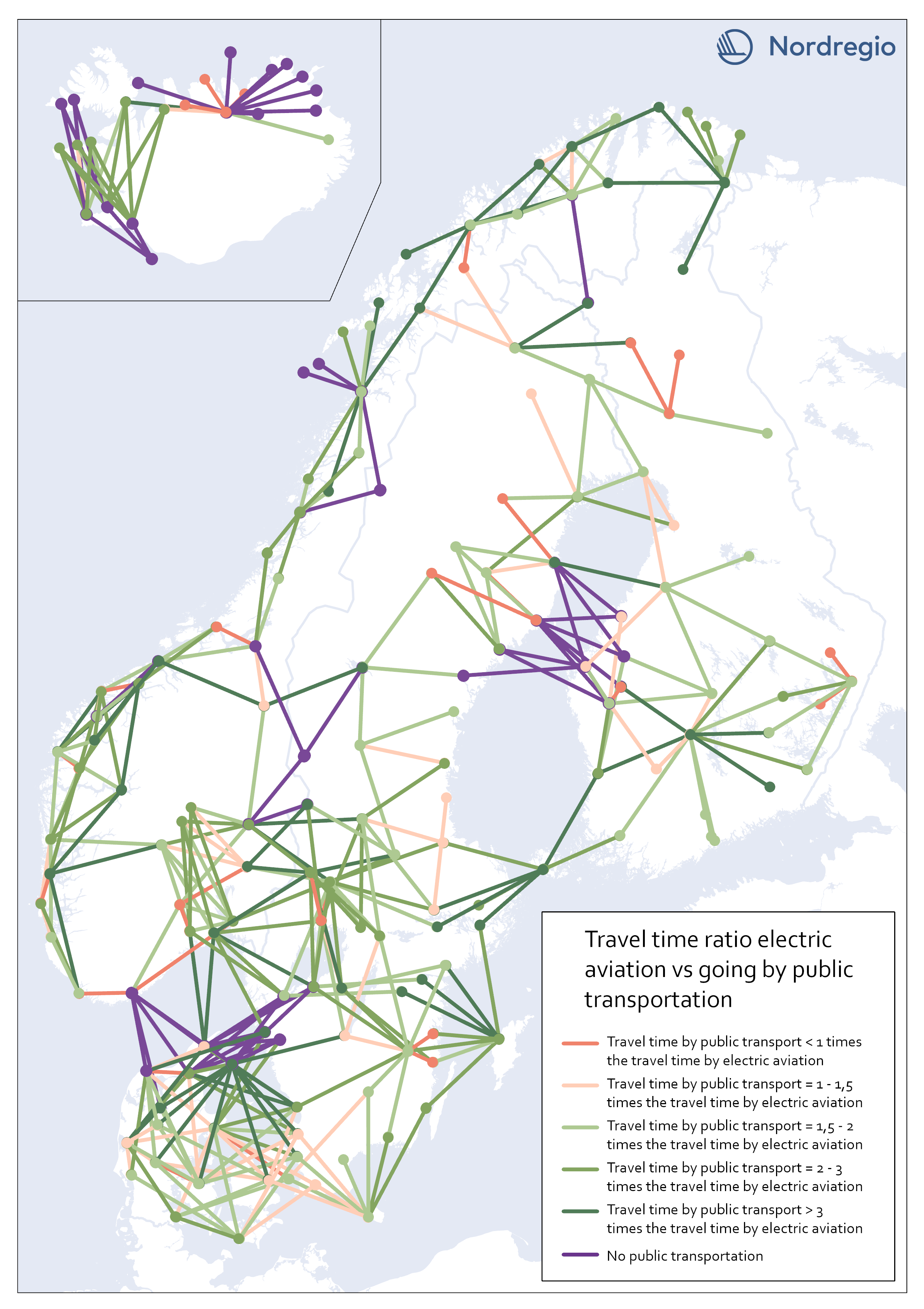
Routes represented by any nuance of green, are routes with significant travel time benefits for electric aviation in comparison with public transportation. The darker the nuance of green, the larger time benefit for electric aviation. The beige color represents routes where the travel time for public transportation is the same or up to 1,5 times the travel time for electric aviation. The red color represents routes where public transportation is faster than electric aviation. Purple lines represent routes where no public transportation is available. These were also routes where we could see significant time benefits for electric aviation.
The number of changes when commuting with public transport may have a negative impact on perceived accessibility. In this accessibility analysis, however, we stay with the same criteria for public transport as for travel by car. For future research, the number of changes when commuting by public transport could be considered in the comparison.