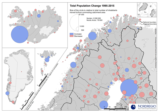
Increase and decrease of population in commuting catchment areas
Map Facts
The map shows the increase and decrease of population in commuting catchment areas in persons (size of the circle). Red indicates decrease and blue increase. The population increase in the regional centres is clearly visible.
All images are the property of Nordregio. They may be freely used as long as the logo of Nordregio is clearly visible and the source is cited accordingly. Please give also the cartographer/designer/author credit and give full recognition to the data sources if named in the graphic.