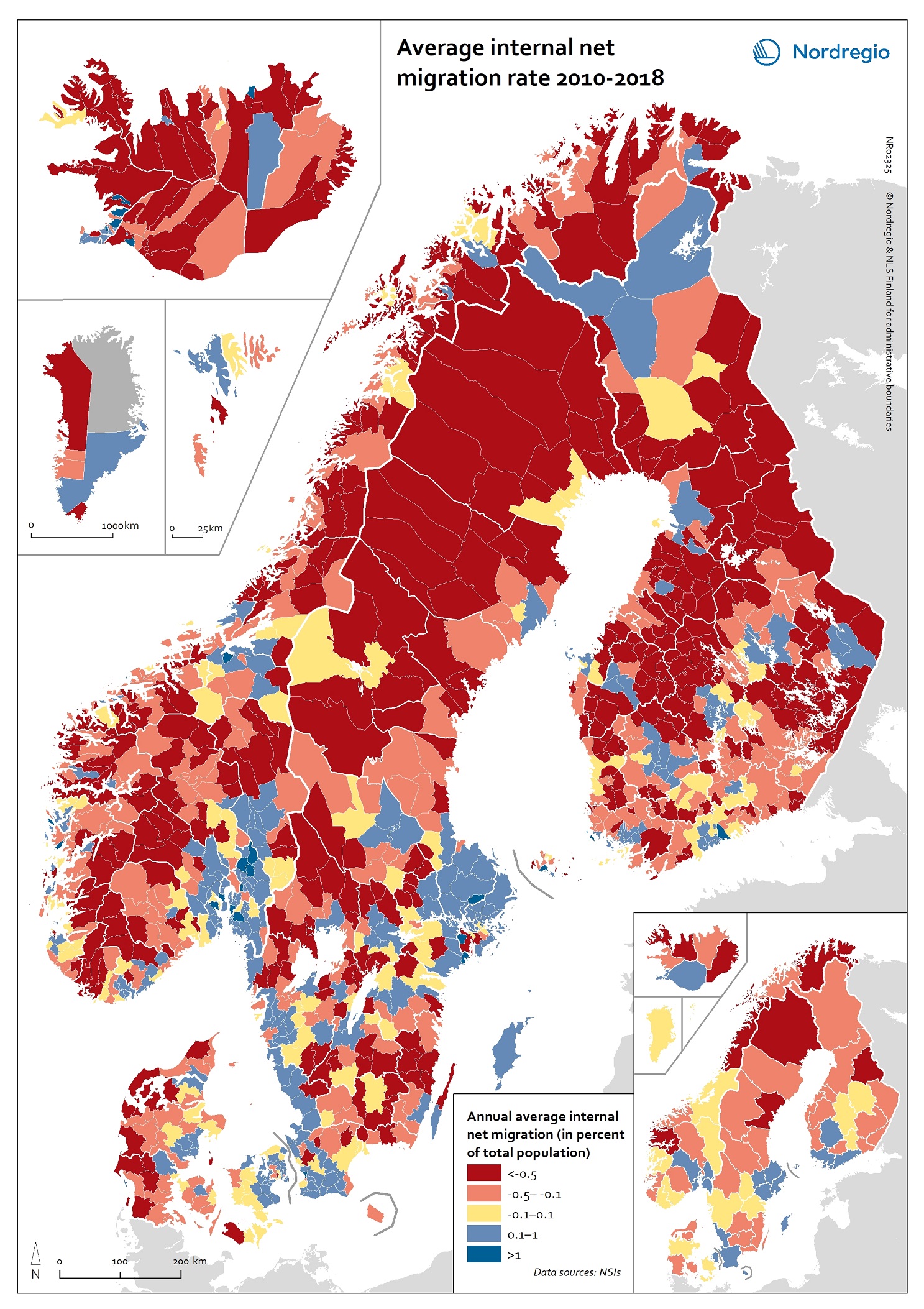
This map shows annual average internal net migration rate at the municipal and regional level in 2010-2018.
The map shows the percentage change from internal migration for the period 2010 to 2018. Internal or domestic migration refers to migration between municipalities and regions within the same country.
The blue areas on the map show municipalities/regions with positive internal net migration (i.e. more people arriving than departing), the red areas show municipalities/regions with negative internal net migration (i.e. more people departing than arriving) and the yellow areas show municipalities/regions with balanced internal net migration rates (i.e. comparable numbers of people arriving and departing).
The trend revealed is that internal migration movements are directed towards larger city regions, with many rural periphery regions losing people. The loss of people in some of these regions is felt especially acutely because of the age selectivity of migration, with young people leaving in large numbers, accelerating the ageing of the population structure in regions with high out-migration.
Read the digital publication here.