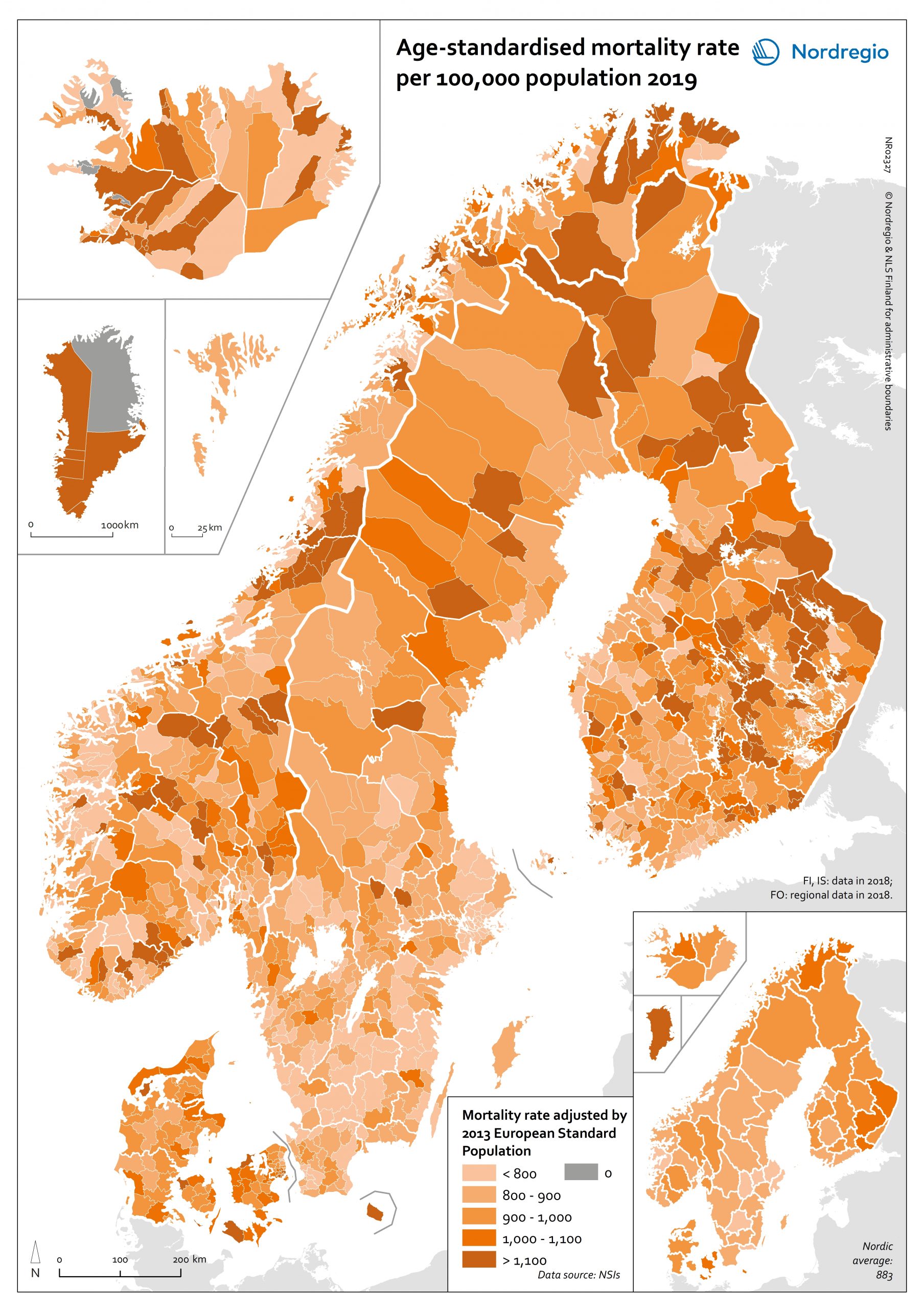
The map shows mortality rate per 100,000 population in 2019 adjusted by 2013 European Standard Population.
To compare the relative health status of different population groups, the population’s age distribution needs to be taken into account, because death rates for most diseases generally increase with age (Curtin & Klein, 1995). “Age-standardized mortality rates adjust for differences in the age distribution of the population by applying the observed age-specific mortality rates for each population to a standard population” (World Health Organization, 2020b). In other words, this technique allows comparison between populations with differing age profiles. The populations are thus given the same age distribution structure, so that those differences in mortality which are not due to the ageing of the population can be highlighted.
At a national level, there are age-standardised mortality rates higher than the Nordic average (883.0) in Greenland (2,449.2), Denmark (988.6), and Finland (921.7). These statistics show the number of deaths per 100,000 of the population in each country, after removing variations brought about by differing age structures between the three countries. In the calculation of age-standardised mortality rates, we used the European Standard Population in 2013. It is observable that age-standardised mortality rates are lower in capital regions and large cities in all Nordic countries, suggesting a lower level of ill health in these regions. There is a high variation of mortality rates between municipalities in Finland, Iceland, Norway, and Sweden. The municipalities having the highest mortality rates tend to be economically disadvantaged, with lower levels of disposable household income and a smaller proportion of people having attained tertiary education.
Since the map was created using death data for only one year, it is important to recognise that the number of deaths may vary a good deal from year-to-year in municipalities with a small population.

