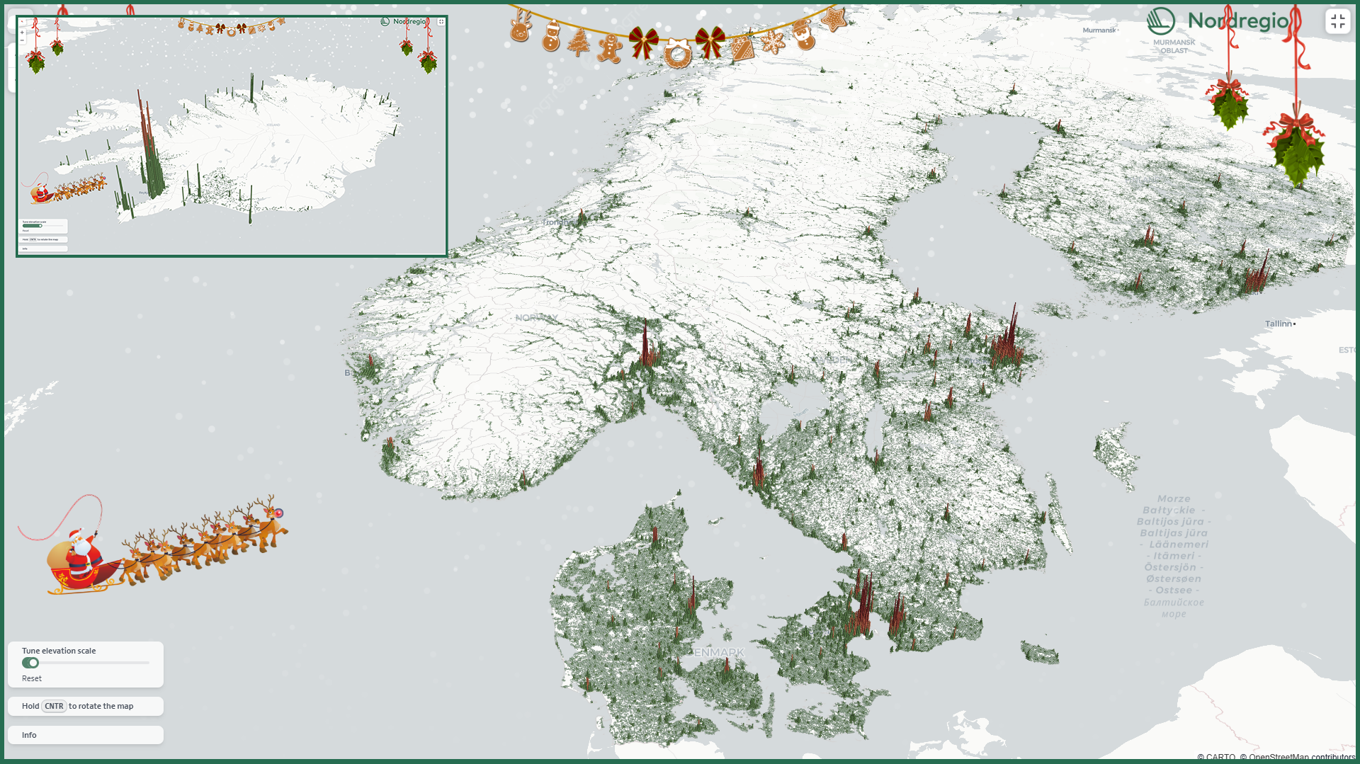
This Christmas, we’re gifting all fellow data nerds our first-ever interactive 3D map:
The map displays the number of residents in each 1km grid cell, with the height of the bars representing the number of residents in each area. It highlights the stark contrasts in population density throughout the region, showcasing vast tracts of sparsely populated territory alongside bustling urban centres. The interactive tool lets users zoom in and out and ‘fly’ around the region like Santa on his sledge, while exploring the population dynamics of the Nordic countries.
Data insights
Much of the population is concentrated in the southern parts of Norway, Sweden, and Finland. The capital cities of Oslo, Stockholm, and Helsinki are clearly visible, along with other large cities such as Malmö and Gothenburg. In the northern regions of these countries, populations are concentrated along the coasts of either the Gulf of Bothnia or the North Sea. The inland areas of the northern regions are notably sparsely populated.
Denmark (6.0 million) has only a slightly larger population than Norway (5.6 million) and Finland (5.6 million), but it is much smaller in size, making it far more densely populated than the other Nordic countries. Denmark does not have the vast stretches of empty land seen in the other countries, but its population is still highly concentrated in and around the capital, Copenhagen.
Iceland is perhaps the most extreme example of population concentration, with two-thirds of the population living in or near the capital, Reykjavik. The second largest city, Akureyri, is also quite prominent on the map, as are a few other settlements. However, the map vividly illustrates the emptiness of much of the island.
Dataset and typology
The map is built using the deck.gl framework and features population data structured in a 1×1 km grid. This dataset was also utilised to create the Nordic urban-rural typology. Greenland and the Faroe Islands could not be included due to a lack of grid data.
The data presented in the map is from 2022, with Iceland’s data sourced from 2017.

