240 Maps

Foreign-born share 2022
This map shows the share of foreign-born of the total population in the Nordic countries. This map shows the share of foreign-born of the total population in Nordic municipalities (big map) and regions (small map), and municipalities (big map) in 2022. Iceland has the highest share of foreign-born residents in the Nordic Region, at 22%. Mýrdalshreppur, the municipality in the south containing the village of Vik, has the largest foreign-born population, at 58%. It is also the only municipality in the Nordic Region with a majority non-native population. Other municipalities in the south, some of which are quite small, also have significant foreign-born populations. Reykjanesbær, near Keflavik airport, is the largest municipality with a sizeable foreign-born population, at 29%. In Reykjavíkurborg, 20% of the population is foreign-born, about the same as the national average. Many municipalities with tiny populations in the Westfjords and the north also have small shares of foreign-born persons. In 2022, 17% of the population of Norway was foreign-born. Municipalities with high shares of foreign-born include Oslo (28%), several suburban municipalities near Oslo, and a few in the north – which have small overall populations but large numbers of foreign workers employed in the fishing industry. In Sweden, 20% of residents are foreign-born, with large differences in distribution by region and municipality. At the regional level, Stockholm has the highest share of foreign-born persons (27%), followed by Skåne, including the city of Malmö (24%). The percentage of foreign-born persons in Västra Götaland, which encompasses Gothenburg, is the same as that of Sweden as a whole. The regions with low shares of foreign-born persons are in the north of the country – Dalarna, Gävleborg, Västernorrland, Jämtland, Västerbotten, and Norrbotten – plus the island of Gotland, which has the lowest share (9%). There are no municipalities in which foreign-born…
 2025 April
 - Demography
- Migration
- Nordic Region

Foreign-born change (%) 2000-2022
This map shows the percentage-point change in foreign-born populations in the Nordic countries. This map shows the percentage-point change in foreign-born populations by region (small map) and municipality (big map) between 2000 and 2022. The blue shades indicate an increase in the number of foreign-born while the red shades indicate a decrease. The recent growth in foreign-born populations differs among the Nordic countries, regions, and municipalities. During the period 2000-2022, much of both the absolute and percentage-point increases in the foreign-born populations took place in suburbs around the capital cities and other large urban centres. However, with few exceptions, every municipality across the Nordic Region saw increases in foreign-born populations. In Iceland, the foreign-born population increased from 5% to 20%. The largest percentage-point increases in the foreign-born populations were in municipalities in the southwest, which had small populations and small foreign-born shares. Of the larger municipalities, Reykjanesbaer and the Capital Region had the largest absolute and percentage point increases. The foreign-born population in Norway grew from 7% to 17%. The municipalities with significant increases in foreign-born populations include several suburban areas near Oslo, as well as scattered municipalities elsewhere that had small foreign-born shares in 2000. The percentage of foreign-born residents in Oslo increased from 16% to 28% between 2000 and 2022. No municipalities experienced a decline in foreign-born population during this period.
- 2025 April
- Demography
- Migration
- Nordic Region

Women in childbearing ages 2022
This map shows the number of women in childbearing age as a percentage of the total population in the Nordic countries. This map shows the number of women in childbearing ages as percent of total population in the Nordic municipalities (big map) and regions (small map) in 2022. At the national level, Greenland and Iceland have the largest shares of women of childbearing age (15–45 years), more than 20%. Next are Norway, Denmark and Sweden, with somewhat lower shares, 18–19%. The lowest share, less than 18%, is in Finland, where there have been more deaths than births since 2016. The Faroes and Åland both have shares of less than 17%. Municipalities in Greenland and Iceland follow the national trends, mostly with shares of women of childbearing age of 20–25%, although some are higher than 25%. In the other countries, municipalities in and around the capitals and other large cities have larger shares, 20% or higher. Most regions outside of the large cities have smaller shares, between 15 and 20%. Many regions in Finland have older populations, and these have shares of less than 10%. The lack of women of childbearing age, combined with those of childbearing age having so few children, means that there will be fewer births in these municipalities in the future, leading to further population decline.
- 2025 April
- Demography
- Nordic Region

Total fertility rate (TFR) 2022
This map shows the total fertility rate (TFR) in 2022. The total fertility rate is the number of children a hypothetical cohort of women would have in one year. Data on total fertility rates is not available at the regional or municipal levels for all of the Nordic countries. The figures are estimated based on multiplying the general fertility rate by 30 (representing the typical number of reproductive years, between 15 and 45), assuming the general fertility rate is constant throughout this period. The general fertility rate is the number of births per woman during the childbearing years. At the regional level, age and gender composition are indicative of past trends but also harbingers of future population change. In 2018, prior to the pandemic, most Nordic municipalities had fertility levels in line with their respective national levels (see map Total fertility rate (TFR) 2018 in Nordregio’s Map Gallery). Most municipalities within Greenland and the Faroes had fertility rates above 1.5 children per woman, consistent with national rates of about 1.9 (2018 map). Municipalities in Sweden and Denmark typically had fertility rates of 1.5 or higher, consistent with their national rates of 1.7. By contrast, many municipalities in Norway and Finland had fertility rates of 1.5 or lower. In 2022, fertility in most municipalities across the Nordic Region fell, reflecting the declines at the national levels, but the spatial pattern had become slightly more varied (2022 map). In several municipalities in Norway, Finland, and Sweden, fertility rates fell to less than 1.0 children per woman. The drops in fertility resulted in declines in the number of births across most municipalities in 2022. Combined with increases in the number of deaths, this resulted in more deaths than births in many municipalities, consistent with trends at the national level. Most municipalities in Greenland,…
- 2025 April
- Demography
- Nordic Region

Total fertility rate (TFR) 2018
This map shows the total fertility rate (TFR) in 2018. The total fertility rate is the number of children a hypothetical cohort of women would have in one year. Data on total fertility rates is not available at the regional or municipal levels for all of the Nordic countries. The figures are estimated based on multiplying the general fertility rate by 30 (representing the typical number of reproductive years, between 15 and 45), assuming the general fertility rate is constant throughout this period. The general fertility rate is the number of births per woman during the childbearing years. At the regional level, age and gender composition are indicative of past trends but also harbingers of future population change. In 2018, prior to the pandemic, most Nordic municipalities had fertility levels in line with their respective national levels. Most municipalities within Greenland and the Faroes had fertility rates above 1.5 children per woman, consistent with national rates of about 1.9. Municipalities in Sweden and Denmark typically had fertility rates of 1.5 or higher, consistent with their national rates of 1.7. By contrast, many municipalities in Norway and Finland had fertility rates of 1.5 or lower. Iceland and Åland also showed varying rates across municipalities, ranging from 1 to over 1.5.
- 2025 April
- Demography
- Nordic Region

Internal Migration 2021
This map shows the internal net migration in 2021 as a percentage of the total population. This map shows the internal net migration in 2021 as a percentage of the total population. The small map shows the result on a regional level, and the big map on the municipal level. Internal (sometimes referred to as domestic) net migration refers to migration between municipalities and regions within the same country. International migration is excluded. In 2021, internal net migration was positive (indicated by shades of blue) or at least balanced (shown in yellow) in many of the municipalities in central and northern Sweden and in central and eastern Finland – areas that traditionally were more likely to lose population due to internal migration. Conversely, several municipalities in the capital regions – such as Stockholm, Oslo, and Copenhagen – exhibited negative internal net migration. Iceland, Greenland, and Åland exhibited mixed internal migration flows, with some municipalities experiencing positive net migration while others faced negative net migration. The Faroe Islands stand as an exception, maintaining only positive internal migration at the municipal level for this year.
- 2025 April
- Demography
- Migration
- Nordic Region

Natural population increase 2022
This map shows the natural population change per 1,000 persons in 2022. This map shows the natural population change per 1,000 persons in 2022 (i.e. between 1 Jan and 31 Dec 2022). Natural population change refers to births minus deaths (i.e. population change disregarding migration). The small map shows the result on a regional level, and the big map shows changes on the municipal level. Red shades refer to population decrease, blue shades to population increase, and yellow shades to balanced development. The map shows that levels of natural population change do not only vary across but also within the Nordic countries. Urban areas such as Stockholm and Gothenburg in Sweden; Oslo and Bergen in Norway; Copenhagen and Aarhus in Denmark; as well as Helsinki and Turku in Finland all experienced positive natural population change. This can be attributed to the comparatively young population age structure of these urban centres. Young people of child-bearing age often cluster in cities for study and work, and many start families there. By contrast, rural and remote areas often have a higher proportion of older people and, as such, tend to register more deaths than births, resulting in negative natural population change. These patterns are particularly pronounced in Finland but also in the northern parts of Sweden and Norway. Nonetheless, there are exceptions. In Iceland, Greenland, and the Faroe Islands, which had comparatively high levels of natural population growth at national level, a majority of municipalities, including many in rural areas, still registered more births than deaths in 2022 (77% of municipalities in Iceland, 60% in Greenland, 67% on the Faroe Islands). In the other Nordic countries, only a minority of municipalities, mostly in urban centres, recorded natural population increase in 2022 (30% in Norway and Sweden, 26% in Denmark, 12% in Finland).
- 2025 April
- Demography
- Nordic Region
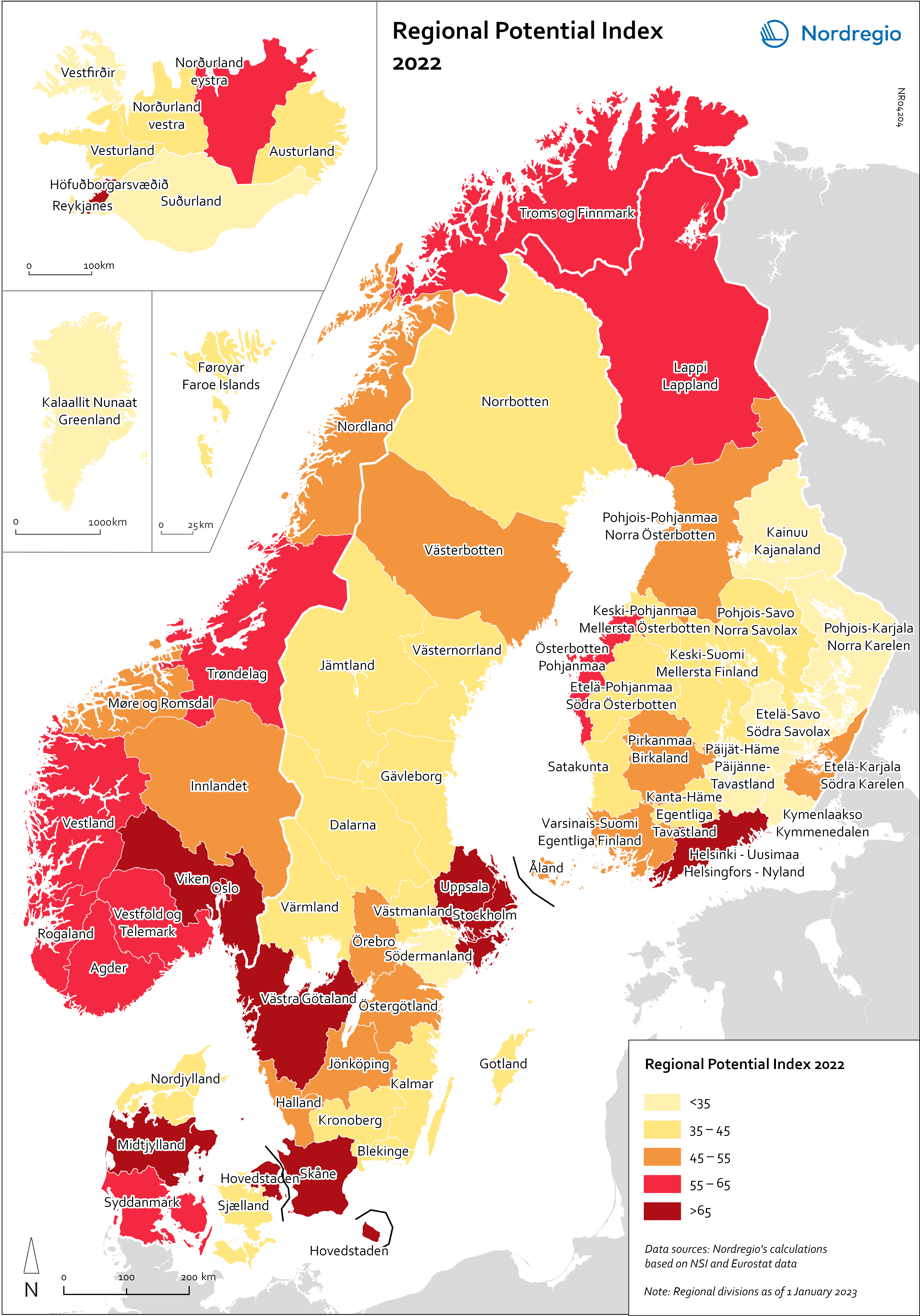
Regional Potential Index 2022
This map shows the result of Nordregio’s Regional Potential Index in 2024 (data from 2022). Nordregio’s Regional Potential Index (RPI) enables cross-regional comparison of development potential and illustrates the regional balance between the Nordic countries and has been part of the State of the Nordic Region report since 2018. The purpose of this multidimensional index is to summarise the current and past performance of the Nordic regions across major policy domains. The index helps to identify regions that have high potential and those in need of further support to boost their potential and meet existing challenges. It provides policy-makers with a comparative learning tool that informs the design of effective regional development strategies at Nordic level. Nordregio’s RPI is a multi-item measurement scale that incorporates information about the demographics, labour market and economic output of the Nordic countries’ 66 administrative regions. It consists of eight indicators classified into four main groups and eight subgroups. These components and indicators were originally selected on the basis of their relevance for regional development. The 2024 RPI is based on a new refined method that maintains a similar set of indicators but applies a more robust statistical process to the construction of the RPI. In brief, the new methodology consists of a pre-processing stage, in which the input data is prepared for analysis, and a processing stage, in which the indicators are weighted and aggregated. More information about the method can be found in the State of the Nordic Region 2024 report. The RPI was calculated retroactively for the 2015–2023 period. However, the focus in this section is on 2022 – the most recent year in our time series with full data coverage. The map shows the redesigned RPI for that period. In line with the principles of accumulation and agglomeration that drive the…
- 2025 April
- Demography
- Economy
- Labour force
- Nordic Region
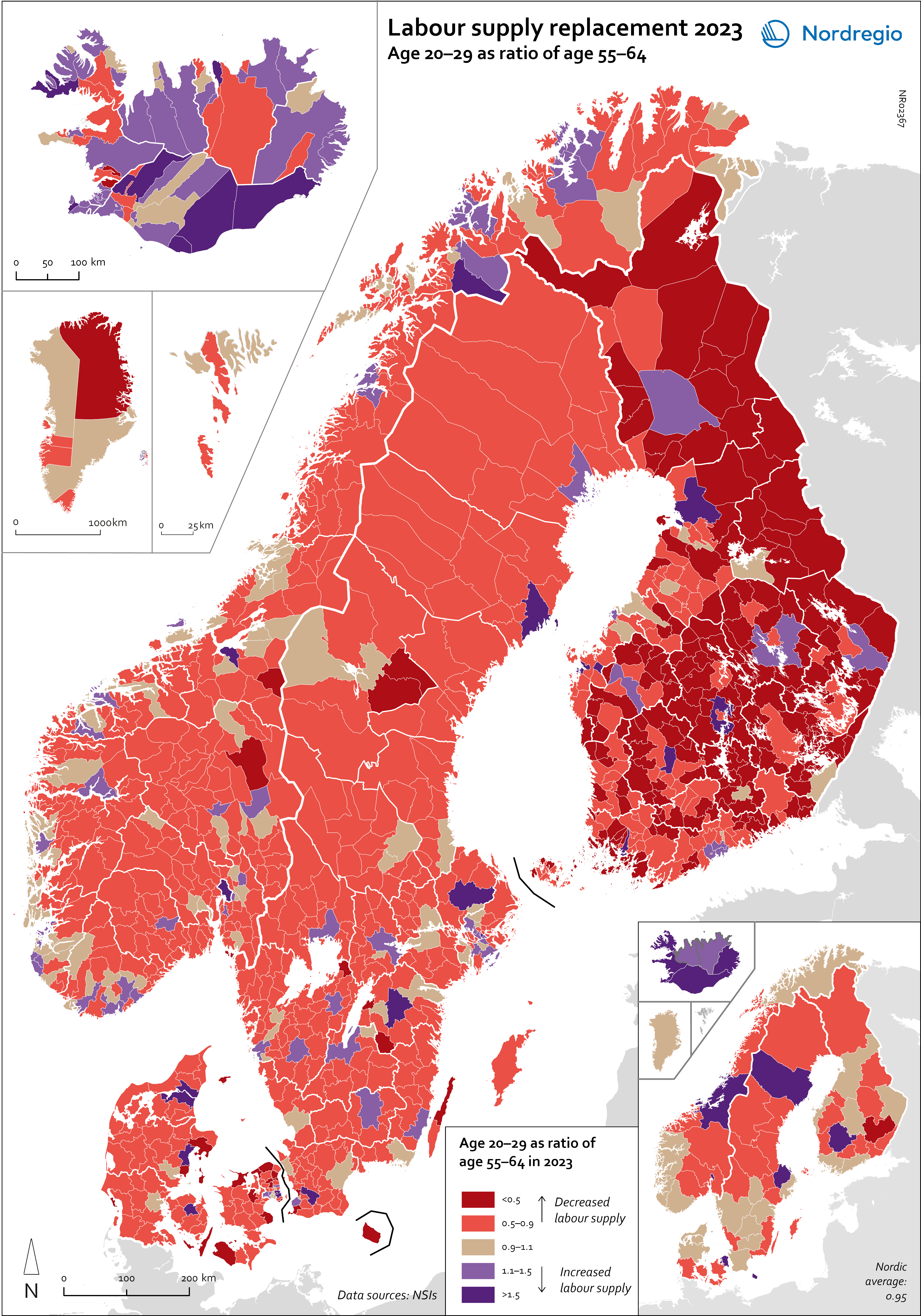
Labour supply replacement 2023
This map shows the ratio between the age groups 20–29 and 55–64 at the municipal level (big map) and regional level (small map). A ratio below 1 indicates that fewer individuals are entering the labor market than leaving it, while a ratio above 1 means more people are entering than exiting. For the Nordic Region as a whole, the ratio is 0.95, meaning that there are slightly fewer people in the age group 20–29 than 55–64. Iceland is the only country with a ratio above 1 (Iceland: 1.3; Greenland: 0.99; Denmark: 0.97; Norway: 0.95; Finland: 0.94; Sweden: 0.93; Faroe Islands: 0.88; Åland: 0.63). All of the Icelandic regions, as well as the capital regions of Norway, Denmark and Finland, have a ratio above 1. In Sweden, the highest ratios are in Uppsala (1.25), Västerbotten (1.14) and Östergötland (1.03), while the ratio in Stockholm is below 1 (0.95). The lowest ratios are found in Etelä-Savo (0.62) and Åland (0.63) in Finland, Sjælland (0.63) in Denmark, Västernorrland (0.74) in Sweden, and in Vestfold og Telemark (0.78) and Viken (0.77) in Norway. However alarming these trends and developments are, they are neither new nor undescribed. An analysis of the factors and policy strategies that are influencing these developments enables adjustments to be made to future trends.
- 2025 April
- Demography
- Labour force
- Nordic Region
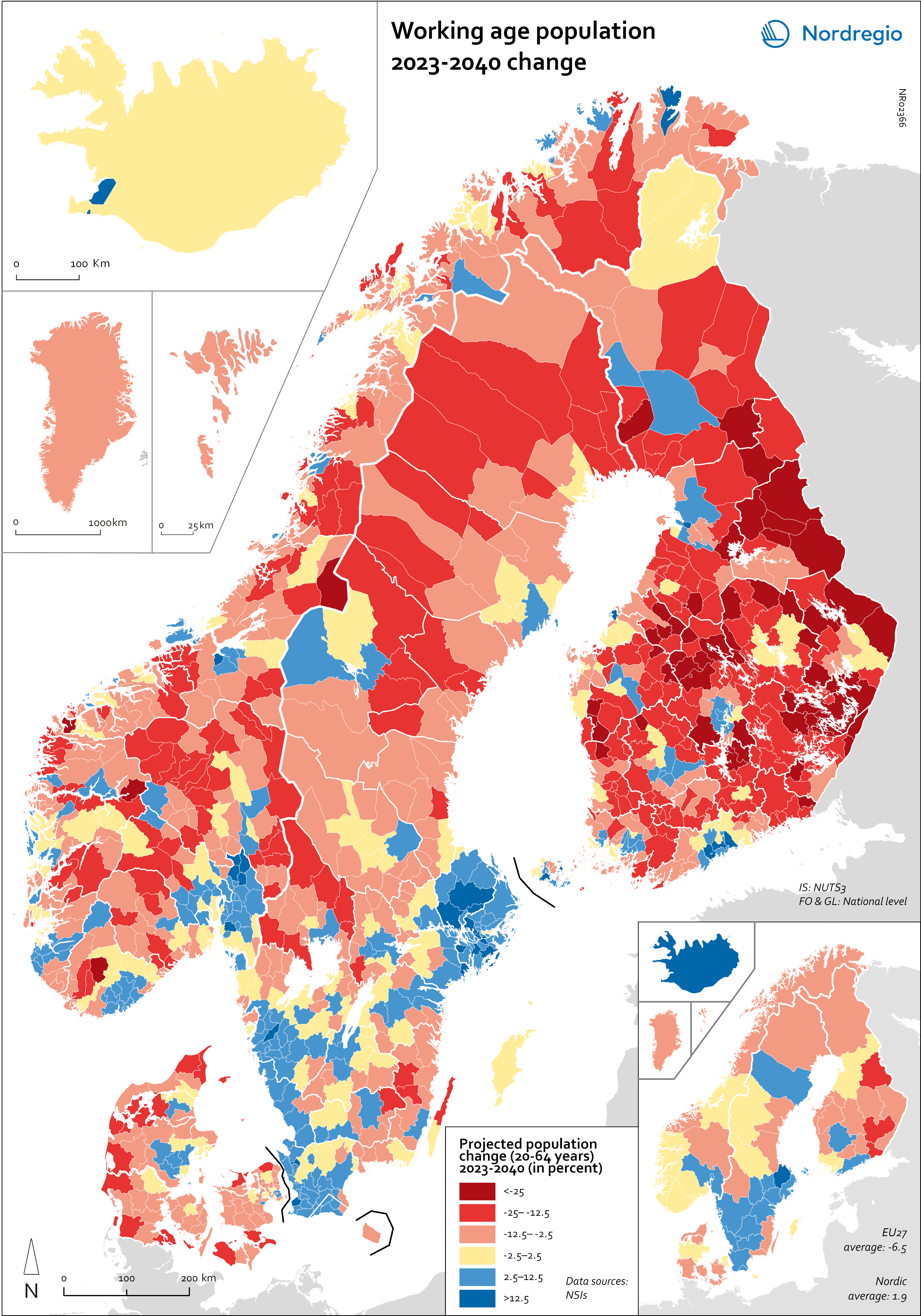
Working age population – 2023-2040 change
This map illustrates the projected change in the working-age population across Nordic municipalities (large map) and regions (small map) from 2023 to 2040. The working-age population is defined here as individuals aged 20 to 64. The blue areas on the maps represent municipalities and regions where the working-age population is expected to increase during this period. In contrast, the red areas indicate a projected decline in the working-age population. These projections are based on data from Nordic statistical institutes, though it’s important to note that the underlying assumptions may vary between Nordic countries. In most of the Western world, the working-age population is decreasing. In the EU, this age group is expected to decrease by 6.5% between 2023 and 2040. Only five EU countries – Malta, Luxembourg, Ireland, Sweden and Belgium – are expected to enjoy growth in the working-age population during this period. However, in the Nordic Region as a whole, the working-age population is expected to grow slightly, with an average increase of 1.9%. As the map shows, the distribution is quite varied, with considerable differences both between and within the countries. The biggest increase is expected in Iceland (28%), followed by Sweden (5.8%), Åland (3.9%) and Norway (0.6%). Decreases are expected in Finland (-0.5%), the Faroe Islands (-2.6%), Denmark (-3.2%) and Greenland (-11.4%). This development is in addition to the decreases already experienced by Finland since 2013. In general, the trend of growing populations in cities and decreasing populations in rural areas is expected to continue. The regions that are expected to have the highest working-age population growth include Höfuðborgarsvæðið in Iceland, Uppsala (+13%), Stockholm (+12%), Skåne (+9%), Halland (+7%) and Västra Götaland (+6%) in Sweden, Uusimaa (+8%) and Pirkanmaa (+5%) in Finland, and Oslo and Viken in Norway (+5%). In addition, Copenhagen municipality (+5%), Rødovre (+9%)…
- 2025 April
- Demography
- Labour force
- Nordic Region
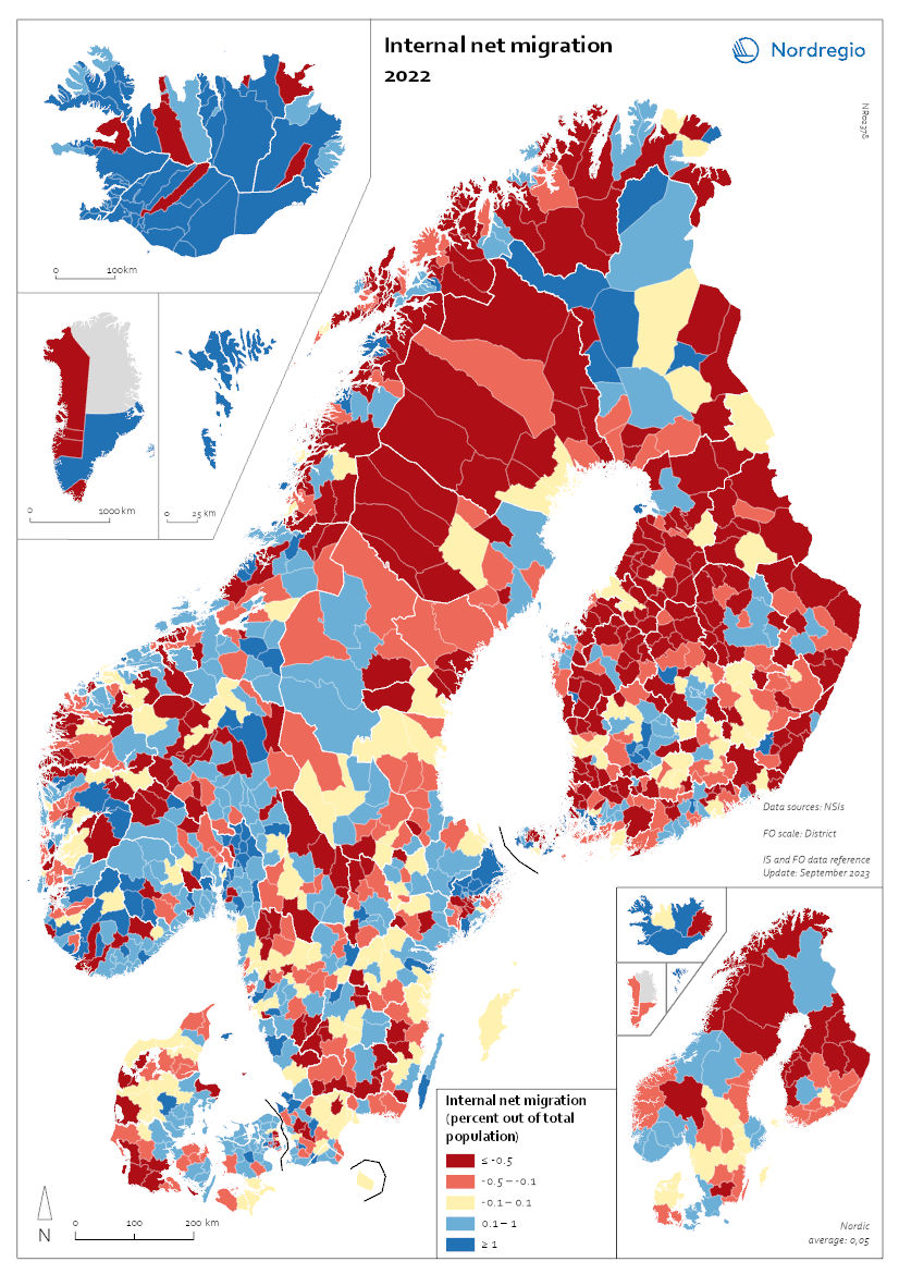
Internal Migration 2022
This map shows the internal net migration in 2022 as a percentage of the total population. This map shows the internal net migration in 2022 as a percentage of the total population. The small map shows the result on a regional level, and the big map on the municipal level. Internal (sometimes referred to as domestic) net migration refers to migration between municipalities and regions within the same country. International migration is excluded. In 2022, internal net migration was positive (indicated by shades of blue) or at least balanced (shown in yellow) in several municipalities in central and southern Sweden and Norway, as well as in central and northern Finland – areas that traditionally were more likely to lose population due to internal migration. Conversely, several municipalities in the capital regions – such as Stockholm, Oslo, and Copenhagen – exhibited negative internal net migration. Several municipalities across the Nordic Region, including in more remote and rural areas, continued to register positive internal net migration in this year. In Iceland, positive migration predominated in most of the municipalities, and the Faroe Islands also presented positive net migration. Greenland oscillated mainly between positive and negative migration flows, while Åland presented the whole spectrum of positive, balanced, and negative net migration for this year.
- 2025 April
- Demography
- Nordic Region
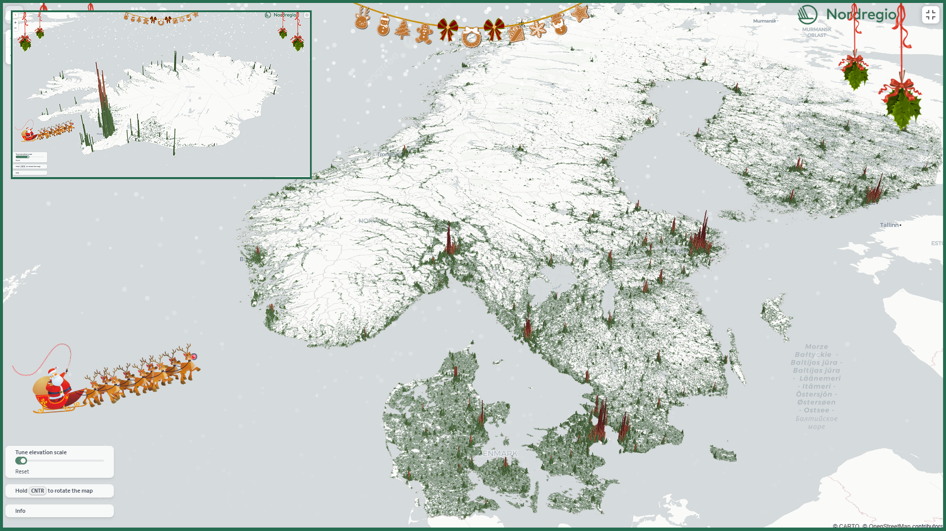
A 3D population map for the holiday season
This Christmas, we’re gifting all fellow data nerds our first-ever interactive 3D map! The map displays the number of residents in each 1km grid cell, with the height of the bars representing the number of residents in each area.
- 2024 December
- Demography
- Nordic Region
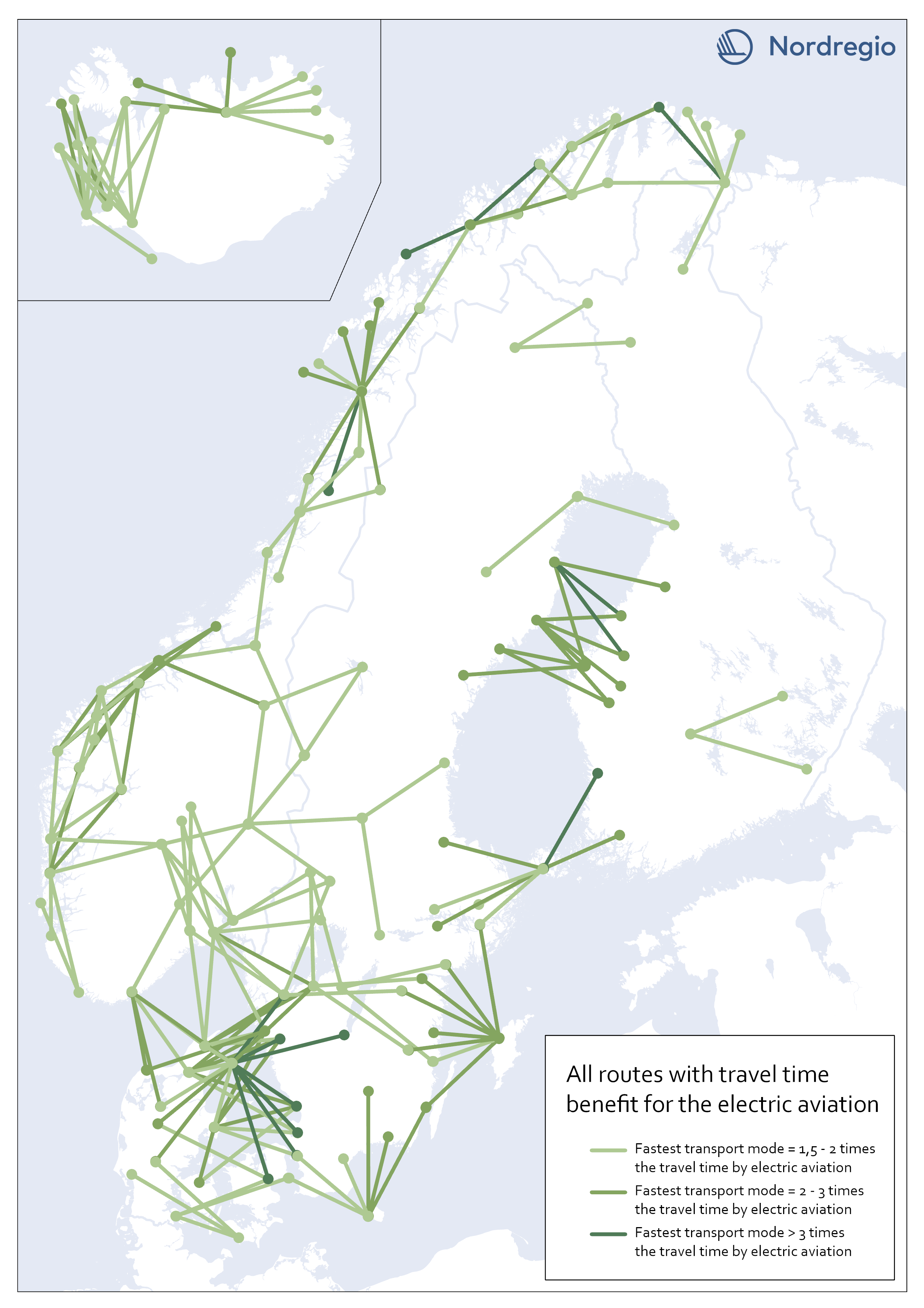
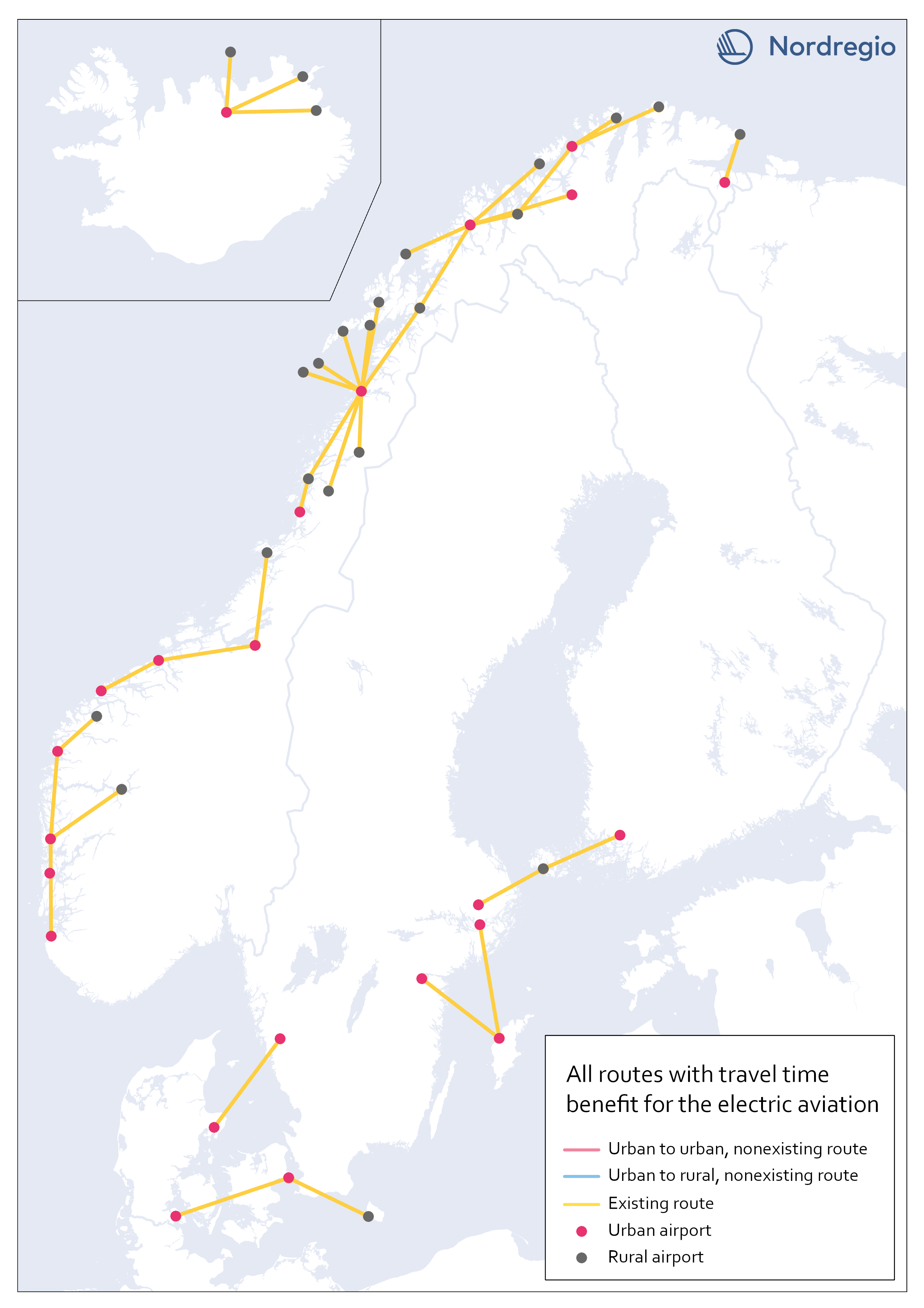
All routes with time benefit for electric aviation
The map shows all routes in our sample with significant travel time benefit for electric aviation. They are 203 in total. A route has a significant travel time benefit if the travel time for both car and public transportation exceeded 1,5 times the travel time for electric aviation. I.e., if one of the existing transport modes is faster or up to 1,5 times the travel time for electric aviation, electric aviation does not have the potential to improve accessibility between the two destinations, according to our analysis.
- 2023 February
- Nordic Region
- Transport
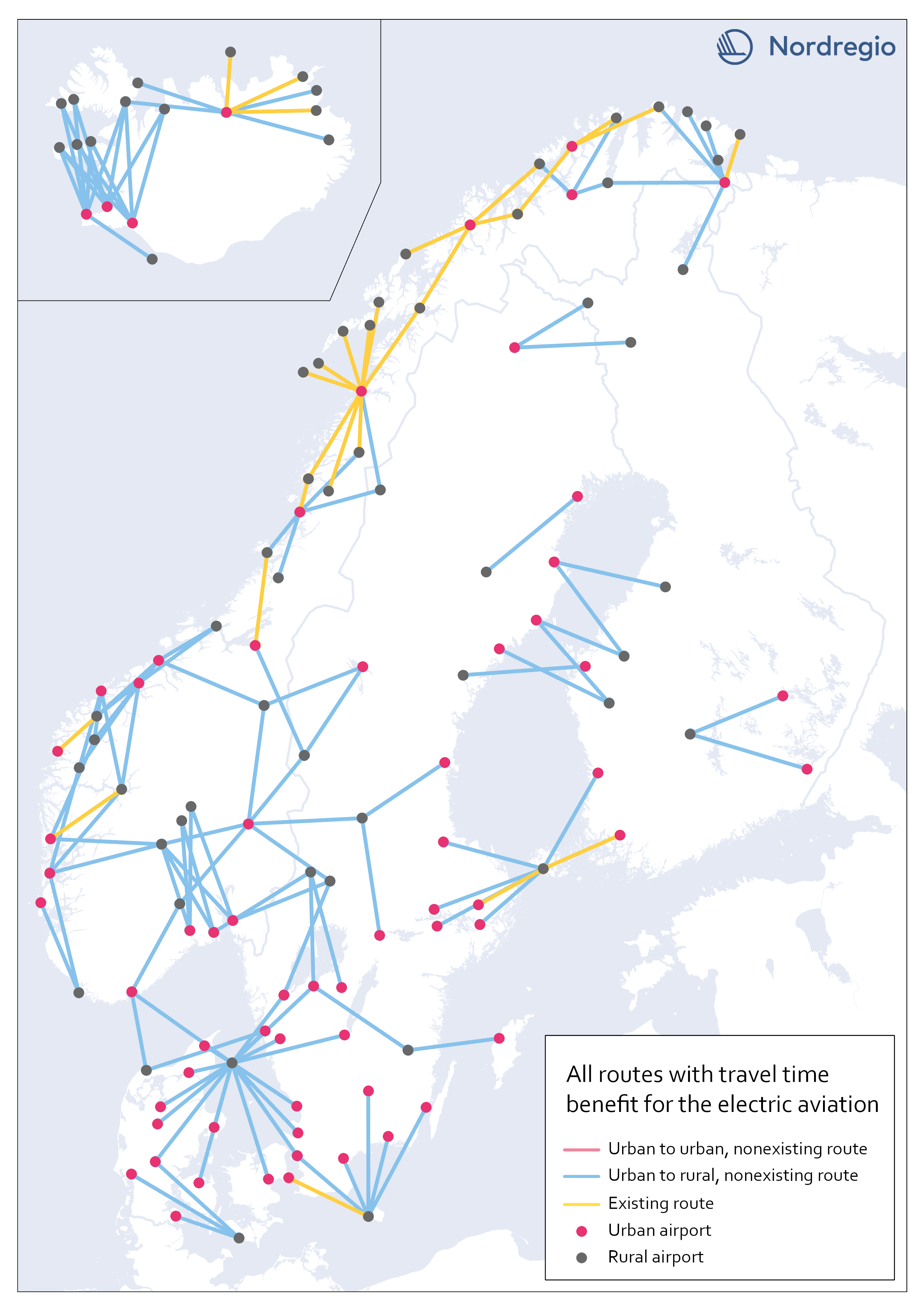
Electric aviation time benefits between urban and rural areas
The map shows all routes between urban and rural areas where electric aviation has significant time benefits compared to other traffic modes. Yellow lines are already served by aviation, while blue color indicates non-existent routes where electric flight would reduce the travel time between destinations. Our motivation for focusing on urban-rural routes was based on the assumption that electric aviation can increase the access for rural areas to public facilities and job opportunities, as well as the possibility of connecting remote areas with national and international transport systems. The result, though, can only be understood in terms of travel time benefits between the areas, and thus reveals little about accessibility to mentioned opportunities. The following are examples of themes to be investigated further within the main project. Identify regional hubs Among others, the project FAIR (2022) has addressed the need to update the flight system to a more flexible aviation network, that meet travelers’ needs with smart mobility. This can be done by identifying demands and establishing regional hubs for electric aviation, which can serve remote and regional areas. The potential of Hamar and Bodö in Norway as regional hubs should be studied more closely.
- 2023 January
- Nordic Region
- Transport
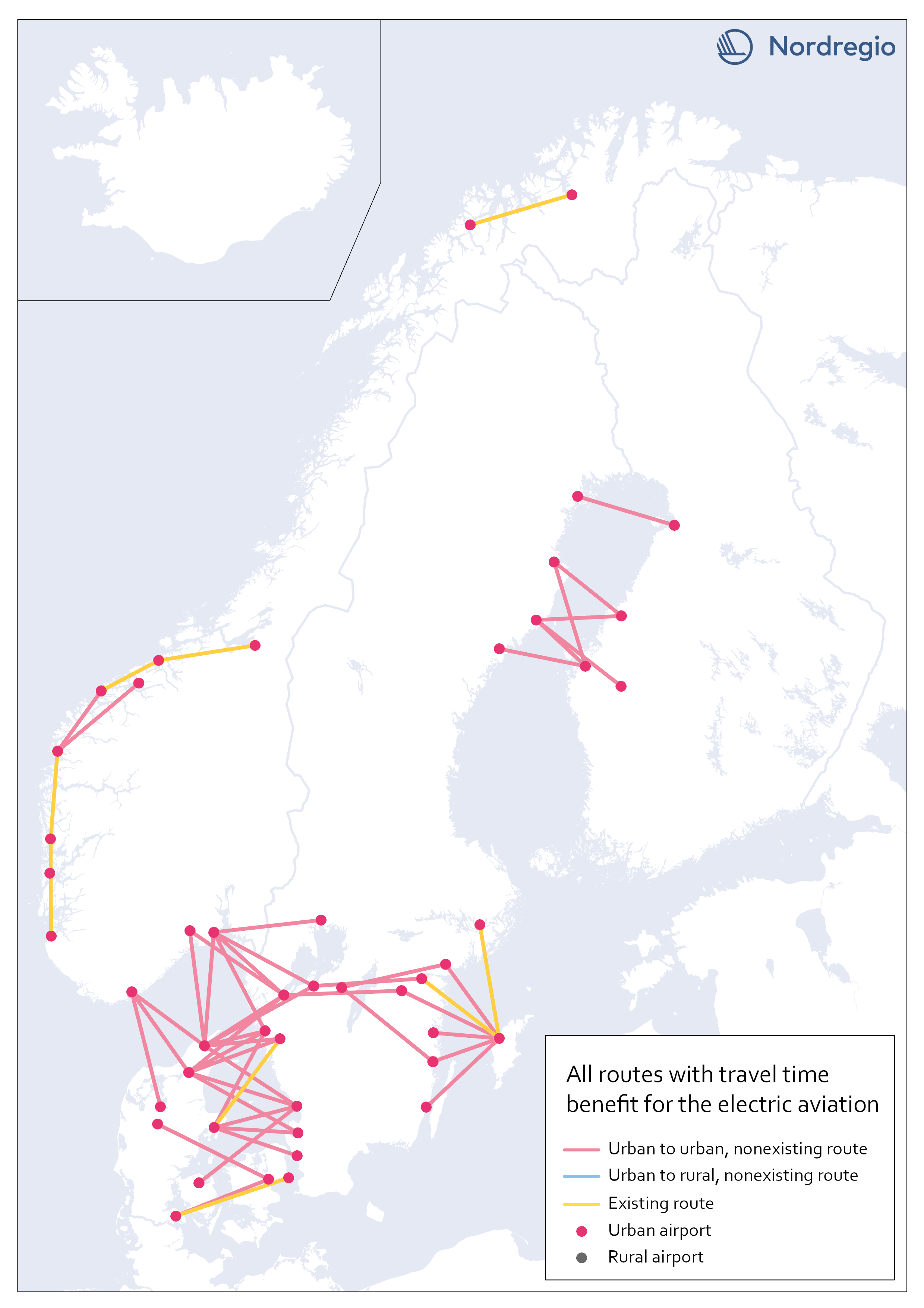
Electric aviation time benefits between urban areas separated by water
The map shows all routes between urban areas separated by water, and where electric aviation has significant time benefits compared to the fastest traffic mode. Yellow lines are already served by aviation, while red color indicates non-existent routes where electric flight would reduce the travel time between destinations. The result is in line with our assumptions, that there is a lack of fast connections between potential labor markets in urban areas, which are geographically close but separated by open water.
- 2023 January
- Nordic Region
- Transport
Existing routes with time benefit for electric aviation
The map visualizes all routes with significant travel time benefit, which are already served with commercial flights. Information on existing routes has been obtained from the report Nordic Sustainable Aviation (Ydersbond et al, 2020) and applies to the year 2019. Since then, routes may have been added or removed, which is important to bear in mind in future investigations. However, choosing a later year risk giving equally misleading results, as flights decreased drastically during the pandemic. Statistics for 2019 provide a picture of the demand that existed before the pandemic, which is the latest stable levels that can be obtained. Whether air traffic will ever return to the same levels as before the pandemic is too early to say. The majority of routes are found in Norway, along the coastline, which confirms earlier knowledge that Norway has a more extensive and coherent aviation network than the rest of the Nordic region.
- 2023 January
- Nordic Region
- Transport
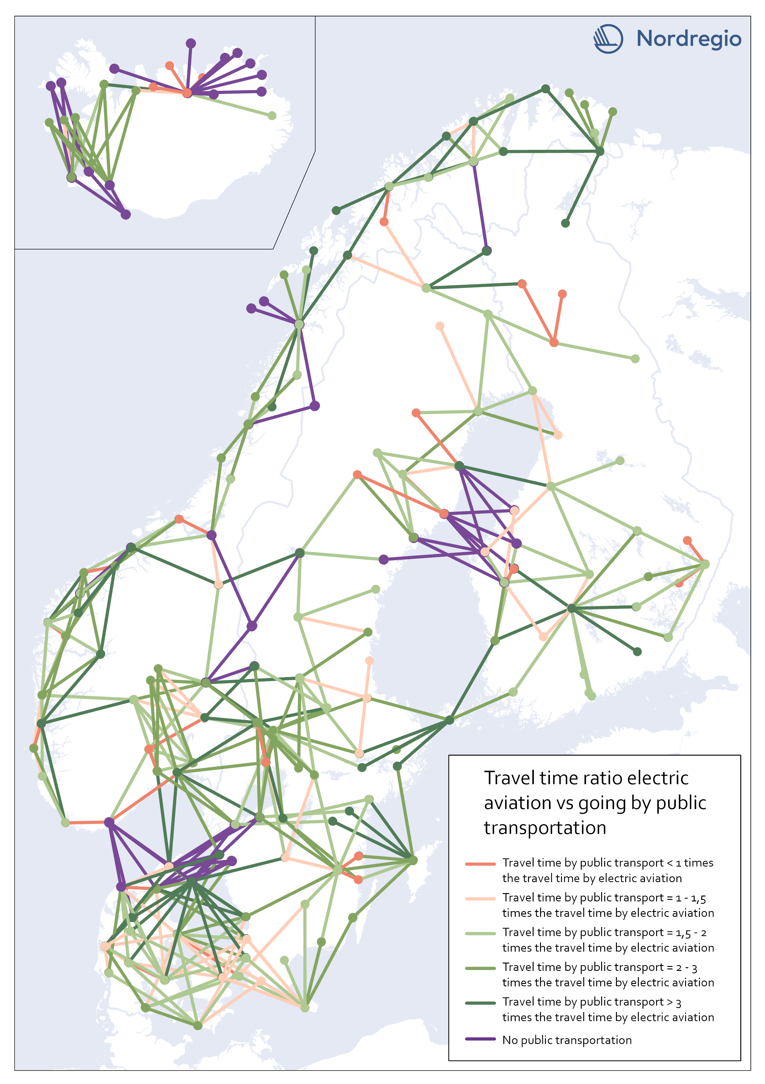
Travel time ratio – electric aviation vs public transportation
This map shows the travel time calculations for electric aviation versus travelling by public transportation. Routes represented by any nuance of green, are routes with significant travel time benefits for electric aviation in comparison with public transportation. The darker the nuance of green, the larger time benefit for electric aviation. The beige color represents routes where the travel time for public transportation is the same or up to 1,5 times the travel time for electric aviation. The red color represents routes where public transportation is faster than electric aviation. Purple lines represent routes where no public transportation is available. These were also routes where we could see significant time benefits for electric aviation. The number of changes when commuting with public transport may have a negative impact on perceived accessibility. In this accessibility analysis, however, we stay with the same criteria for public transport as for travel by car. For future research, the number of changes when commuting by public transport could be considered in the comparison.
- 2023 January
- Nordic Region
- Transport
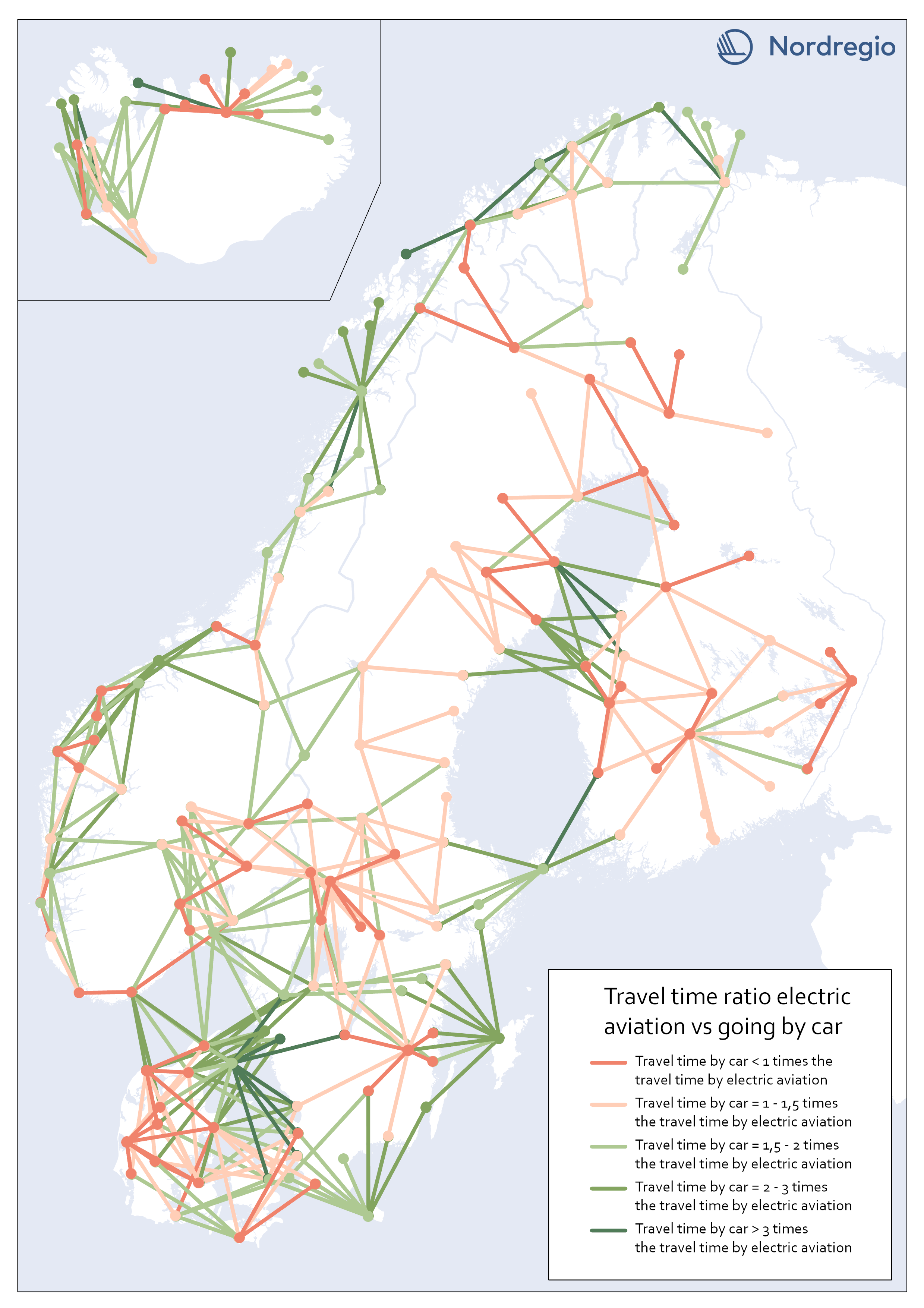
Travel time ratio – electric aviation vs car
This map shows the travel time calculations for electric aviation versus traveling by car. Routes represented by any nuance of green, are routes with significant travel time benefits for electric aviation in comparison with car. The darker the nuance of green, the larger time benefit for electric aviation. The beige color represents routes where the travel time for car is the same or up to 1,5 times the travel time for electric aviation. The red color represents routes where car is faster than electric aviation.
- 2023 January
- Nordic Region
- Transport
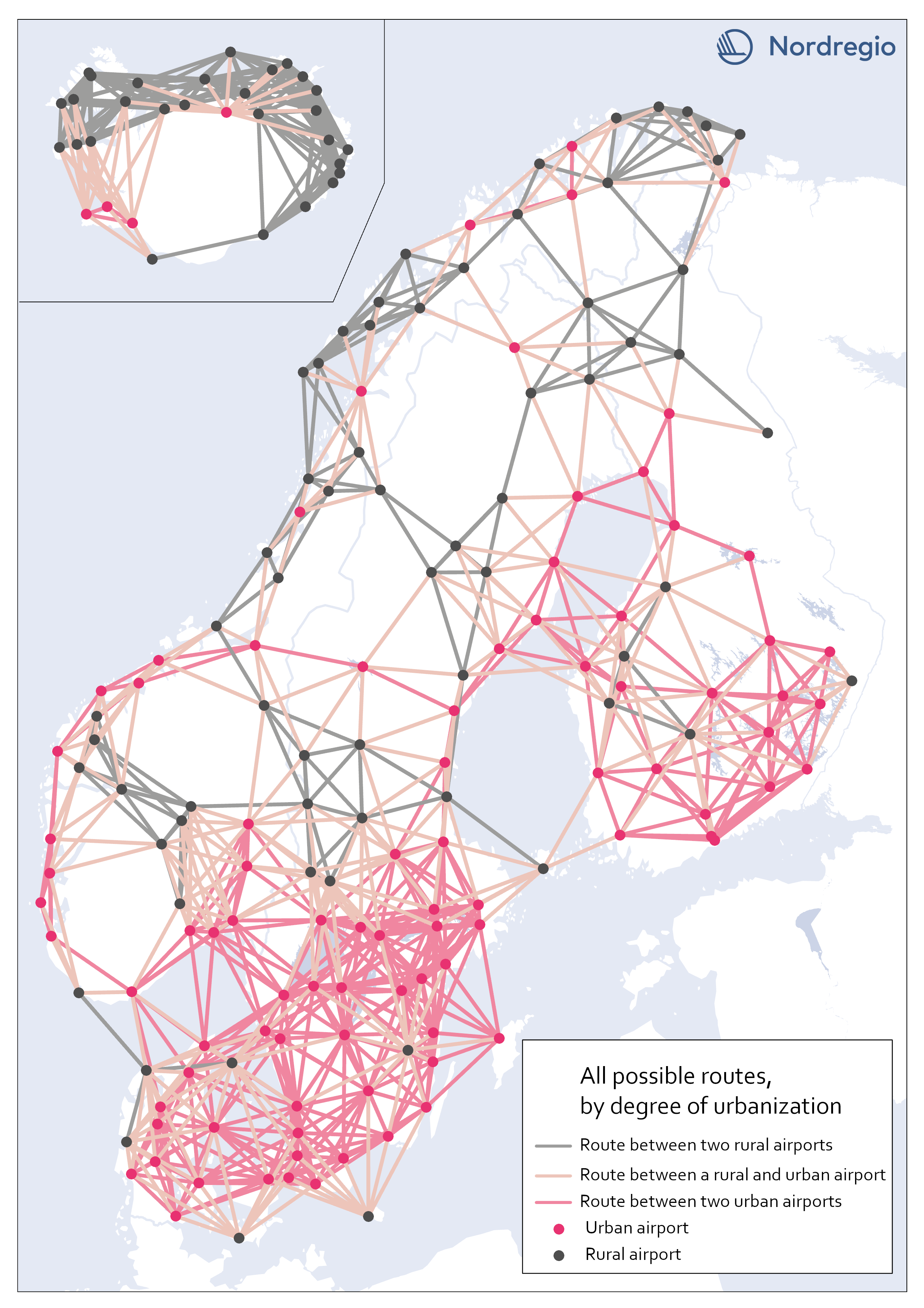
All possible electric aviation routes by a degree of urbanisation
The map shows all routes with a maximum distance of 200 km divided into three categories, based on the airports’ degree of urbanization: Routes between two rural airports, routes between one rural and one urban airport and routes between two urban airports. The classification is based on the new urban-rural typology. We restricted the analysis to routes between rural and urban areas as well as routes between urban areas that are separated by water. Those are 426 in total. We based our criteria on the assumption that accessibility gains to public services and job clusters can be made for rural areas, if better connected to areas with a high degree of urbanization. Because of possible potential to link labor markets between urban areas on opposite sides of water urban to urban areas that cross water are also included. This is based on previous research which has shown the potential for electric aviation to connect important labor markets which are separated by water, particularly in the Kvarken area (Fair, 2022). Our choice of selection criteria means that we intentionally ignore routes where electric aviation may have a potential to reduce travel times significantly. There might also be other important reasons for the implementation of electric aviation between the excluded routes. Between rural areas, for example, tourism or establishing a comprehensive transport system in the Nordic region, constitute reasons for implementing electric aviation. Regarding routes between urban areas over mainland, the inclusion of more routes with the same rationale as above – that significant time travel benefits could be gained between labor markets with electric aviation (for example between two urban areas in mountainous regions where travel times can be long) – can be motivated. Some of those routes can be important to investigate at a later stage but are outside the…
- 2023 January
- Nordic Region
- Transport
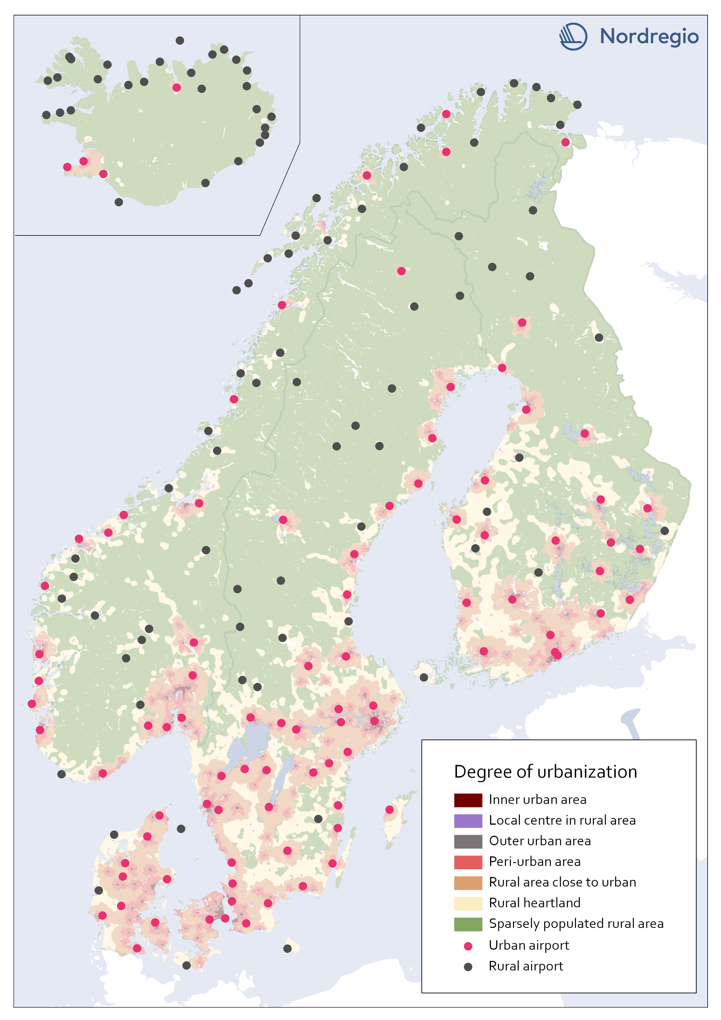
All airports in the Nordic region by a degree of urbanisation
This map classifies all airports by a degree of urbanisation. The classification is based on the new urban-rural typology. We classified all airports localized within any of the top five urbanization classes (Inner urban area, Local center in rural area, Outer urban area, peri-urban area, or Rural area close to close to urban) as Urban. All other airports, localized within the bottom two classes (Rural heartland or Sparsely populated rural area) were classified as Rural. No adjustments were made based on the proximity of the airports to urban areas. During the process we considered adjustments in the categorization based on the airports’ potential catchment area from a close urban area. For example, one can assume that Gällivare Lappland airport in the north of Sweden, has its main catchment area from Gällivare which is classified as a local center in rural area (i.e. Urban). The airport, though, is localized within the category Rural heartland. Yet, we decided to let the typology determine to which category each airport belong.
- 2023 January
- Nordic Region
- Transport
