57 News
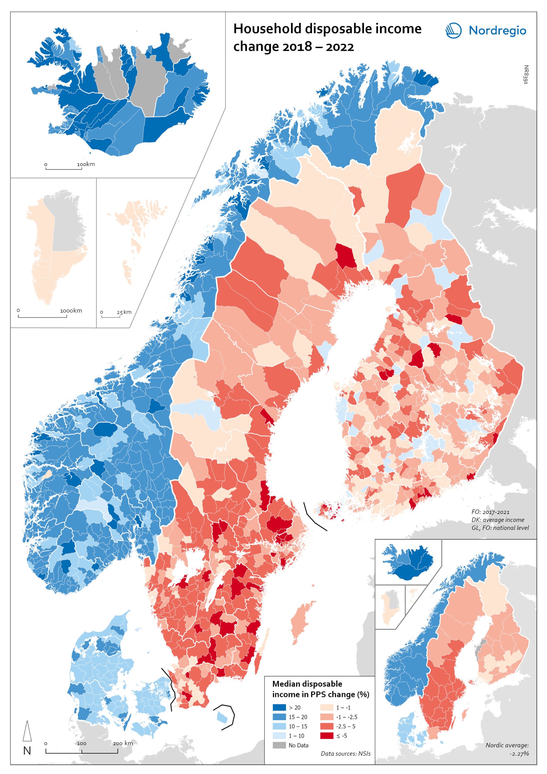
Household disposable income change 2018-2022
This map shows the percentage change in household disposable income between 2018 and 2022 in Nordic municipalities (big map) and regions (small map). Household disposable income per capita is a common indicator of the affluence of households and, therefore, of the material quality of life. It reflects the income generated by production, measured as GDP that remains in the regions and is financially available to households, excluding those parts of GDP retained by corporations and government. In sum, household disposable income is what households have available for spending and saving after taxes and transfers. It is ‘equivalised’ – adjusted for household size and composition – to enable comparison across all households. Purchasing Power Standards (PPS) is used to compare the countries’ economies and the cost of living for households. As shown in the map, between 2018 and 2022, household disposable income increased for all Danish, Icelandic, and Norwegian municipalities and decreased for Finnish and Swedish municipalities. On average, the city municipalities have higher incomes and increased most in Finland and Sweden in 2018–2022. In Sweden, a tendency towards larger falls in income was observed in several southern municipalities. In summary, absolute household income increased in all Nordic countries but not when measured in purchasing power. Based on this metric, on average, Norwegian households are the most well-off and Iceland the worst off, while Danish households benefited from a stronger currency in 2022. Single-parent households have had lower increases in household income than other families in Norway and parts of Sweden. Municipalities show a similar trend in Norway and Denmark, although Norwegian coastal municipalities fared slightly better in 2022. Disposable income is falling in all Swedish and Finnish municipalities.
 2025 April
 - Economy
- Nordic Region
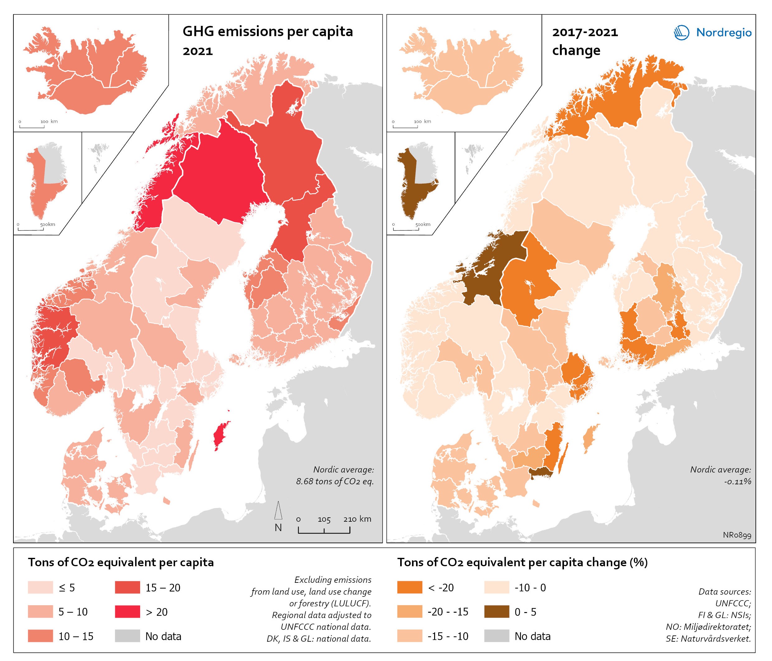
Regional GHG emissions per capita in 2021 and change 2017-2021 on a territorial basis
The data excludes emissions from land use, land use change or forestry (LULUCF). The regional data has been adjusted to UNFCCC national data. The data for Denmark, Iceland and Greenland is on national level. It should be noted that displaying emissions on a territorial basis may be skewed due to the inter-regional dynamics of energy processes, natural resource distributions and concentrations of industrial activities. From 2017 to 2021, the Nordic regions cut their per-capita GHG emissions by on average 11.3%, with an overall Nordic average fall of 8.7% over the same period. In regions historically reliant on fossil fuels for heat and power generation, emissions have continued to decline. This trend is evident in Denmark, as well as in Southern Sweden and Southern Finland – densely populated areas that have taken steps toward expanding district heating coverage and reducing carbon intensity. The largest decrease in GHG emissions per capita was found in Troms and Finnmark, with a 42.3% decrease, Satakunta with a 30.2% decrease and Päijät-Häme – Päijänne-Tavastland with a 29.2% decrease. Only three regions (Greenland, Trøndelag and Blekinge) saw an increase in GHG emissions per capita. At an aggregated level, industrial-related emissions decreased throughout the Nordic Region, but this trend does not hold true for regions in Norway with intensive offshore oil and gas operations. For instance, Nordland, Vestland, Møre og Romsdal, Vestfold and Telemark exhibited the highest per capita emissions in 2021. Between 2017 and 2021, emissions were increasing in many Norwegian regions with intensive offshore oil and gas activity, but also in Norrbotten in Sweden (21.2 tonnes of CO2 equivalent per capita) and Gotland (33.6 tonnes of CO2 equivalent per capita) due to intensive activity in the metal and cement industries, respectively, as well as in several Finnish regions. At the other end of the scale, the…
- 2025 April
- Environment
- Nordic Region

Gini coefficient change 2018-2022
This map shows the percentage change in the Gini coefficient between 2018 and 2022. The big map shows the change on municipal level and the big map at regional level. Blue shades indicate a decrease in income inequality, while red areas indicate an increase in income inequality The Gini coefficient index is one of the most widely used inequality measures. The index ranges from 0–1, where 0 indicates a society where everyone receives the same income, and 1 is the highest level of inequality, where one individual or group possesses all the resources in the society, and the rest of the population has nothing. The map illustrates significant variations in the change in income inequality across Nordic municipalities and regions. Between 2018 and 2022, income inequality increased in predominantly rural municipalities, notably in Jämtland, Gävleborg, Dalarna and Västerbotten in Sweden, as well as Telemark in Norway. For Denmark, the rise in inequality is mainly for the municipalities in Western Jutland. At the same time, approximately one third of municipalities in the Nordic Region experienced a decrease in income inequality during the same period, primarily in Finland and Åland. For example, in Finland, the distribution of inequality was more varied. This trend aligns with the ongoing narrowing of the household income gap observed in many Finnish municipalities since 2011, which is mainly attributed to the economic downturn of the early 2010s, as well as demographic shifts such as outmigration and ageing.
- 2025 April
- Economy
- Nordic Region
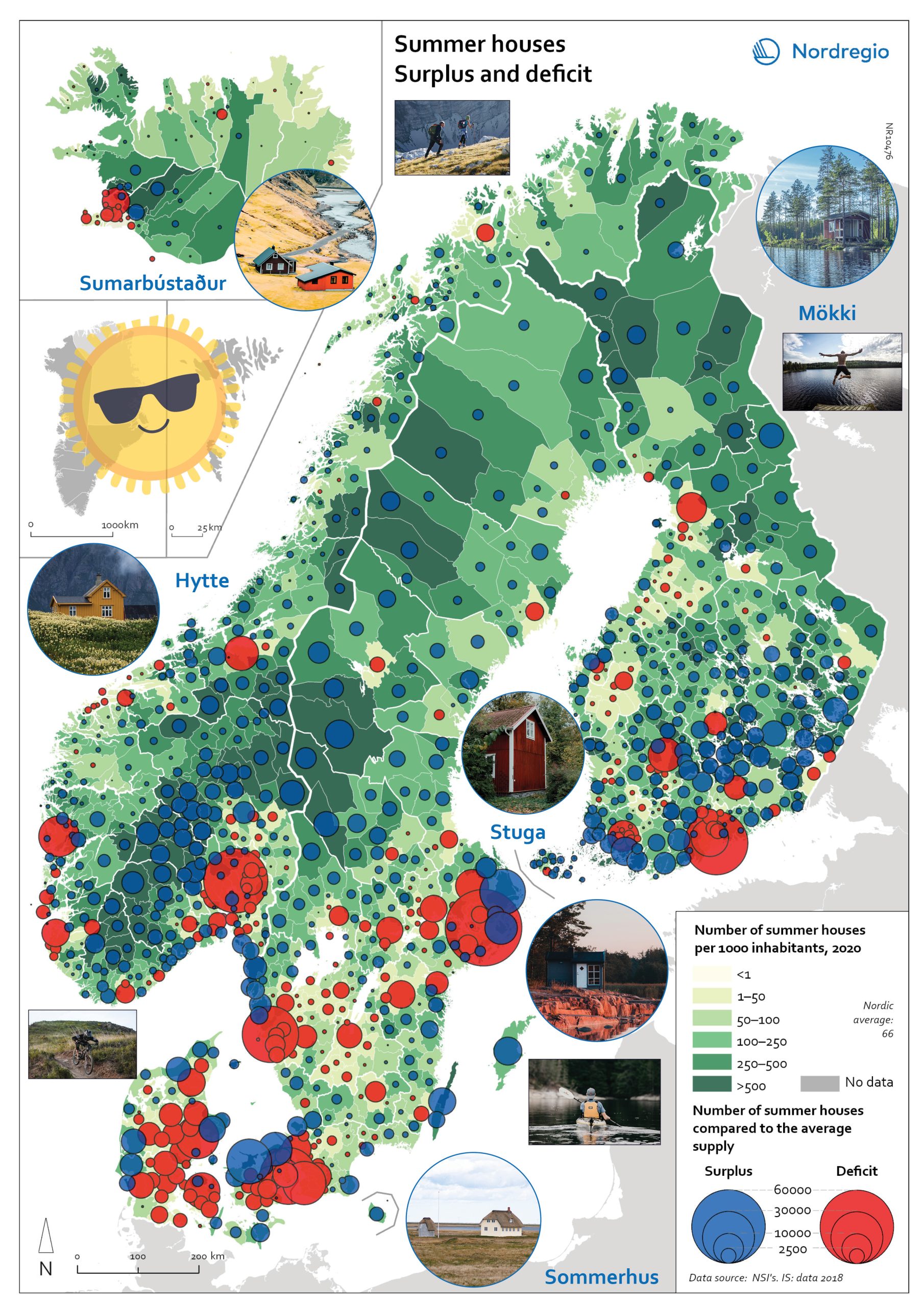
Gone missing: Nordic people!
Nordregio Summer Map 2022: Empty streets, closed restaurants – where is everyone? Nordic cities are about to quiet down as millions of people are logging out from work. But where do they go – Mallorca? Some yes, but the Nordic people are known for their nature-loving and private spirit, and most like to unwind in isolation. So, they head to their private paradises – to one of the 1.8 million summer houses around the Nordics, or as they would call them: sommerhus, stuga, hytte, sumarbústaður or mökki. The Nordregio Summer Map 2022 reveals the secret spots. The Finnish and Norwegians are most likely already packing their cars and leaving the cities: the highest supply of summer houses per inhabitant is found in Finland (92 summer houses per 1000 inhabitants) closely followed by Norway (82). The Swedish (59) Danish (40) and Icelandic (40) people seem to have more varied summer activities. There are large regional differences in the number of summer houses and the number of potential users – so not enough cabins where people would want them! And this is the dilemma Nordregio Summer Map 2022 shows in detail. Most people live in the larger urban areas while many summer houses are located in more remote and sparsely populated areas. The largest deficit of summer houses is found in Stockholm: with almost 1 million inhabitants, there is a need for 65,000 summer houses but the municipality has only 2,000 to offer! So, people living in Stockholm need to go elsewhere to find a summer house. The same goes for the other capital municipalities which have large deficits in summer houses: Oslo is missing 44,000, Helsinki 43,000, and Copenhagen 34,000. Fortunately, there are places that would happily accommodate these second-home searchers. Good news for Stockholm after all as the top-scoring municipality…
- 2022 June
- Nordic Region
- Tourism
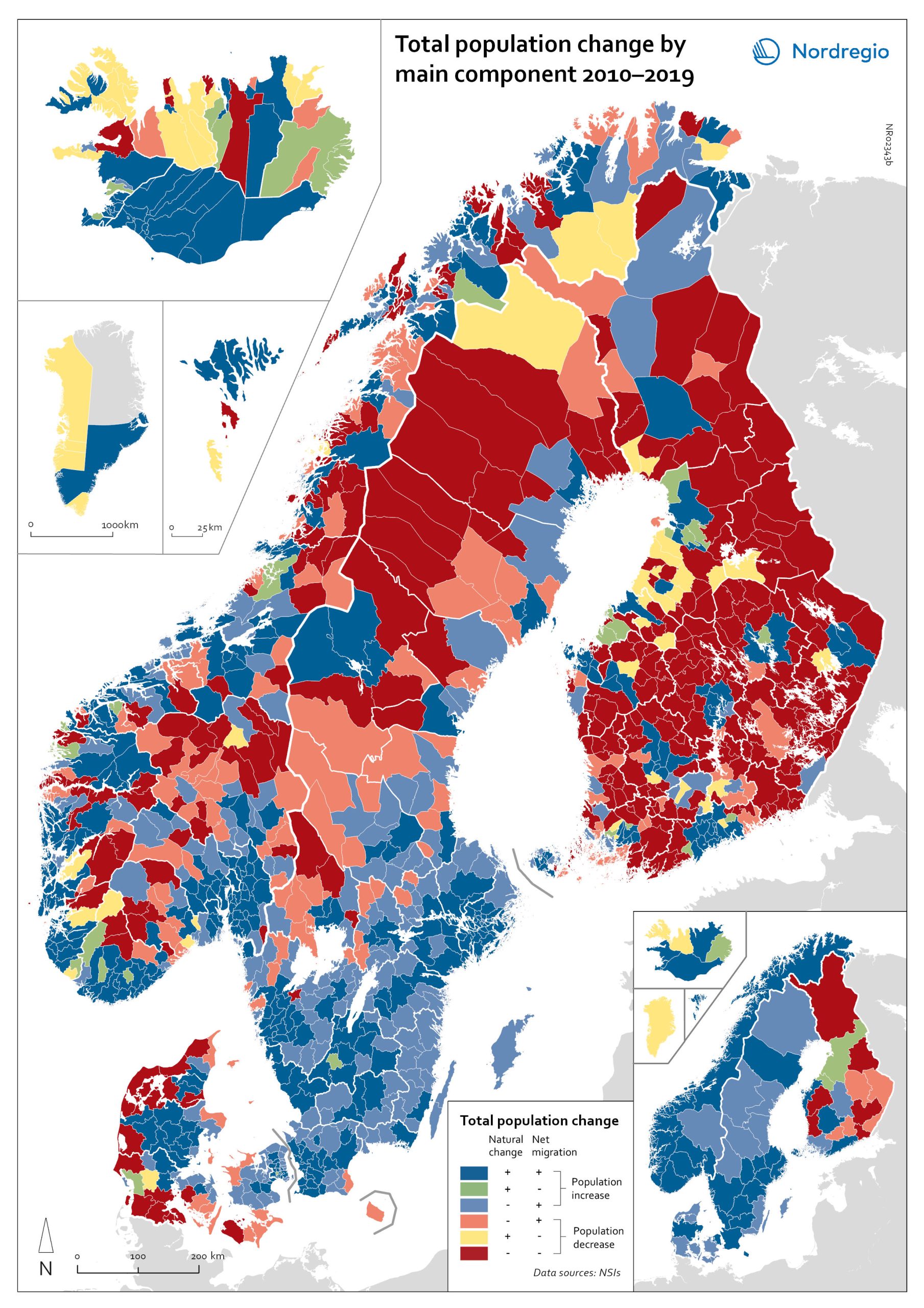
Population change by component 2010-2019
The map shows the population change by component 2010-2019. The map is related to the same map showing regional and municipal patterns in population change by component in 2020. Regions are divided into six classes of population change. Those in shades of blue or green are where the population has increased, and those in shades of red or yellow are where the population has declined. At the regional level (see small inset map), all in Denmark, all in the Faroes, most in southern Norway, southern Sweden, all but one in Iceland, all of Greenland, and a few around the capital in Helsinki had population increases in 2010-2019. Most regions in the north of Norway, Sweden, and Finland had population declines in 2010-2019. Many other regions in southern and eastern Finland also had population declines in 2010-2019, mainly because the country had more deaths than births, a trend that pre-dated the pandemic. In 2020, there were many more regions in red where populations were declining due to both natural decrease and net out-migration. At the municipal level, a more varied pattern emerges, with municipalities having quite different trends than the regions of which they form part. Many regions in western Denmark are declining because of negative natural change and outmigration. Many smaller municipalities in Norway and Sweden saw population decline from both negative natural increase and out-migration despite their regions increasing their populations. Many smaller municipalities in Finland outside the three big cities of Helsinki, Turku, and Tampere also saw population decline from both components. A similar pattern took place at the municipal level in 2020 of there being many more regions in red than in the previous decade.
- 2022 March
- Demography
- Migration
- Nordic Region
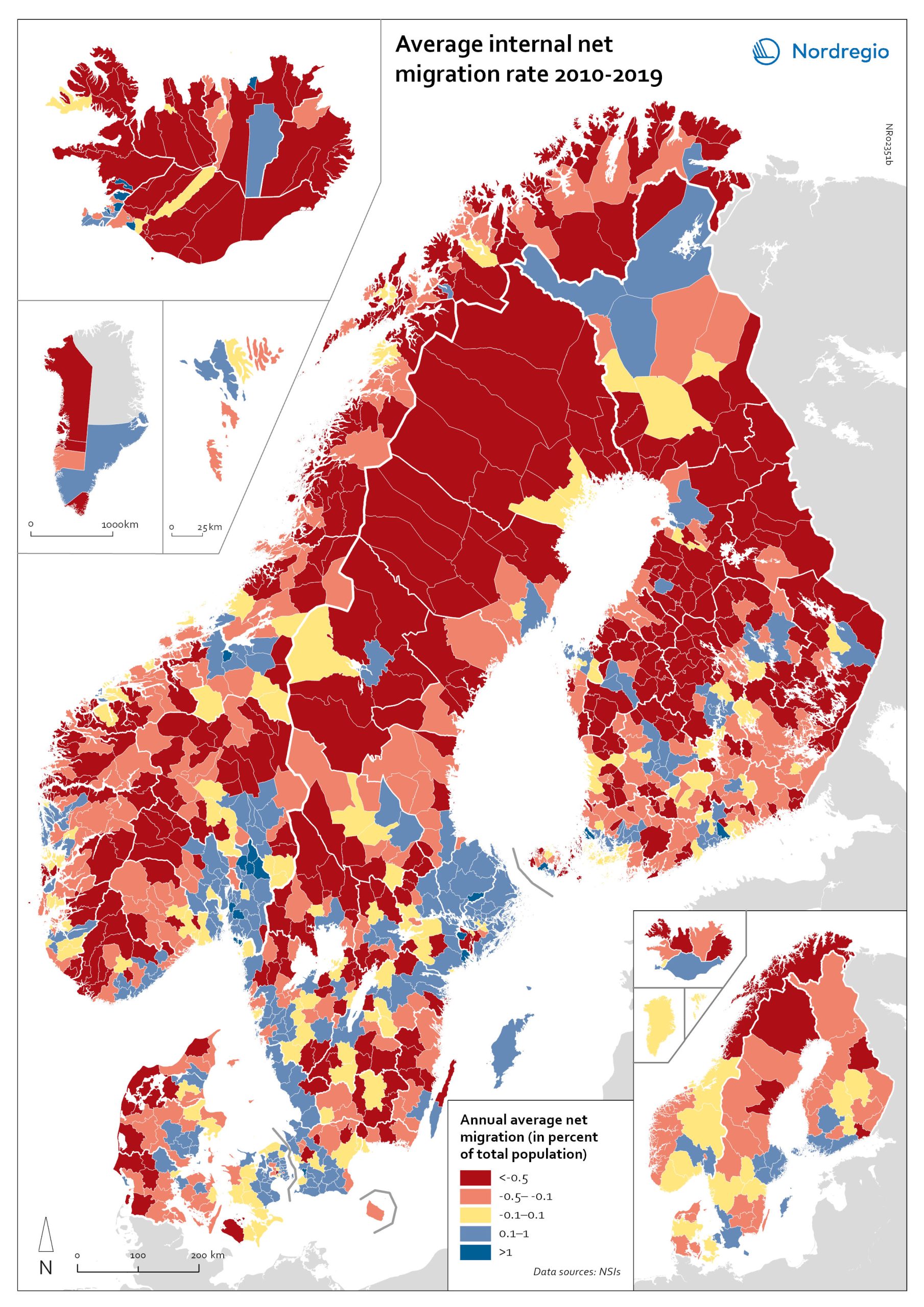
Net internal migration rate, 2010-2019
The map shows the annual average internal net migration in 2010-2019. The map is related to the same map showing net internal migration in 2020. The maps show several interesting patterns, suggesting that there may be an increasing trend towards urban-to-rural countermigration in all the five Nordic countries because of the pandemic. In other words, there are several rural municipalities – both in sparsely populated areas and areas close to major cities – that have experienced considerable increases in internal net migration. In Finland, for instance, there are several municipalities in Lapland that attracted return migrants to a considerable degree in 2020 (e.g., Kolari, Salla, and Savukoski). Swedish municipalities with increasing internal net migration include municipalities in both remote rural regions (e.g., Åre) and municipalities in the vicinity of major cities (e.g., Trosa, Upplands-Bro, Lekeberg, and Österåker). In Iceland, there are several remote municipalities that have experienced a rapid transformation from a strong outflow to an inflow of internal migration (e.g., Ásahreppur, Tálknafjarðarhreppurand, and Fljótsdalshreppur). In Denmark and Norway, there are also several rural municipalities with increasing internal net migration (e.g., Christiansø in Denmark), even if the patterns are somewhat more restrained compared to the other Nordic countries. Interestingly, several municipalities in capital regions are experiencing a steep decrease in internal migration (e.g., Helsinki, Espoo, Copenhagen and Stockholm). At regional level, such decreases are noted in the capital regions of Copenhagen, Reykjavík and Stockholm. At the same time, the rural regions of Jämtland, Kalmar, Sjælland, Nordjylland, Norðurland vestra, Norðurland eystra and Kainuu recorded increases in internal net migration. While some of the evolving patterns of counterurbanisation were noted before 2020 for the 30–40 age group, these trends seem to have been strengthened by the pandemic. In addition to return migration, there may be a larger share of young adults who…
- 2022 March
- Demography
- Migration
- Nordic Region
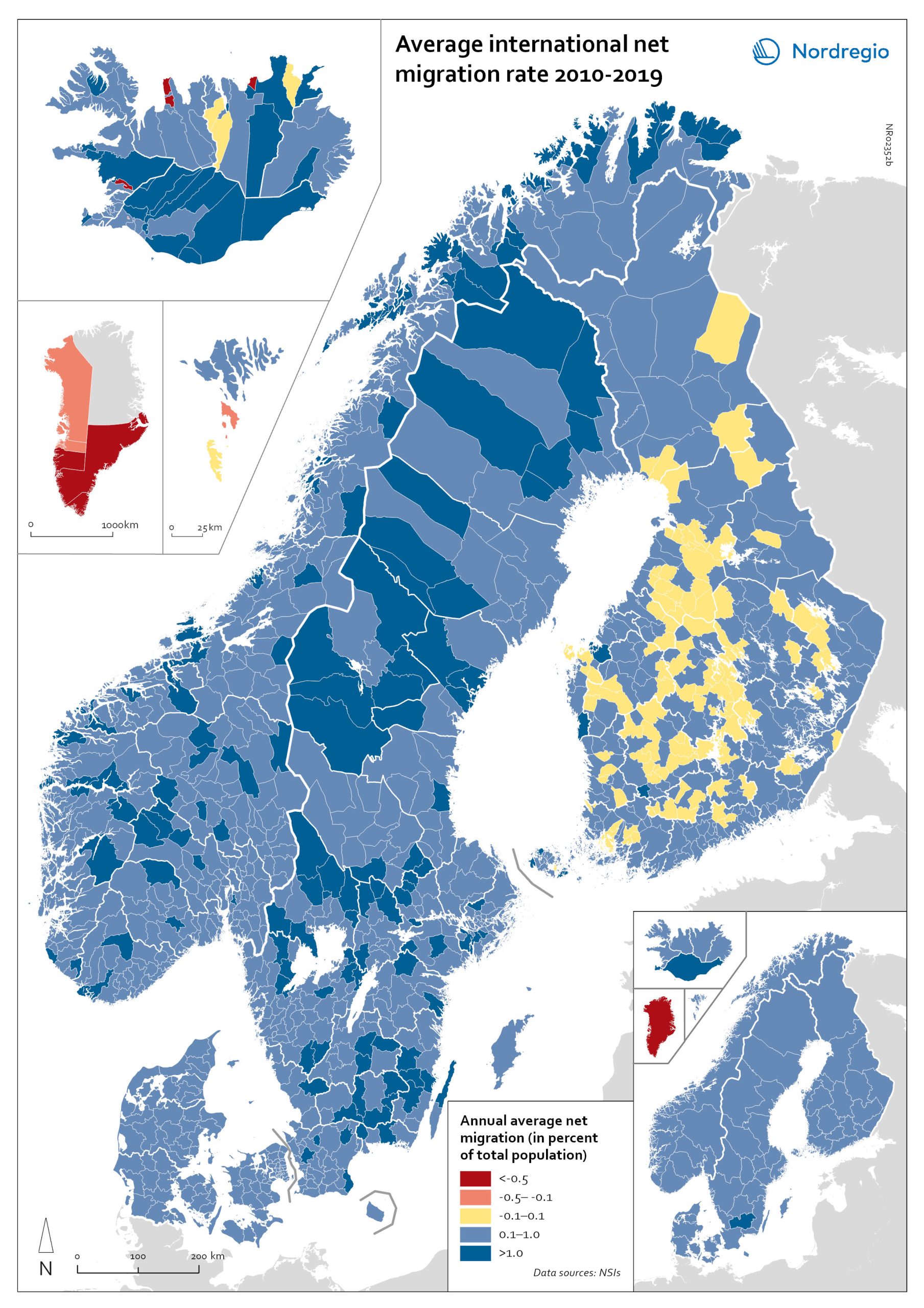
Net international migration rate, 2010–2019
The map shows the annual average international net migration from 2010 to 2019. The map is related to the same map showing net migration in 2020. At regional level, there are only minor changes between the net migration in 2010-2019 and 2020. All regions of Norway, all regions of Sweden except Gotland and Uppsala, and the regions of Österbotten in Finland, Midtjylland in Denmark and Norðurland eystra in Iceland experienced a slight decrease in international net migration I 2020 compared to 2010-2019. There is a more marked increase in net migration in the Faroe Islands, Greenland and the region of Norðurland vestra in Iceland, and a slight increase in the region of Austurland in Iceland. At municipal level, the maps show more changing patterns. In Denmark, Norway and Sweden, several municipalities – both in the capital, intermediate, and rural regions – had lower levels of international net migration in 2020 compared to 2010-2019. In Iceland and Finland, the picture is more balanced, with some municipalities showing a decrease, others an increase. In the Faroe Islands and Greenland, several municipalities/regions had an increase in international net migration.
- 2022 March
- Demography
- Migration
- Nordic Region
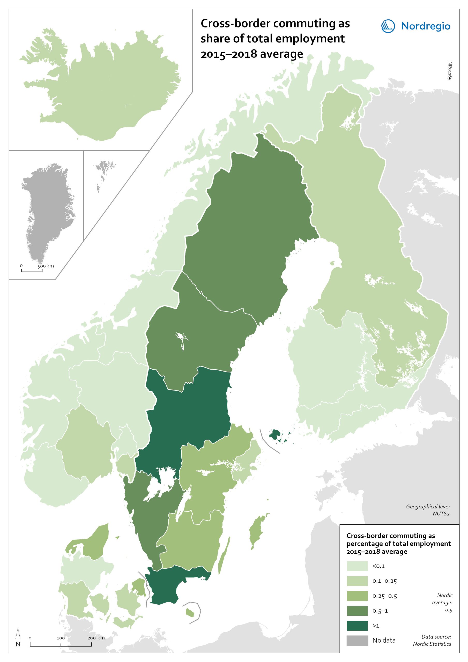
Cross-border commuting as share of employment
The map illustrates the average share of employees who commuted to another Nordic country between between 2015 and 2018 in Nordic regions (NUTS 2). Between 2015 and 2018, an average of approximately 49,000 people held a job in a Nordic country in which they were not residents. This indicates that, on average, 0.5% of the Nordic working-age population commuted to a job in another Nordic country. This is below the EU27 average of 1%, with the highest numbers found in Slovakia (5.1%), Luxembourg (2.8%) and Estonia (2.6%). Some of these people cross borders daily. Others work in another country by means of remote working combined with occasional commuting across borders. Within the Nordic Region, the largest cross-border commuter flows are in the southernmost parts of Sweden, regions in the middle of Sweden and in Åland, where more than 1% of the working population commutes to another Nordic country. However, there may be individual municipalities where cross-border commuting is substantially higher. For example, the employment rate in Årjäng Municipality, Sweden, increases by 15 percentage points when cross-border commuting is taken into account. These municipalities are not reflected on NUTS 2 level when averages are calculated. In terms of absolute numbers in 2015, the highest numbers of commuters were from Sweden: Sydsverige (16,543), Västsverige (7,899) and Norra Mellansverige (6,890). The highest number of commuters from a non-Swedish region were from Denmark’s Hovedstaden (2,583). Due to legislative barriers regarding the exchange of statistical data on cross-border commuting between the Nordic countries, more recent data is not available.
- 2022 March
- Labour force
- Nordic Region
- Transport

Major immigration flows to the Nordic Region from 2010 to 2019
The map shows annual average immigration flows above 3,000 people, and the growing diversity in their countries of origin Sweden and Denmark, in particular, experienced large inflows from non-Nordic countries during the period 2010-2019, with Sweden standing out as the Nordic country with by far the largest immigrant in-flows. A large portion of these arrivals were from war-torn Syria (an annual average of almost 15,000), followed by Poland (approximately 4,500), United Kingdom, Iraq, India and Iran (around 4,000 each). Denmark experienced a smaller number of inflows above 3,000 people, compared to Sweden. The largest non-Nordic inflows to Denmark were around 5,000 people (per sending country) and included migrants from the U.S., Germany, Romania and Poland. For Norway, large non-Nordic in-flows were limited to Lithuania and Poland. Similarly, Finland had only one major inflow, from Estonia.
- 2021 December
- Migration
- Nordic Region
Change in share of biofuels in transport from 2010 to 2018
This map shows change in share of biofuels in final energy consumption in transport in the Nordic Arctic and Baltic Sea Region from 2010 to 2018. Even though a target for greater use of biofuels has been EU policy since the Renewable Energy and Fuel Quality Directives of 2009, development has been slow. The darker shades of blue on the map represent higher increase, and the lighter shades of blue reflect lower increase. The lilac color represent decrease. The Baltic Sea represents a divide in the region, with countries to the north and west experiencing growth in the use of biofuels for transport in recent years. Sweden stands out (16 per cent growth), while the other Nordic countries has experienced more modest increase. In the southern and eastern parts of the region, the use of biofuels for transport has largely stagnated. Total biofuel consumption for transport has risen more than the figure indicates due to an increase in transport use over the period.
- 2021 December
- Arctic
- Baltic Sea Region
- Nordic Region
- Transport
Share of biofuels in transport in 2018
This map shows the share of biofuels in final energy consumption in transport in the Nordic Arctic and Baltic Sea Region in 2018. There has been considerable political support for biofuels and in the EU, this debate has been driven by the aim of reducing dependency on imported fuels. For instance, 10 per cent of transport fuel should be produced from renewable sources. The darker shades on the map represent higher proportions, and the lighter shades reflect lower proportions. As presented by the map, only Sweden (20.7%) had reached the 10 per cent target in the Nordic Arctic and Baltic Region in 2018. Both Finland (8.3%) and Norway (8.3%) were close by the target, while the other countries in the region were still lagging behind, particularly the Baltic countries.
- 2021 December
- Arctic
- Baltic Sea Region
- Nordic Region
- Transport
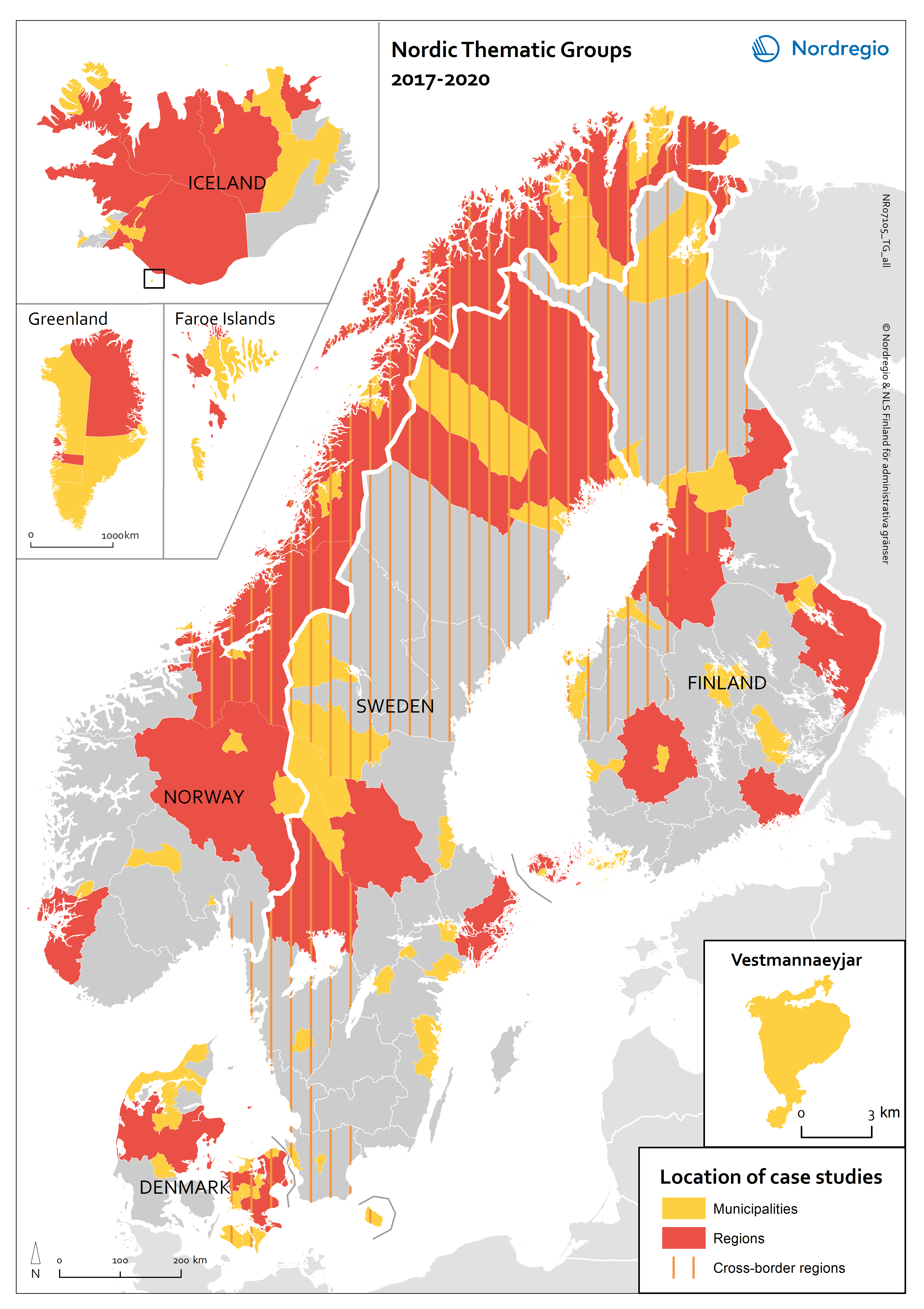
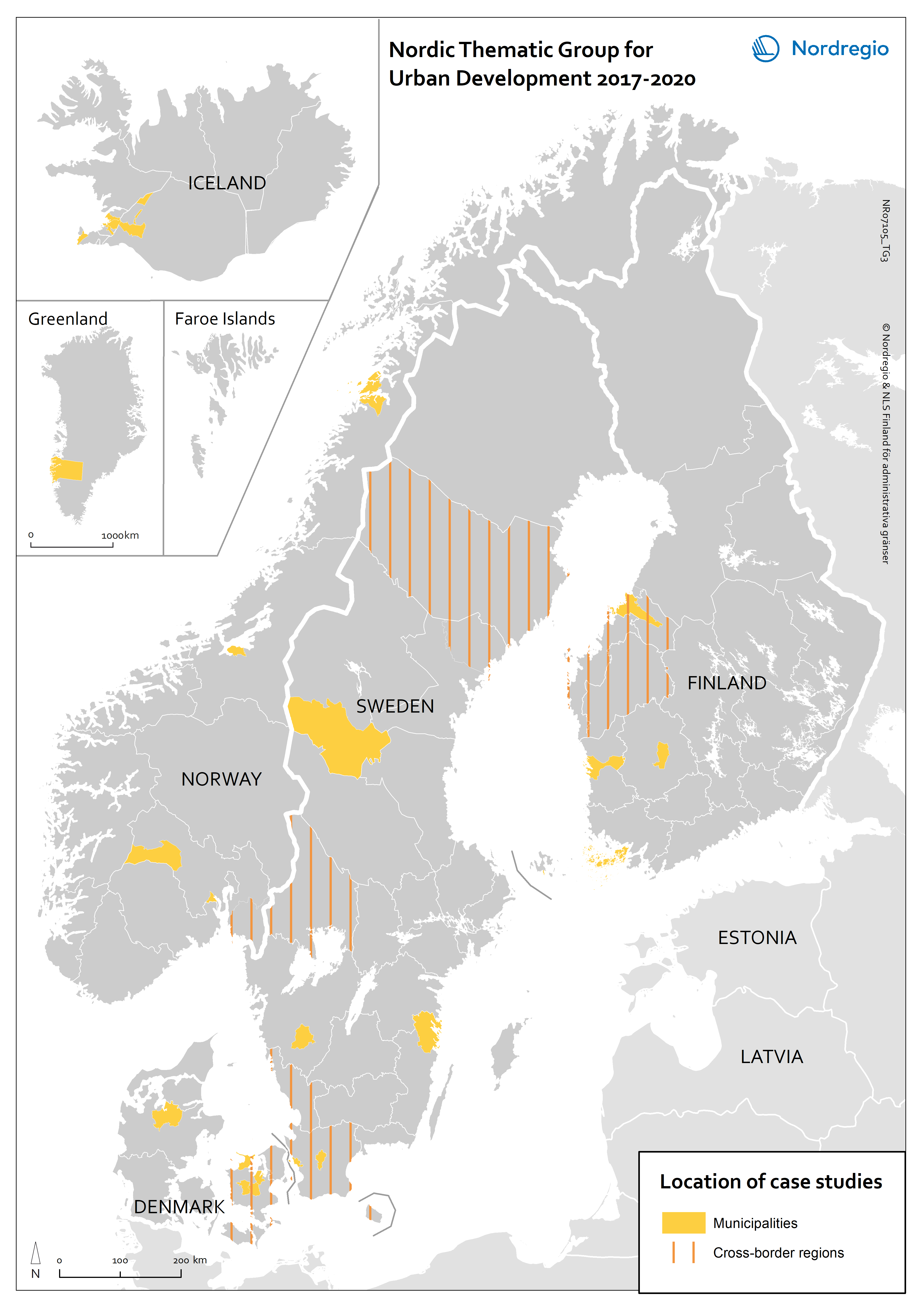
Nordic Thematic Group for Urban Development 2017-2020: location of case studies
This map indicates the geographical areas involved in case studies and more in-depth research but does not cover municipalities and other areas involved in e.g. questionnaires or more general studies.
- 2021 February
- Nordic Region
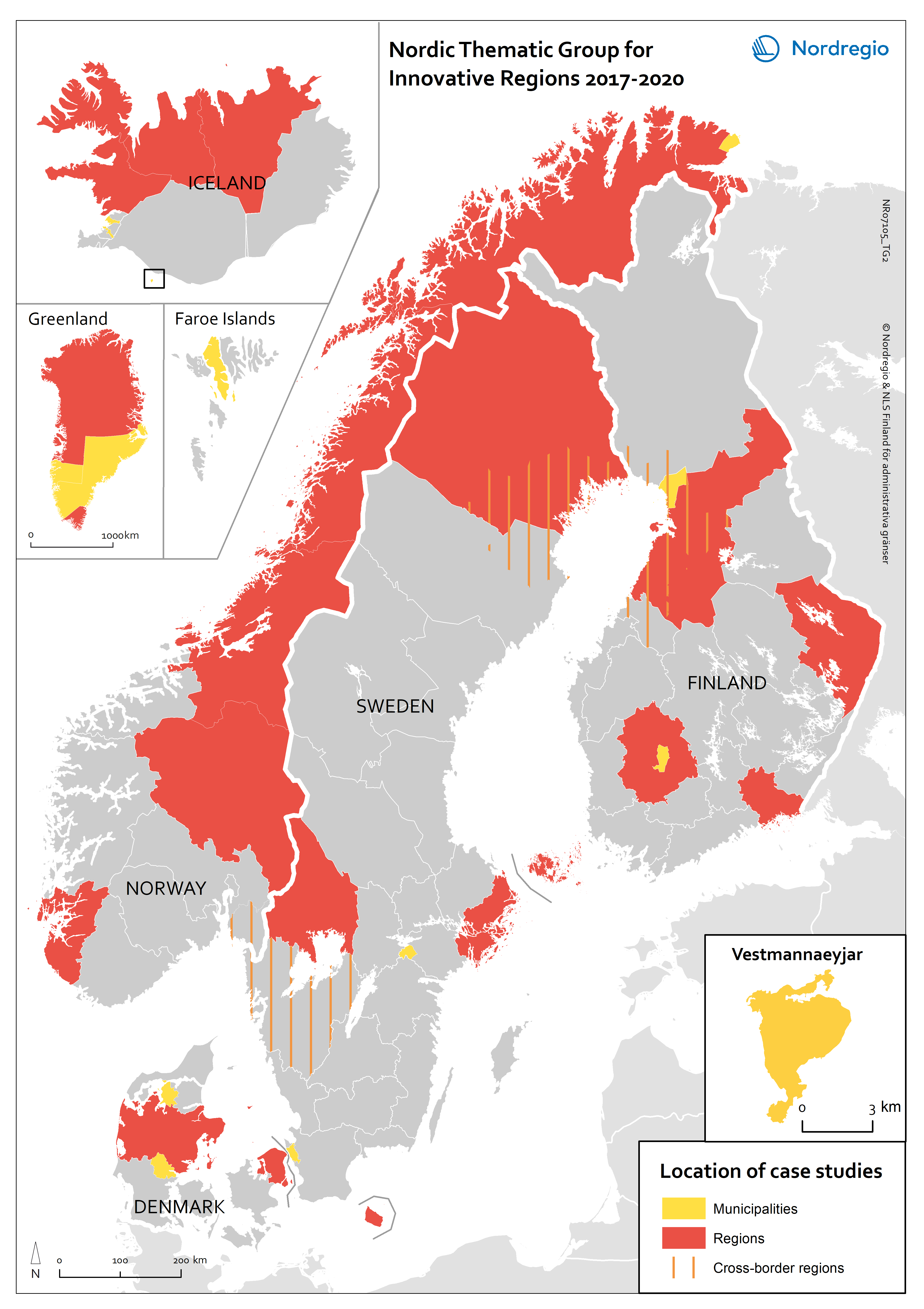
Nordic Thematic Group for Innovative Regions 2017-2020: location of case studies
This map indicates the geographical areas involved in case studies and more in-depth research but does not cover municipalities and other areas involved in e.g. questionnaires or more general studies.
- 2021 February
- Nordic Region
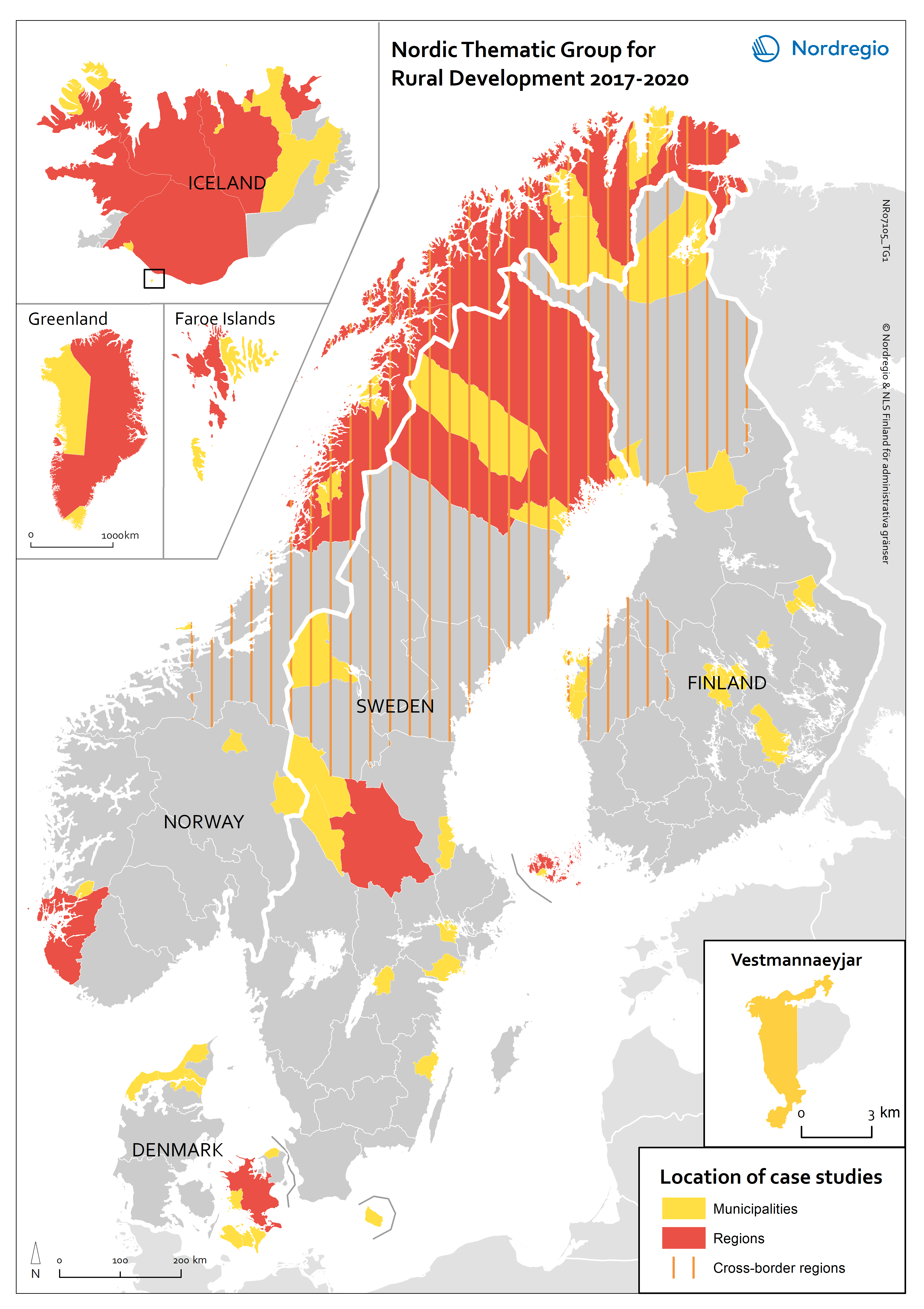
Nordic Thematic Group for Rural Development 2017-2020: location of case studies
This map indicates the geographical areas involved in case studies and more in-depth research but does not cover municipalities and other areas involved in e.g. questionnaires or more general studies.
- 2021 February
- Nordic Region
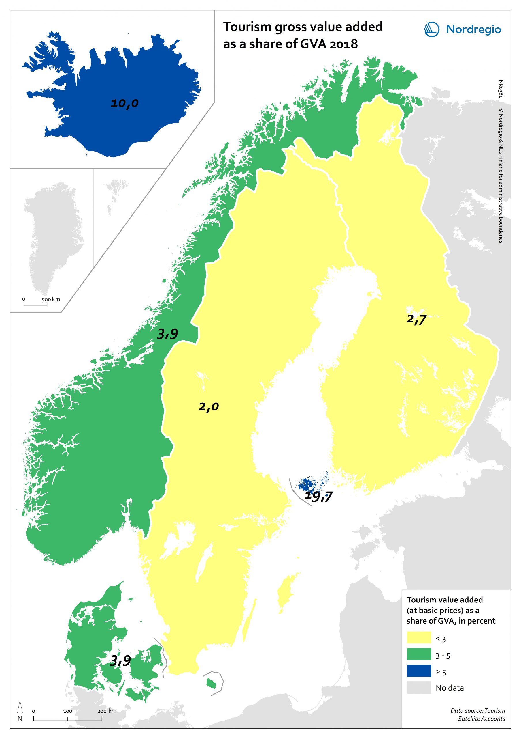
Tourism gross value added as a share of GVA 2018
Tourism gross added value (GVA) corresponds to the part of GVA generated by all industries in contact with visitors. This indicator is measured as a percentage of total GVA at basic prices in 2018 (No data for Greenland and Faroe Islands; data for Finland includes Åland). Data were retrieved from each country’s tourism satellite account. Åland and Iceland stand out as the country or territory where tourism added value accounts for over 10% of the total GVA. For Åland, tourism is so important an industry that added value related to tourism is equivalent to nearly 20% of the total GVA in Åland. The share of tourism related GVA is close to 4% of the total GVA in Norway and Denmark, and lower than 3% in Finland and Sweden.
- 2021 February
- Economy
- Nordic Region
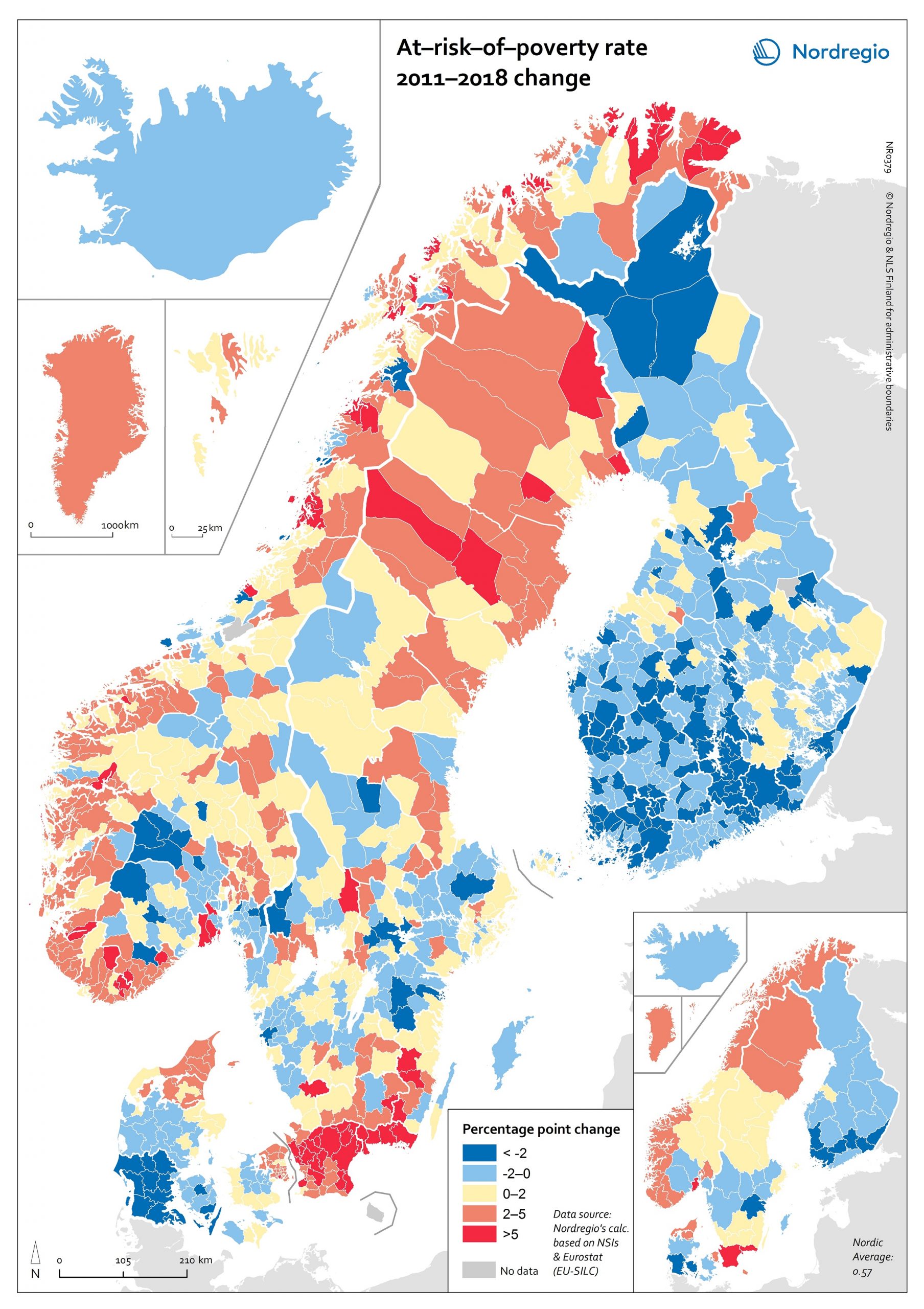
At-risk-of-poverty rate 2011-2018 change
The map shows the “at-risk-of-poverty” (AROP) rate in the Nordic Region. For the period from 2004 to 2018, the AROP rate increased in all Nordic countries except Iceland. This trend was strongest in Sweden. In Finland the AROP rate has been decreasing during the past few years, in line with what has previously been indicated – namely, on account of economic turmoil. This points to one of the weaknesses of using the AROP rate alongside several other measures of inequality. That is, while people have become poorer due to the economic crisis, the at-risk-of-poverty rate has paradoxically gone down. In addition, the AROP rate for Finland is higher in 2018 than it was in 2004. Looking at these trends on a regional level over a period of time (between 2011 and 2018), we can see that the AROP rate has decreased in almost all areas of Finland, whereas the pattern is rath er more varied in the other Nordic countries (we can also see a cohesive area in the south of Denmark where the AROP rate has decreased.) Again, Sweden has the most regions displaying increases in the AROP rate. Finland and Sweden contain the largest differences between the regions with the highest and lowest AROP rate. Hence the greatest regional differences are to be found in Sweden and Finland. Sweden also has the highest average AROP rate. About the At-risk-of-poverty The at-risk-of-poverty rate is a common measure of relative poverty and social inclusion. Most notably, it has been used for monitoring the EU2020 goal of inclusive growth. The at-risk-of-poverty rate is normally defined as “the share of people with an equivalised disposable income (after social transfer) below the at-risk-of-poverty threshold, which is set at 60% of the national median equivalised disposable income after social transfer.” (Eurostat). The indicator is…
- 2020 October
- Demography
- Economy
- Nordic Region
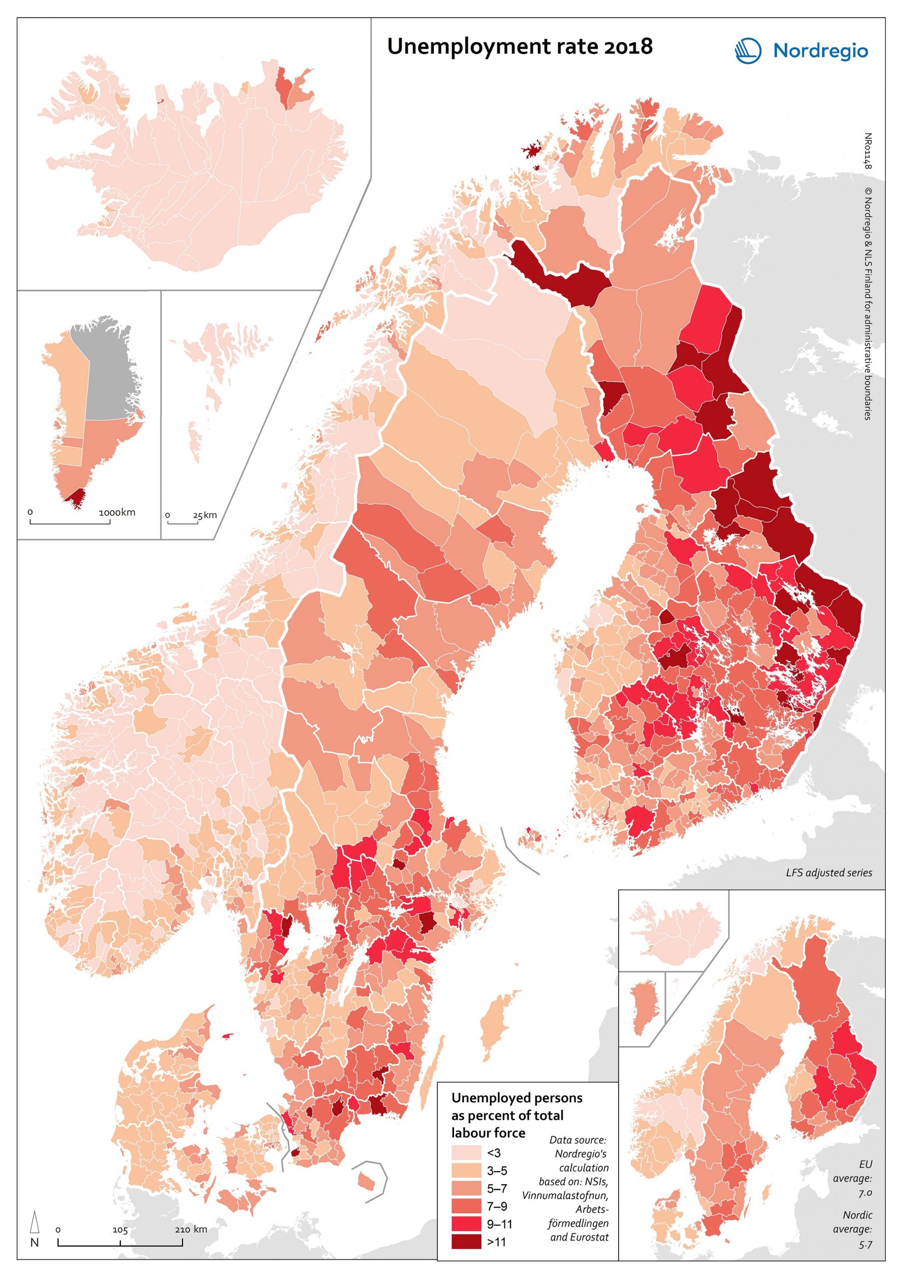
Unemployment rate 2018
The map shows the unemployment rate in the Nordic counties at the municipal level in 2018. Unemployment is measured as the total number of unemployed (i.e. people who were not in employment, but seeking job and available to take up an employment) as share of the total workforce (i.e. employed plus unemployed). The map is based on data from the labour force survey, which is the official way of measuring unemployment. In order to show the municipal level register data has been used as an allocation key. The lighter shades on the map represent lower levels of unemployment, and the darker shades represent higher levels. The Nordic Region has a low average unemployment rate (5.7%) compared with the EU average (7.0%). There is, however, substantial regional variation, both within and between countries. The lowest unemployment rates are found in Iceland, Norway and the Faroe Islands. The highest rates can be found in Finland (particularly in the east ern municipalities), parts of southern Sweden, and Kujalleq (Greenland). Unemployment rates in Den mark are higher than those found in Iceland and Norway, but lower than those found in Sweden and Finland – with the highest rates found in Nord Jylland. The unemployment rate also varies between population groups. In all Nordic countries, for ex ample, the foreign-born population are more likely to be unemployed than their native-born counter parts, particularly if they were born outside the EU (see Figure 4.5). This trend is most pronounced in Sweden and Finland. It can also be observed throughout the EU, where unemployment for foreign-born persons is more than twice that of the native-born population.
- 2020 October
- Economy
- Labour force
- Nordic Region
