45 Maps

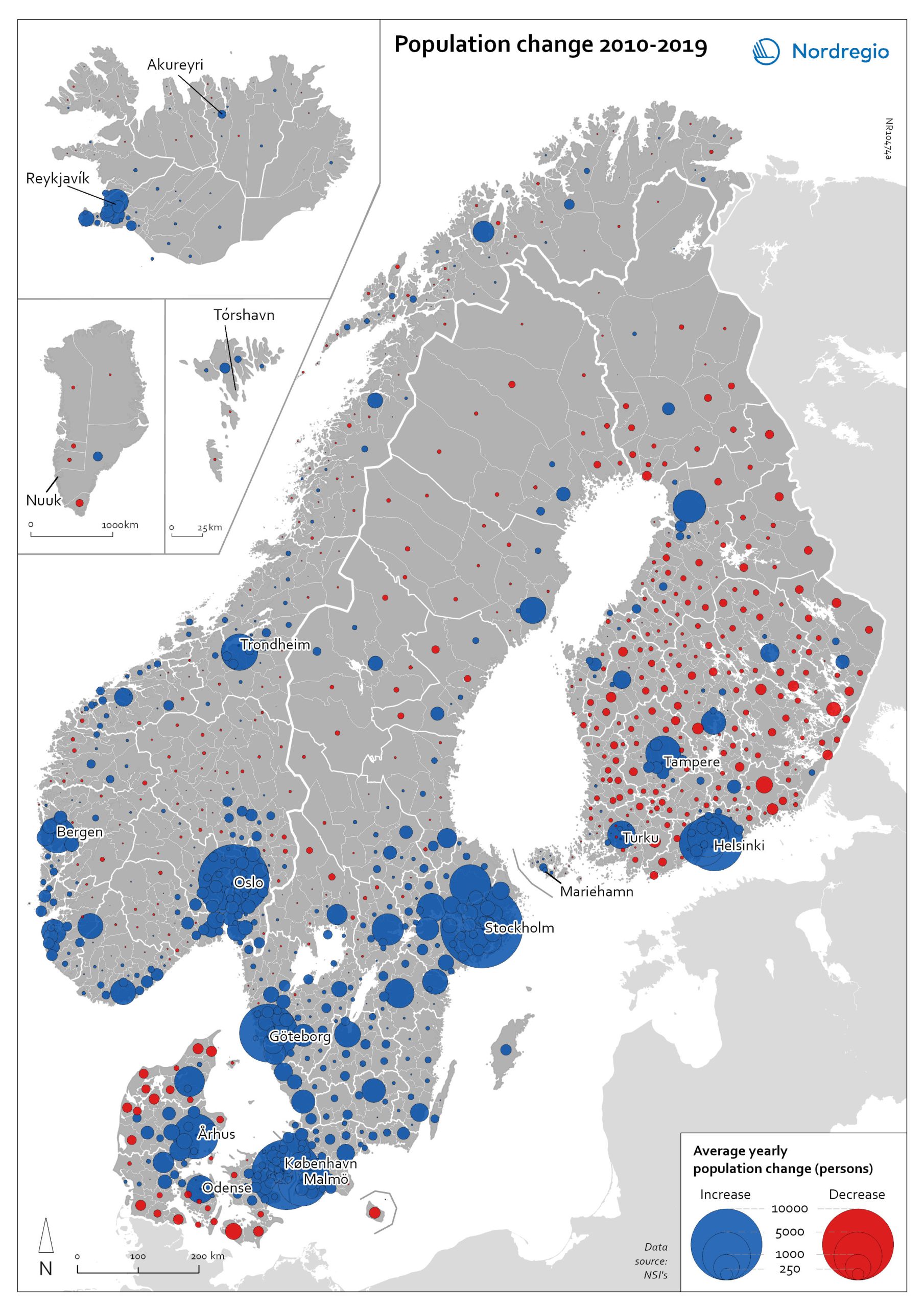
Population change 2010-2019
The map shows the type (positive or negative) and size of population change from 2010 to 2019 in all nordic municipalities. In Finland, Denmark, and Greenland there is a clear pattern of population growth in and around the larger cities and population decline in rural areas. Geographical and administrative differences mean that a much larger number of rural municipalities in Finland are dealing with population decline. Sweden experienced substantial population growth between 2010 and 2019, primarily due to high levels of international immigration. As a result, many rural areas also experienced population growth, particularly in the south of Sweden. However, in the more sparsely populated municipalities in the north of Sweden, the pattern is somewhat similar to that observed in Denmark and Finland, albeit with population decline in lower absolute numbers. Both Iceland and the Faroe Islands experienced substantial growth of their tourism industries within the period. This enabled some rural areas to maintain or even grow their populations. Norway exhibits more balanced population development in general, with a mix of population growth and decline in rural areas throughout the country.
 2022 May
 - Demography
- Migration
- Nordic Region
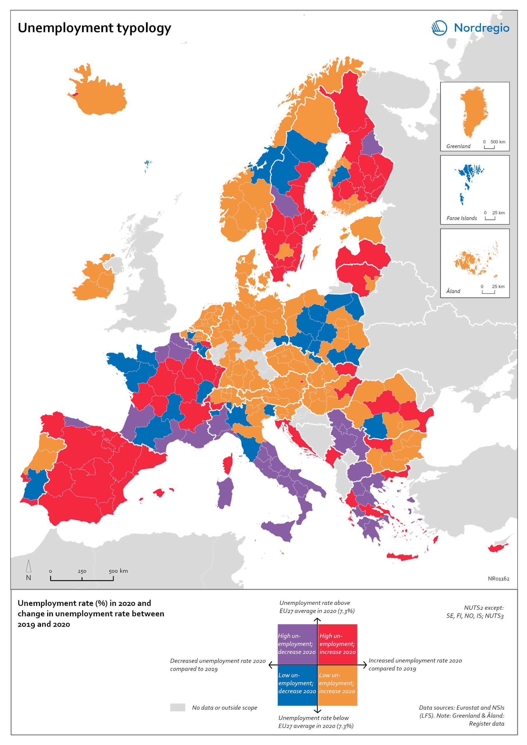
Unemployment typology
The map shows a typology of European regions by combining information on pre-pandemic unemployment rates with unemployment rates in 2020, based on the annual Labour Force Survey (LFS) that is measured in November. On one axis, the typology considers the extent of the change in the unemployment rate between 2019 and 2020. On the other axis, it considers whether the unemployment rate in 2020 was above or below the EU average of 7.3%. Regions are divided into four types based on whether the unemployment rate decreased or increased and how it relates to the EU average. Regions falling into the first type, shown in red on the map, had an increase in the unemployment rate in 2020 as well as an above-average unemployment rate in general in 2020. These regions were most affected by the pandemic. They are mainly found in northern and central parts of Finland, southern and eastern Sweden, the capital area of Iceland, Latvia, Lithuania, Spain and central parts of France. Regions falling into the second type, shown in orange on the map, had an increase in the unemployment rate in 2020 but a below-average unemployment rate in general in 2020. These regions had low pre-pandemic unemployment rates and so were not as badly affected as the red regions, despite the rising unemployment rates. They are located in Denmark, Iceland, Norway, Åland, southern and western Finland, Sweden (Gotland, Jönköping, and Norrbotten), Estonia, Ireland, northern Portugal and central and eastern parts of Europe.
- 2022 March
- Europe
- Labour force
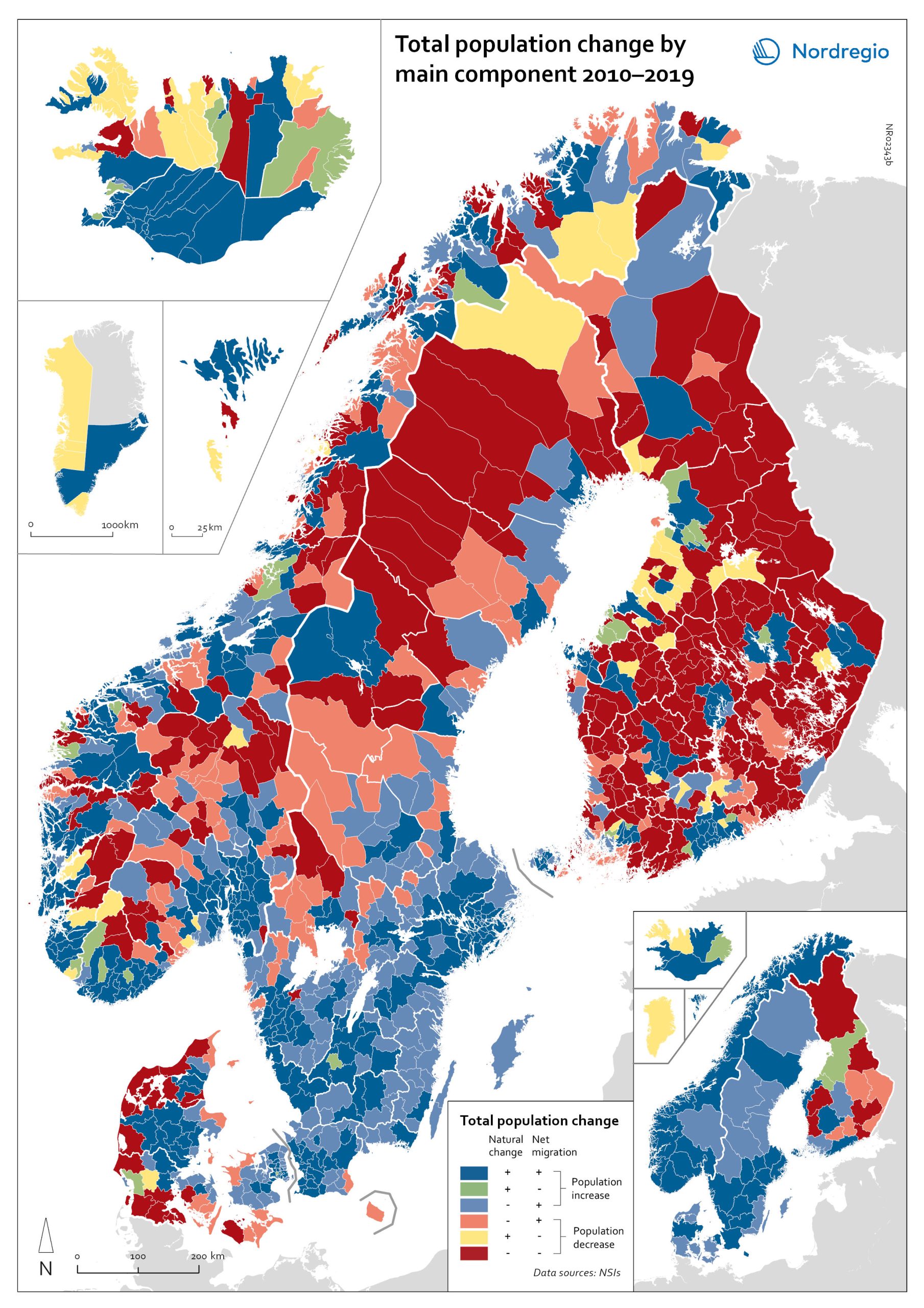
Population change by component 2010-2019
The map shows the population change by component 2010-2019. The map is related to the same map showing regional and municipal patterns in population change by component in 2020. Regions are divided into six classes of population change. Those in shades of blue or green are where the population has increased, and those in shades of red or yellow are where the population has declined. At the regional level (see small inset map), all in Denmark, all in the Faroes, most in southern Norway, southern Sweden, all but one in Iceland, all of Greenland, and a few around the capital in Helsinki had population increases in 2010-2019. Most regions in the north of Norway, Sweden, and Finland had population declines in 2010-2019. Many other regions in southern and eastern Finland also had population declines in 2010-2019, mainly because the country had more deaths than births, a trend that pre-dated the pandemic. In 2020, there were many more regions in red where populations were declining due to both natural decrease and net out-migration. At the municipal level, a more varied pattern emerges, with municipalities having quite different trends than the regions of which they form part. Many regions in western Denmark are declining because of negative natural change and outmigration. Many smaller municipalities in Norway and Sweden saw population decline from both negative natural increase and out-migration despite their regions increasing their populations. Many smaller municipalities in Finland outside the three big cities of Helsinki, Turku, and Tampere also saw population decline from both components. A similar pattern took place at the municipal level in 2020 of there being many more regions in red than in the previous decade.
- 2022 March
- Demography
- Migration
- Nordic Region
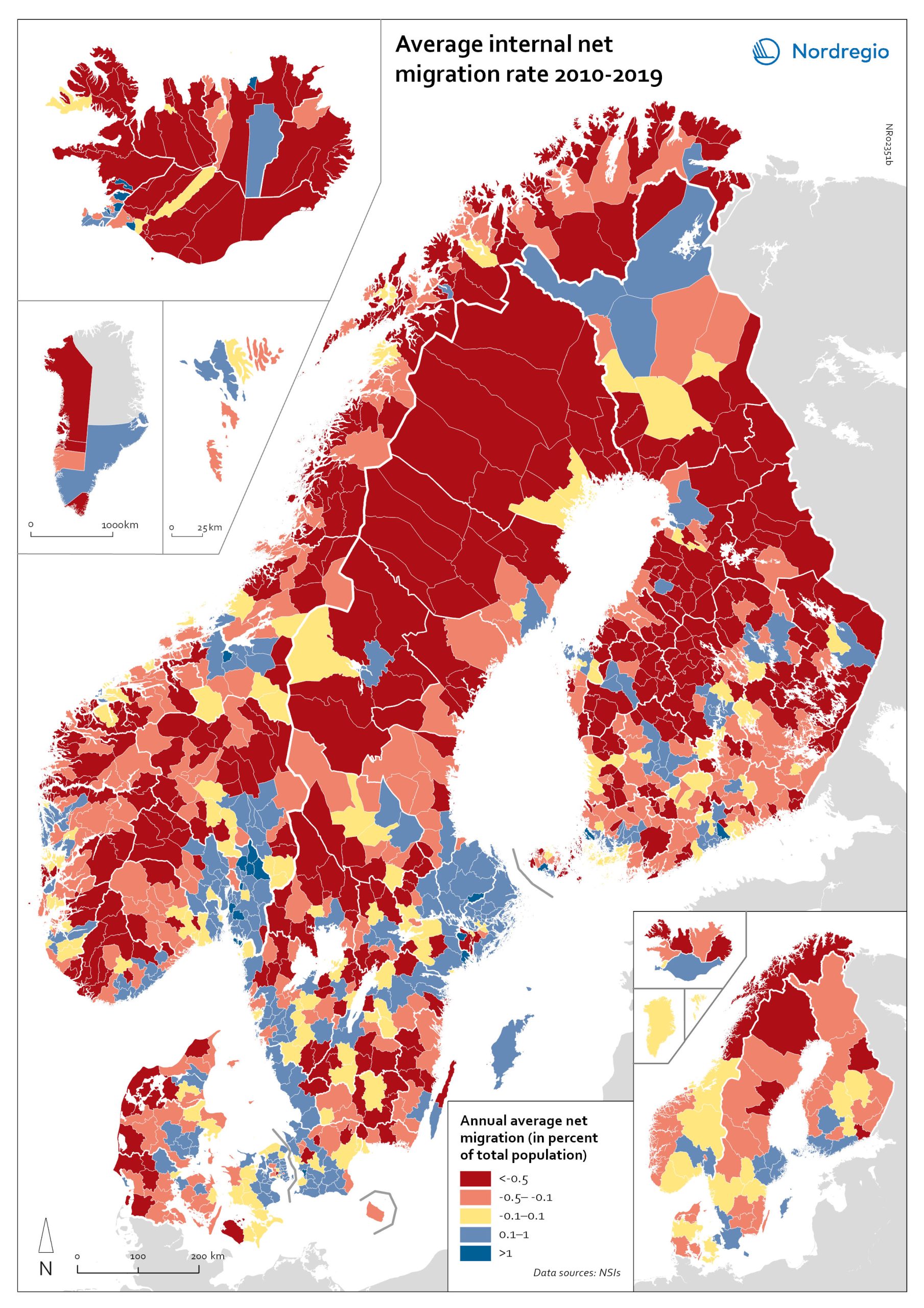
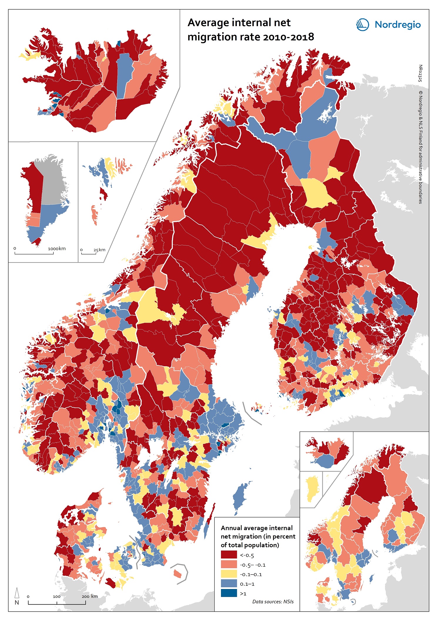
Net internal migration rate, 2010-2019
The map shows the annual average internal net migration in 2010-2019. The map is related to the same map showing net internal migration in 2020. The maps show several interesting patterns, suggesting that there may be an increasing trend towards urban-to-rural countermigration in all the five Nordic countries because of the pandemic. In other words, there are several rural municipalities – both in sparsely populated areas and areas close to major cities – that have experienced considerable increases in internal net migration. In Finland, for instance, there are several municipalities in Lapland that attracted return migrants to a considerable degree in 2020 (e.g., Kolari, Salla, and Savukoski). Swedish municipalities with increasing internal net migration include municipalities in both remote rural regions (e.g., Åre) and municipalities in the vicinity of major cities (e.g., Trosa, Upplands-Bro, Lekeberg, and Österåker). In Iceland, there are several remote municipalities that have experienced a rapid transformation from a strong outflow to an inflow of internal migration (e.g., Ásahreppur, Tálknafjarðarhreppurand, and Fljótsdalshreppur). In Denmark and Norway, there are also several rural municipalities with increasing internal net migration (e.g., Christiansø in Denmark), even if the patterns are somewhat more restrained compared to the other Nordic countries. Interestingly, several municipalities in capital regions are experiencing a steep decrease in internal migration (e.g., Helsinki, Espoo, Copenhagen and Stockholm). At regional level, such decreases are noted in the capital regions of Copenhagen, Reykjavík and Stockholm. At the same time, the rural regions of Jämtland, Kalmar, Sjælland, Nordjylland, Norðurland vestra, Norðurland eystra and Kainuu recorded increases in internal net migration. While some of the evolving patterns of counterurbanisation were noted before 2020 for the 30–40 age group, these trends seem to have been strengthened by the pandemic. In addition to return migration, there may be a larger share of young adults who…
- 2022 March
- Demography
- Migration
- Nordic Region
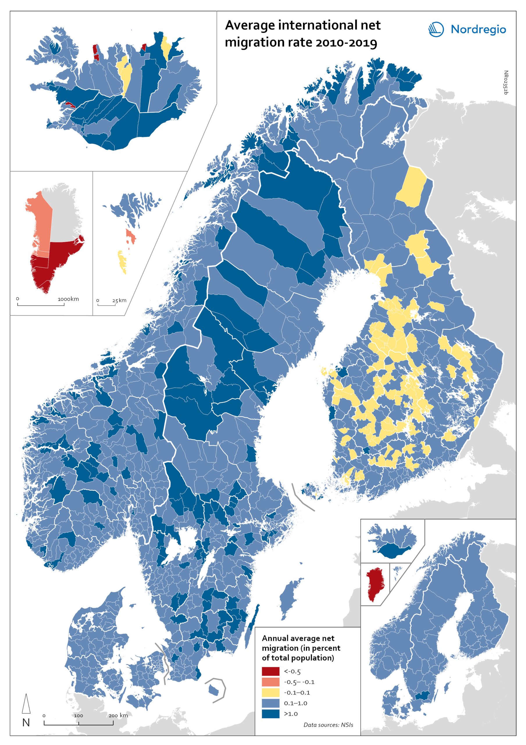
Net international migration rate, 2010–2019
The map shows the annual average international net migration from 2010 to 2019. The map is related to the same map showing net migration in 2020. At regional level, there are only minor changes between the net migration in 2010-2019 and 2020. All regions of Norway, all regions of Sweden except Gotland and Uppsala, and the regions of Österbotten in Finland, Midtjylland in Denmark and Norðurland eystra in Iceland experienced a slight decrease in international net migration I 2020 compared to 2010-2019. There is a more marked increase in net migration in the Faroe Islands, Greenland and the region of Norðurland vestra in Iceland, and a slight increase in the region of Austurland in Iceland. At municipal level, the maps show more changing patterns. In Denmark, Norway and Sweden, several municipalities – both in the capital, intermediate, and rural regions – had lower levels of international net migration in 2020 compared to 2010-2019. In Iceland and Finland, the picture is more balanced, with some municipalities showing a decrease, others an increase. In the Faroe Islands and Greenland, several municipalities/regions had an increase in international net migration.
- 2022 March
- Demography
- Migration
- Nordic Region
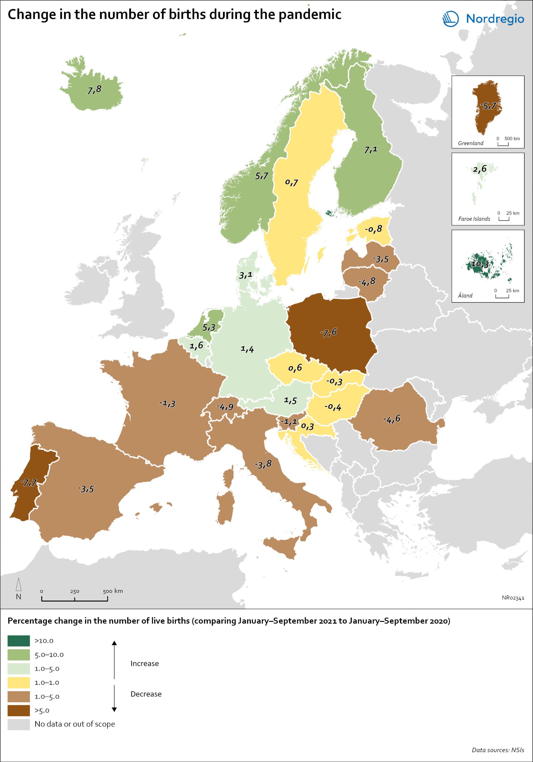
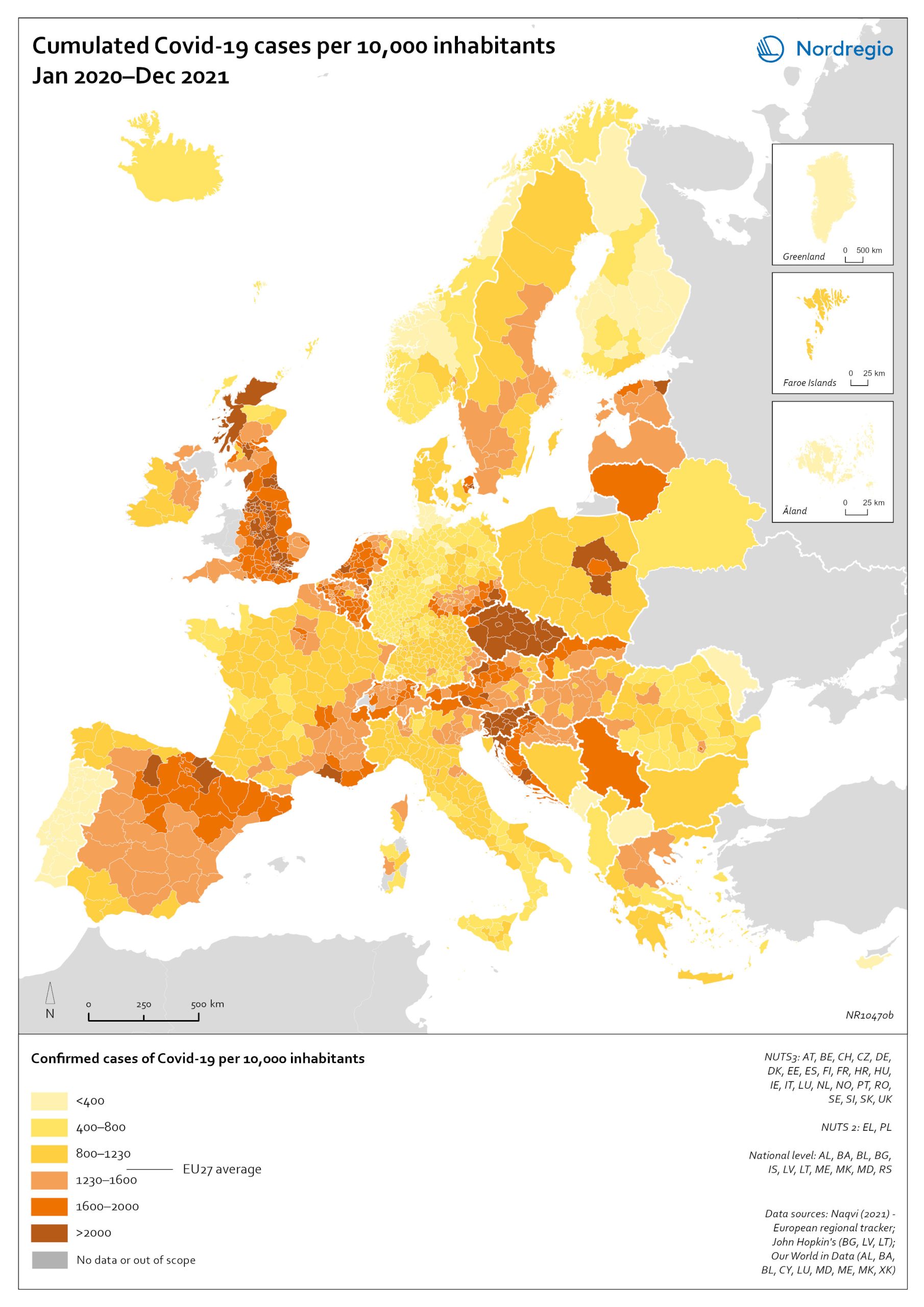
Change in the number of births in Europe
The map shows the number of births during the first nine months of 2021 (January to September) compared to the number of births during the same months in 2020. The babies born during the first nine months of 2021 were conceived between the spring and winter of 2020 when the first waves of the pandemic affected Europe. Babies born during the first nine months of 2020 were conceived in 2019 (i.e., before the pandemic). The map therefore compares the number of births conceived before and during the pandemic. At the time of writing, it seems as if both baby boom and baby bust predictions have been correct, with developments playing out differently across countries. In many Southern and Eastern European countries, such as Spain, Italy or Romania, the number of births declined by more than 1% during the first nine months of 2021. In Portugal and Poland, but also Greenland, drops in the number of births were particularly sharp with more than 5% fewer babies born in 2021. In several of these “baby bust” countries, these decreases in fertility came on top of already low fertility rates. Spain, Italy, Portugal and Poland, for instance, all already had a total fertility rate (TFR) of less than 1.5 children per woman before the crisis. These values are substantially below the so-called ‘replacement ratio’ of 2.1 children per woman, which is necessary to maintain population size. In these countries, existing demographic challenges have thus been aggravated during the pandemic.
- 2022 March
- Demography
- Europe
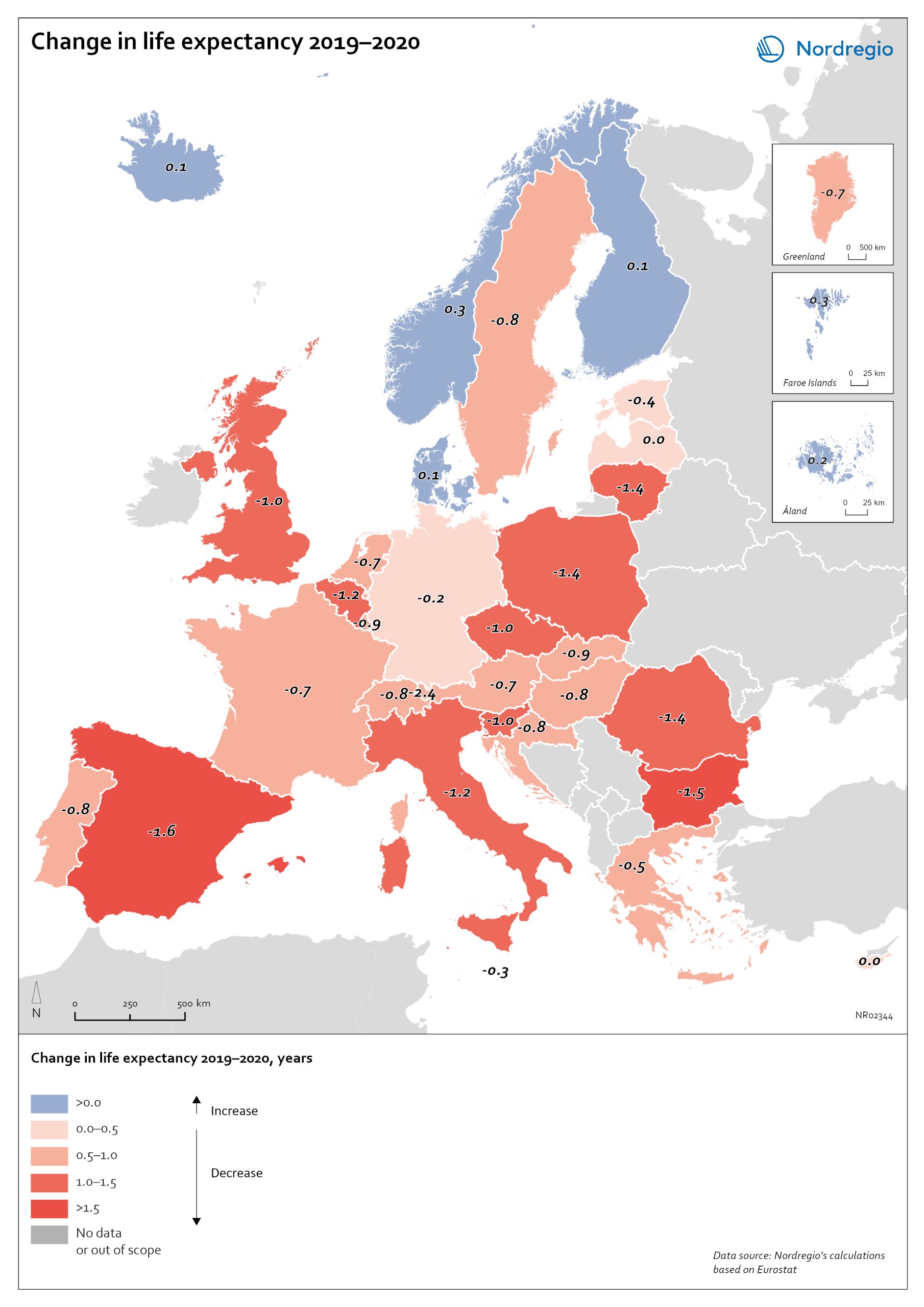
Change in life expectancy 2019–2020 by country in Europe
The excess mortality has affected overall life expectancy at birth across Europe. In 2019, prior to the start of the pandemic, Spain, Switzerland, and Italy had the highest life expectancy in Europe, followed closely by Sweden, Iceland, France, and Norway. Finland and Denmark had slightly lower levels but were still at or above the EU average (Eurostat, 2021). Life expectancy across the EU as a whole and in nearly all other countries has been steadily increasing for decades. Declines in life expectancy are rare, but that is indeed what happened in many countries in Europe during the pandemic in 2020. One study of upper-middle and high-income countries showed that life expectancy declined in 31 of 37 countries in 2020. The only countries where life expectancy did not decline were New Zealand, Taiwan, Iceland, South Korea, Denmark and Norway. The largest falls were in Russia and the United States. The high excess mortality in Sweden in 2020 has had an impact on life expectancy. In Iceland, Norway, Finland, Denmark and the Faroe Islands, life expectancy went up for both sexes in 2020 (data not yet available for Greenland and Åland). In Sweden, life expectancy fell by 0.7 years for males from 81.3 years to 80.6 and for females by 0.4 years from 84.7 to 84.3 years. The steeper decline in life expectancy for males is consistent with the larger number of excess deaths among males. Thus, compared to other Nordic countries, the adverse mortality impact of the pandemic has been greater in Sweden. However, when comparing Sweden to the rest of Europe, it is the Nordic countries, other than Sweden, which are exceptional. The trend among countries in Europe is for a fall in life expectancy in 2020. The largest declines were in countries in southern and eastern Europe. Italy and…
- 2022 March
- Demography
- Europe

Major immigration flows to the Nordic Region from 2010 to 2019
The map shows annual average immigration flows above 3,000 people, and the growing diversity in their countries of origin Sweden and Denmark, in particular, experienced large inflows from non-Nordic countries during the period 2010-2019, with Sweden standing out as the Nordic country with by far the largest immigrant in-flows. A large portion of these arrivals were from war-torn Syria (an annual average of almost 15,000), followed by Poland (approximately 4,500), United Kingdom, Iraq, India and Iran (around 4,000 each). Denmark experienced a smaller number of inflows above 3,000 people, compared to Sweden. The largest non-Nordic inflows to Denmark were around 5,000 people (per sending country) and included migrants from the U.S., Germany, Romania and Poland. For Norway, large non-Nordic in-flows were limited to Lithuania and Poland. Similarly, Finland had only one major inflow, from Estonia.
- 2021 December
- Migration
- Nordic Region
Change in share of biofuels in transport from 2010 to 2018
This map shows change in share of biofuels in final energy consumption in transport in the Nordic Arctic and Baltic Sea Region from 2010 to 2018. Even though a target for greater use of biofuels has been EU policy since the Renewable Energy and Fuel Quality Directives of 2009, development has been slow. The darker shades of blue on the map represent higher increase, and the lighter shades of blue reflect lower increase. The lilac color represent decrease. The Baltic Sea represents a divide in the region, with countries to the north and west experiencing growth in the use of biofuels for transport in recent years. Sweden stands out (16 per cent growth), while the other Nordic countries has experienced more modest increase. In the southern and eastern parts of the region, the use of biofuels for transport has largely stagnated. Total biofuel consumption for transport has risen more than the figure indicates due to an increase in transport use over the period.
- 2021 December
- Arctic
- Baltic Sea Region
- Nordic Region
- Transport
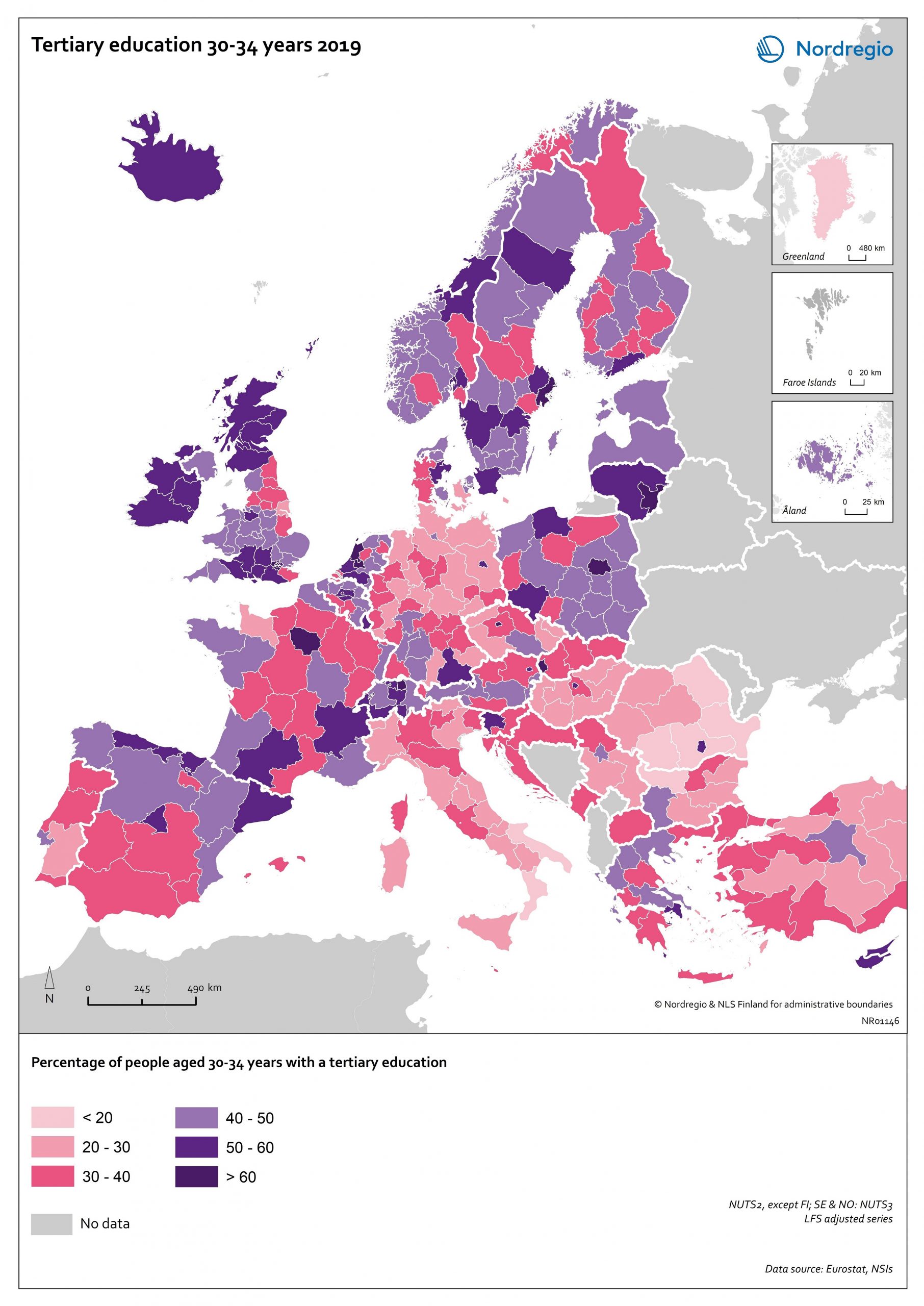
Tertiary education attainment level of 30- to 34-year-olds 2019
The map shows the proportion of the population aged 30-34 years old, who had a tertiary education at the European level in 2019. Purple shades indicate higher proportions, and pinkish shades reflect lower proportions. It is common to show the education attainment for the age group 30-34 since it is an age group where most people have finalised their studies. The focus on this age group makes it easier to see recent trends and outcomes of policies. Overall, over 40% of Europeans aged 30-34 years old had a tertiary education in 2019. Young people in the Nordic countries are among the most educated, with approximately half of 30 to 34-year-olds achieving a tertiary education across all Nordic countries. The highest proportions can be found in the capital regions. Stockholm is particularly noteworthy, with over 60% of 30 to 34-year-olds having had a tertiary education. Regions with prominent universities also stand out – for example, Skåne, Uppsala, Västerbotten and Västra Götaland (Sweden), Trøndelag (Norway) and Østjylland (Denmark).
- 2020 October
- Baltic Sea Region
- Demography
- Europe
- Nordic Region
- Others
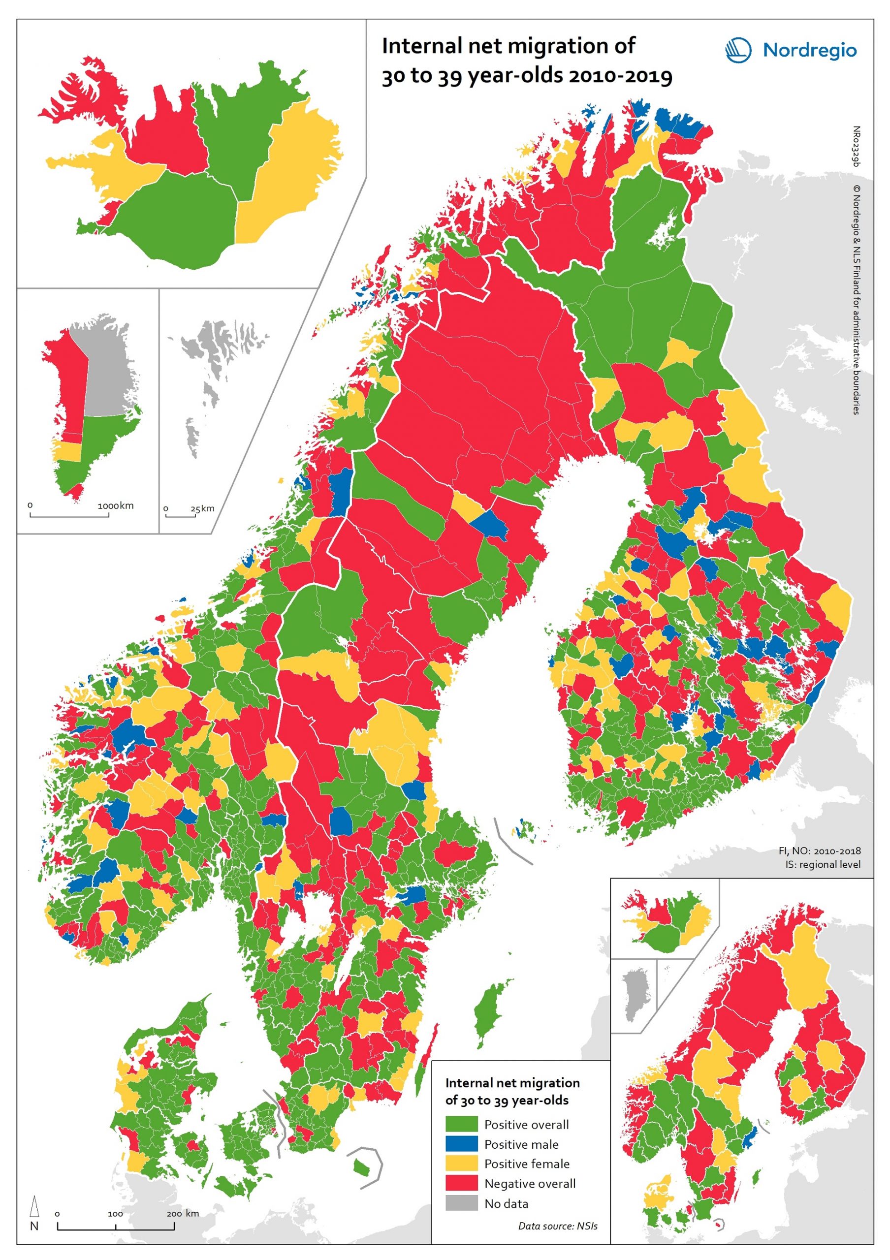
Internal net migration of 30 to 39 years-of-age, by gender, in 2010-2019
This map shows a typology that divides the Nordic municipalities and regions into four migration categories: positive net migration for both males and females (green on the map), positive male net migration (blue on the map), positive female net migration (yellow on the map), and negative net migration for both males and females (red on the map). These migration flows on 30 to 39-year-olds are of particular interest since it is often assumed that the future of rural regions is dependent upon their capability both to retain their populations and to attract newcomers, returning residents and second home owners. In this context, the map provides a rather positive picture, because a considerable proportion of rural municipalities have experienced positive net migration among females, males, or both sexes across all the Nordic countries. Even so, there is negative net migration among both females and males in many municipalities in northern Sweden, north-eastern Norway and eastern Finland, in addition to several inland municipalities within these countries. Interestingly, there is negative net migration among both sexes across all the capital city municipalities of the Nordic Region. According to the regional map, the capital city regions of Denmark, Iceland and Norway all experienced negative net migration of young people aged 30-39 years between 2010 and 2019. The capital city region of Sweden experienced positive net migration of males and negative net migration of females while the capital city region of Finland experienced positive net migration overall. Despite the majority of peripheral regions experiencing negative net migration of 30 to 39-year-olds during the time period studied, there are also several interesting examples of rural regions which experienced positive female net migration, for example Nordjylland (Denmark), Pohjois-Savo (Finland), Austurland (Iceland), Møre og Romsdal (Norway), and Jämtland (Sweden).
- 2020 October
- Demography
- Migration
- Nordic Region
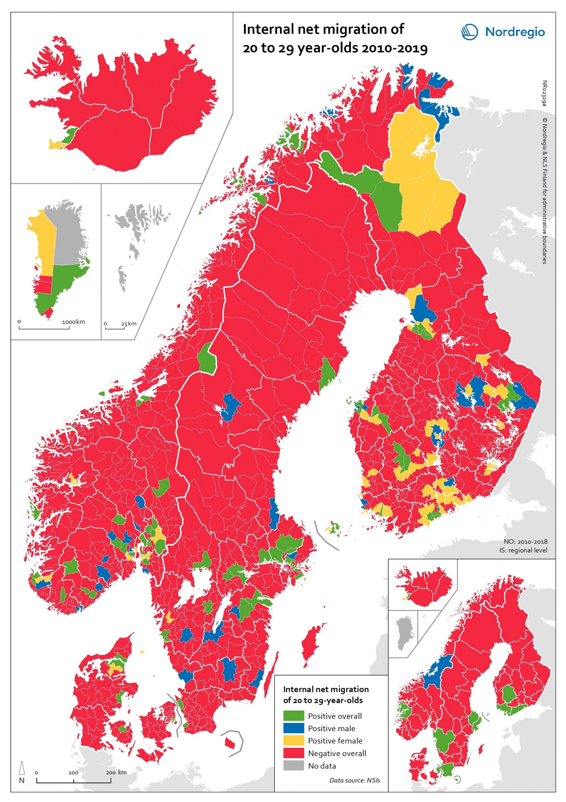
Internal net migration of 20 to 29 years-of-age, by gender, in 2010-2019
This map shows a typology that divides the Nordic municipalities and regions into four migration categories: positive net migration for both males and females (green on the map), positive male net migration (blue on the map), positive female net migration (yellow on the map), and negative net migration for both males and females (red on the map). These migration flows of 20 to 29-year-olds are of interest since there is a particularly high level of internal migration among young adults across the Nordic countries compared to other EU countries. While the map shows that the great majority of municipalities experience negative net migration of young adults in favour of a few functional urban areas and some larger towns, it is possible to observe a number of exceptions to this general rule. The rural municipalities of Utsira, Moskenes, Valle, Smøla, Ballangen and Lierne in Norway have the highest positive net migration rates both for men and women. There are also positive net migration rates for males and females in the peripheral municipalities of Jomala, Kittilä, Lemland and Finström in Finland and Åland. There is positive male net migration but negative female net migration in Gratangen, Loppa, Gamvik, Drangedal and a few other Norwegian rural municipalities, plus Mariehamn in Åland, while several municipalities in remote areas of Finland have positive female net migration but negative male net migration. Some of these patterns may be related to specialised local labour markets, such as fisheries in Loppa, or recreational tourism in Kittilä. In general, the pattern of net migration among young adults is more diverse in Finland (where 72.0% of all municipalities have negative net migration), compared with 84.6% in Norway, 88.9% in Denmark and 89.0% in Sweden. However, it is important to remember that Danish, Finnish and Norwegian municipalities are smaller in size…
- 2020 October
- Demography
- Migration
- Nordic Region
Internal net migration as percentage of population 2010–2018
This map shows annual average internal net migration rate at the municipal and regional level in 2010-2018. The map shows the percentage change from internal migration for the period 2010 to 2018. Internal or domestic migration refers to migration between municipalities and regions within the same country. The blue areas on the map show municipalities/regions with positive internal net migration (i.e. more people arriving than departing), the red areas show municipalities/regions with negative internal net migration (i.e. more people departing than arriving) and the yellow areas show municipalities/regions with balanced internal net migration rates (i.e. comparable numbers of people arriving and departing). The trend revealed is that internal migration movements are directed towards larger city regions, with many rural periphery regions losing people. The loss of people in some of these regions is felt especially acutely because of the age selectivity of migration, with young people leaving in large numbers, accelerating the ageing of the population structure in regions with high out-migration. Read the digital publication here.
- 2020 February
- Demography
- Migration
- Nordic Region
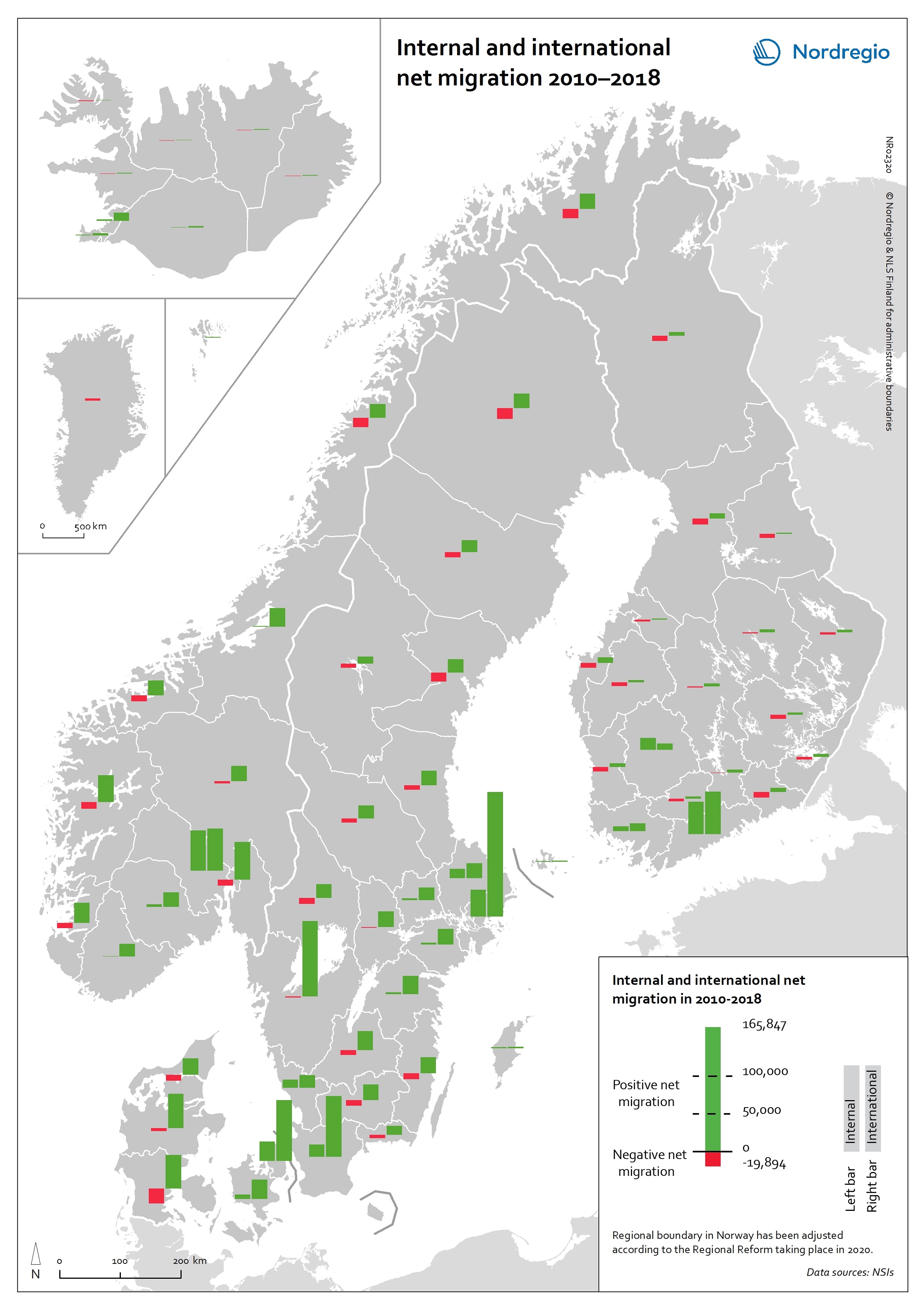
Internal and international net migration 2010-2018
This map shows internal and international net migration in 2010-2018. The map shows the combination of domestic migration (left-hand bar) and international migration (right-hand bar), with red indicating net out-migration and green indicating net in-migration, for the 66 regions within the Nordic Region in the period 2010 to 2018. The size of the bar indicates the size of the net flows. All regions have had positive international migration since 2010, which is not surprising given the size of the international migration flows into the Nordic Region in recent years. Overall in the Nordic Region, there were either domestic migration losses and international migration gains or gains from people moving both from elsewhere in the country and from abroad. The gains from international migration far exceeded those of internal migration in almost all regions that experienced net gains from both streams. Due to these different patterns of internal and international migration, nearly all regions are becoming much more diverse in terms of the size of foreign-born populations. Read the digital publication here.
- 2020 February
- Demography
- Migration
- Nordic Region
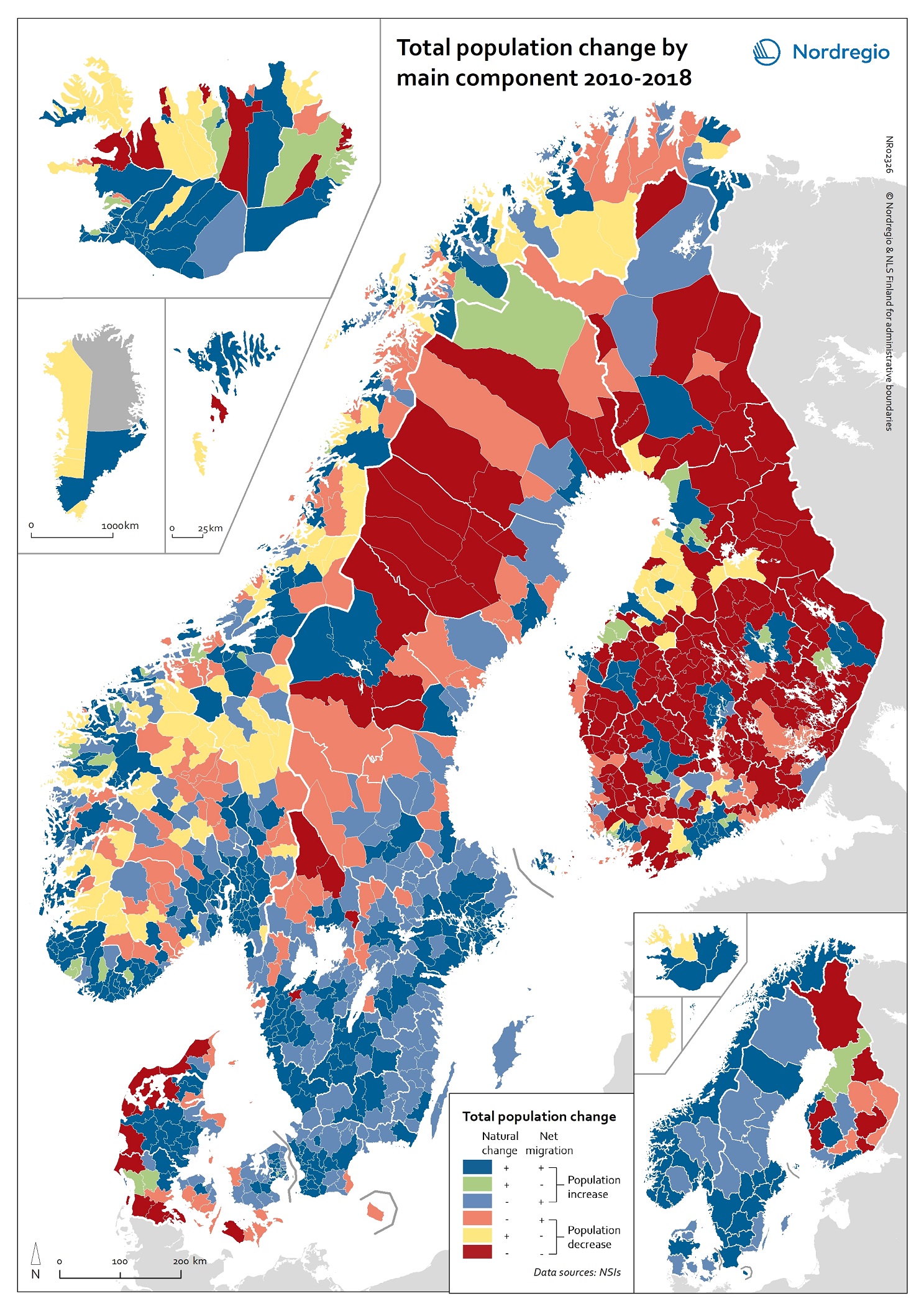
Total population change by main component 2010-2018
This map shows total population change by main component at the municipal and regional level in 2010-2018. The two components of population change are natural change and net migration. As the map shows, all regions in Denmark, Norway and Sweden experienced population increase due to either a combination of natural increase and net migration or through net migration alone between 2010-2018. In Iceland, all regions experienced both positive natural increase and positive net migration, except for Vestfirðir and Norðurland vestra, which experienced population decline despite experiencing more births than deaths over the period. The regional picture in Finland was more varied, with population decline most pronounced in the east and the north. At the municipal level, the highest overall population growth can be found mostly in the capital regions and bigger cities (e.g. Tampere and Turku in Finland), Central Jutland (Denmark), coastal areas of Norway, southern Iceland, southern Sweden, the northern municipalities of the Faroe Islands and Sermersooq Municipality (Greenland), which contains the capital of Nuuk. The highest overall population decline can be found mostly in the western and southern parts of Denmark, the majority of Finnish municipalities and most inland municipalities in northern Sweden. While the map shows a snapshot of population change for one decade, these trends of population increase in urban regions and municipalities and decline and ageing in periphery regions and municipalities have been underway for some time and are expected to continue into the foreseeable future. Read the digital publication here.
- 2020 February
- Demography
- Migration
- Nordic Region
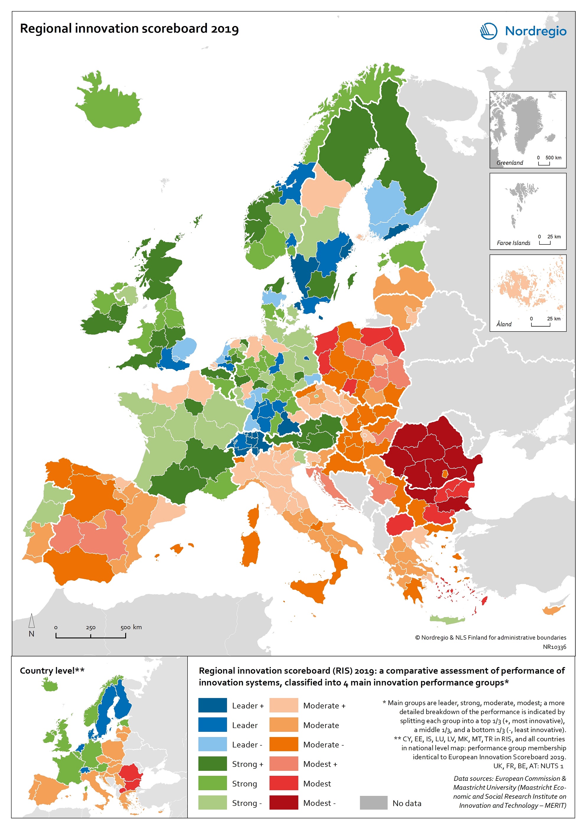
Regional innovation scoreboard 2019
This map shows the regional innovation scoreboard (RIS) in the European regions in 2019. The small map shows the innovation scoreboard at national level. The index shows the performance of innovation systems, classified into four main performance groups (leader, strong, moderate and modest). The European innovation scoreboard provides a comparative assessment of the research and innovation performance in European countries. It assesses the relative strengths and weaknesses of national innovation systems and helps countries identify areas they need to address. The Regional innovation scoreboard (RIS), a regional extension of the European innovation scoreboard, assesses the innovation performance of European regions on a limited number of indicators. The RIS 2019 covers 238 regions across 23 EU countries, as well as Norway, Serbia and Switzerland. Cyprus, Estonia, Latvia, Luxembourg and Malta are also included at country level. The RIS 2019 is a comparative assessment of regional innovation based on the European innovation scoreboard methodology, using 18 of the latter’s 27 indicators. It provides a more detailed breakdown of the performance groups with contextual data that can be used to analyse and compare structural economic, business and socio-demographic differences between regions. The Nordic regions are doing well in an overall RIS comparison regarding innovation performance. There are, however, considerable differences in innovation performance between the Nordic regions. For example, the capital regions have higher levels of innovation performance than more rural and peripheral regions, according to RIS 2019. This is often due to the critical mass of companies and the spatial significance of the proximity of firms and entrepreneurs, enabling knowledge-sharing and spill-over effects. Read the digital publication here.
- 2020 February
- Economy
- Europe
- Research and innovation
