77 Maps
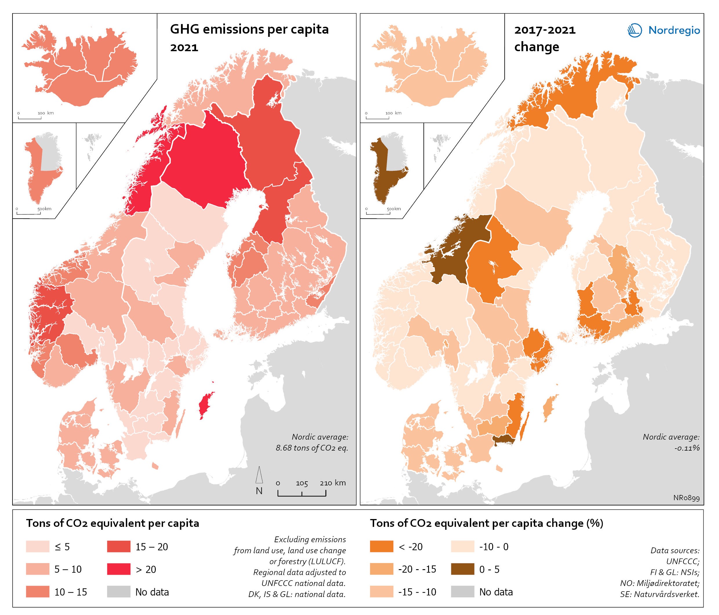
Regional GHG emissions per capita in 2021 and change 2017-2021 on a territorial basis
The data excludes emissions from land use, land use change or forestry (LULUCF). The regional data has been adjusted to UNFCCC national data. The data for Denmark, Iceland and Greenland is on national level. It should be noted that displaying emissions on a territorial basis may be skewed due to the inter-regional dynamics of energy processes, natural resource distributions and concentrations of industrial activities. From 2017 to 2021, the Nordic regions cut their per-capita GHG emissions by on average 11.3%, with an overall Nordic average fall of 8.7% over the same period. In regions historically reliant on fossil fuels for heat and power generation, emissions have continued to decline. This trend is evident in Denmark, as well as in Southern Sweden and Southern Finland – densely populated areas that have taken steps toward expanding district heating coverage and reducing carbon intensity. The largest decrease in GHG emissions per capita was found in Troms and Finnmark, with a 42.3% decrease, Satakunta with a 30.2% decrease and Päijät-Häme – Päijänne-Tavastland with a 29.2% decrease. Only three regions (Greenland, Trøndelag and Blekinge) saw an increase in GHG emissions per capita. At an aggregated level, industrial-related emissions decreased throughout the Nordic Region, but this trend does not hold true for regions in Norway with intensive offshore oil and gas operations. For instance, Nordland, Vestland, Møre og Romsdal, Vestfold and Telemark exhibited the highest per capita emissions in 2021. Between 2017 and 2021, emissions were increasing in many Norwegian regions with intensive offshore oil and gas activity, but also in Norrbotten in Sweden (21.2 tonnes of CO2 equivalent per capita) and Gotland (33.6 tonnes of CO2 equivalent per capita) due to intensive activity in the metal and cement industries, respectively, as well as in several Finnish regions. At the other end of the scale, the…
 2025 April
 - Environment
- Nordic Region
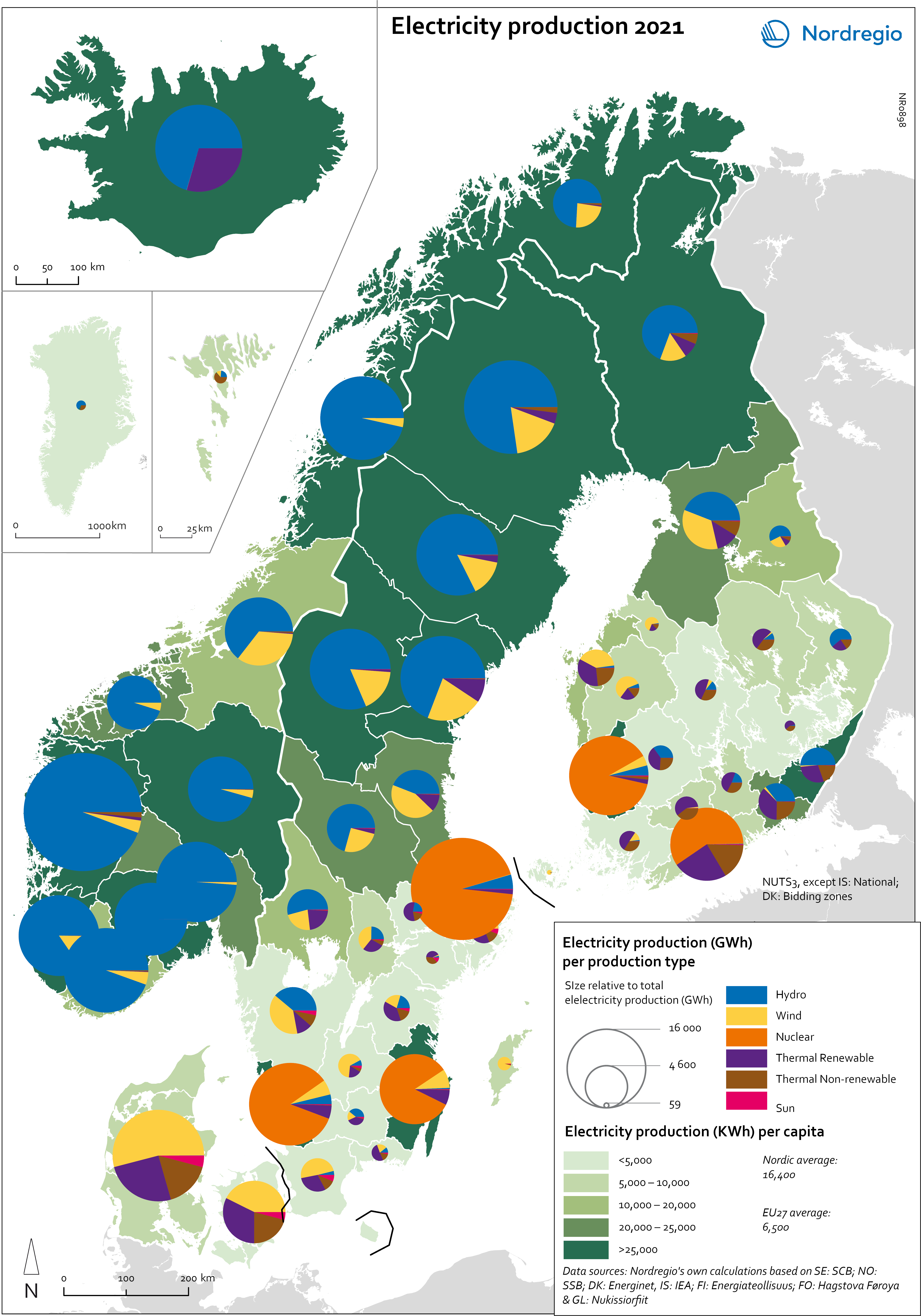
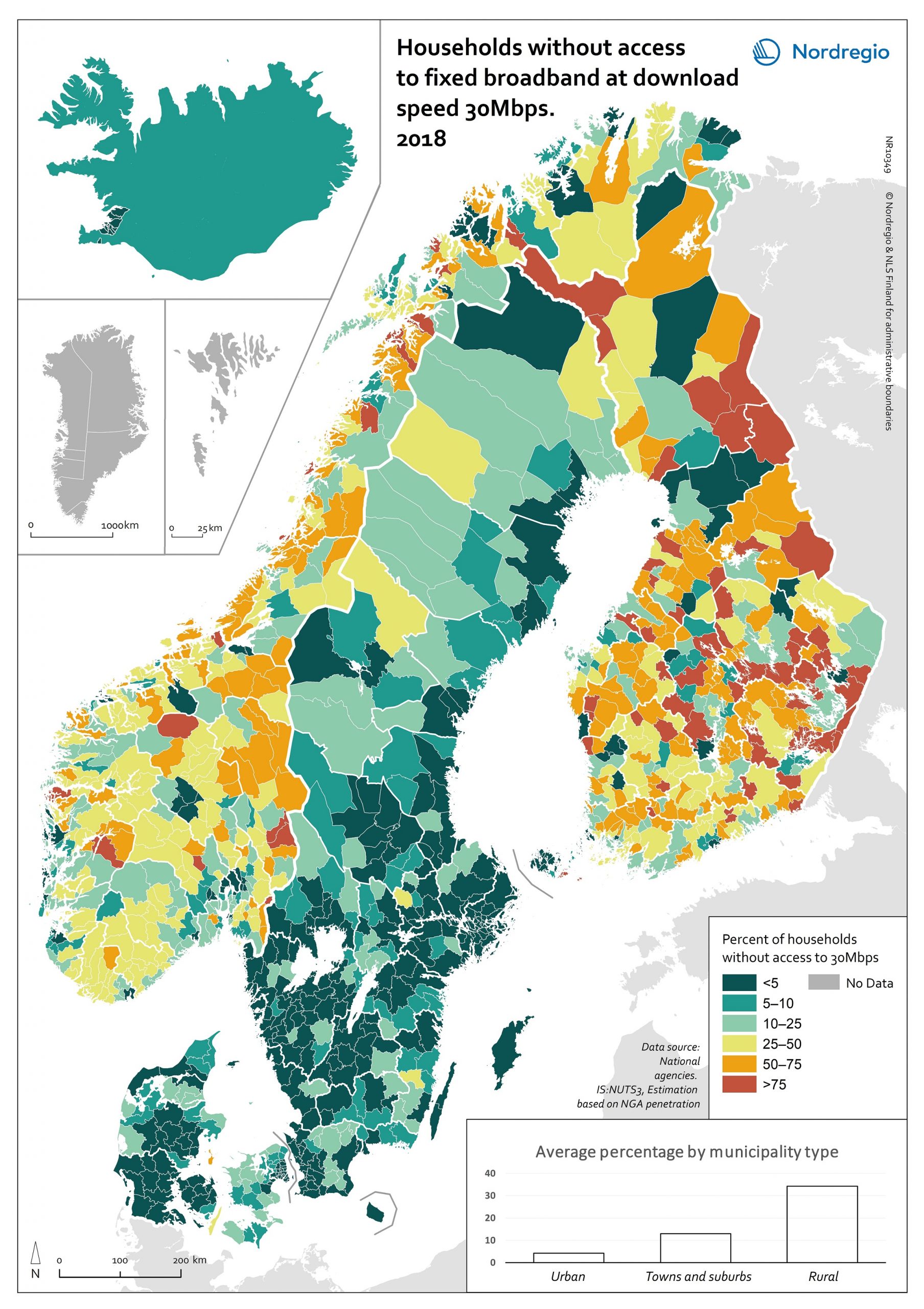
Electricity production 2021
This map shows the spatial distribution of Nordic electricity production per capita, by volume and source type in the Nordic Region in 2021. The data is presented at a regional level, except for Iceland (national level) and Denmark (bidding zones). The circles represent electricity production in GWh, while the green shades indicate electricity production per capita (kWh). Finally, the colour of the circles denotes the source of electricity. The Nordic Region overall has a high electricity production per capita; in fact, Iceland and Norway have the world’s highest electricity production per capita. The electricity mix in 2021 was 96% fossil-free – 73% from renewables (mainly hydropower) and 17% from nuclear power. In 2000 85% of the electricity production was fossile-free. Still there are clear spatial differences in the electricity production. Firstly, we see the high amount of electricity being produced for the five nuclear facilities in Sweden and Finland. Secondly, a substantial volume of hydro-electricity is produced in southern Norway, throughout Iceland, Northern Sweden and Northern Finland. As a result, over half of Nordic electricity is produced from hydropower. Wind power is the source of electricity that has been growing the most during the last two decades, from 1.2% in 2000 to 14% in 2021. The regions with the highest electricity production per capita are in Iceland, Northern Sweden, and Northern and Western Norway. Both Finland and Denmark are net importers of electricity, but both countries have rapidly transitioned away from fossil fuels. Cheap and fossil-free electricity is a prerequisite for the green transition and with growing industries within e.g. battery production, green steel and mining, the need for fossil-free electricity is expected to increase in the coming decades.
- 2025 April
- Environment
- Labour force
- Nordic Region
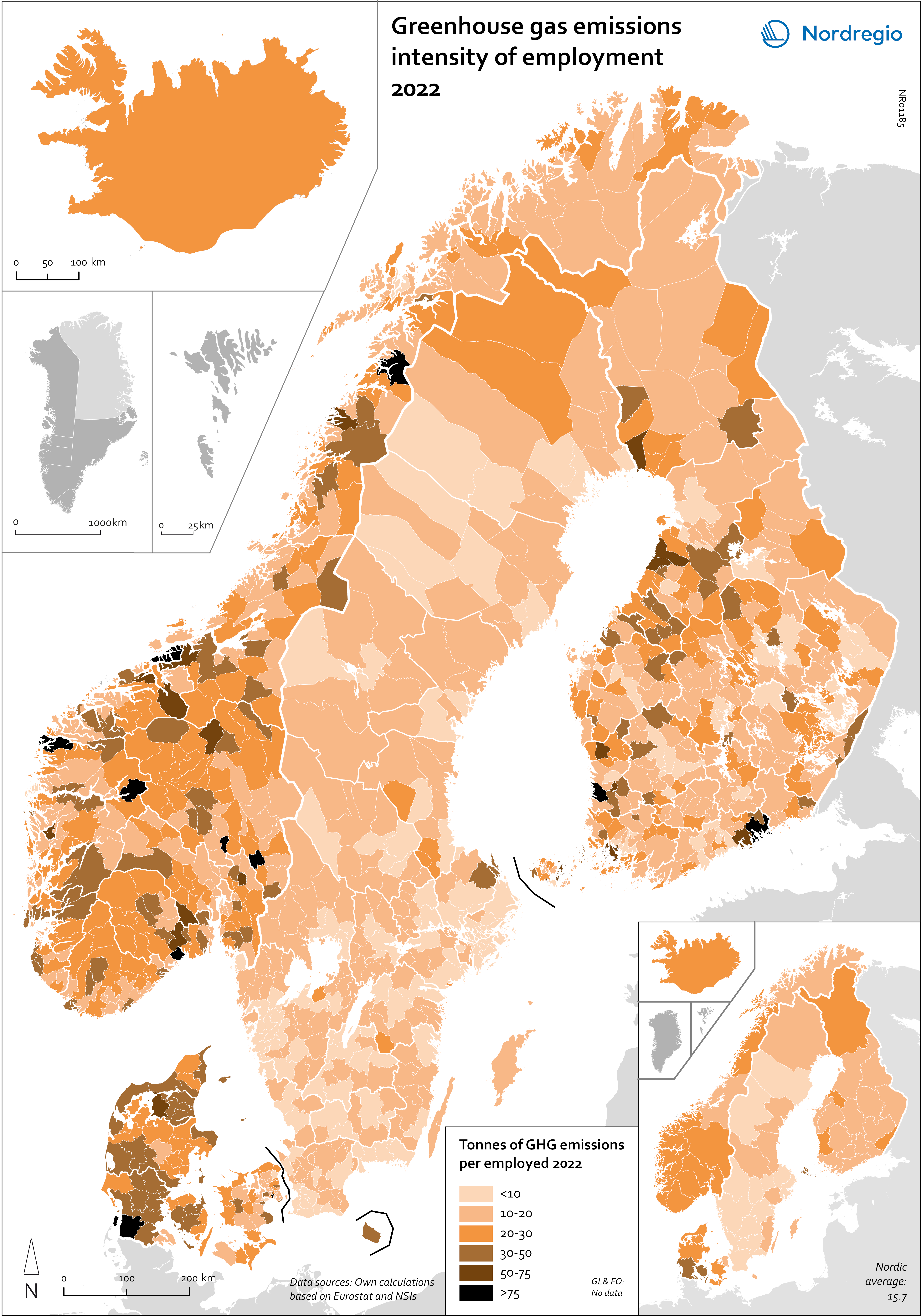
Greenhouse gas emissions intensity of employment in 2022
This map shows the tonnes of greenhouse gas emissions per person employed in Nordic municipalities (big map) and regions (small map) in 2022. The data for Iceland is presented at the national level, while no data was available for the Faroe Islands and Greenland. The map is based on data on emissions per sector and country from Eurostat and detailed employment by sector data from the Nordic statistical offices. By calculating the average emissions per person employed and per sector we could use municipal employment by sector data to assess the average emissions per person employed in each municipality. The results are an estimation based on the assumption that all jobs in the same sector have the same GHG emissions. In 2022, greenhouse gas (GHG) emissions per person employed in the Nordic Region were 15.7 tonnes. This is higher than the EU average of 13.5 tonnes. There are also fairly big differences between the Nordic countries, with higher emissions per person employed in Iceland (28.6), Denmark (23.1) and Norway (20.5) and lower emissions in Finland (15.7) and Sweden (8). On the other hand, the emissions per person employed have decreased faster in the Nordic Region than for the EU as a whole. In the last decade, emissions per person employed fell by 24% in the Nordic Region compared to the EU average of 22%. The biggest decrease (32%) was in Finland. The sectors with the highest emissions per worker vary slightly between the countries. In Sweden and Norway, the sector with by far the highest emissions per worker was the manufacture of petroleum coke and refined petroleum products. However, it should be noted that the number of workers in this sector is small. In Denmark, the highest emissions by person employed could be found in water transport; in Finland, in…
- 2025 April
- Environment
- Labour force
- Nordic Region
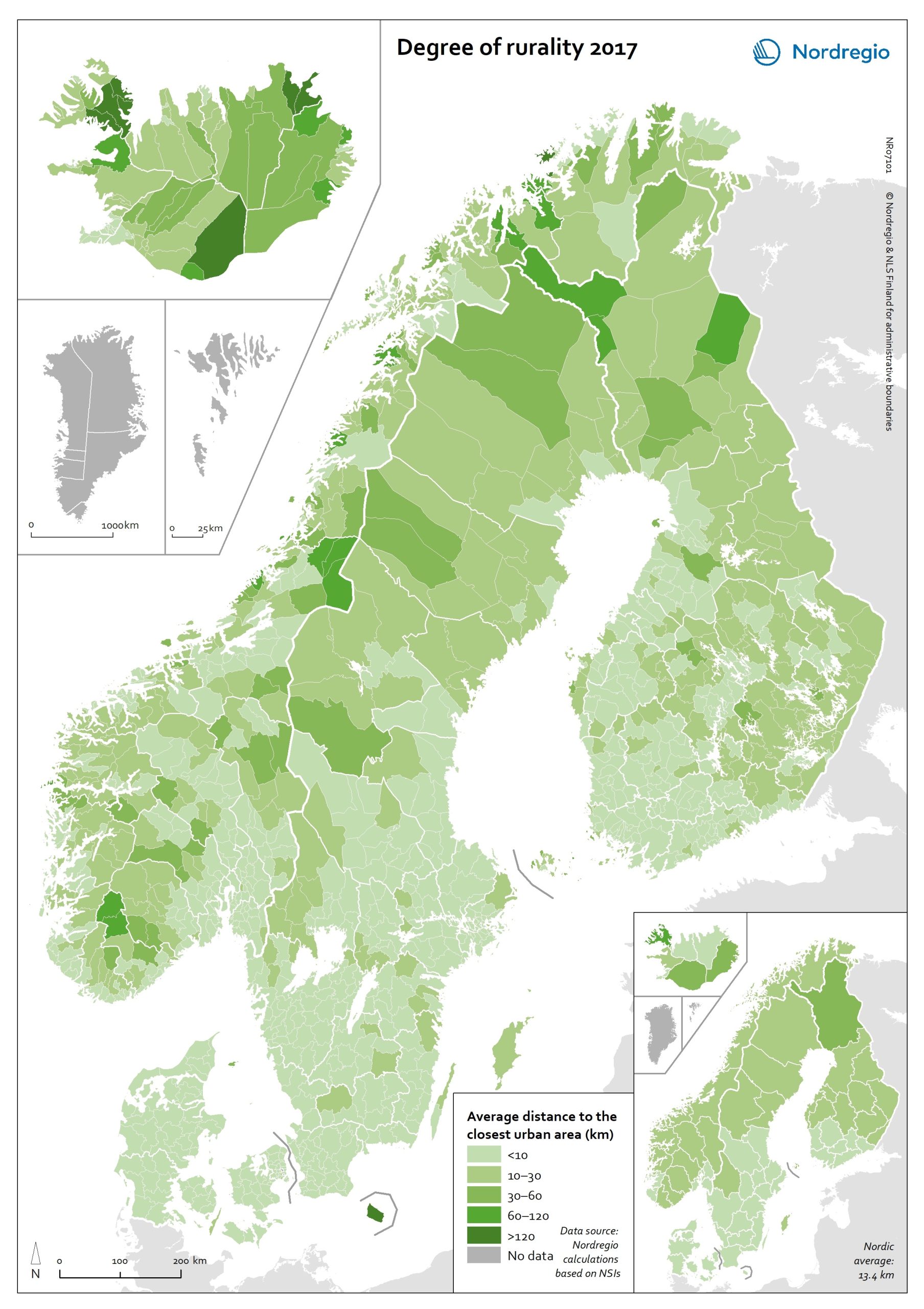
Degree of rurality at the municipal and regional level in 2017
This map shows the average distance to the edge of the closest urban area for the population living outside urban areas in the Nordic municipalities and regions. These figures are of particular interest in the analysis of urban-rural patterns and the Nordic populations’ access to local services in sparsely population areas. The darker shades on the map indicate longer average distances to the edge of the nearest urban area, and the lighter shades indicate shorter average distances. While almost all Danish municipalities have an average distance of below 10 km from rural grid cells to the nearest urban area, a large share of the municipal populations of the remaining Nordic countries need to contend with longer average distances to local services. The largest distances can be found in several municipalities of Iceland and Norway (Árneshreppur 230 km, Hasvik 154 km), whereas the largest average distances for Finnish and Swedish municipalities are considerably shorter (Enontekiö 103 km, Storuman 52 km). Regarding within-country variation, shorter average distances can generally be found in southwestern Finland and southern Sweden, in comparison with the more remote parts of these countries. Both Norway and Iceland provide a rather more mixed picture, since there are municipalities with shorter average distances scattered across different parts of each country. Method used to calculate the degree of rurality In order to take into account access to services such as grocery stores, pharmacies, schools, community centres and public transport, the European definition of urban grid cells was used to create this map, i.e. a population density threshold of 300 inhabitants per km2 applied to grid cells of 1 km2. The closest distance was calculated from each rural grid cell centroid to the nearest urban grid cell centroid along the existing road network traversable by car, including car ferries, based on population…
- 2020 October
- Environment
- Nordic Region
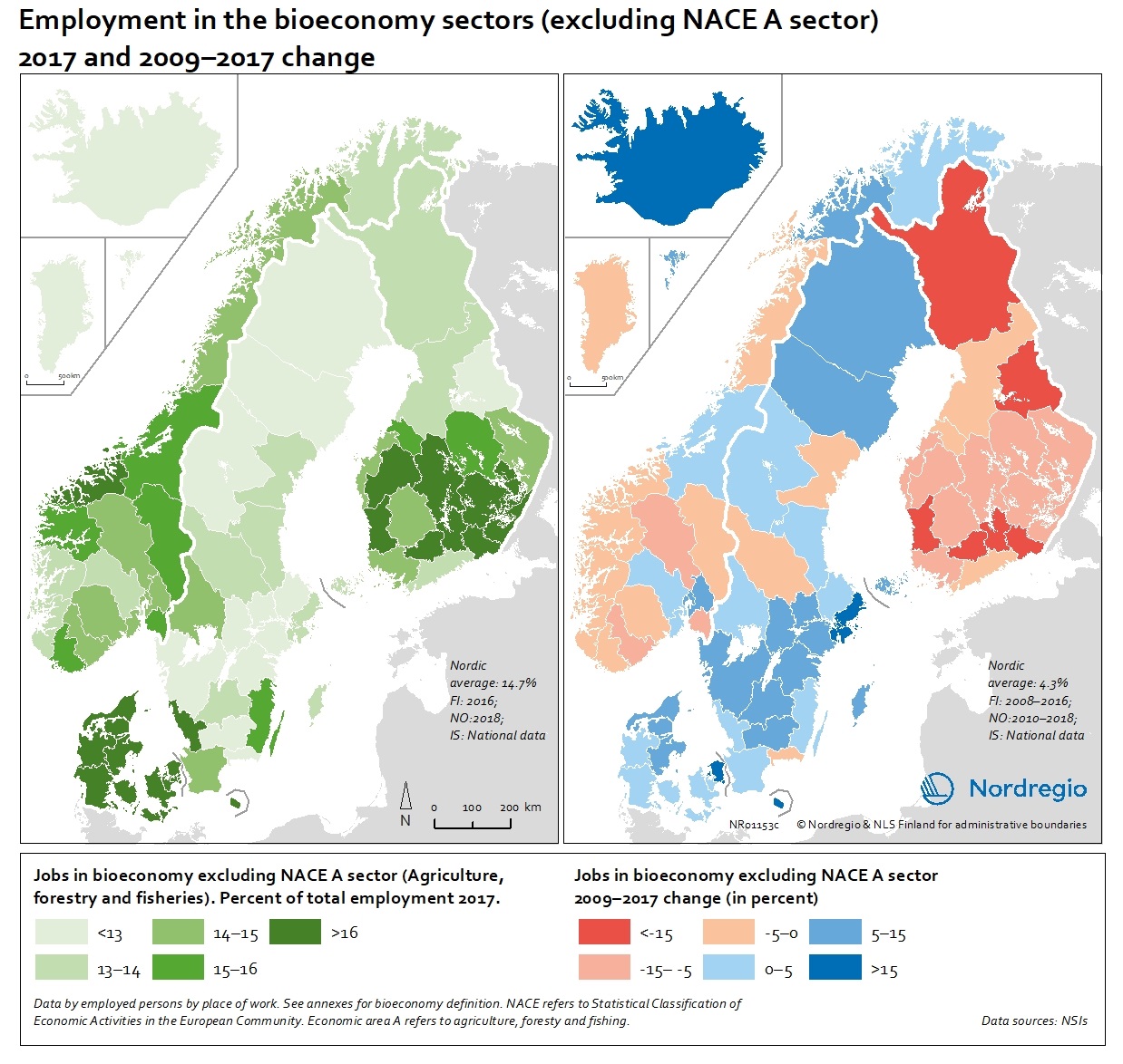
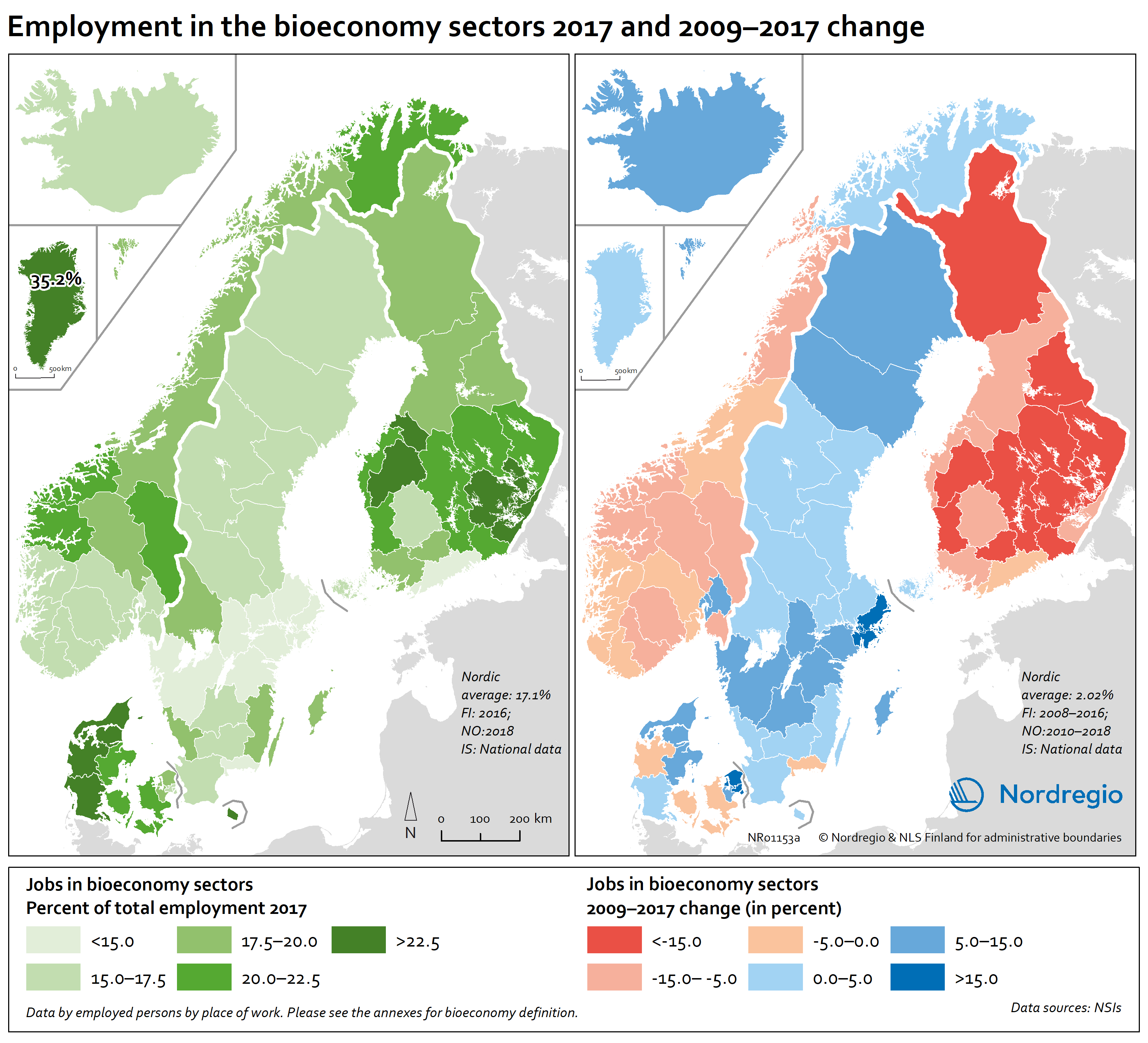
People employed in the bioeconomy excluding NACE sector A in 2017 and 2009-2017 change
These maps show the number of jobs in the bioeconomy sectors as a share of the total employment in 2017 (left) and 2009-2017 change (right), excluding the NACE A sectors. The non-NACE-A sectors have seen a more moderate decrease in Finland but a noticeable increase in most parts of Sweden, Denmark and the Faroe Islands and a remarkable increase in Iceland with more than 15% (Figure 9.3). The average increase in the Nordic Region is 4.3% in the non-NACE-A sectors. There are also notable differences within the countries, showing that regional differences matter. In Denmark, Greenland and the Faroe Islands, there is a positive trend in most regions, but in Finland, almost all regions are losing jobs in the primary industries. In Norway and Sweden, some regions show positive development while others are in decline. Read the digital publication here.
- 2020 February
- Economy
- Labour force
- Nordic Region
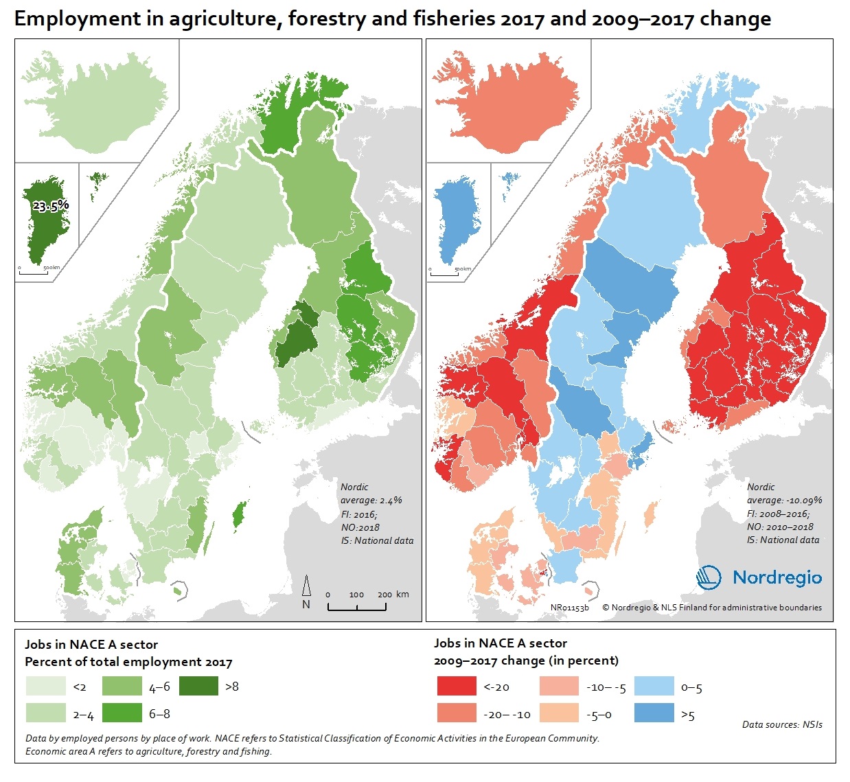
People employed in the agriculture, forestry and fisheries sectors (NACE Sector A) in 2017 and 2009-2017 change
These map show the number of jobs in the agriculture, forestry and fisheries sectors (NACE A sectors) as a share of the total employment in 2017 (left) and 2009-2017 change (right). The map (left) indicates ranges of people employed in agriculture, forestry and fisheries sectors between below 2% to above 8%, with the highest proportion being in Greenland with 23.5% in 2017. In the EU-28, the overall proportion of the total workforce with jobs in the NACE-A sectors is an average of 4.6%. Overall, the NACE-A sectors show a sharp decline in employment (right map), particularly in Finland, Iceland and Norway (except northern Norway), where the decline was up to 20% between 2009 and 2017. Read the digital publication here.
- 2020 February
- Economy
- Labour force
- Nordic Region
People employed in the bioeconomy including NACE sector A in 2017 and 2009-2017 change
These maps show the number of jobs in the bioeconomy sectors as a share of the total employment in 2017 (left) and 2009-2017 change (right). The share of jobs in the bioeconomy varies from below 15% to above 22.5%. For instance, in the western regions of Denmark, the central and southern regions in Finland, Greenland and some mid and northern regions of Norway, over 22.5% of the working population is employed in the bioeconomy. At the same time, most regions in mid-Norway, in all Finnish and some Danish regions witnessed negative development in jobs in the bioeconomy. In Greenland, Iceland, Faroe Islands, Sweden, Northern Norway and other parts of Denmark the situation is very different and the number of jobs in the bioeconomy has increased. These proportions should also be seen in relation to the increase in total number of jobs17 in most regions in the Nordic countries except for the Finnish regions and Åland where there is a decline in most regions. Read the digital publication here.
- 2020 February
- Economy
- Labour force
- Nordic Region
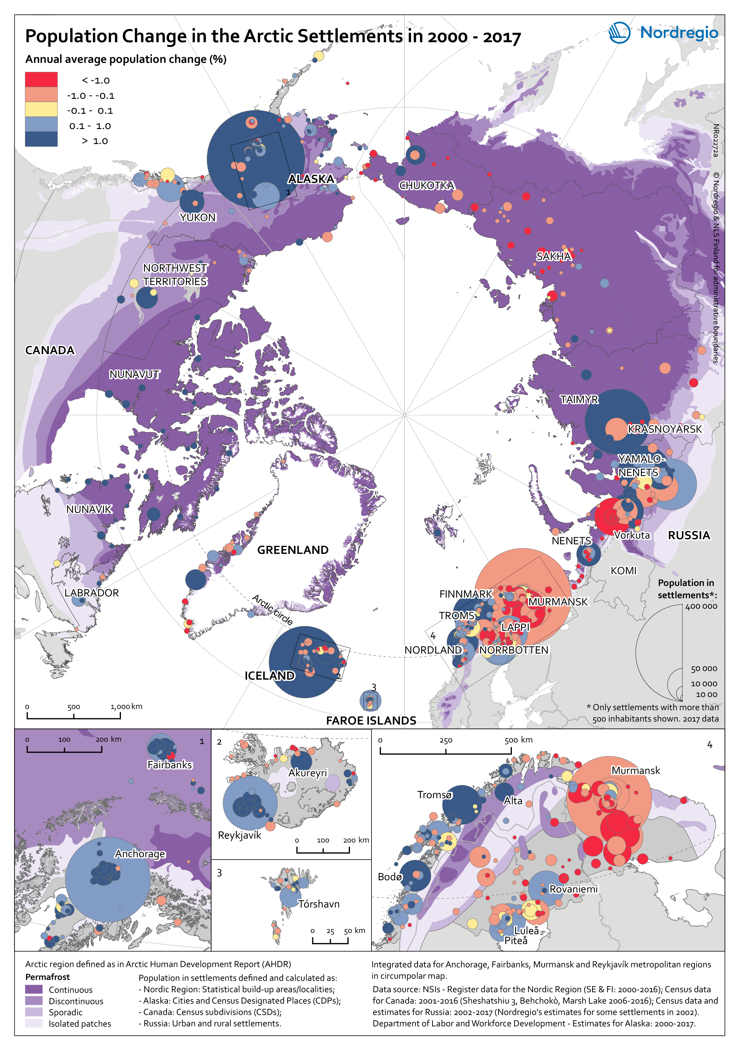
Population change in Arctic settlements
The map provides an overview of the population change in Arctic settlements with 500 inhabitants or more during the period 2000 to 2017. The purple underlaying layer shows the extent of permafrost across the Arctic. The circles indicate settlements with 500 inhabitants or more and are proportional to the total population in 2017. Blue tones indicate population growth between 2000 and 2017, while red tones indicate population decline. Four zoomed-in maps show areas with high settlement density – Arctic Fennoscandia, Iceland, the Faroe Islands, and Alaska. In Alaska, population increased in the largest settlements between 2000 and 2017. The population decline in small settlements located far from the two large cities – Anchorage and Fairbanks – has been caused by outmigration, which has cancelled out the positive natural population growth. In the Canadian Arctic, most people live in a few settlements. Similar to Alaska, the population increased in the largest settlements and decreased in small settlements. Most of the smaller settlements in Arctic Fennoscandia have witnessed a population decline between 2000 and 2017, except in Norway. The dominant pattern in Fennoscandia is a population growth in larger settlements and a population decline in surrounding smaller settlements. This is similar to the pattern observed in the other Nordic Arctic countries – Iceland, Greenland, and the Faroe Islands. New inhabitants settled in the capitals (Reykjavik, Nuuk, and Torshavn) and regional centres, from both domestic and international locations, while settlements in sparsely populated areas are becoming less attractive to incomers. In the Russian Arctic, the regions can be divided into the oil and gas areas of the Khanty-Mansi and Yamal-Nenets, and other areas. The population is growing in the oil and gas areas and declining slowly in the others. Over 75% of the settlements have been shrinking throughout the 21st century, mainly because…
- 2019 March
- Arctic
- Demography
- Migration
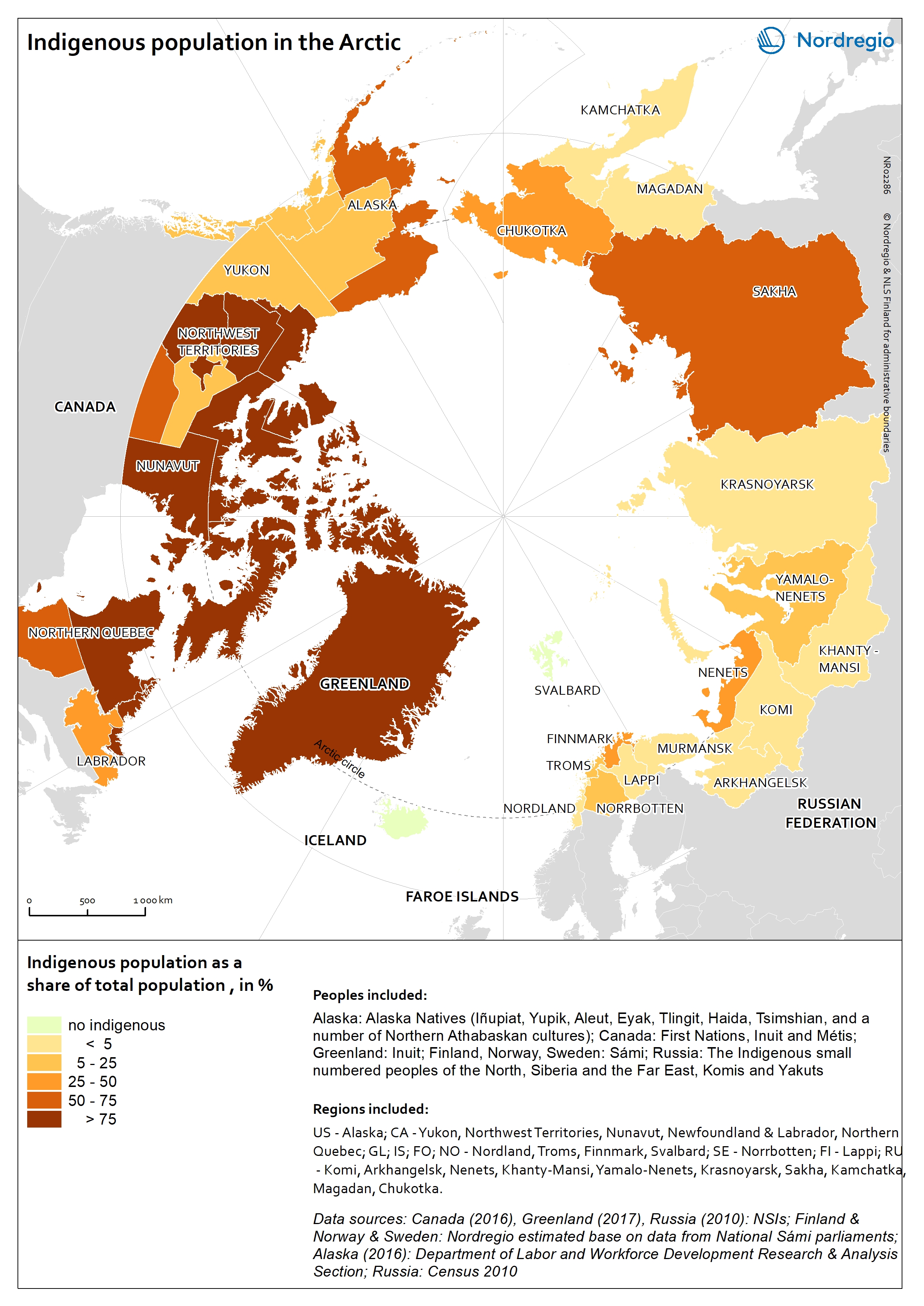
Indigenous population in the Arctic
The map shows the indigenous population as a share of the total population in the Arctic. Approximately one million people, or 9% of the total population in the Arctic is indigenous. Indigenous population reassembles more than 40 different ethnic groups. In terms of statistics there are no circumpolar definition of an indigenous person and therefore the number of indigenous people is based on different national definitions. Official statistics do not necessarily recognize indigenous populations separately. The indigenous population is the highest in the Canadian Arctic and in Greenland, weighing more than 75% of the total population. The Yukon, the southern part of Northern Quebec, and Labrador and Newfoundland (Canada) have the lowest shares of indigenous population. In the remaining part of the Arctic, indigenous peoples represent less than half of the total population, except in Sakha (Russian Federation), Southwest Region and Northern Region (Alaska, USA) where 50-75% of the population is indigenous. There are no indigenous people in Iceland, the Faroe Islands and Svalbard.
- 2019 March
- Arctic
- Demography

Settlements on permafrost in the Arctic
The map shows the distribution of coastal and inland settlements on permafrost in the Arctic in 2017. Permafrost is ground that is at or below 0°C for at least 2 consecutive years. The purple tones indicate settlements located on permafrost and distinguishes between coastal (light purple) and inland (dark purple) settlements. Settlements located outside the permafrost extent are in yellow. Among all Arctic settlements, 66,1% are located on permafrost. Settlements are classified as permafrost settlements if they are located within the permafrost extent, comprising zones of continuous, discontinuous, sporadic, or isolated permafrost. Among all permafrost settlements 46,0% are coastal. Coastal settlements are defined by their dependency to the sea. They are either adjacent to the coast, located inland along large rivers with a free connection to the open sea, or located within a short distance to the sea (0-200 km). In this map, coastal settlements comprise all settlements that are located within an Arctic subregion adjacent to the coast. Most of the settlements located outside the permafrost extent area are in the Nordic countries (Iceland, Norway, the Faroe Islands, Sweden, and Finland) as well as in the southern part of Alaska (USA) and the western part of the Russian Arctic. Almost all Arctic settlements in the Russian Federation and in Canada are located on permafrost. The increase in air surface temperature observed in the Arctic causes dramatic changes in the permafrost thermal regime leading to the destabilisation of infrastructure built on permafrost.
- 2019 March
- Arctic
- Demography
- Environment

Land Cover in the Arctic
The terrestrial ecosystem of the Arctic is characterized by low tundra vegetation, composed of shrubs, herbaceous plants, mosses, and lichens. Arctic vegetation is becoming more productive due to increasing air temperature. One of the main trends shows an increase in tall shrub cover. On the contrary, the cover of lichen and moss has declined in response to regional warming.
- 2019 January
- Arctic
- Environment
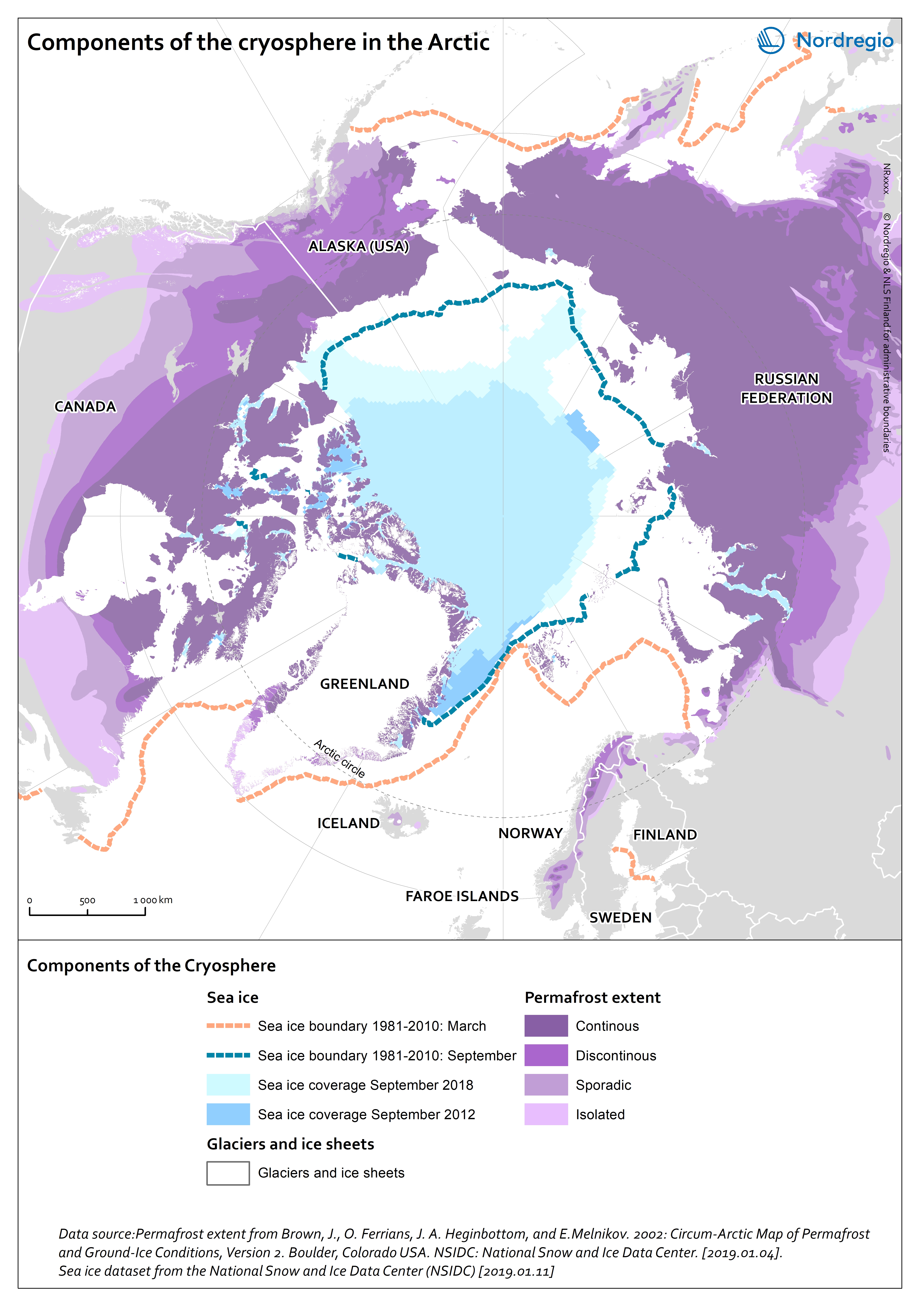
Components of the cryosphere in the Arctic
This map shows the main components of the cryosphere in the Arctic: sea-ice, permafrost, ice-sheets, and glaciers. Sea-ice covers most of the Arctic Ocean during winter. The sea-ice extent reaches its maximum in March, when it covers approximately 14-16 million km2. Since 1979, the Arctic ice extent in winter has decreased by 3% per decade relative to the 1981-2010 average, and this trend accelerates. Similarly, ice-sheets and glaciers, which cover globally over 15 million km2 are melting. In the Arctic, the main ice-sheet is the Greenlandic ice sheet. Most of the land surface in the Arctic is underlay by permafrost, ground that is at or below 0°C for at least 2 consecutive years. The purple tones on the map indicates the extent of the northern circumpolar permafrost. Permafrost can occur as continuous (dark purple, 90-100% coverage), discontinuous (purple, 50-90% coverage), sporadic (light purple, 10-50%), or isolated patches (magenta, 0-10% coverage). Permafrost is thawing due to increased air temperatures and precipitations in the Arctic. Permafrost temperature increased by 0.29 ± 0.12°C between 2007 and 2016.
- 2019 January
- Arctic
- Environment
Protected areas in the Arctic
Within the northern circumpolar permafrost region, there are ca. 1300 protected areas. Most of these areas are terrestrial (1069), while 126 are coastal – defined as partially within the marine environment – and 62 are marine. The World Database on Protected Areas (WDPA)[1] includes a wide range of protected areas, including national protected areas recognized by the government, areas designated under regional and international conventions, privately protected areas and indigenous peoples’ and community conserved territories and areas. Greenland is one of the countries with the largest protected terrestrial area (41,0%). [1] IUCN and UNEP-WCMC (2019), The World Database on Protected Areas (WDPA) [On-line], [January 2019]. Cambridge, UK: UNEP-WCMC. Available at: www.protectedplanet.net.
- 2019 January
- Arctic
- Environment
Origin of FDI inflows 2003-2016
This map shows the country of origin of Foreign Direct Investment (FDI) in the Nordic regions between 2003 and 2016. The colours indicate different countries of origin of FDI inflow by number of projects between 2003 and 2016. FDI inflows examined by country of origin, reveal an interesting pattern in terms of intra-Nordic investment inflows, confirming the assumption that proximity, both in terms of geographical distance, and in terms of rules, regulation and business culture is an important driver of FDI. A breakdown at the regional level reveals that 55 out of the 74 Nordic regions received the largest number of FDI projects from a region located in another Nordic country. The largest share of these intra-Nordic flows originates from Sweden (35 regions in total), particularly in the manufacturing sector as well as the ICT sector in Norway. The largest share of FDI projects from Finland are attracted to Sweden’s highly competitive international manufacturing industry. Denmark is the main source country of FDI inflows in both Greenland (mostly in the transportation and storage and business services sectors) and the Faroe Islands (mostly manufacturing and finance and insurance activities sectors). Eighteen Nordic regions have their largest source country in terms of project located outside the Nordic Region, i.e. other European and extra-European countries. FDI inflows from other European countries are the highest in terms of projects in six Nordic regions, most of these regions can be characterised by their relative remoteness and strong industrial profile. Finally, two extra-European countries, namely the United States and Canada, are the largest source country in twelve Nordic regions, that are either capital city regions with a strong and diversified service sector or peripheral industrial regions.
- 2018 December
- Economy
- Nordic Region
Relative local employment effect 2008-2016
The map shows the change in jobs (growth or decline) at municipal level over a period that can be attributed to local factors (e.g. local policies or local natural or institutional conditions) and is thus not due to national or industry trends. The map is based on shift-share analyses which can help answer why employment is growing or declining in a local or regional industry. This type of analysis can answer questions like: How much of local job growth can be attributed to expected national and sectoral trends and how much is due to local factors Is the local economy growing or declining? How does the community compare with other communities? What are the local strengths and weaknesses in providing jobs and in which sectors? What industries are doing well? What industries should be targeted? There are large differences between municipalities in terms of the change in employment due to local factors. For example some of the municipalities in Mid Jutland in Denmark show a high local employment effect while others in the North of Jutland do not. These differences can be due to access to markets, to industrial culture, to municipal or regional facilitation etc. In-depth research is needed in order to understand the reasons. The map does not show the total change in jobs.
- 2018 June
- Labour force
- Nordic Region

Employment rate 2016 related to the EU2020 goal and 2009-2016 change
This map shows the employment recovery from the financial crisis, with the employment rate (20-64 years) in European regions in 2016 related to the EU2020 goal of 75%, as well as the change in the employment rate between 2009 and 2016. The green colour indicates regions with employment rates above 75% and an increase in the employment rate between 2009 and 2016. The red colour indicates regions with employment rates below 75% and a decrease in the employment rate between 2009 and 2016. The yellow colour indicates regions with employment rates above 75% and a decrease in the employment rate between 2009 and 2016. The blue colour indicates regions with employment rates below 75% and a decrease in the employment rate between 2009 and 2016. The grey colour indicates regions with no data available. On a European scale, the effect of the financial crisis on employment became noticeable from 2009 onwards when average employment rates started to decline. This continued until 2013 when the average European employment rate reached its lowest level of 68.3% for the age group 20–64 years. After 2013 the employment rate started to rise again but it took until 2016 for the average European employment rate to reach and then surpass pre-crisis levels. In 2016 the average employment rate in the European union was 71%, edging closer to the EU2020 goal of 75%. In some regions, primarily in southern Europe, employment rates have still to recover to pre-crisis levels. This is particularly so for Greece, Spain, Italy and Portugal which were particularly hard hit by the debt crisis and thus had to undertake massive cuts across the public sector. On the other hand, some countries such as Germany, Austria and Switzerland saw rising employment rates even during the financial crisis. The differential nature of outcomes in…
- 2018 February
- Europe
- Labour force
FDI inflows value and FDI intensity 2003-2016
This map shows the total value of Foreign Direct Investment (FDI) in million euros, and the intensity of the FDI in the Nordic regions between 2003 and 2016. The FDI intensity is an index of the value of FDI inflows divided by the gross regional product. The FDI intensity index allows comparing the performance of the Nordic regions in attracting FDI inflows by taking the size of the regional economy into account. A high intensity result reflects a more resilient regional economy, due to a diversity of investors. The brown shading indicates different FDI intensities in the regions between 2003 and 2016. The lighter the shade, the lower the FDI intensity. The grey colour indicates regions with no data. The circles indicate the total value of FDI in million euros (2016 value) in the regions between 2003 and 2016. The larger the circle, the greater the value. The colour in the circles indicate changes in the FDI total value between 2003 and 2016. The pink colour indicates regions with a decrease in the FDI value, the yellow colour indicates stable FDI values, and the blue colour indicates regions with an increase in the FDI value. Large capital city regions tend to be the main beneficiaries of FDI inflows and this pattern is also observed in the Nordic Region. Stockholm region emerges as the clear leader with a total deal value of EUR 110,000m. The Danish capital region attracted about half of Stockholm Region’s deal value – EUR 53,804m followed by Helsinki (EUR 45,000m), Skåne (EUR 30,000m), and Oslo (EUR 29,100m). The total deal value for Reykjavík is rather modest – at around EUR 2,000m, and is comparable to regions such as Dalarna and Jönköping (Sweden), Sør-Trøndelag (Norway) and Lappi (Finland). All Nordic regions have witnessed an increase in FDI inflows…
- 2018 February
- Economy
- Nordic Region
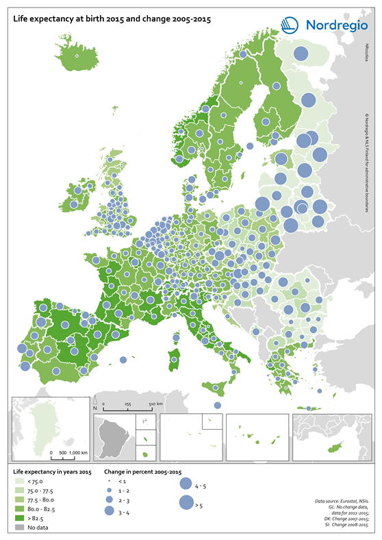
Life expectancy at birth 2015 and change 2005-2015
This map shows the life expectancy at birth in the regions of Europe in 2015 and the change between 2005 and 2015. The green shading indicates the life expectancy at birth in years in the regions of Europe in 2015. The darker the green the longer the life expectancy at birth. The grey colour indicates regions with no data. The blue circles represent the changes in the life expectancy at birth between 2005 and 2015. The larger the circle, the greater the increase in the life expectancy at birth between 2005 and 2015. As one of the UN Sustainable Development indicators for good health and well-being, life expectancy at birth measures the general health status of a population. Life expectancy at the national level is highly correlated to national income indicators such as GDP per capita. Most of Europe has however reached a level where further increases in wealth no longer increase average life expectancy. The longest life expectancies are found in parts of Spain, France, Italy, Switzerland and Norway. In 2015 there is still a visible East-West divide, where countries in Eastern Europe, in the south-east of the Baltic Sea Region and Northwest Russia have a significantly lower life expectancy. The size of the blue bubbles indicate however that these regions have witnessed the largest increases over the last ten years. If their economies continue to grow it is likely that their life expectancy will continue to increase for some years to come. Regional differences are partly due to individual characteristics, but also to the local environment as well as the politics and institutions that influence the local economy, access to local services and care, general educational levels and the local norms that influence lifestyles.
- 2018 February
- Demography
- Europe