73 News
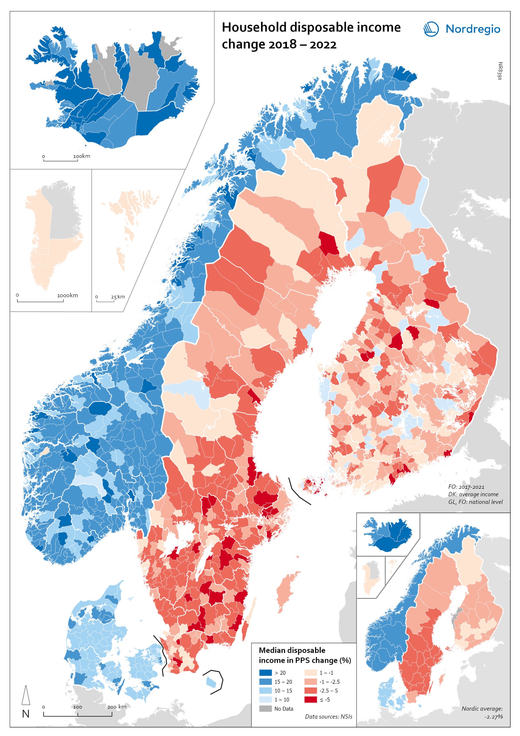
Household disposable income change 2018-2022
This map shows the percentage change in household disposable income between 2018 and 2022 in Nordic municipalities (big map) and regions (small map). Household disposable income per capita is a common indicator of the affluence of households and, therefore, of the material quality of life. It reflects the income generated by production, measured as GDP that remains in the regions and is financially available to households, excluding those parts of GDP retained by corporations and government. In sum, household disposable income is what households have available for spending and saving after taxes and transfers. It is ‘equivalised’ – adjusted for household size and composition – to enable comparison across all households. Purchasing Power Standards (PPS) is used to compare the countries’ economies and the cost of living for households. As shown in the map, between 2018 and 2022, household disposable income increased for all Danish, Icelandic, and Norwegian municipalities and decreased for Finnish and Swedish municipalities. On average, the city municipalities have higher incomes and increased most in Finland and Sweden in 2018–2022. In Sweden, a tendency towards larger falls in income was observed in several southern municipalities. In summary, absolute household income increased in all Nordic countries but not when measured in purchasing power. Based on this metric, on average, Norwegian households are the most well-off and Iceland the worst off, while Danish households benefited from a stronger currency in 2022. Single-parent households have had lower increases in household income than other families in Norway and parts of Sweden. Municipalities show a similar trend in Norway and Denmark, although Norwegian coastal municipalities fared slightly better in 2022. Disposable income is falling in all Swedish and Finnish municipalities.
 2025 April
 - Economy
- Nordic Region
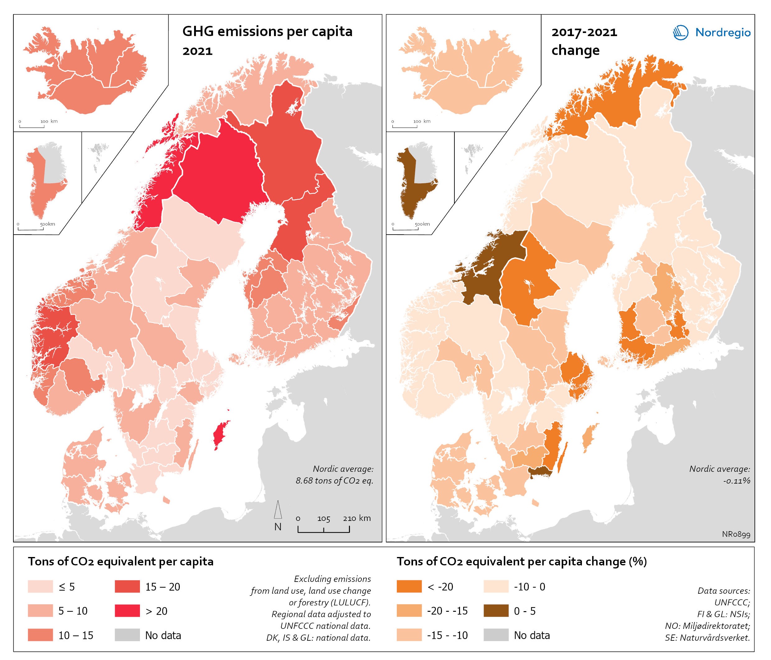
Regional GHG emissions per capita in 2021 and change 2017-2021 on a territorial basis
The data excludes emissions from land use, land use change or forestry (LULUCF). The regional data has been adjusted to UNFCCC national data. The data for Denmark, Iceland and Greenland is on national level. It should be noted that displaying emissions on a territorial basis may be skewed due to the inter-regional dynamics of energy processes, natural resource distributions and concentrations of industrial activities. From 2017 to 2021, the Nordic regions cut their per-capita GHG emissions by on average 11.3%, with an overall Nordic average fall of 8.7% over the same period. In regions historically reliant on fossil fuels for heat and power generation, emissions have continued to decline. This trend is evident in Denmark, as well as in Southern Sweden and Southern Finland – densely populated areas that have taken steps toward expanding district heating coverage and reducing carbon intensity. The largest decrease in GHG emissions per capita was found in Troms and Finnmark, with a 42.3% decrease, Satakunta with a 30.2% decrease and Päijät-Häme – Päijänne-Tavastland with a 29.2% decrease. Only three regions (Greenland, Trøndelag and Blekinge) saw an increase in GHG emissions per capita. At an aggregated level, industrial-related emissions decreased throughout the Nordic Region, but this trend does not hold true for regions in Norway with intensive offshore oil and gas operations. For instance, Nordland, Vestland, Møre og Romsdal, Vestfold and Telemark exhibited the highest per capita emissions in 2021. Between 2017 and 2021, emissions were increasing in many Norwegian regions with intensive offshore oil and gas activity, but also in Norrbotten in Sweden (21.2 tonnes of CO2 equivalent per capita) and Gotland (33.6 tonnes of CO2 equivalent per capita) due to intensive activity in the metal and cement industries, respectively, as well as in several Finnish regions. At the other end of the scale, the…
- 2025 April
- Environment
- Nordic Region
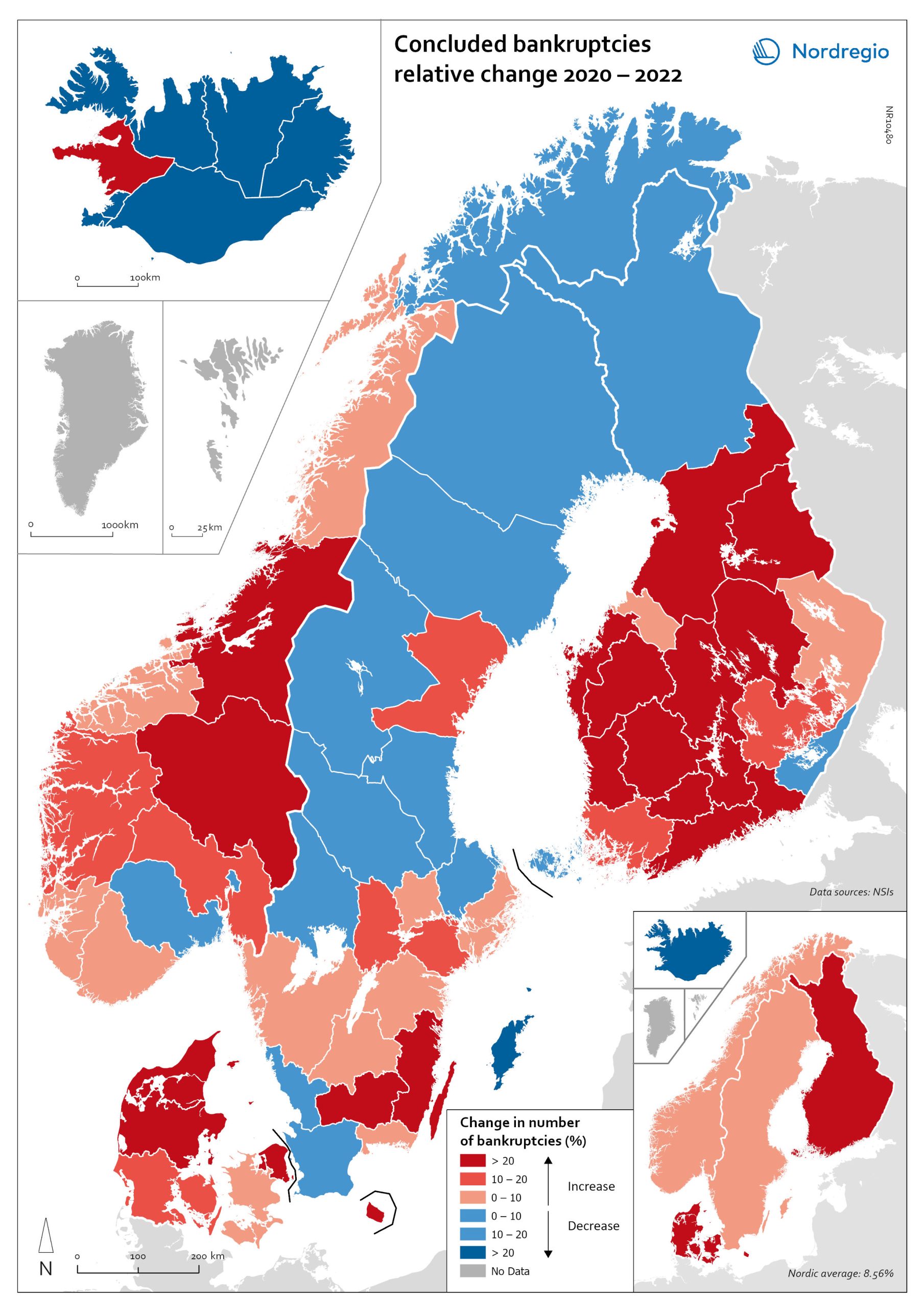
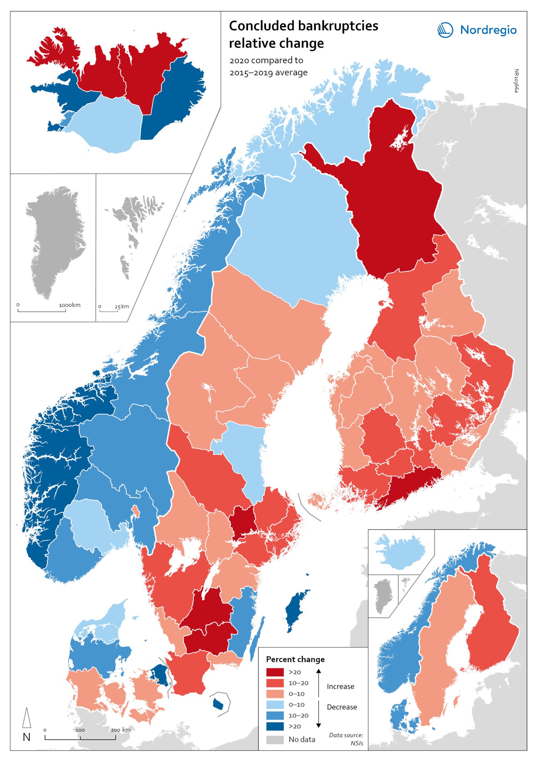
Change in the number of business bankruptcies (2020–2022)
This map depicts the change in total number of bankruptcies in the Nordic regions between 2020 and 2022. The red shades indicates an increase in numbers of bunkruptcies and blue shades a decrease. The big map shows the regional level and the small map the national level. The rate of business bankruptcies is a core indicator of the robustness of the economy from the business perspective. Nordic and international businesses have been impacted by both the COVID-19 pandemic and rising inflation in recent years. In terms of the level of bankruptcies, data from Eurostat (2024) shows that the Nordic countries fared relatively well compared to other high-income countries between 2020 – 2022. In the years during and after the COVID-19 pandemic, the most densely populated regions saw the highest levels of bankruptcies. This finding is partly to be expected, as these regions also tend to be those with the highest number of companies. However, some variation can be seen across the countries. Overall, Iceland and Finland experienced the lowest rate of bankruptcies in 2020 and 2022. Denmark had the highest level of bankruptcies during COVID-19. Potential explanations for the national variations may include the countries’ varying strategic approaches to the pandemic. Denmark enforced more restrictive lockdowns compared to, for example, Sweden, where the less restrictive approach has been linked to the more limited impact on business bankruptcies in the early part of the pandemic. Furthermore, there is a large consensus that the many jobretention schemes across the Nordic Region also served to limit the number of bankruptcies. However, new data from early 2024 shows that after the job-retention schemes ended, and while high inflation and interest rates were increasing the pressure on Nordic companies, the level of bankruptcies increased. In 2023, 8,868 companies went bankrupt in Sweden the highest number…
- 2025 April
- Economy
- Nordic Region

Gini coefficient change 2018-2022
This map shows the percentage change in the Gini coefficient between 2018 and 2022. The big map shows the change on municipal level and the big map at regional level. Blue shades indicate a decrease in income inequality, while red areas indicate an increase in income inequality The Gini coefficient index is one of the most widely used inequality measures. The index ranges from 0–1, where 0 indicates a society where everyone receives the same income, and 1 is the highest level of inequality, where one individual or group possesses all the resources in the society, and the rest of the population has nothing. The map illustrates significant variations in the change in income inequality across Nordic municipalities and regions. Between 2018 and 2022, income inequality increased in predominantly rural municipalities, notably in Jämtland, Gävleborg, Dalarna and Västerbotten in Sweden, as well as Telemark in Norway. For Denmark, the rise in inequality is mainly for the municipalities in Western Jutland. At the same time, approximately one third of municipalities in the Nordic Region experienced a decrease in income inequality during the same period, primarily in Finland and Åland. For example, in Finland, the distribution of inequality was more varied. This trend aligns with the ongoing narrowing of the household income gap observed in many Finnish municipalities since 2011, which is mainly attributed to the economic downturn of the early 2010s, as well as demographic shifts such as outmigration and ageing.
- 2025 April
- Economy
- Nordic Region
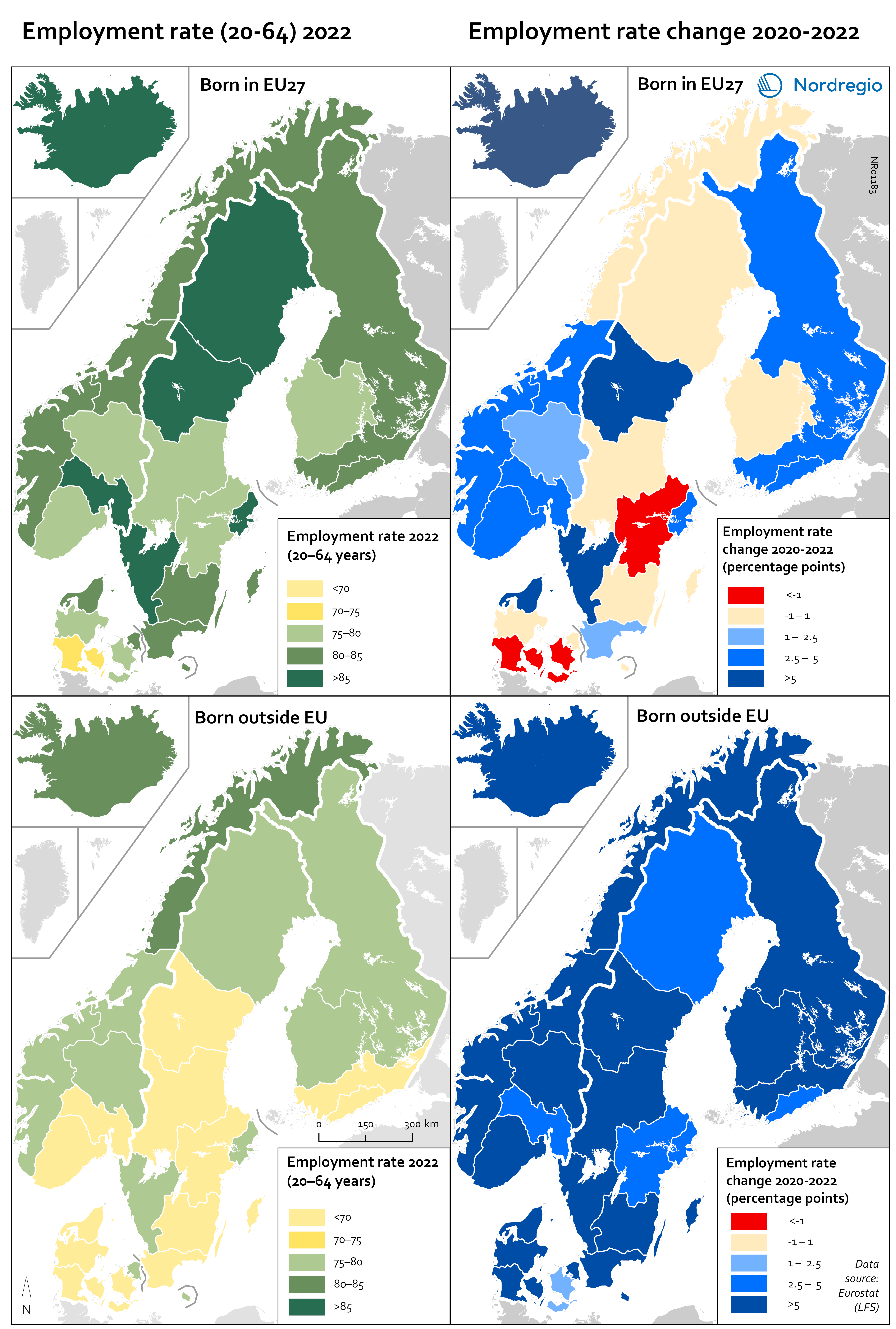
Employment rate 2022 and Employment rate change 2020-2022 among foreign-born
These maps shows the employment rate in 2022 for those born in a EU country (top left) and those born outside of the EU (bottom left), as well as the change in employment rate between 2020 and 2022 for those born in the EU (upper right) and outside the EU (lower right). The data is displayed at NUTS 2 level and comes from the labour force survey (LFS). The category ‘foreign-born’ is quite heterogeneous and consists of everything from labour migrants to refugees – two groups who face quite different conditions and have different connections to the labour market. The employment rate for people born in another EU country – a group that includes a large proportion of labour migrants – has been on par with the employment rate for native-born people for a long time. As can be seen in the top-left figure in the map, in 2022 all NUTS2 regions except Southern Denmark had an employment rate of 75% or more for this group. The highest employment rate was observed in the Swedish NUTS2 regions of Middle Norrland, Stockholm and Western Sweden, followed by Oslo in Norway and Iceland. The employment rate for people born outside of the EU (a group that largely consists of refugees) has been lower for a long time than that of native-born people and those born in the EU. While the employment rate for people born in non-EU countries is still lower than for natives (a 15 percentage point difference (pp) in Sweden, 11 pp in Norway, 7 pp in Denmark and Finland, and 2 pp in Iceland), this gap has been closing in the last couple of years since the pandemic. Between 2020 and 2022, the employment rate for those born outside of the EU rose almost eight percentage points in Denmark…
- 2025 April
- Labour force
- Nordic Region
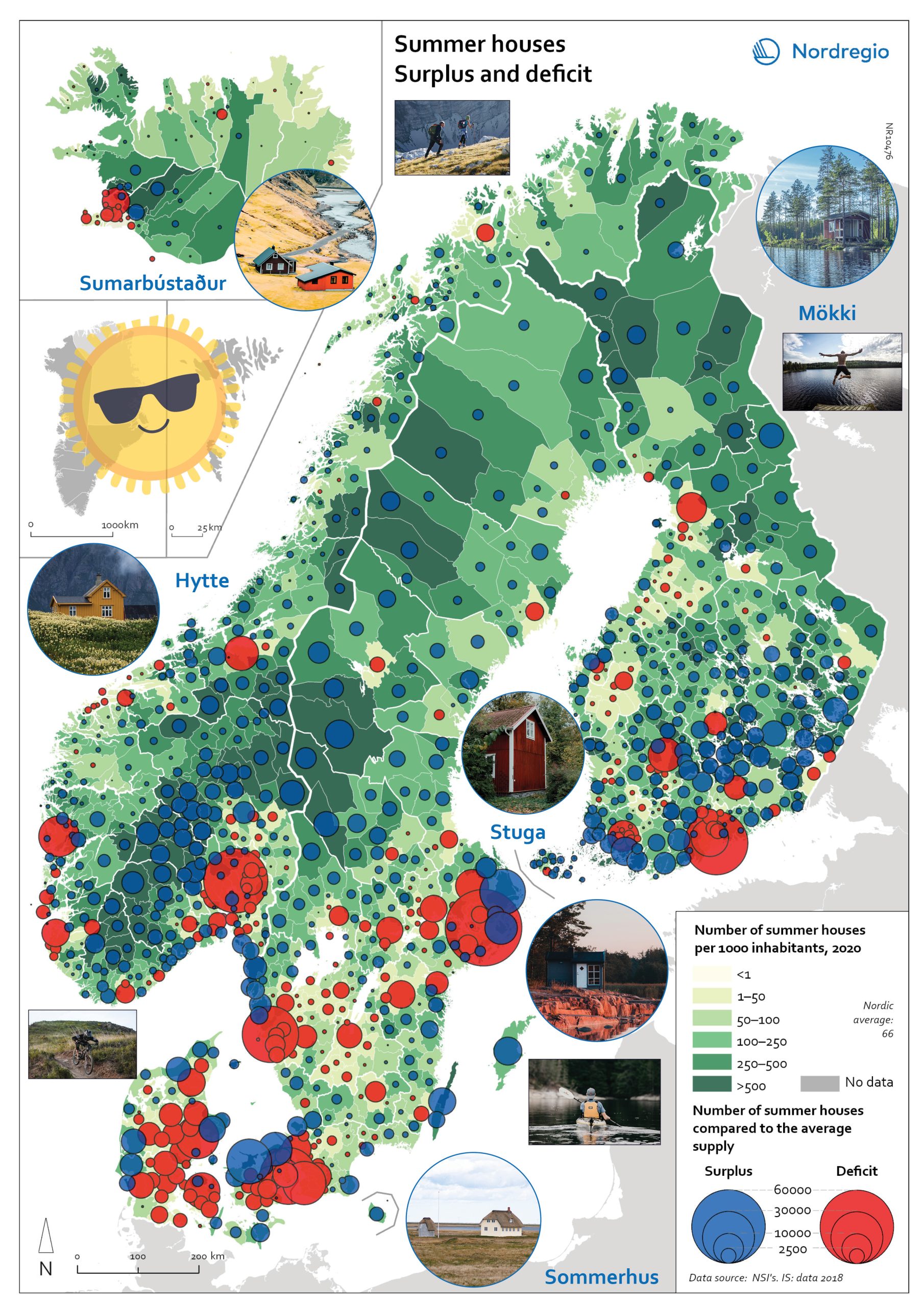
Gone missing: Nordic people!
Nordregio Summer Map 2022: Empty streets, closed restaurants – where is everyone? Nordic cities are about to quiet down as millions of people are logging out from work. But where do they go – Mallorca? Some yes, but the Nordic people are known for their nature-loving and private spirit, and most like to unwind in isolation. So, they head to their private paradises – to one of the 1.8 million summer houses around the Nordics, or as they would call them: sommerhus, stuga, hytte, sumarbústaður or mökki. The Nordregio Summer Map 2022 reveals the secret spots. The Finnish and Norwegians are most likely already packing their cars and leaving the cities: the highest supply of summer houses per inhabitant is found in Finland (92 summer houses per 1000 inhabitants) closely followed by Norway (82). The Swedish (59) Danish (40) and Icelandic (40) people seem to have more varied summer activities. There are large regional differences in the number of summer houses and the number of potential users – so not enough cabins where people would want them! And this is the dilemma Nordregio Summer Map 2022 shows in detail. Most people live in the larger urban areas while many summer houses are located in more remote and sparsely populated areas. The largest deficit of summer houses is found in Stockholm: with almost 1 million inhabitants, there is a need for 65,000 summer houses but the municipality has only 2,000 to offer! So, people living in Stockholm need to go elsewhere to find a summer house. The same goes for the other capital municipalities which have large deficits in summer houses: Oslo is missing 44,000, Helsinki 43,000, and Copenhagen 34,000. Fortunately, there are places that would happily accommodate these second-home searchers. Good news for Stockholm after all as the top-scoring municipality…
- 2022 June
- Nordic Region
- Tourism
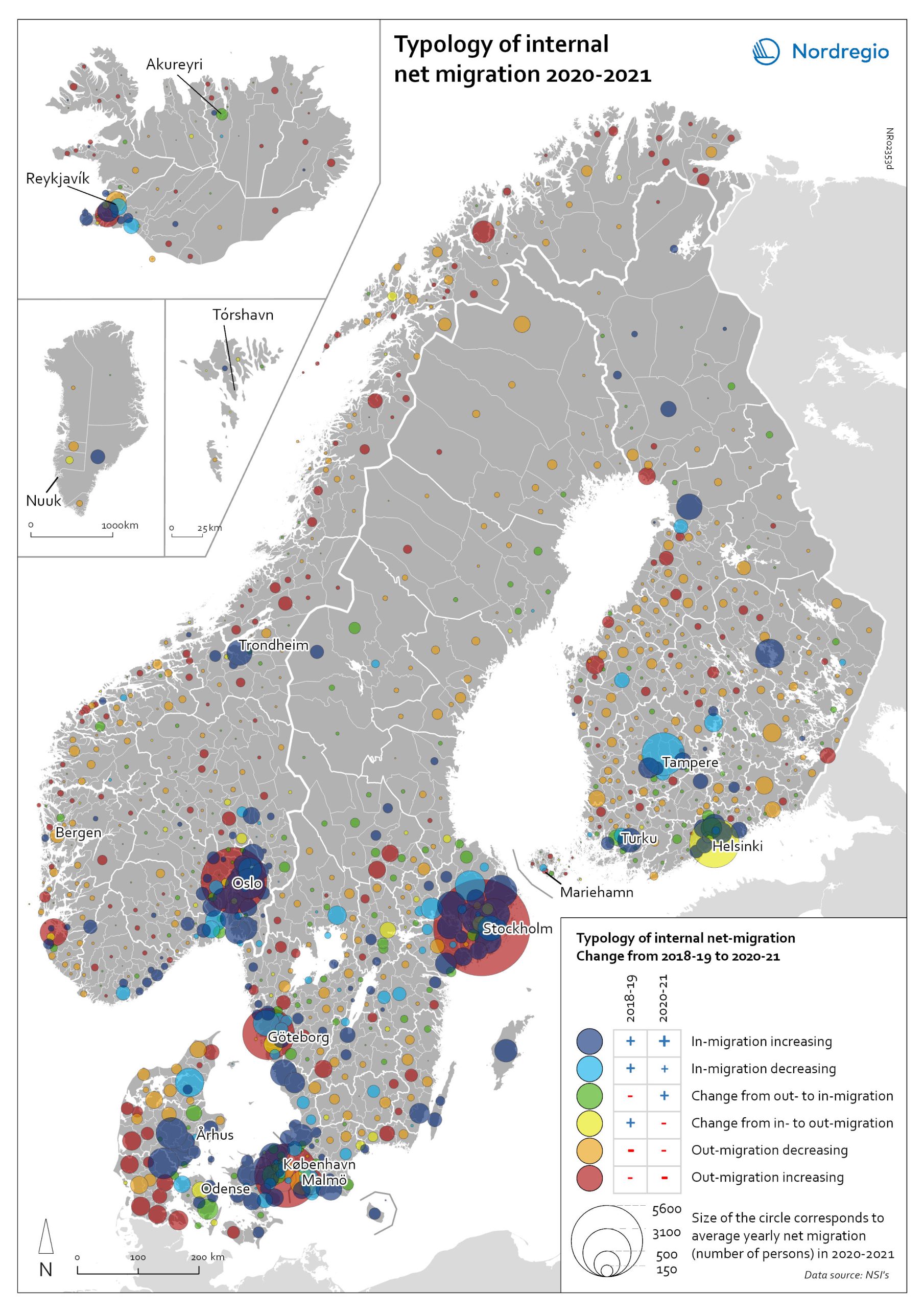
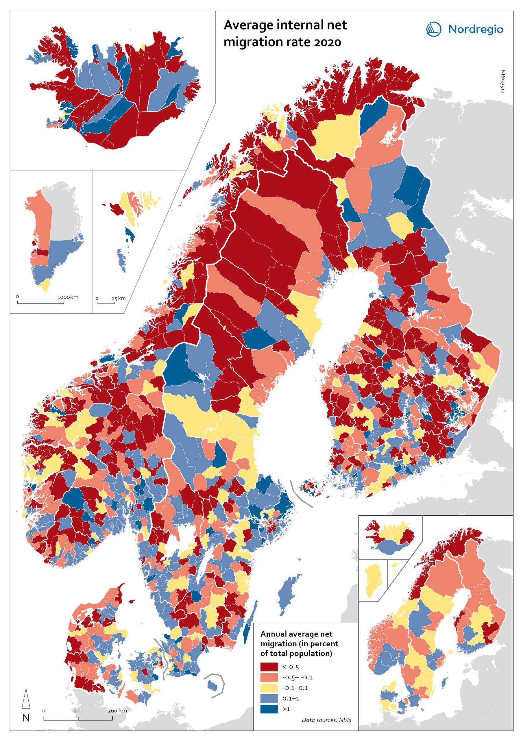
Typology of internal net migration 2020-2021
The map presents a typology of internal net migration by considering average annual internal net migration in 2020-2021 alongside the same figure for 2018-2019. The colours on the map correspond to six possible migration trajectories: Dark blue: Internal net in migration as an acceleration of an existing trend (net in-migration in 2020-2021 + increase compared to 2018-2019) Light blue: Internal net in migration but at a slower rate than previously (net in-migration in 2020-2021 + decrease compared to 2018-2019) Green: Internal net in migration as a new trend (net in-migration in 2020-2021 + change from net out-migration compared to 2018-2019) Yellow: Internal net out migration as a new trend (net out-migration in 2020-2021 + change from net in-migration compared to 2018-2019) Orange: Internal net out migration but at a slower rate than previously (net out-migration in 2020-2021 + decrease compared to 2018-2019) Red: Internal net out migration as a continuation of an existing trend (net out-migration in 2020-2021 + increase compared to 2018-2019) The patterns shown around the larger cities reinforces the message of increased suburbanisation as well as growth in smaller cities in proximity to large ones. In addition, the map shows that this is in many cases an accelerated (dark blue circles), or even new development (green circles). Interestingly, although accelerated by the pandemic, internal out migration from the capitals and other large cities was an existing trend. Helsinki stands out as an exception in this regard, having gone from positive to negative internal net migration (yellow circles). Similarly, slower rates of in migration are evident in the two next largest Finnish cities, Tampere and Turku (light blue circles). Akureyri (Iceland) provides an interesting example of an intermediate city which began to attract residents during the pandemic despite experiencing internal outmigration prior. From a rural perspective there are…
- 2022 May
- Demography
- Migration
- Nordic Region
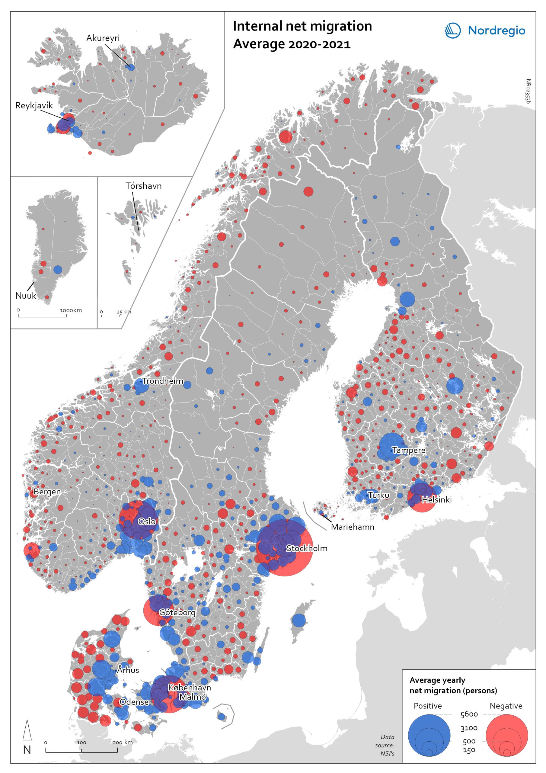
Internal net migration 2020-2021
The map shows the average internal net migration in 2020 and 2021 for Nordic municipalities. Blue dots indicate positive internal net migration (more people moving in than out) and red dots indicate negative internal net migration (more people moving out than in), while the size of the dots represents the extent of the positive or negative trend. Internal migration refers to a change of address within the same country. The map shows substantial outmigration from the Nordic capitals, as well as from Gothenburg and Malmö in Sweden. Alongside increased suburbanisation, the map also provides some evidence of growth in medium-sized cities and smaller cities within commuting distance of larger cities.
- 2022 May
- Demography
- Migration
- Nordic Region
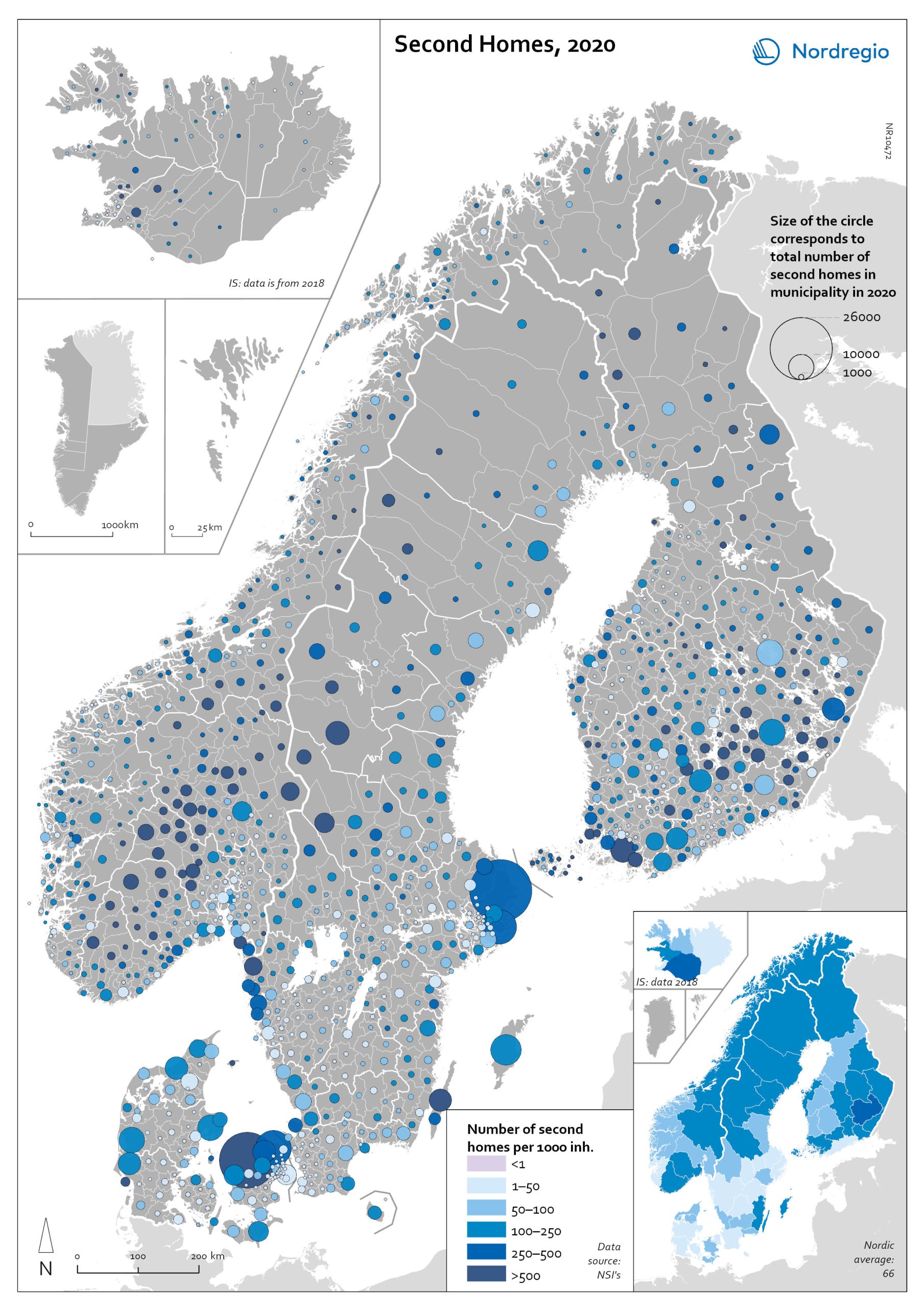
Second Homes 2020
The map shows the locations of second homes in the Nordic countries. The size of the circle represents the number of second homes in each municipality, while the colour highlights this number in the context of the permanent population, with darker colours representing a larger number of second homes per 1 000 inhabitants. The main areas for second homes – both in numbers and in relation to permanent inhabitants – are Northern Sjælland and along the west coast of Jylland (Denmark); mid-eastern lake areas (Etelä-Savo/Södra Savolax) and southwest archipelago including Åland (Finland); municipalities in proximity to Reykjavík in south of Iceland; the southern mountain areas Innlandet and Buskerud fylke (Norway); and the southern mountains area Dalarna and Jämtland Härjedalen, Stockholm archipelago, and Öland (Sweden).
- 2022 May
- Nordic Region

Change in overnight stays for domestic visitors 2019–2020
The map shows the relative change in the number of overnight stays at the regional level between 2019 and 2020 for domestic visitors. This map is related to the same map showing change in overnight stays for foreign visitors 2019–2020. The sharpest fall in visitors from abroad was in destinations where foreign tourists usually make up a high proportion of the total visitors. This is particularly relevant to islands like Åland (89% decrease on foreign visitors, from early 2019 to mid-2020) and to Iceland (66-77% drop depending on region). Lofoten and Nordland County in Norway, as well as Western Norway with Møre and Romsdal, which also have a high proportion of international tourists during the summer season due to their scenic landscape, also recorded sharp falls of 77-79% on foreign visitors during the same period. In Finland, the lake district (South Savo) and Southern Karelia, as well as the coastal Central Ostrobothnia (major cities Vasa and Karleby), recorded a 75-77% drop in the number of visitors from abroad. The fall here was mainly due to the lack of tourists from Russia. Even Finnish Lapland suffered a major fall in international visits during the winter peak period. For many local businesses that rely heavily on winter holidaymakers, the 2021/22 winter was a make-or-break season. In Sweden, the regions of Kalmar, Västra Götaland, Värmland and Örebro lost 77–79% of visitors from abroad, probably due to much fewer visitors from neighbouring Norway and from Denmark. In Denmark, the number of overnight stays by visitors from abroad to the Capital Region was down by 73%, whereas the number of domestic visitors declined by 27%. No region lost as many overnight visitors, both from abroad and domestic, as the capital cities and larger urban areas in the Nordic countries. Copenhagen, Oslo, Stockholm, Helsinki and Reykjavik…
- 2022 March
- Nordic Region
- Tourism
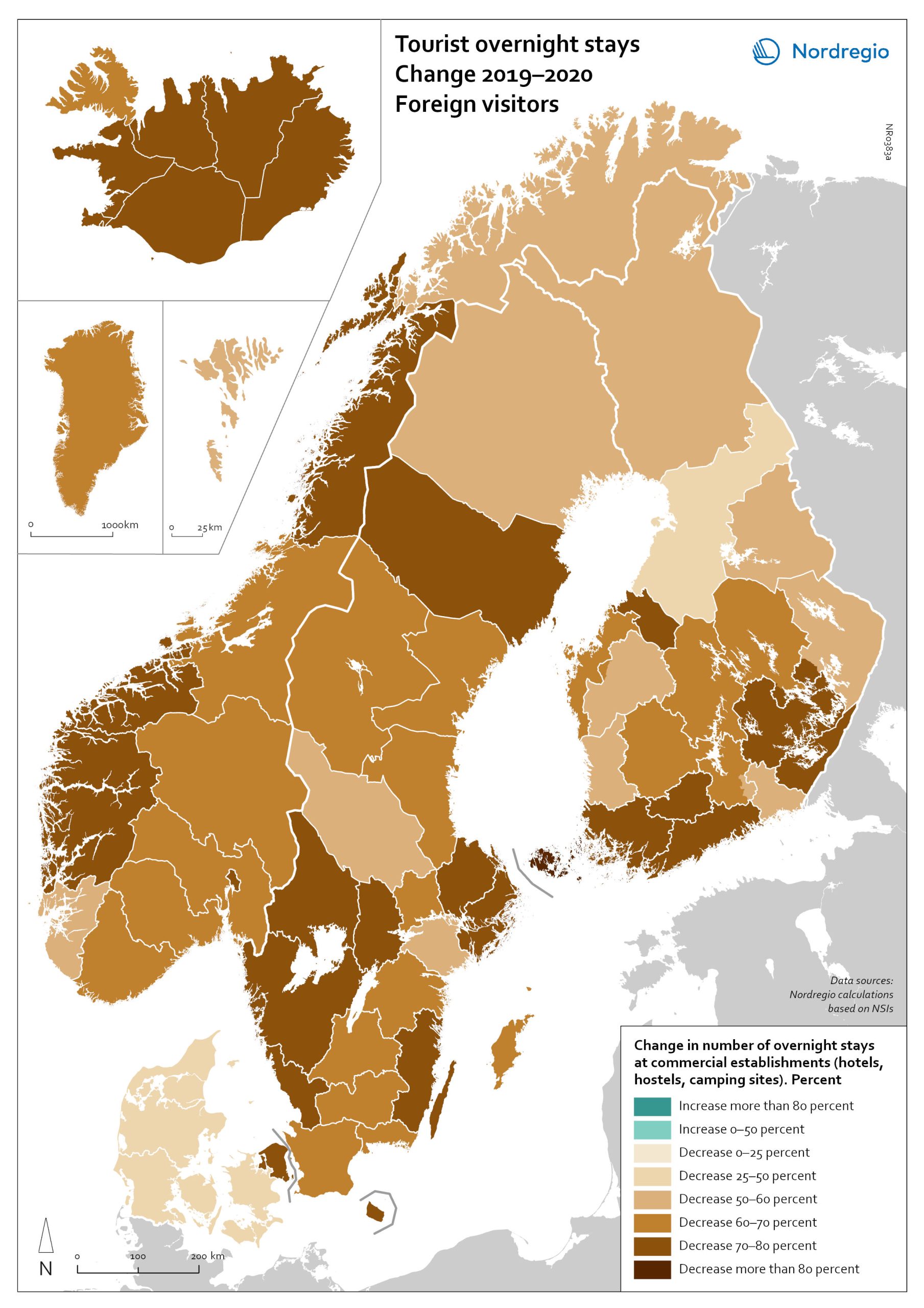
Change in overnight stays for foreign visitors 2019–2020
The map shows the relative change in the number of overnight stays at the regional level between 2019 and 2020 for foreign visitors. This map is related to the same map showing change in overnight stays for domestic visitors 2019–2020. The sharpest fall in visitors from abroad was in destinations where foreign tourists usually make up a high proportion of the total visitors. This is particularly relevant to islands like Åland (89% decrease on foreign visitors, from early 2019 to mid-2020) and to Iceland (66-77% drop depending on region). Lofoten and Nordland County in Norway, as well as Western Norway with Møre and Romsdal, which also have a high proportion of international tourists during the summer season due to their scenic landscape, also recorded sharp falls of 77-79% on foreign visitors during the same period. In Finland, the lake district (South Savo) and Southern Karelia, as well as the coastal Central Ostrobothnia (major cities Vasa and Karleby), recorded a 75-77% drop in the number of visitors from abroad. The fall here was mainly due to the lack of tourists from Russia. Even Finnish Lapland suffered a major fall in international visits during the winter peak period. For many local businesses that rely heavily on winter holidaymakers, the 2021/22 winter was a make-or-break season. In Sweden, the regions of Kalmar, Västra Götaland, Värmland and Örebro lost 77–79% of visitors from abroad, probably due to much fewer visitors from neighbouring Norway and from Denmark. In Denmark, the number of overnight stays by visitors from abroad to the Capital Region was down by 73%, whereas the number of domestic visitors declined by 27%. No region lost as many overnight visitors, both from abroad and domestic, as the capital cities and larger urban areas in the Nordic countries. Copenhagen, Oslo, Stockholm, Helsinki and Reykjavik…
- 2022 March
- Nordic Region
- Tourism
OECD House Price Index. Change 2020Q2–2021Q2
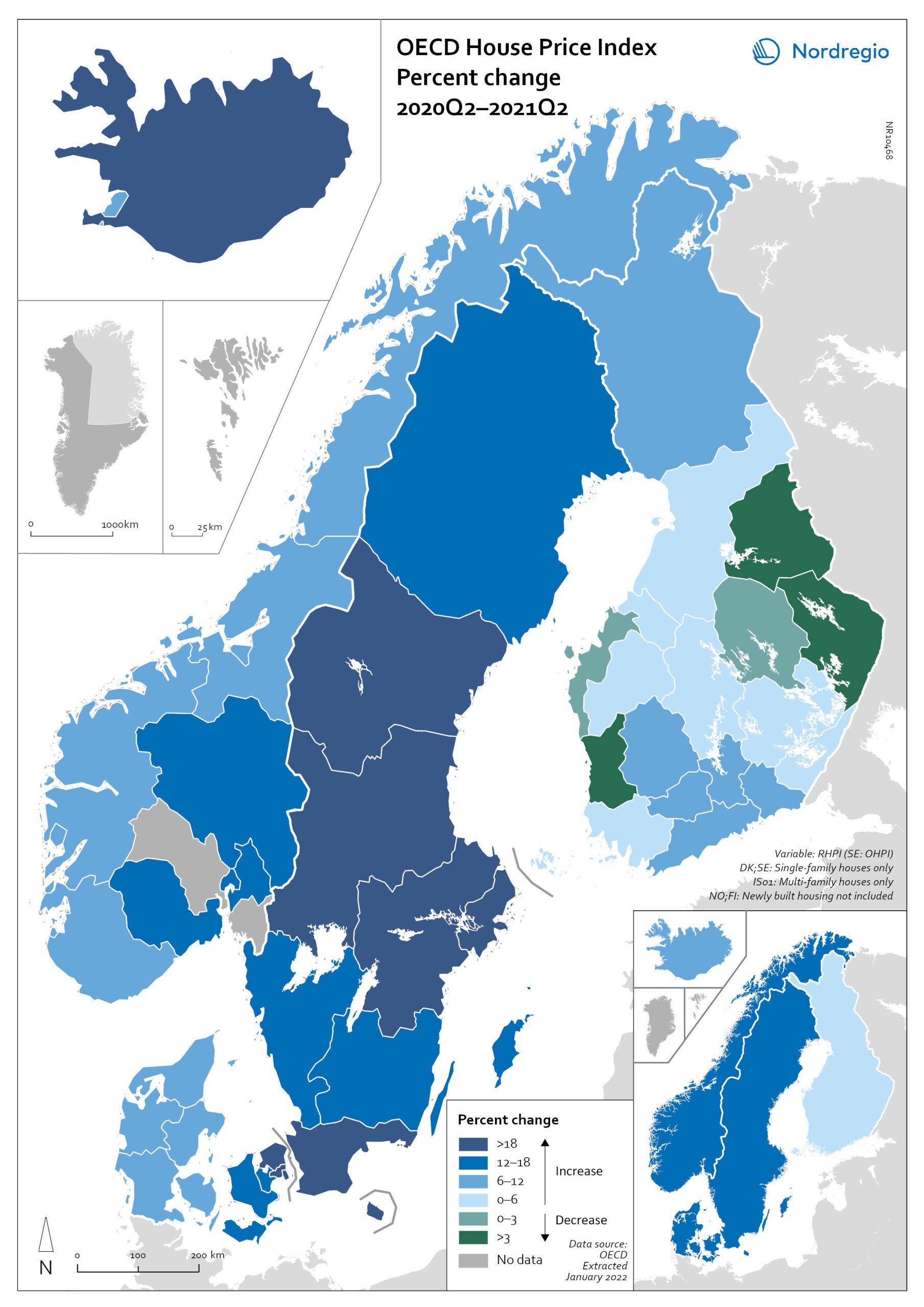
The map shows the relative change of the OECD House Price Index from Q2 2020 to Q2 2021. The map shows that the price development was not uniform within the countries. Iceland recorded the largest price increases overall, with the most marked price increases found outside of the capital region. All Swedish regions recorded increases above 20%, with the highest increases in the Stockholm and Malmö regions. All Norwegian regions showed price increases, though to a lesser extent than Swedish regions in most cases. In Denmark, Bornholm, Sjælland and the rural islands of Lolland and Falster recorded relatively high price increases, although many rural areas developed from low absolute prices in 2020. Finland was the only country where some regions saw property prices decrease. Moderate increases were still observed in some of the southern regions, where the major cities are located, and in the north.
- 2022 March
- Economy
- Nordic Region
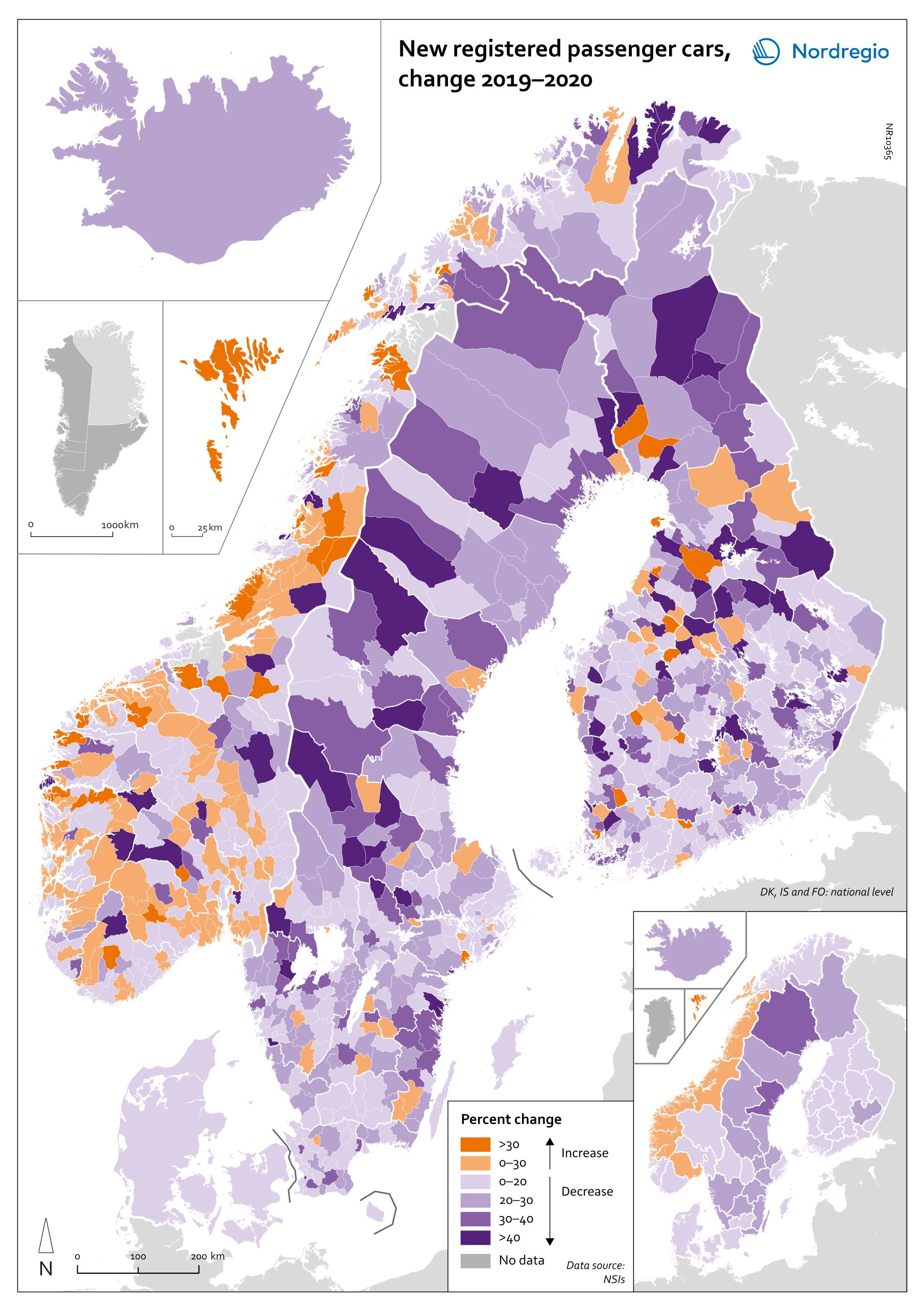
Change in new registered cars 2019-2020
The map shows the change in new registered passenger cars from 2019 to 2020. In most countries, the number of car registrations fell in 2020 compared to 2019. On a global scale, it is estimated that sales of motor vehicles fell by 14%. In the EU, passenger car registrations during the first three quarters of 2020 dropped by 28.8%. The recovery of consumption during Q4 2020 brought the total contraction for the year down to 23.7%, or 3 million fewer cars sold than in 2019. In the Nordic countries, consumer behaviour was consistent overall with the EU and the rest of the world. However, Iceland, Sweden, Finland, Åland, and Denmark recorded falls of 22%–11% – a far more severe decline than Norway, where the market only fell by 2.0%. The Faroe Islands was the only Nordic country to record more car registrations, up 15.8% in 2020 compared to 2019. In Finland, Iceland, Norway, and Sweden, there were differences in car registrations in different parts of the country. In Sweden and Finland, the position was more or less the same in the whole of the country, with only a few municipalities sticking out. In Finland and Sweden, net increases in car registrations were concentrated in rural areas, while in major urban areas, such as Uusimaa-Nyland in Finland and Västra Götaland and Stockholm in Sweden, car sales fell between 10%–22%. Net increases in Norway were recorded in many municipalities throughout the whole country in 2020 compared to 2019.
- 2022 March
- Economy
- Nordic Region
- Transport
Bankruptcies in 2020 by industry and region
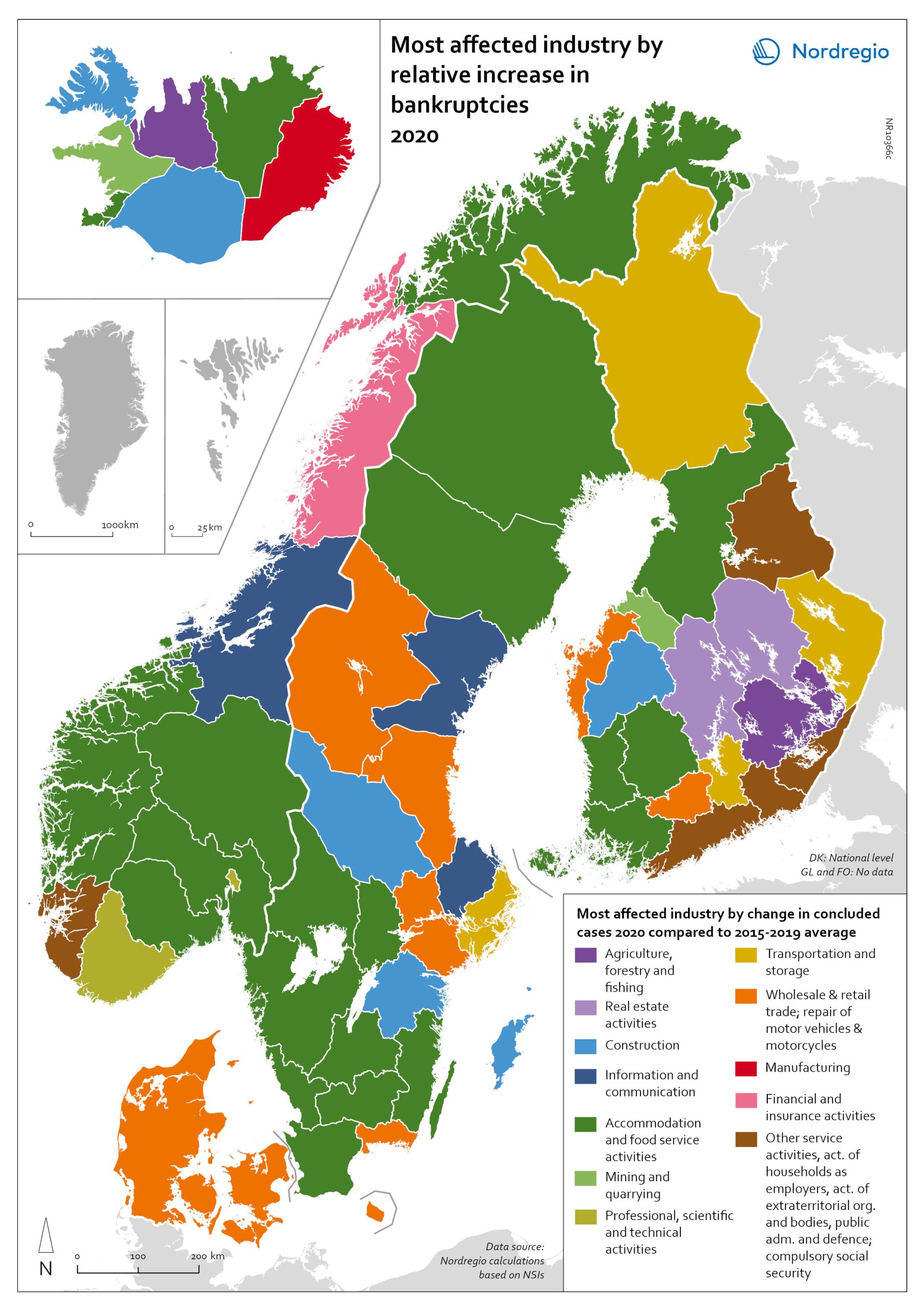
The map shows the most affected industry by relative increase in concluded business bankruptcies 2020 compared to 2015–2019 average. Regional patterns in business failures are linked to factors ranging from the effectiveness of the measures adopted by the various governments to the exposure of regional economies to vulnerable sectors. Regions with higher numbers of bankruptcies tend to reflect the concentration of economic activity in sectors particularly affected by the pandemic. It comes as little surprise that Accommodation and food service activities were the industries with the largest increase in business bankruptcies in 2020 compared to the 2015–2019 baseline. In the Nordic Region as a whole, the number rose by 28.6%. This pattern is also discernible at the regional level. Hotels and restaurants were the activities with the biggest increase in the number of bankruptcies in a significant number of Swedish, Norwegian and Finnish regions. Other sectors suffering higher-than-average numbers of business bankruptcies are service industries, particularly those requiring closer social interaction, like Education (16.5% increase), Other service activities (12.0% increase) and Administrative and support service activities (7.9% increase). The logistics sector was also greatly affected, with major impact localised around logistics centres and transport nodes in the different countries. In the capital regions of Oslo, Stockholm and Helsinki, Transportation and storage was the sector with the largest increase in bankruptcies. Wholesale and retail trade; repair of motor vehicles and motorcycles was the industry to suffer the most in Denmark and several Finnish and Swedish regions.
- 2022 March
- Economy
- Nordic Region
Relative change in the number of business bankruptcies
The map shows the relative change in the number of concluded business bankruptcies by region, 2015–2019 average compared to 2020. At sub-national levels, the distribution of business bankruptcies does not show a clear territorial pattern. In Iceland and Denmark, businesses in the most urbanised areas, including the capital regions, seem to have been those that benefited most from the economic mitigation measures (-23.9% in Höfuðborgarsvæðið and -24.4% in Region Hovedstaden). By contrast, Oslo is the only Norwegian region where there were more business bankruptcies in 2020 compared to the 2015–2019 baseline (1.9% increase). Most Norwegian regions did, in fact, have fewer bankruptcies in 2020, particularly in the western regions. One plausible explanation for this could be that the number of business failures during the baseline period was especially high in western Norway due to the fall in oil prices in 2014–2015. In Sweden the situation is even more mixed. Here, businesses in urban areas seem to have been more exposed to the distress caused by the Covid-19 pandemic. The most urbanised regions in the Stockholm-Gothenburg-Malmö corridor registered a greater increase in liquidations (Jönköping, Kronoberg and Södermanland regions saw surges of around 20%). However, predominantly rural regions in Sweden, such as Västerbotten and Jämtland, also recorded higher numbers of bankruptcies than average (9.8% and 8.8% increase, respectively). In Finland, the impact was greater in Lapland (26.9%) and around Helsinki (Uusimaa, 25.9%) than in the central parts of the country. Åland also experienced a moderate rise in business bankruptcies in 2020 (4.0%), mostly related to the tourism sector.
- 2022 March
- Economy
- Nordic Region
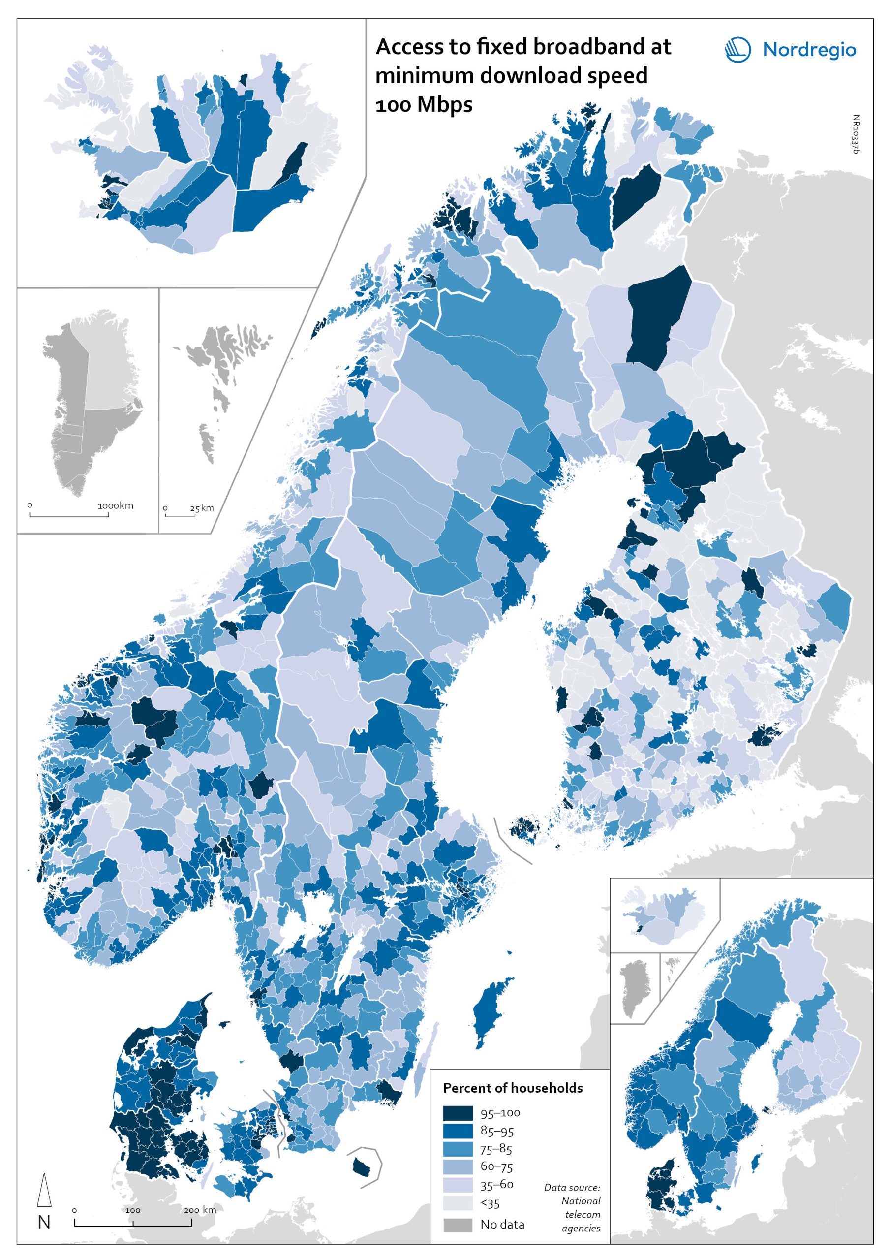
Access to fixed broadband at minimum download speed 100 Mpbs
The map shows the proportion of households that had access to fixed-line broadband with download speeds >100 Mbps (superfast broadband) at the municipal level, with darker colours indicating higher coverage. Overall, Denmark has the highest levels of connectivity, with 92% of municipalities providing superfast broadband to at least 85% of households. In over half (59%) of all Danish municipalities, almost all (>95%) of households have access to this connection speed. The lowest levels of connectivity are found in Finland. This is particularly evident in rural municipalities where, on average, less than half of households (48%) have access to superfast broadband. Connectivity levels are also rather low in some parts of Iceland, for example, the Westfjords and several municipalities in the east. Households in urban municipalities are still more likely to have access to superfast broadband than households in rural or intermediate municipalities, but the gap appears to be closing in most. This is most evident in Norway, where the average household coverage for rural municipalities increased by 31% between 2018 and 2020. By comparison, average household coverage for urban municipalities in Norway increased by only 0.7%. In the archipelago (Åland Islands, Stockholm and Helsinki), general broadband connectivity is good; however, some islands with many second homes still have poor coverage.
- 2022 March
- Labour force
- Nordic Region
- Others
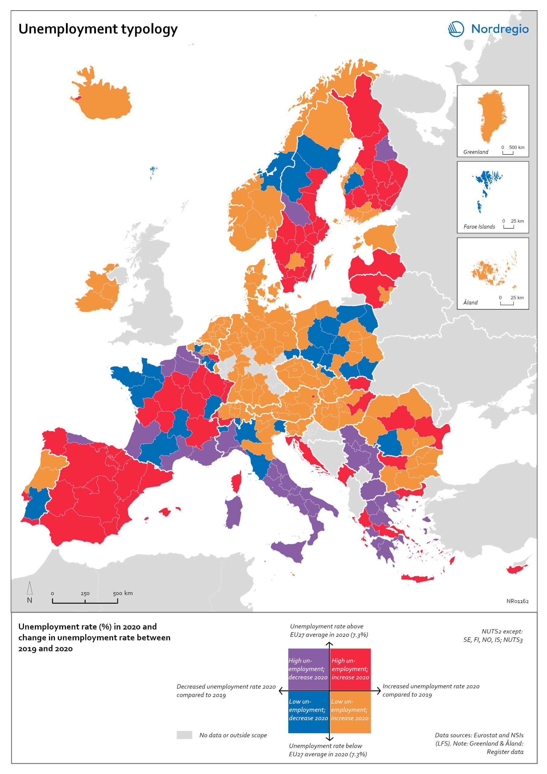
Unemployment typology
The map shows a typology of European regions by combining information on pre-pandemic unemployment rates with unemployment rates in 2020, based on the annual Labour Force Survey (LFS) that is measured in November. On one axis, the typology considers the extent of the change in the unemployment rate between 2019 and 2020. On the other axis, it considers whether the unemployment rate in 2020 was above or below the EU average of 7.3%. Regions are divided into four types based on whether the unemployment rate decreased or increased and how it relates to the EU average. Regions falling into the first type, shown in red on the map, had an increase in the unemployment rate in 2020 as well as an above-average unemployment rate in general in 2020. These regions were most affected by the pandemic. They are mainly found in northern and central parts of Finland, southern and eastern Sweden, the capital area of Iceland, Latvia, Lithuania, Spain and central parts of France. Regions falling into the second type, shown in orange on the map, had an increase in the unemployment rate in 2020 but a below-average unemployment rate in general in 2020. These regions had low pre-pandemic unemployment rates and so were not as badly affected as the red regions, despite the rising unemployment rates. They are located in Denmark, Iceland, Norway, Åland, southern and western Finland, Sweden (Gotland, Jönköping, and Norrbotten), Estonia, Ireland, northern Portugal and central and eastern parts of Europe.
- 2022 March
- Europe
- Labour force

Population change by component 2020
The map shows the population change by component 2020. The map is related to the same map showing regional and municipal patterns in population change by component in 2010-2019. Regions are divided into six classes of population change. Those in shades of blue or green are where the population has increased, and those in shades of red or yellow are where the population has declined. At the regional level (see small inset map), all in Denmark, all in the Faroes, most in southern Norway, southern Sweden, all but one in Iceland, all of Greenland, and a few around the capital in Helsinki had population increases in 2010-2019. Most regions in the north of Norway, Sweden, and Finland had population declines in 2010-2019. Many other regions in southern and eastern Finland also had population declines in 2010-2019, mainly because the country had more deaths than births, a trend that pre-dated the pandemic. In 2020, there were many more regions in red where populations were declining due to both natural decrease and net out-migration. At the municipal level, a more varied pattern emerges, with municipalities having quite different trends than the regions of which they form part. Many regions in western Denmark are declining because of negative natural change and outmigration. Many smaller municipalities in Norway and Sweden saw population decline from both negative natural increase and out-migration despite their regions increasing their populations. Many smaller municipalities in Finland outside the three big cities of Helsinki, Turku, and Tampere also saw population decline from both components. A similar pattern took place at the municipal level in 2020 of there being many more regions in red than in the previous decade.
- 2022 March
- Demography
- Migration
- Nordic Region
Net internal migration rate 2020
The map shows the internal net migration in 2020. The map is related to the same map showing net internal migration in 2010-2019. The maps show several interesting patterns, suggesting that there may be an increasing trend towards urban-to-rural countermigration in all the five Nordic countries because of the pandemic. In other words, there are several rural municipalities – both in sparsely populated areas and areas close to major cities – that have experienced considerable increases in internal net migration. In Finland, for instance, there are several municipalities in Lapland that attracted return migrants to a considerable degree in 2020 (e.g., Kolari, Salla, and Savukoski). Swedish municipalities with increasing internal net migration include municipalities in both remote rural regions (e.g., Åre) and municipalities in the vicinity of major cities (e.g., Trosa, Upplands-Bro, Lekeberg, and Österåker). In Iceland, there are several remote municipalities that have experienced a rapid transformation from a strong outflow to an inflow of internal migration (e.g., Ásahreppur, Tálknafjarðarhreppurand, and Fljótsdalshreppur). In Denmark and Norway, there are also several rural municipalities with increasing internal net migration (e.g., Christiansø in Denmark), even if the patterns are somewhat more restrained compared to the other Nordic countries. Interestingly, several municipalities in capital regions are experiencing a steep decrease in internal migration (e.g., Helsinki, Espoo, Copenhagen and Stockholm). At regional level, such decreases are noted in the capital regions of Copenhagen, Reykjavík and Stockholm. At the same time, the rural regions of Jämtland, Kalmar, Sjælland, Nordjylland, Norðurland vestra, Norðurland eystra and Kainuu recorded increases in internal net migration. While some of the evolving patterns of counterurbanisation were noted before 2020 for the 30–40 age group, these trends seem to have been strengthened by the pandemic. In addition to return migration, there may be a larger share of young adults who decide to…
- 2022 March
- Demography
- Migration
- Nordic Region
