51 Maps

Internal Migration 2021
This map shows the internal net migration in 2021 as a percentage of the total population. This map shows the internal net migration in 2021 as a percentage of the total population. The small map shows the result on a regional level, and the big map on the municipal level. Internal (sometimes referred to as domestic) net migration refers to migration between municipalities and regions within the same country. International migration is excluded. In 2021, internal net migration was positive (indicated by shades of blue) or at least balanced (shown in yellow) in many of the municipalities in central and northern Sweden and in central and eastern Finland – areas that traditionally were more likely to lose population due to internal migration. Conversely, several municipalities in the capital regions – such as Stockholm, Oslo, and Copenhagen – exhibited negative internal net migration. Iceland, Greenland, and Åland exhibited mixed internal migration flows, with some municipalities experiencing positive net migration while others faced negative net migration. The Faroe Islands stand as an exception, maintaining only positive internal migration at the municipal level for this year.
 2025 April
 - Demography
- Migration
- Nordic Region
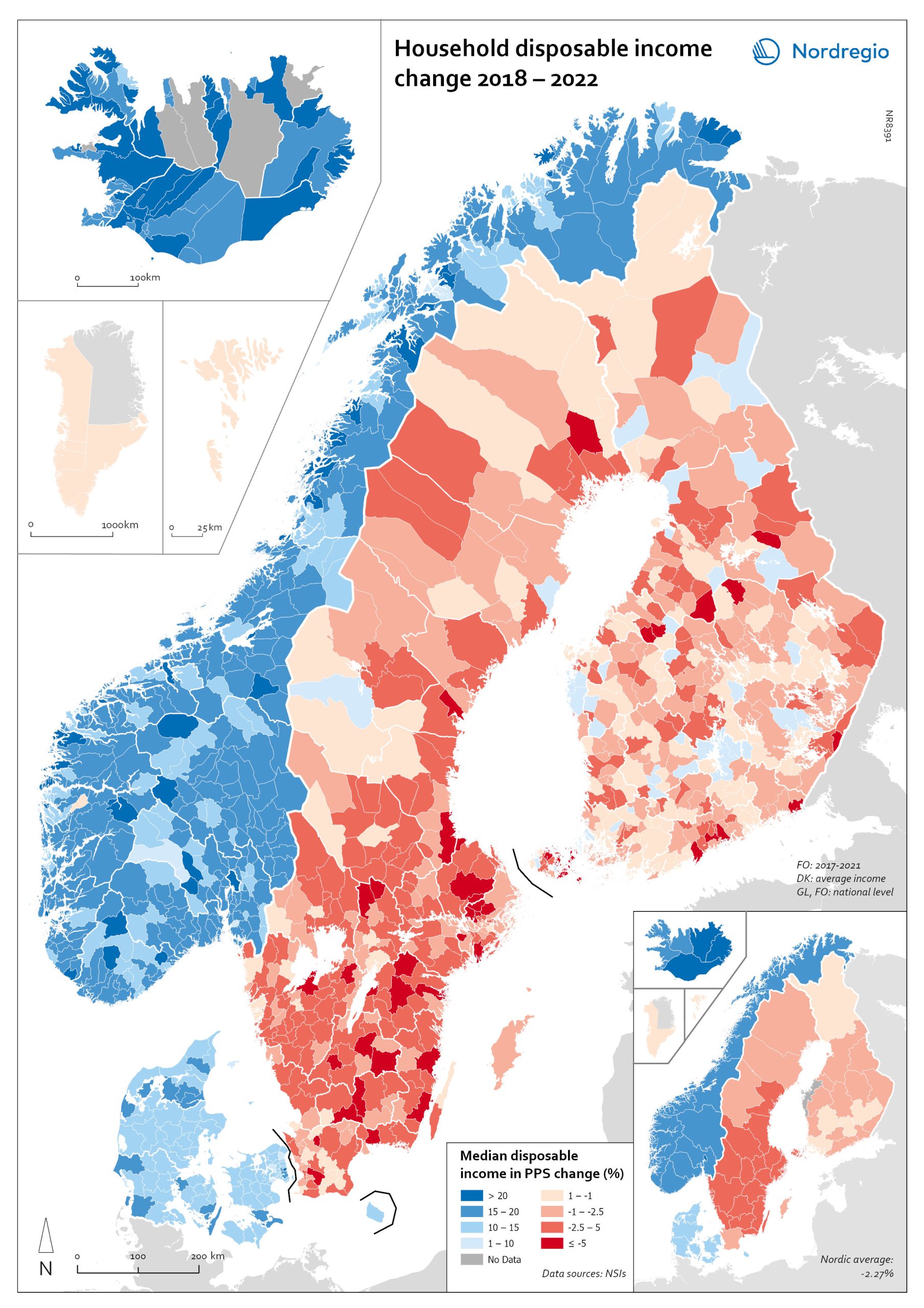
Household disposable income change 2018-2022
This map shows the percentage change in household disposable income between 2018 and 2022 in Nordic municipalities (big map) and regions (small map). Household disposable income per capita is a common indicator of the affluence of households and, therefore, of the material quality of life. It reflects the income generated by production, measured as GDP that remains in the regions and is financially available to households, excluding those parts of GDP retained by corporations and government. In sum, household disposable income is what households have available for spending and saving after taxes and transfers. It is ‘equivalised’ – adjusted for household size and composition – to enable comparison across all households. Purchasing Power Standards (PPS) is used to compare the countries’ economies and the cost of living for households. As shown in the map, between 2018 and 2022, household disposable income increased for all Danish, Icelandic, and Norwegian municipalities and decreased for Finnish and Swedish municipalities. On average, the city municipalities have higher incomes and increased most in Finland and Sweden in 2018–2022. In Sweden, a tendency towards larger falls in income was observed in several southern municipalities. In summary, absolute household income increased in all Nordic countries but not when measured in purchasing power. Based on this metric, on average, Norwegian households are the most well-off and Iceland the worst off, while Danish households benefited from a stronger currency in 2022. Single-parent households have had lower increases in household income than other families in Norway and parts of Sweden. Municipalities show a similar trend in Norway and Denmark, although Norwegian coastal municipalities fared slightly better in 2022. Disposable income is falling in all Swedish and Finnish municipalities.
- 2025 April
- Economy
- Nordic Region
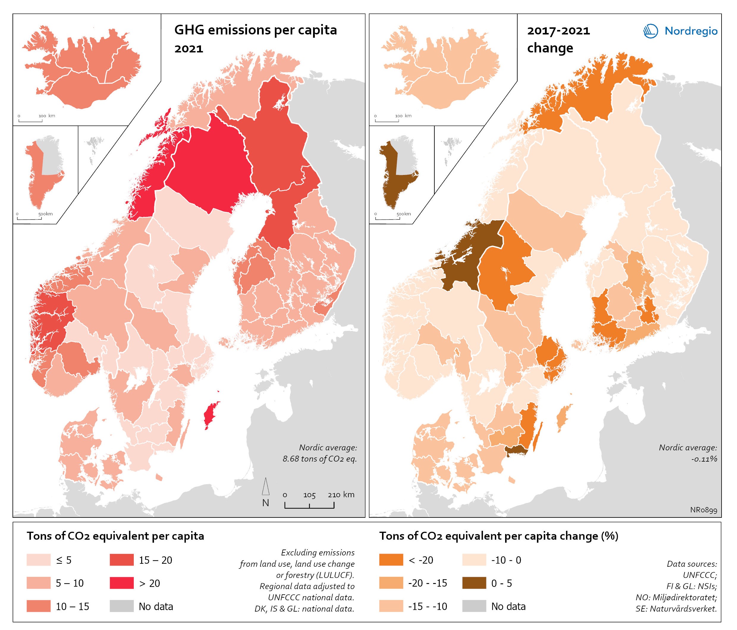
Regional GHG emissions per capita in 2021 and change 2017-2021 on a territorial basis
The data excludes emissions from land use, land use change or forestry (LULUCF). The regional data has been adjusted to UNFCCC national data. The data for Denmark, Iceland and Greenland is on national level. It should be noted that displaying emissions on a territorial basis may be skewed due to the inter-regional dynamics of energy processes, natural resource distributions and concentrations of industrial activities. From 2017 to 2021, the Nordic regions cut their per-capita GHG emissions by on average 11.3%, with an overall Nordic average fall of 8.7% over the same period. In regions historically reliant on fossil fuels for heat and power generation, emissions have continued to decline. This trend is evident in Denmark, as well as in Southern Sweden and Southern Finland – densely populated areas that have taken steps toward expanding district heating coverage and reducing carbon intensity. The largest decrease in GHG emissions per capita was found in Troms and Finnmark, with a 42.3% decrease, Satakunta with a 30.2% decrease and Päijät-Häme – Päijänne-Tavastland with a 29.2% decrease. Only three regions (Greenland, Trøndelag and Blekinge) saw an increase in GHG emissions per capita. At an aggregated level, industrial-related emissions decreased throughout the Nordic Region, but this trend does not hold true for regions in Norway with intensive offshore oil and gas operations. For instance, Nordland, Vestland, Møre og Romsdal, Vestfold and Telemark exhibited the highest per capita emissions in 2021. Between 2017 and 2021, emissions were increasing in many Norwegian regions with intensive offshore oil and gas activity, but also in Norrbotten in Sweden (21.2 tonnes of CO2 equivalent per capita) and Gotland (33.6 tonnes of CO2 equivalent per capita) due to intensive activity in the metal and cement industries, respectively, as well as in several Finnish regions. At the other end of the scale, the…
- 2025 April
- Environment
- Nordic Region
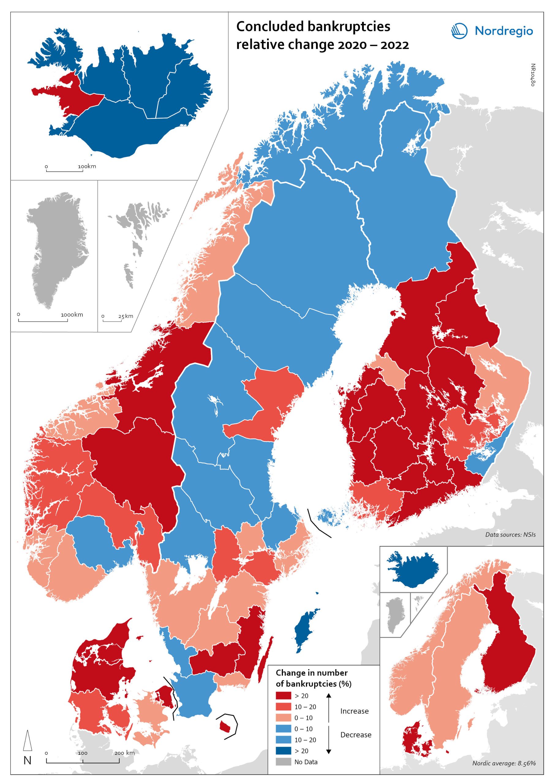
Change in the number of business bankruptcies (2020–2022)
This map depicts the change in total number of bankruptcies in the Nordic regions between 2020 and 2022. The red shades indicates an increase in numbers of bunkruptcies and blue shades a decrease. The big map shows the regional level and the small map the national level. The rate of business bankruptcies is a core indicator of the robustness of the economy from the business perspective. Nordic and international businesses have been impacted by both the COVID-19 pandemic and rising inflation in recent years. In terms of the level of bankruptcies, data from Eurostat (2024) shows that the Nordic countries fared relatively well compared to other high-income countries between 2020 – 2022. In the years during and after the COVID-19 pandemic, the most densely populated regions saw the highest levels of bankruptcies. This finding is partly to be expected, as these regions also tend to be those with the highest number of companies. However, some variation can be seen across the countries. Overall, Iceland and Finland experienced the lowest rate of bankruptcies in 2020 and 2022. Denmark had the highest level of bankruptcies during COVID-19. Potential explanations for the national variations may include the countries’ varying strategic approaches to the pandemic. Denmark enforced more restrictive lockdowns compared to, for example, Sweden, where the less restrictive approach has been linked to the more limited impact on business bankruptcies in the early part of the pandemic. Furthermore, there is a large consensus that the many jobretention schemes across the Nordic Region also served to limit the number of bankruptcies. However, new data from early 2024 shows that after the job-retention schemes ended, and while high inflation and interest rates were increasing the pressure on Nordic companies, the level of bankruptcies increased. In 2023, 8,868 companies went bankrupt in Sweden the highest number…
- 2025 April
- Economy
- Nordic Region

Gini coefficient change 2018-2022
This map shows the percentage change in the Gini coefficient between 2018 and 2022. The big map shows the change on municipal level and the big map at regional level. Blue shades indicate a decrease in income inequality, while red areas indicate an increase in income inequality The Gini coefficient index is one of the most widely used inequality measures. The index ranges from 0–1, where 0 indicates a society where everyone receives the same income, and 1 is the highest level of inequality, where one individual or group possesses all the resources in the society, and the rest of the population has nothing. The map illustrates significant variations in the change in income inequality across Nordic municipalities and regions. Between 2018 and 2022, income inequality increased in predominantly rural municipalities, notably in Jämtland, Gävleborg, Dalarna and Västerbotten in Sweden, as well as Telemark in Norway. For Denmark, the rise in inequality is mainly for the municipalities in Western Jutland. At the same time, approximately one third of municipalities in the Nordic Region experienced a decrease in income inequality during the same period, primarily in Finland and Åland. For example, in Finland, the distribution of inequality was more varied. This trend aligns with the ongoing narrowing of the household income gap observed in many Finnish municipalities since 2011, which is mainly attributed to the economic downturn of the early 2010s, as well as demographic shifts such as outmigration and ageing.
- 2025 April
- Economy
- Nordic Region
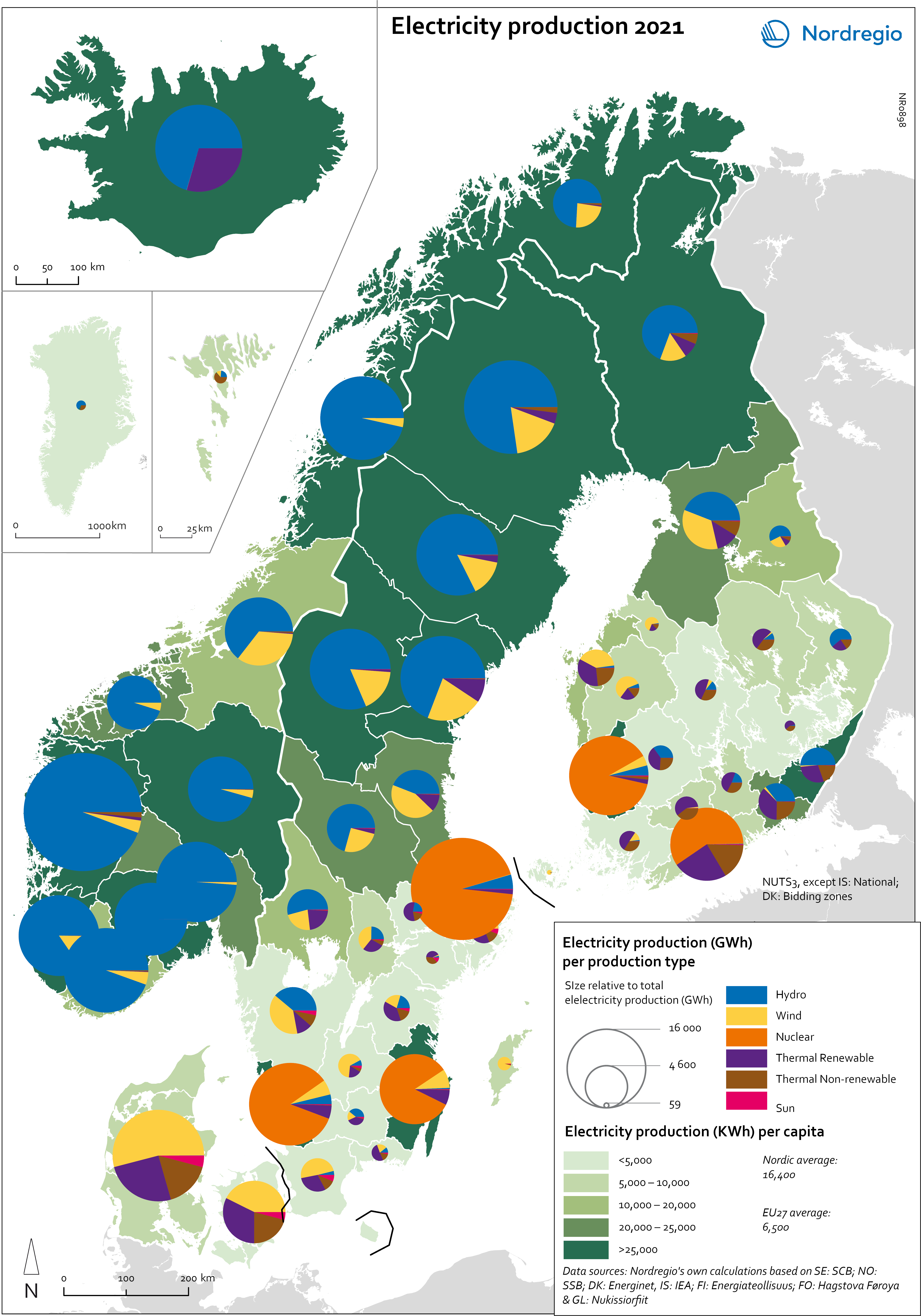
Electricity production 2021
This map shows the spatial distribution of Nordic electricity production per capita, by volume and source type in the Nordic Region in 2021. The data is presented at a regional level, except for Iceland (national level) and Denmark (bidding zones). The circles represent electricity production in GWh, while the green shades indicate electricity production per capita (kWh). Finally, the colour of the circles denotes the source of electricity. The Nordic Region overall has a high electricity production per capita; in fact, Iceland and Norway have the world’s highest electricity production per capita. The electricity mix in 2021 was 96% fossil-free – 73% from renewables (mainly hydropower) and 17% from nuclear power. In 2000 85% of the electricity production was fossile-free. Still there are clear spatial differences in the electricity production. Firstly, we see the high amount of electricity being produced for the five nuclear facilities in Sweden and Finland. Secondly, a substantial volume of hydro-electricity is produced in southern Norway, throughout Iceland, Northern Sweden and Northern Finland. As a result, over half of Nordic electricity is produced from hydropower. Wind power is the source of electricity that has been growing the most during the last two decades, from 1.2% in 2000 to 14% in 2021. The regions with the highest electricity production per capita are in Iceland, Northern Sweden, and Northern and Western Norway. Both Finland and Denmark are net importers of electricity, but both countries have rapidly transitioned away from fossil fuels. Cheap and fossil-free electricity is a prerequisite for the green transition and with growing industries within e.g. battery production, green steel and mining, the need for fossil-free electricity is expected to increase in the coming decades.
- 2025 April
- Environment
- Labour force
- Nordic Region
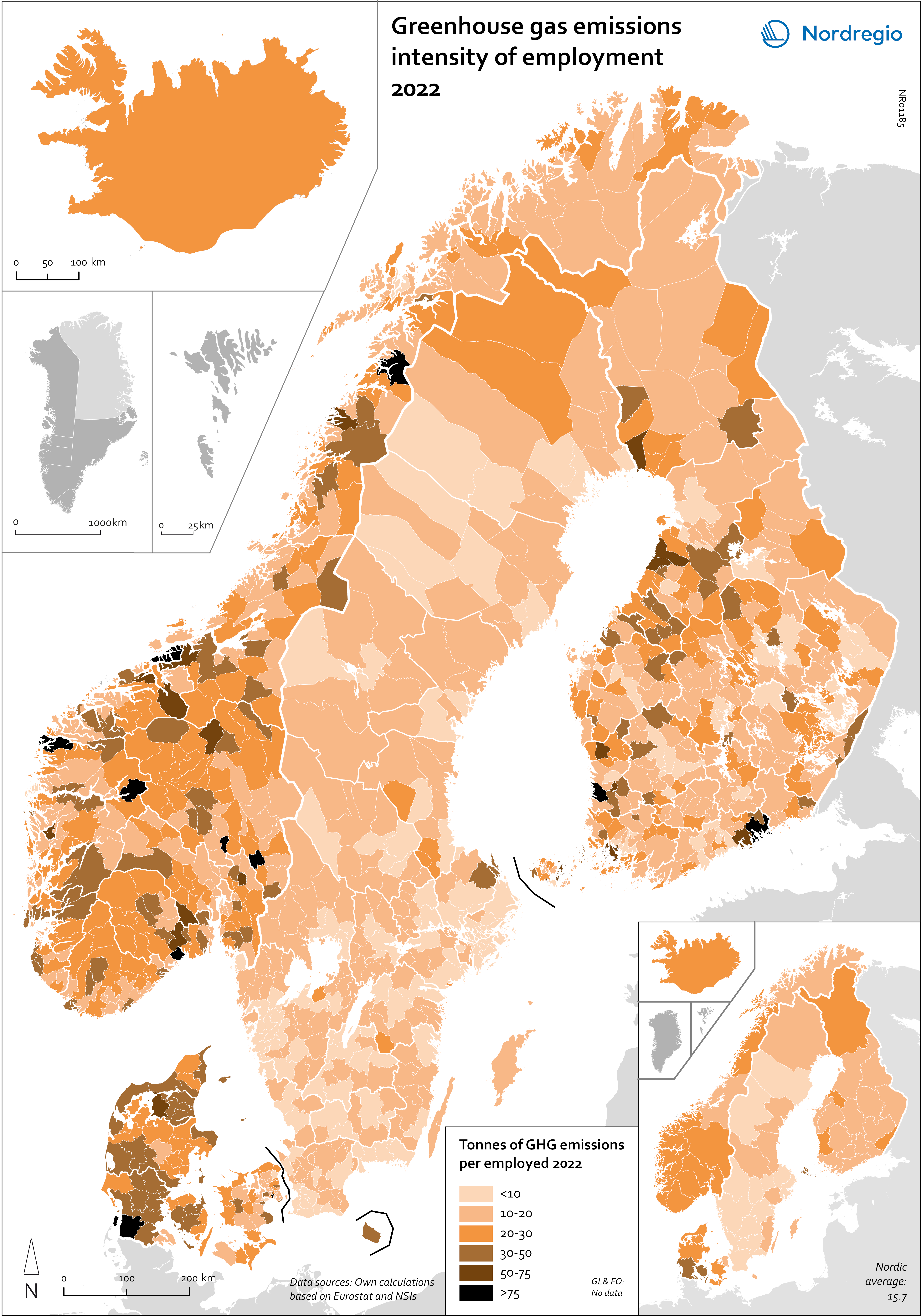
Greenhouse gas emissions intensity of employment in 2022
This map shows the tonnes of greenhouse gas emissions per person employed in Nordic municipalities (big map) and regions (small map) in 2022. The data for Iceland is presented at the national level, while no data was available for the Faroe Islands and Greenland. The map is based on data on emissions per sector and country from Eurostat and detailed employment by sector data from the Nordic statistical offices. By calculating the average emissions per person employed and per sector we could use municipal employment by sector data to assess the average emissions per person employed in each municipality. The results are an estimation based on the assumption that all jobs in the same sector have the same GHG emissions. In 2022, greenhouse gas (GHG) emissions per person employed in the Nordic Region were 15.7 tonnes. This is higher than the EU average of 13.5 tonnes. There are also fairly big differences between the Nordic countries, with higher emissions per person employed in Iceland (28.6), Denmark (23.1) and Norway (20.5) and lower emissions in Finland (15.7) and Sweden (8). On the other hand, the emissions per person employed have decreased faster in the Nordic Region than for the EU as a whole. In the last decade, emissions per person employed fell by 24% in the Nordic Region compared to the EU average of 22%. The biggest decrease (32%) was in Finland. The sectors with the highest emissions per worker vary slightly between the countries. In Sweden and Norway, the sector with by far the highest emissions per worker was the manufacture of petroleum coke and refined petroleum products. However, it should be noted that the number of workers in this sector is small. In Denmark, the highest emissions by person employed could be found in water transport; in Finland, in…
- 2025 April
- Environment
- Labour force
- Nordic Region
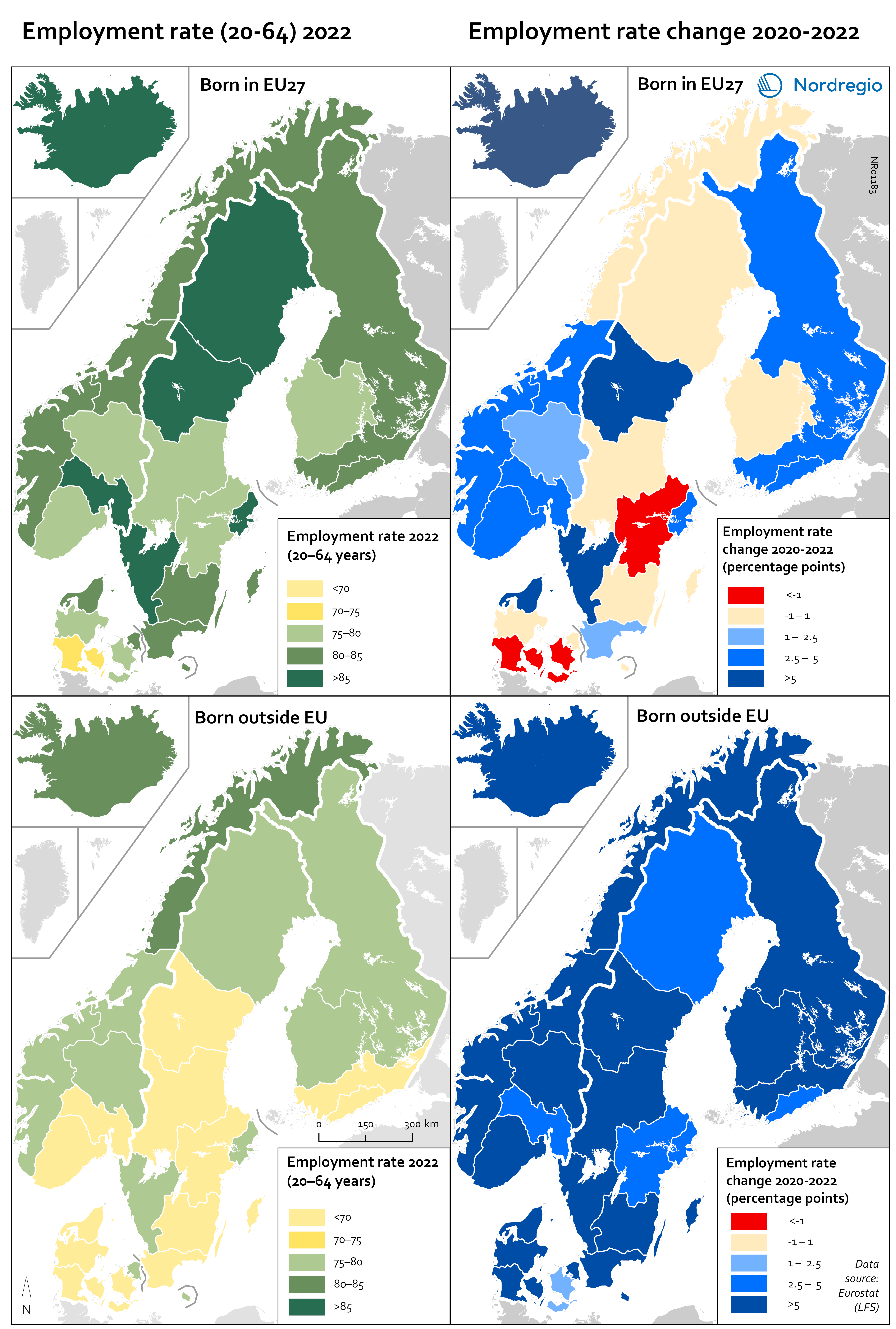
Employment rate 2022 and Employment rate change 2020-2022 among foreign-born
These maps shows the employment rate in 2022 for those born in a EU country (top left) and those born outside of the EU (bottom left), as well as the change in employment rate between 2020 and 2022 for those born in the EU (upper right) and outside the EU (lower right). The data is displayed at NUTS 2 level and comes from the labour force survey (LFS). The category ‘foreign-born’ is quite heterogeneous and consists of everything from labour migrants to refugees – two groups who face quite different conditions and have different connections to the labour market. The employment rate for people born in another EU country – a group that includes a large proportion of labour migrants – has been on par with the employment rate for native-born people for a long time. As can be seen in the top-left figure in the map, in 2022 all NUTS2 regions except Southern Denmark had an employment rate of 75% or more for this group. The highest employment rate was observed in the Swedish NUTS2 regions of Middle Norrland, Stockholm and Western Sweden, followed by Oslo in Norway and Iceland. The employment rate for people born outside of the EU (a group that largely consists of refugees) has been lower for a long time than that of native-born people and those born in the EU. While the employment rate for people born in non-EU countries is still lower than for natives (a 15 percentage point difference (pp) in Sweden, 11 pp in Norway, 7 pp in Denmark and Finland, and 2 pp in Iceland), this gap has been closing in the last couple of years since the pandemic. Between 2020 and 2022, the employment rate for those born outside of the EU rose almost eight percentage points in Denmark…
- 2025 April
- Labour force
- Nordic Region
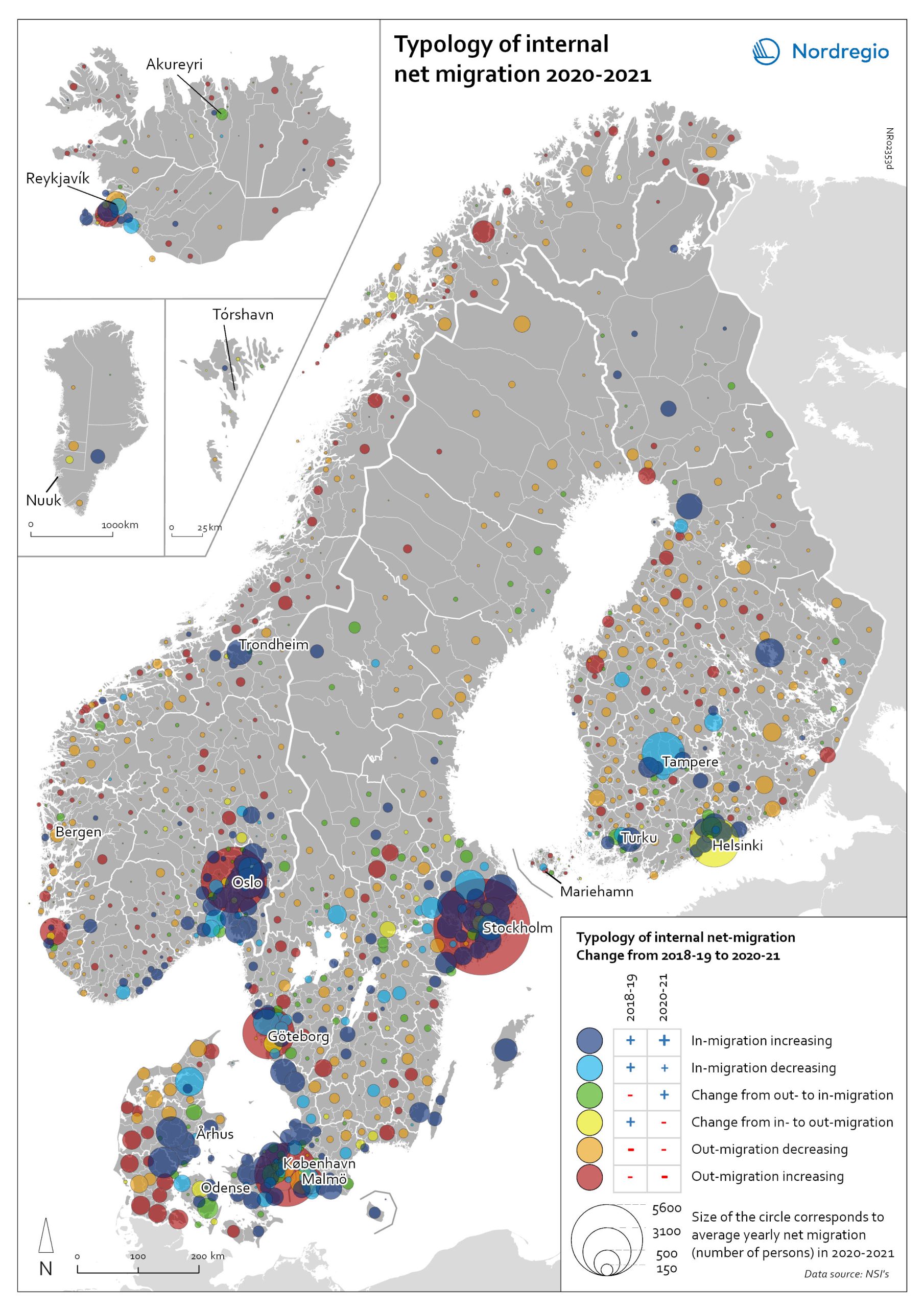
Typology of internal net migration 2020-2021
The map presents a typology of internal net migration by considering average annual internal net migration in 2020-2021 alongside the same figure for 2018-2019. The colours on the map correspond to six possible migration trajectories: Dark blue: Internal net in migration as an acceleration of an existing trend (net in-migration in 2020-2021 + increase compared to 2018-2019) Light blue: Internal net in migration but at a slower rate than previously (net in-migration in 2020-2021 + decrease compared to 2018-2019) Green: Internal net in migration as a new trend (net in-migration in 2020-2021 + change from net out-migration compared to 2018-2019) Yellow: Internal net out migration as a new trend (net out-migration in 2020-2021 + change from net in-migration compared to 2018-2019) Orange: Internal net out migration but at a slower rate than previously (net out-migration in 2020-2021 + decrease compared to 2018-2019) Red: Internal net out migration as a continuation of an existing trend (net out-migration in 2020-2021 + increase compared to 2018-2019) The patterns shown around the larger cities reinforces the message of increased suburbanisation as well as growth in smaller cities in proximity to large ones. In addition, the map shows that this is in many cases an accelerated (dark blue circles), or even new development (green circles). Interestingly, although accelerated by the pandemic, internal out migration from the capitals and other large cities was an existing trend. Helsinki stands out as an exception in this regard, having gone from positive to negative internal net migration (yellow circles). Similarly, slower rates of in migration are evident in the two next largest Finnish cities, Tampere and Turku (light blue circles). Akureyri (Iceland) provides an interesting example of an intermediate city which began to attract residents during the pandemic despite experiencing internal outmigration prior. From a rural perspective there are…
- 2022 May
- Demography
- Migration
- Nordic Region
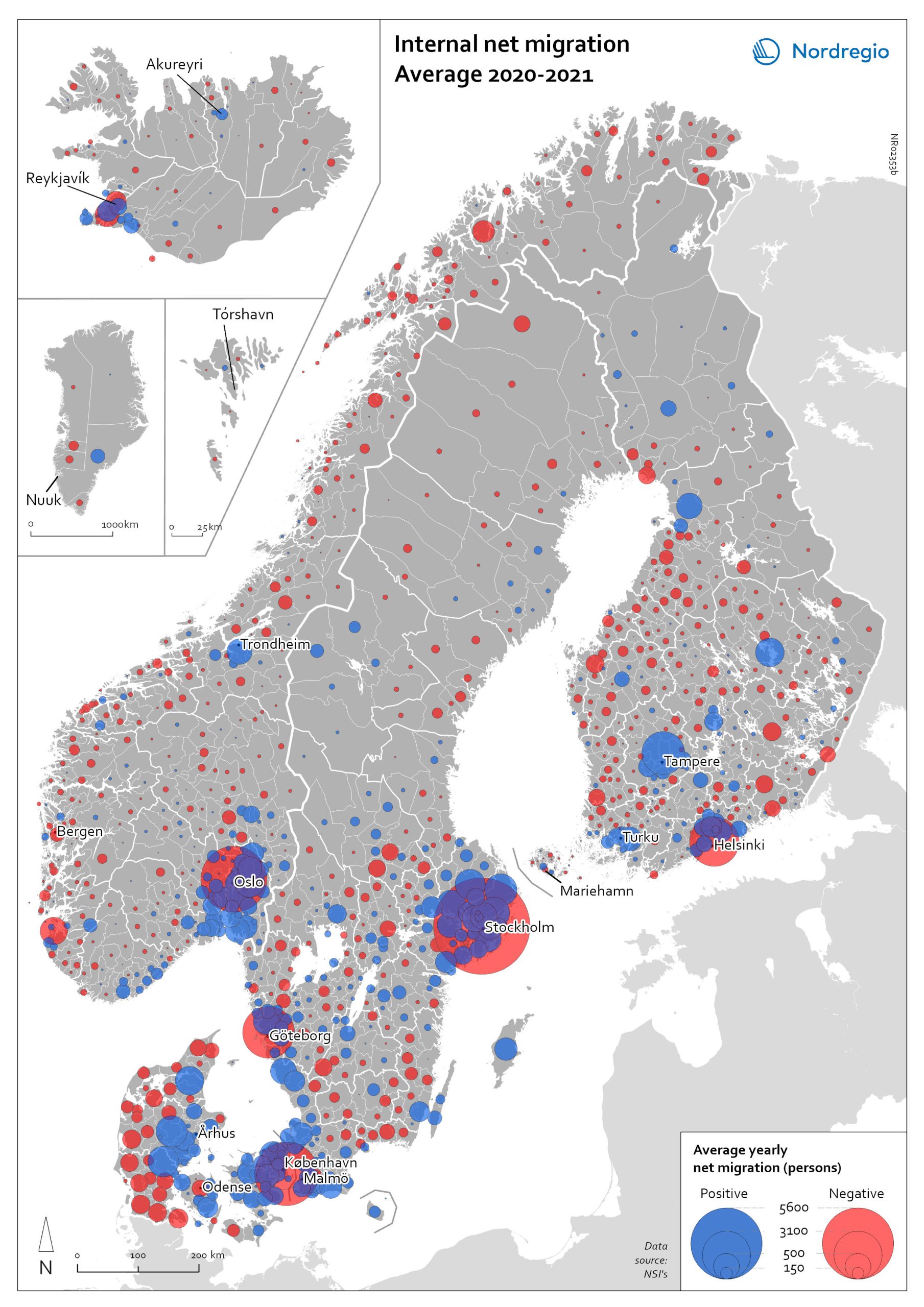
Internal net migration 2020-2021
The map shows the average internal net migration in 2020 and 2021 for Nordic municipalities. Blue dots indicate positive internal net migration (more people moving in than out) and red dots indicate negative internal net migration (more people moving out than in), while the size of the dots represents the extent of the positive or negative trend. Internal migration refers to a change of address within the same country. The map shows substantial outmigration from the Nordic capitals, as well as from Gothenburg and Malmö in Sweden. Alongside increased suburbanisation, the map also provides some evidence of growth in medium-sized cities and smaller cities within commuting distance of larger cities.
- 2022 May
- Demography
- Migration
- Nordic Region
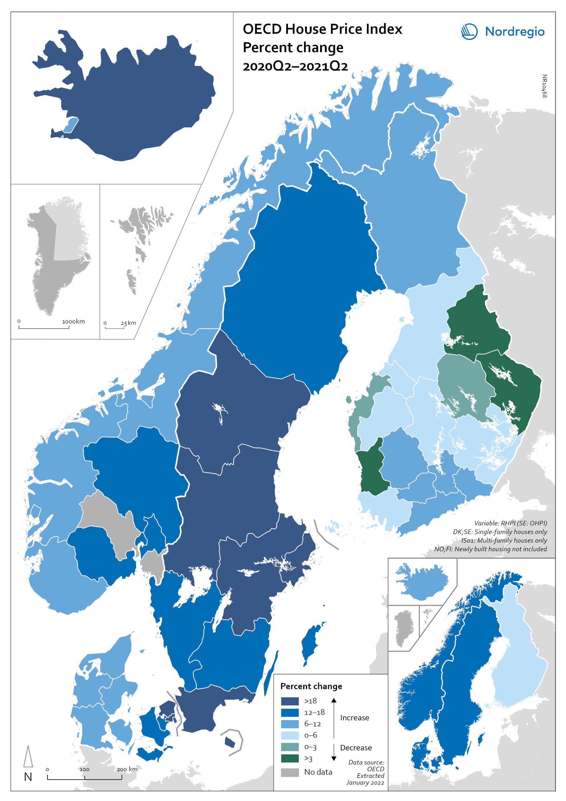
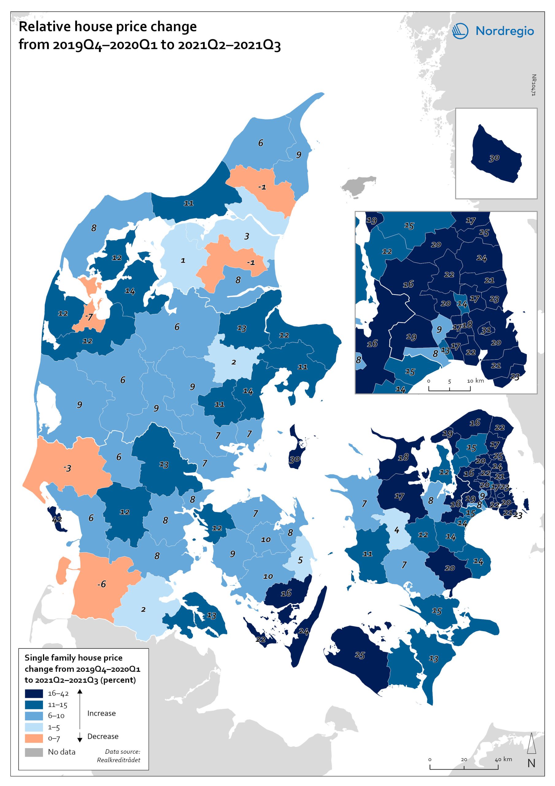
OECD House Price Index. Change 2020Q2–2021Q2
The map shows the relative change of the OECD House Price Index from Q2 2020 to Q2 2021. The map shows that the price development was not uniform within the countries. Iceland recorded the largest price increases overall, with the most marked price increases found outside of the capital region. All Swedish regions recorded increases above 20%, with the highest increases in the Stockholm and Malmö regions. All Norwegian regions showed price increases, though to a lesser extent than Swedish regions in most cases. In Denmark, Bornholm, Sjælland and the rural islands of Lolland and Falster recorded relatively high price increases, although many rural areas developed from low absolute prices in 2020. Finland was the only country where some regions saw property prices decrease. Moderate increases were still observed in some of the southern regions, where the major cities are located, and in the north.
- 2022 March
- Economy
- Nordic Region
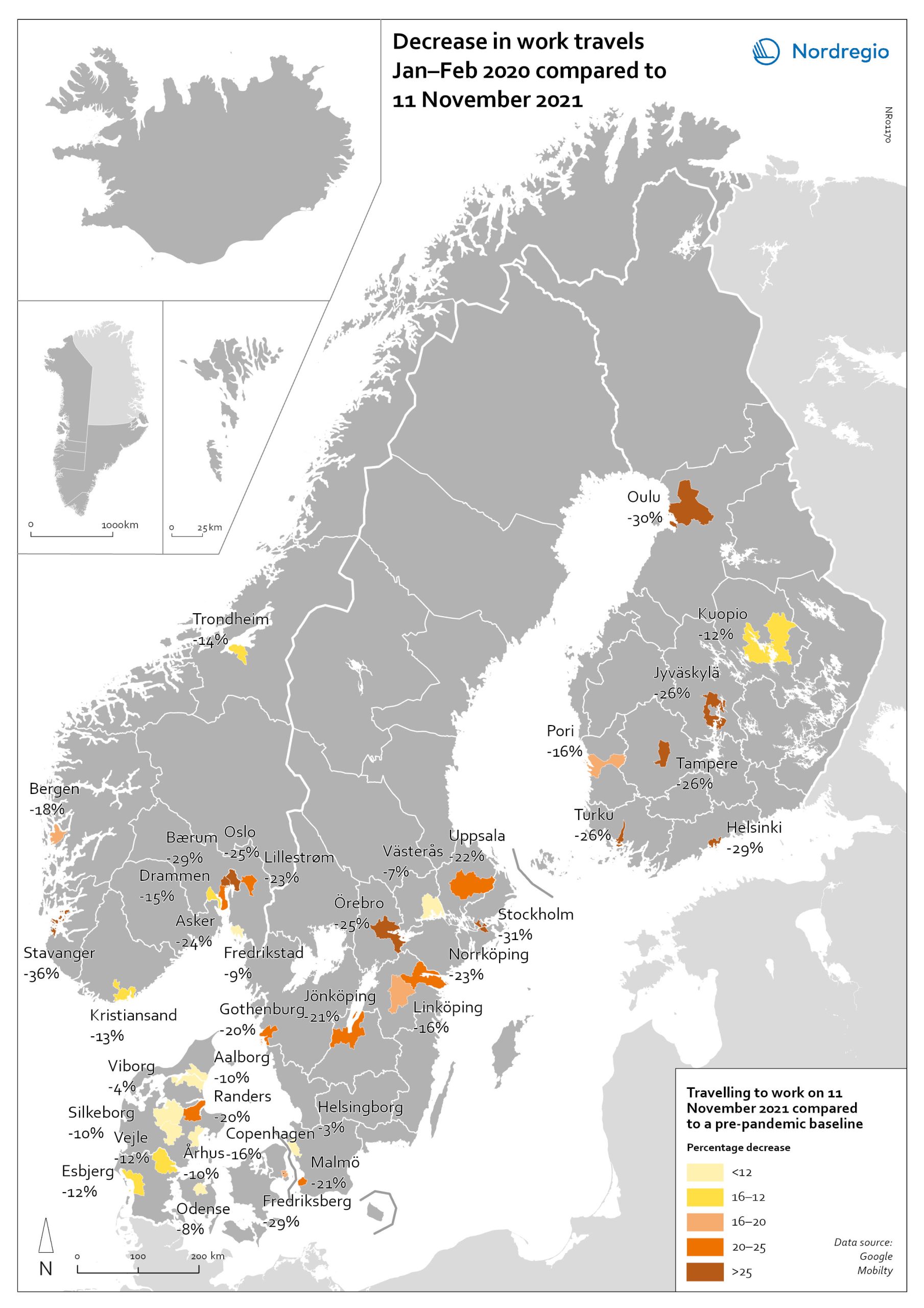
Change in work travels Jan-Feb 2020 compared to Nov 2021
The map shows changes in number of people travelling to work in the Nordic municipalities with the biggest populations comparing November 2021 to a pre-pandemic baseline. The map compares the average number of people who travelled to work on a weekday in January and February 2020 with the number of people who travelled to work on 11 November 2021 in the ten largest cities of Denmark, Finland, Norway and Sweden. The date was selected as the reference date as it is considered to be a relatively typical Thursday. It also represents a point when few movement restrictions were in place in the Nordic countries. As can be seen from the map, all of the municipalities highlighted recorded a fall in work-related travel on 11 November compared to the pre-pandemic baseline. It was biggest in Stavanger (-36%), followed by Stockholm (-31%), Oulu (-30%), Bærum (adjacent to Oslo) (-29%), Frederiksberg (adjacent to Copenhagen) (-29%) and Helsinki (-29%). In general, the decrease was highest around the capital regions and larger cities, but there were exceptions, for example, Jyväskylä (-26%), Örebro (-25%), Jönköping (-21%), and Randers (-20%). Several large municipalities also stood out because their patterns did not change so much, for example, Helsingborg (-3%) and Västerås (-7%) in Sweden; Viborg (-3%) and Odense (-8%) in Denmark.
- 2022 March
- Labour force
- Nordic Region
- Transport
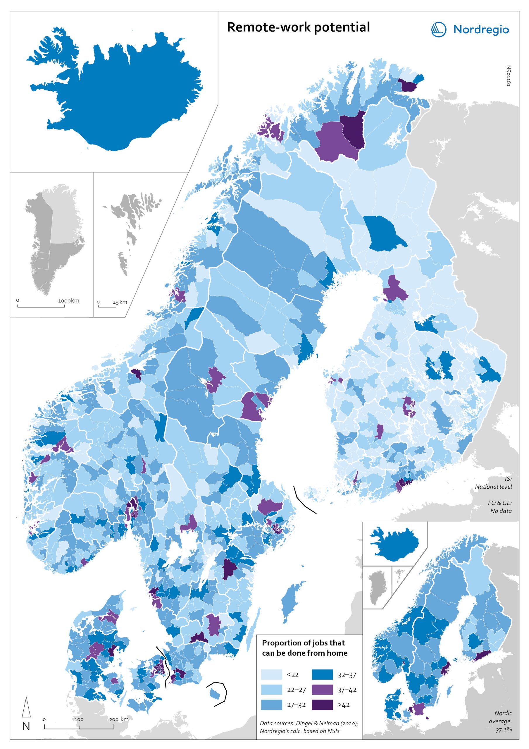
Remote work potential
The map shows the share of jobs that can potentially be done from home. At the municipal level it shows that the highest proportion is in, or in the proximity of, the largest urban conurbations. The purple areas show the municipalities that has a remote-work potential above the Nordic average (37%) and the blue areas the municipalities with remote-work potential below the Nordic average. The indicator is based on the methodology of Dingel & Neiman (2020). This method estimates the proportion of jobs that can theoretically be performed from home based on the tasks included in different occupations. Dingel & Neiman’s US classification was translated to the European International Standard Classification of Operations (ISCO-08) codes. The data is based on the 4-digit ISCO-08 and includes 437 occupations. The result was that every 4-digit ISCO occupation was coded as either 1: possible to work from home or not possible to work from home. For more information about the method please look at the State of the Nordic Region 2022 publication. The ten municipalities with the highest proportions are all in capital regions, with seven out of 10 in either Copenhagen (Hovedstaden) or Stockholm Region. In general, people in urban municipalities are more likely to be able to work from home (46.2%) than those in intermediate municipalities (32.3%) and rural municipalities (27.8%). It seems to be the case that the higher proportion of jobs that can be done from home in urban areas relates to the differences in industrial and occupational profiles between urban and rural areas, in particular, a higher concentration of knowledge-intensive occupations in urban areas. These differences are also evident when comparing countries. For example, Denmark has a rather large number of municipalities with high proportions of jobs that can be done from home. This may be due to…
- 2022 March
- Labour force
- Nordic Region
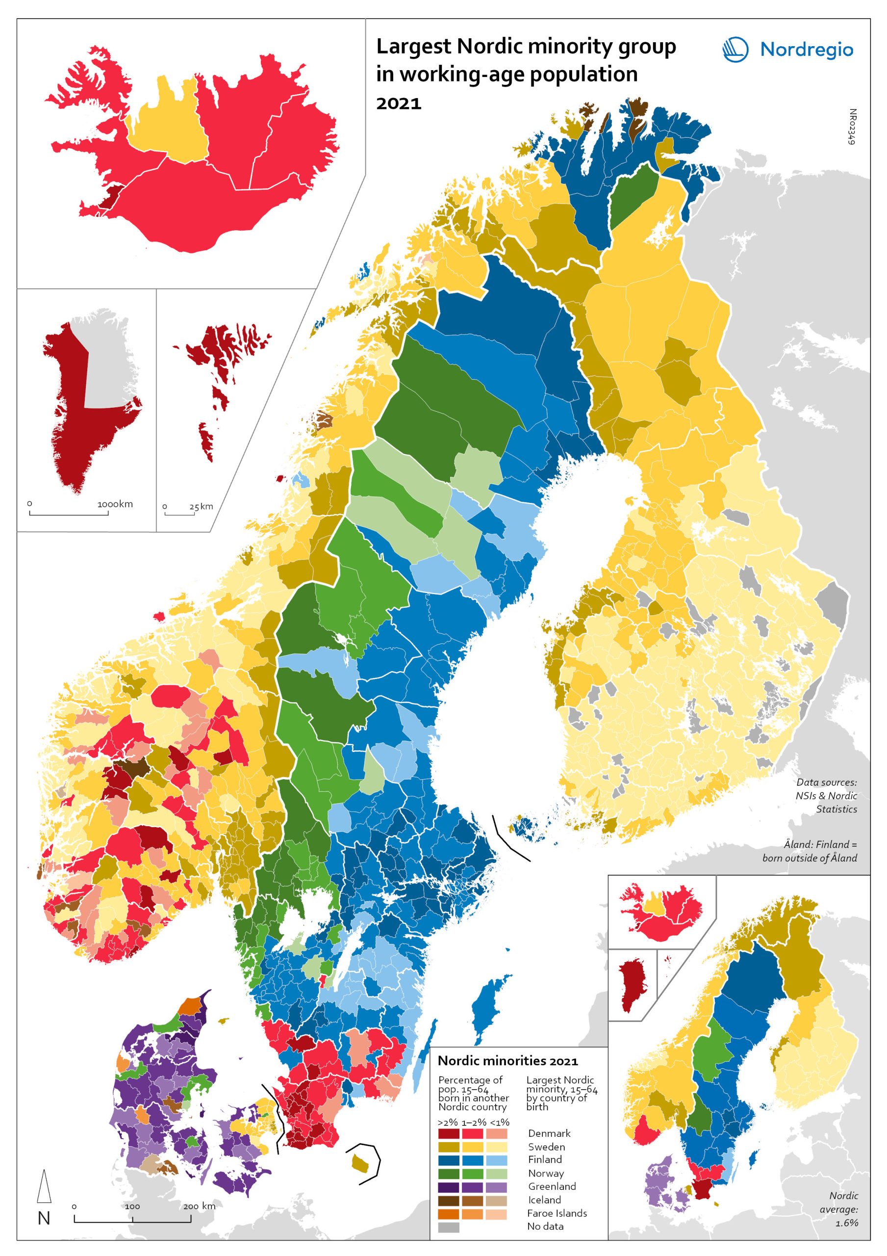
Largest Nordic minority 2021
The map shows the largest Nordic-born minority group at the municipal level among the working-age population (15-64 years old). The intensity of the colour shows the share of the total foreign-born Nordic population, with darker tints indicating a larger percentage than lighter tints. The map illustrates differences at the regional and municipal levels within the countries. For example, while the largest minority in Norway are born in Sweden, those born in Denmark constitute the largest minority Nordic-born group in the southern Norwegian region of Agder. The largest Nordic-born minority in Denmark are those born in Sweden in absolute numbers and in the capital region of Hovedstaden, while the largest minority in all other Danish regions is from Greenland. In Sweden, the largest Nordic-born minority overall are from Finland, but there are also regional differences here: in the regions of Skåne, Halland and Kronoberg, the largest Nordic minority group come from Denmark, and in Värmland and Jämtland-Härjedalen, the largest is Norwegian born. In the cross-border municipalities, this pattern is even more accentuated and made evident in areas such as Haparanda in Sweden (the twin city of Tornio in Finland) where 26.5% of the population is Finnish born. Åland has the highest share of other Nordic nationals, where, for example, 47% of the population in the municipality of Kökar is born in a different Nordic country (including Finnish born). Excluding the municipalities of Åland, Haparanda is the municipality in which Nordic-born minorities make up the highest percentage of the total working-age population.
- 2022 March
- Demography
- Nordic Region
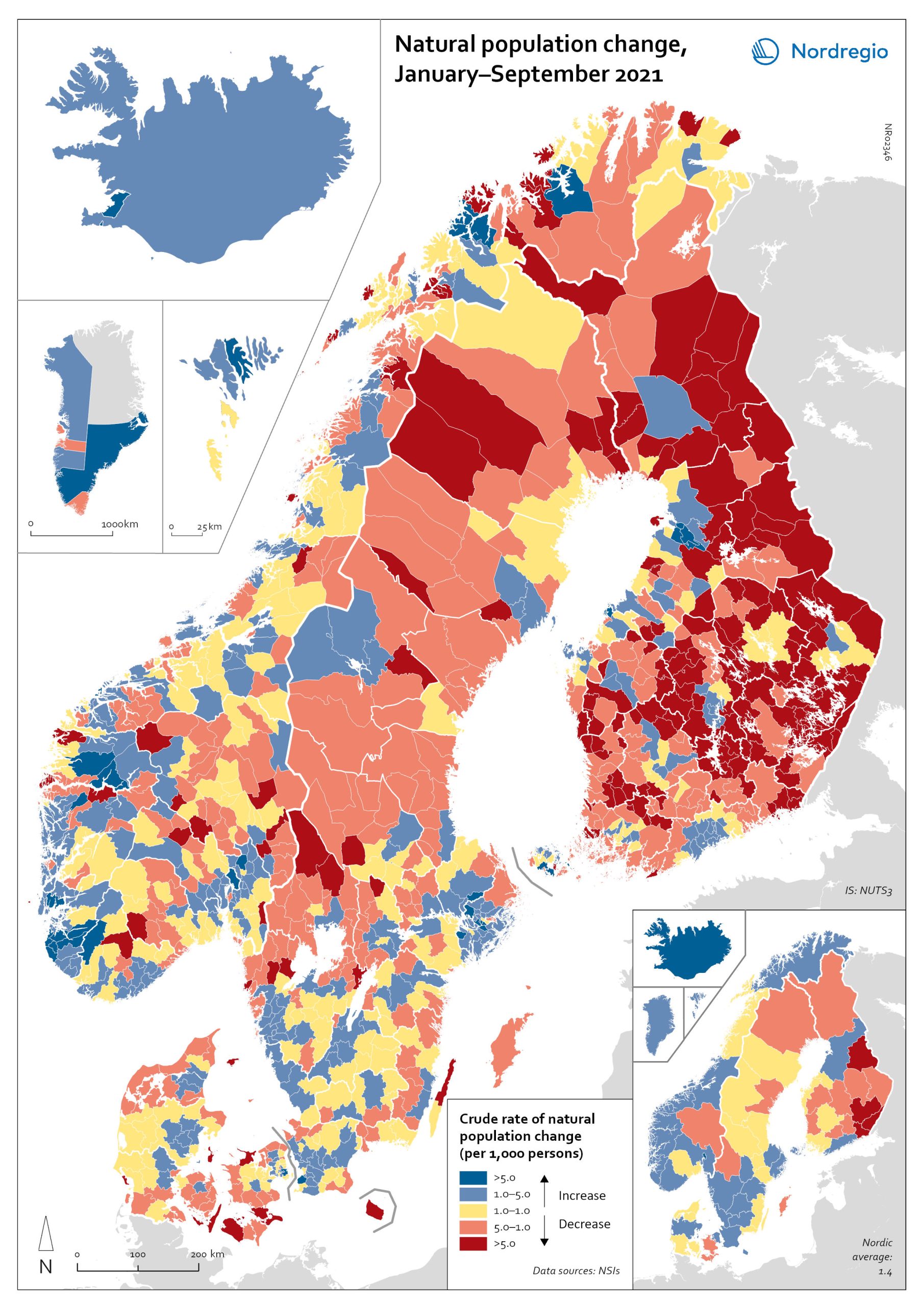
Natural population change in the Nordic Region 2021
The map shows the natural population change in the Nordic Region from January to September 2021 While all Nordic countries except Finland were characterised by positive natural population change during 2021, this growth was often particularly pronounced in and around cities and towns, with their relatively youthful populations. Urban centres and their surrounding areas such as Stockholm and Malmö in Sweden, Oslo and Trondheim in Norway, Espoo and Helsinki in Finland or Aarhus and Copenhagen in Denmark all reported among the highest rates of natural population growth during the first nine months of 2021. Rural regions with their often-older population age structures were more likely to experience natural population decline, a pattern that had already existed prior to the pandemic. Especially in Finland, many rural municipalities reported high natural population decline during the first nine months of 2021, despite increases in the number of births, as shown in the map “Change in the number of births in the Nordics”. In the other Nordic countries, only a few municipalities experienced similarly high levels of natural population decline.
- 2022 March
- Demography
- Nordic Region
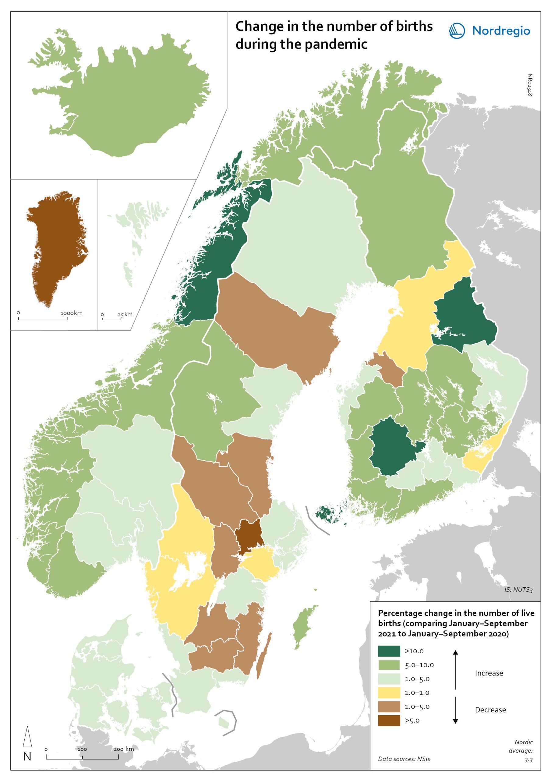
Change in the number of births in the Nordics
The map shows percentage change in the number of live births in Nordic regions, comparing January-September 2021 to the same period in 2020. While most Nordic countries and autonomous territories saw a rise in births during the pandemic, not all regions followed this trend to the same extent. Rural regions stand out as having had both baby booms and baby busts during the pandemic. In Finland, for example, rural regions reported both large increases in births (Kainuu) but also declines (Central Ostrobothnia). In Sweden, only a few regions registered an increase in the number of babies conceived during the pandemic; among those were rural Gotland and Jämtland. Kronoberg and Dalarna, by contrast, reported a drop of more than 3% in the number of births.
- 2022 March
- Demography
- Nordic Region
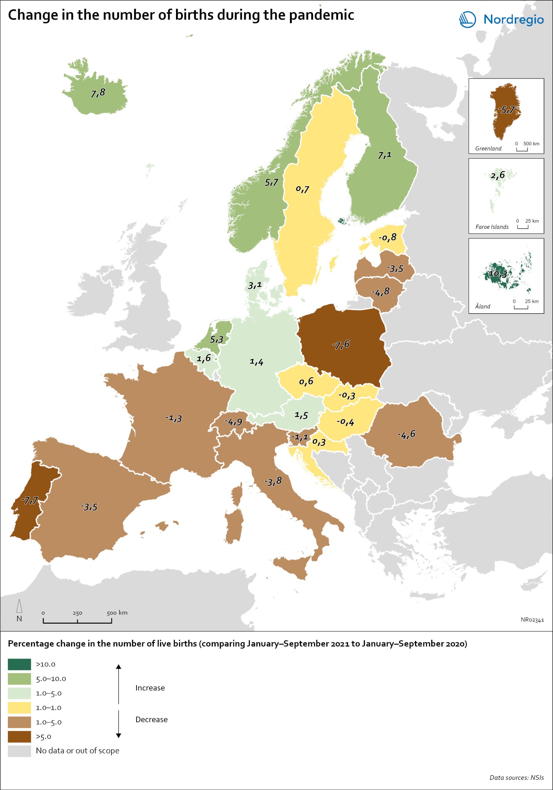
Change in the number of births in Europe
The map shows the number of births during the first nine months of 2021 (January to September) compared to the number of births during the same months in 2020. The babies born during the first nine months of 2021 were conceived between the spring and winter of 2020 when the first waves of the pandemic affected Europe. Babies born during the first nine months of 2020 were conceived in 2019 (i.e., before the pandemic). The map therefore compares the number of births conceived before and during the pandemic. At the time of writing, it seems as if both baby boom and baby bust predictions have been correct, with developments playing out differently across countries. In many Southern and Eastern European countries, such as Spain, Italy or Romania, the number of births declined by more than 1% during the first nine months of 2021. In Portugal and Poland, but also Greenland, drops in the number of births were particularly sharp with more than 5% fewer babies born in 2021. In several of these “baby bust” countries, these decreases in fertility came on top of already low fertility rates. Spain, Italy, Portugal and Poland, for instance, all already had a total fertility rate (TFR) of less than 1.5 children per woman before the crisis. These values are substantially below the so-called ‘replacement ratio’ of 2.1 children per woman, which is necessary to maintain population size. In these countries, existing demographic challenges have thus been aggravated during the pandemic.
- 2022 March
- Demography
- Europe
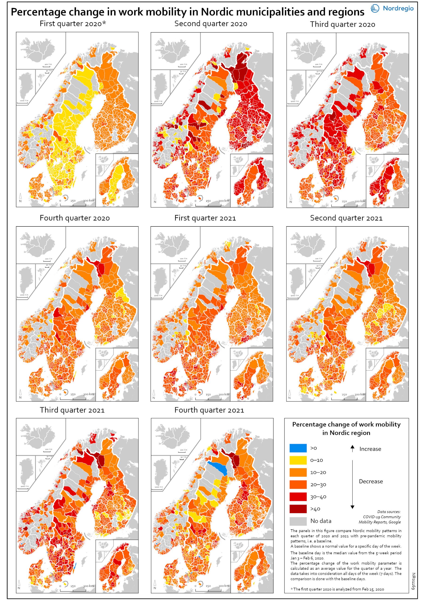
Work mobility per municipality and region by quarter
The map shows the percentage change for work mobility in Nordic regions and municipalities compared to a pre-pandemic baseline. The maps compare Nordic mobility patterns in each quarter of 2020 and 2021 with a pre-pandemic baseline. Based on Google data, the panels illustrate the impact of national restrictions and how those restrictions hampered work mobility. As the restrictions were both national and regional in nature, some regions and municipalities were more affected than others. The darker areas in the map show that work mobility decreased the most Q2 and Q3 2020 and in Q3 2021. The panels also show that mobility decreased later in Sweden than in the other Nordic countries. However, the decrease in Q3 in both 2020 and 2021 may partly be explained by the summer vacation months, when work mobility tends to decrease anyway. In Q4 2021, the overall situation seems to improve, although the pattern is mixed. In a few municipalities the situation is almost back to pre-pandemic baseline while in most municipalities, there is still less mobility in the labour market compared to the pre-pandemic situation.
- 2022 March
- Labour force
- Nordic Region
- Transport